InType: High-Contrast Fonts
InDesign Magazine issue 113This article appeared in Issue 113 of InDesign Magazine. Andrea Leksen explores fonts that create drama and intensity by combining thick and thin strokes.

This article appears in Issue 113 of InDesign Magazine.
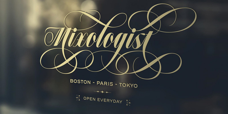
I don’t know about you, but I love a gorgeous, dramatic, over-the-top, high contrast font for large titles in magazines, on posters, or on a tattoo! There’s something about homing in on that meticulously designed letterform—each curve connecting a thin stroke to a ridiculously thick stroke—that creates drama and intensity (Figure 1). Is it a quick transition or slow? Does the terminal connect back into other letterforms or is it drawn out into an ornate swash that ends like a stunning symphony finale?
Just thinking about it gives me goosebumps.
The Modern Beauty of Didone Fonts
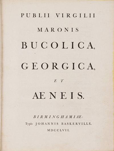
Fonts with strong, heavy vertical strokes surrounded by highly-contrasting thin horizontal strokes and serifs are called Didone fonts. The name refers to Didot and Bodoni, two eighteenth-century font designers well known for their beautifully well-designed modern fonts. These designers were inspired by the modern fonts created by the English printer John Baskerville, who set the stage for the next chapter of serif type in the 18th century, bridging the gap between oldstyle and modern serifs. Baskerville achieved crisp printing of these thin modern strokes through his experimentation with printing technology, crafting new processes to create darker inks and using brighter paper (Figure 2). Through this, Baskerville printed crisp, legible type in spite of the new printing challenges of these extreme stroke weights.1
The modern serif continued to evolve through Giambattista Bodoni’s experimental typography in Italy. “The king of printers and the printer of kings,” Bodoni created innovative type designs and also had the reputation of being
a meticulous printer.2 Bodoni’s letterforms evolved from traditional roman letterforms, not only extending the contrast of stroke weight but also by designing more condensed letterforms with hairline serifs. These characteristics reflected the machine age of the time—precision, perfection, and simplicity of design—replacing the frills of the rococo style.3 The friendly typographic competition between Bodoni and the Didot family kept evolving the modern serif further and raised the standard of precision in the printing world of the early nineteenth century (Figure 3).
While this Didone movement is over two centuries old, these fonts often still feel modern to us! But of course, typography never stands still, and designers have taken high contrast fonts to even greater extremes.
Extreme Fonts in Fashion Design
If you were to describe a Didone font, you might use adjectives like “sophisticated,” “dramatic,” or “classy,” due to its precision and extreme contrast of stroke weight. In many fashion lines, the goal is to create clothing that describes similar qualities—or at least make you feel like you will fit that description. So naturally, it makes sense that these fonts might be paired with these types of brands. For example, the Couture mission is to create clothing of the highest quality with incredible attention to detail. That sounds a lot like Bodoni’s style to me!4
Commercial Type’s Le Jeune font, designed for the 2013 refresh of Vanity Fair, was based on the Didot typeface and named after the French punchcutter Joseph Molé Le Jeune (Figure 4).
It even includes a stencil version, playing with the extremes of disconnection to offer even more excitement in the strokes (Figure 5).
As in all design, typography and images work together to tell a cohesive, compelling story. In “Type in Couture,” Elizabeth Carey Smith states: “Typography informs and expresses but it’s mostly literal, while fashion is more nebulous. Fashion communicates lifestyles or the aspirations of life visually. Fashion is about self-invention and self-expression. The secure and insecure ways that we reflect ourselves to ourselves and others.”
Art Director Alexey Brodovitch brought the iconic Didone Bazaar masthead to life during his years at Harper’s Bazaar. This cover from 1955 (Figure 6) shows a clever correlation between type and image and is just one example of a persuasive visual story from his 24 years reforming editorial design.5
While these fonts have screamed “modern” for so long, some designers have wondered if the trend is overused.
The Science of Contrast
However, it’s clear that so many of us are drawn to these high contrast fonts. But why? Bruno Maag of the type design foundry Dalton Maag states, “Extreme fonts, whether that be contrast, weight, width, or any other thing that a type designer can think of, are very expressive. They shout for attention and elicit an emotional response, and that makes them useful and popular.” Whether it’s seen in design, fashion, or typography, contrast is one of the essentials that creates dynamic design.
Of course, what we define as beauty is determined by many things, including culture, history, and nature. Last month I was discussing this issue with neurologist Alessia Nicotra, who has recently been educating the typography world on the neuroscience of typography. She said that “Cultural preference depends on emotional choices that have become history on the background of a script. High contrast typography applies only to certain scripts, like Latin, for example (and not Chinese). The use of high contrast typography has been passed from one user to another on an emotional basis, hence very much involving the ‘emotional brain’.” It would be a fascinating study to see how people’s brains respond to contrast in a variety of cultures!
Nietzsche suggests that “all pleasure depends on proportion” and that one of our innate desires is to find pattern and symmetry. It is also suggested that the significance of the aesthetic response correlates to the relationship of the parts to the whole. So perhaps we could find a link to contrast in these aesthetic responses as our eye compares the difference in the thin stroke to the thick stroke of a high contrast letterform. The greater the disparity between stroke weights, the more our brain reacts aesthetically to the stimulus.6
How Should I Use High Contrast Fonts?
High contrast fonts have a clear, resonant voice that demands to be heard. If these fonts reflect the personality of your project, use them at large sizes and show off those beautiful curves! High contrast fonts are best used for display and big headings. At smaller text sizes, hairlines will disappear and no longer be legible. So have fun with these flamboyant, dramatic fonts in headlines and subtitles, and keep body type to legible text fonts that are designed for paragraph settings.
Here are a few fun high-contrast fonts you should know about:
Matthew Carter’s Miller font includes all the weights you need, from text to display, including Miller Banner, Miller Display, Miller Headline, and Miller Text. Carter has a beautiful way of integrating personality into his letterforms while still keeping the consistency necessary for a successful typeface (Figure 7). Check out that italic lowercase z and uppercase Q! (swoon)
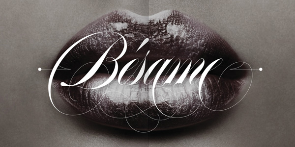
Argentinian type designer Maximiliano Sproviero’s Erotica font is a calligraphic script that oozes sensuality through the dramatic stroke contrast and with terminals ending in elaborate swashes (Figure 8). He includes multiple alternates to create your own ending—a designer’s dream!
A few years ago I was drooling over the display font in Food & Wine magazine and wrote to ask what font it featured. It turns out it’s Dino Dos Santos’ Acta Display, so gorgeous in Black Italic (Figure 9).
Am I a little biased when it comes to this category of type? Perhaps. I do have a knack for finding passion, whether it’s in an expressive dance step on the tango floor, playing a Rachmaninoff rhapsody on my grand piano, or drawing an over-the-top curve in a letterform. So when the Font Bureau offered me a generous mentorship opportunity a few years ago, I used my time to concoct a typeface with some of my favorite display attributes—low x-height and high contrast, with oodles of ligatures to explore beauty in the connection between letterforms. This typeface, Mr Gabe (Figure 10), will be making its debut in the near future, and I can only hope that it would have made the founders of the modern serif era proud.
High Expression Fonts
Perhaps now that we understand the history, emotion, and meticulous creation of high contrast fonts a little better, we can appreciate them even more as we see them in use. Our clients may not know the history of Didone fonts when we use them in specific projects, but they (the clients!) will feel the connection between the emotion and the story we’re attempting to portray as designers. So continue the craze, push the limits, and see where it leads you!
Works Cited
Yau, Cheryl. “Know Your Type: Baskerville.” idsgn.org. 10 October 2010.
Tholenaar, J., Jong, C., & Purvis, A. W. (2009). Type: A visual history of typefaces and graphic styles. Köln: Taschen.
Meggs, P. B., Purvis, A. W., & Meggs, P. B. (2012). Meggs’ history of graphic design. Hoboken, N.J: J. Wiley & Sons.
Smith, Elizabeth Carey. “Type In Couture.” YouTube.com. Type Directors Club. 24 June 2018.
Gallagher, Jenna Gabrial. “Alexey Brodovich: 1934–1958.” HarpersBazaar.com. Hearst Communications, Inc. 31 May 2007.
Smith, C. U. M. “Evolutionary Neurobiology and Aesthetics.” Perspectives in biology and medicine 48.1 (2005): 17–30. ProQuest. Web. 8 May 2018.
Commenting is easier and faster when you're logged in!
Recommended for you
13 Fonts From the Dark Side
Don’t be afraid of the dark! Use these fonts for creating distinctive, impactful...

Make a Font “Contact Sheet” in InDesign
Need a specimen sheet for a font? Or a catalog of all your font characters? Chec...
Should You Use Photoshop CC, Elements, or Lightroom?
It can be a bit intimidating trying to decide which image-editing software you n...


