
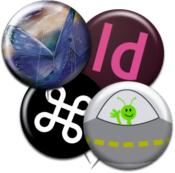
InStep: Pinback Button FX
Mike Rankin shows how to add a little flair to your layouts with a fun pinback button transparency effect


This article appears in Issue 102 of InDesign Magazine.
1. Find or create your message
Long before the Internet and social media enabled us to instantly share our opinions on everything from presidents to pumpkin spice Oreos, we used decidedly low-tech methods to get our messages across. Growing up in the ’70s and ’80s, my preferred expressive media were lunch boxes, T-shirts, and the little pinback buttons that adorned my jackets and backpacks. Mostly these pins featured my favorite bands or deep philosophical statements like “Pobody’s Nerfect.” Finding the perfect pin to add to my collection was a rare and happy event. Now, of course, you can design and order pins to say anything you want, and have them shipped to you. So there’s no excuse to be caught with the bare minimum amount of flair. And it’s just as easy to add a pin effect to an InDesign layout. All you need is a little bevel and emboss and a drop shadow to get anything off (or in this case, on) your chest.
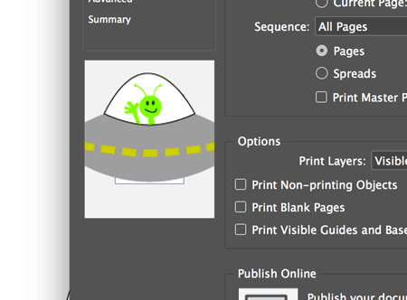
The first, and maybe hardest, part of this job is deciding what you want your pin to say. You can design it using any photo, graphic, or text. For this example, I’ve chosen a message that only true InDesign aficionados will recognize: the Friendly Alien easter egg in the Print dialog box.
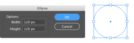
2. Draw the pin shape
The basic pin shape is just a circle. To make it, take the Ellipse tool, and hold Shift as you drag. Or, if you know the exact size you want, click with the Ellipse tool, enter the same dimensions for Width and Height,
and click OK.
3. Add the message
Place or paste the desired image or text into the ellipse. If you have multiple objects that make up the pin’s message, you’ll need to group them before selecting the ellipse and choosing Edit > Paste Into (Command+Option+V/Ctrl+Alt+V).

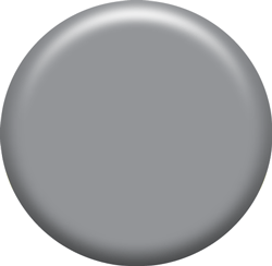
4. Create a copy for the effects
It’s tempting to apply effects directly to the image, but don’t. Instead, copy the ellipse, and duplicate it in place by choosing Edit > Paste in Place (Command+Shift+Option+V/Ctrl+Shift+Alt+V). Then delete the contents of the duplicated ellipse by clicking the Select Content button in the Control panel () and pressing Delete. If your document is intended for screen output and you’re using RGB swatches, fill the ellipse with 50% Black. If your document is intended for print output and you’re using CMYK swatches, fill the ellipse with 50% Registration.

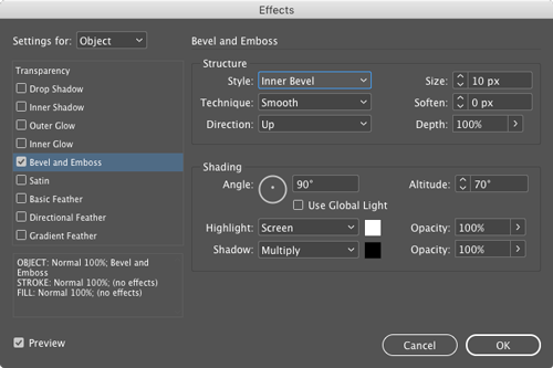
5. Apply Bevel and Emboss
In the Effects panel, apply Bevel and Emboss. Set the Style to Inner Bevel, the Technique to Smooth, and the Direction to Up. The Size, Angle, Depth, Altitude, and Softening settings will vary depending on the content of the pin, so be prepared to play around with them as you go. Make sure the Preview checkbox is turned on so you can see the effect of tweaking the settings right away.
In this example, I’m starting with a Size of 10 pixels, a Depth of 100%, and Angle of 90°, which puts the highlight at the top of the pin and the shadow at the bottom. The Altitude setting determines the relative intensity of the highlight and shadow. In most cases, an Altitude of 70 degrees makes for a shiny effect.
6. Add a drop shadow
While you’re still in the Effects dialog box, turn on the Drop Shadow checkbox, and adjust the settings to taste. Usually, you’ll want a small shadow set to the same angle as the bevel and emboss. In this case, that’s 3 pixels for the Distance and Size, and an Angle of 90°.


7. Set the blend mode to Hard Light
There’s one more thing to do before closing the Effects dialog box, and that’s to click on the Transparency settings and change the blend mode from Normal to Hard Light. This makes the 50% Black fill disappear, while leaving the highlight and shadow of the bevel and emboss visible. At this point, you might want to go back to the Bevel and Emboss settings and tweak them to the get the look you want. Changing the tint of Black that you used to fill the ellipse can also help to emphasize the effect. For my pin, I increased the Tint value to 70%.

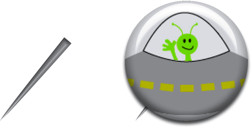
8. Add a pin
If you want to make the pin even more pin-like (and you don’t want to make it look like it’s pinned onto something), create a very narrow triangle using the Pen tool, fill it with a shade of gray, and apply bevel and emboss to taste. Place the triangle behind the two ellipses and group them.
9. Add a background image
The final step is to place your pin on a background image (if desired). Again, you may need to revisit the Effects dialog box and tweak the settings. You might also want to resize, skew, or rotate the group of objects that make up the pin to match the content of the image.

The best part is that now that you have the basic elements for the pin effect, you can create as many different pins as you like very quickly and easily, just by swapping out the image or text. You’ll have flair to spare!
Commenting is easier and faster when you're logged in!

Recommended for you

InDesign Magazine Issue 104: Accessibility
We’re happy to announce that InDesign Magazine Issue 104 (December 2017) is...

InDesign Eye Candy, part 3: Punch-Outs, Stickers, and Rips
Eye candy punchouts, stickers, rips, and burns.