
InReview: Cacidi Charts CC
Jamie McKee reviews a tool that gives InDesign users the ability to make and edit charts right in InDesign.

This article appears in Issue 104 of InDesign Magazine.
Sooner or later every InDesign user, needs to make a chart. In the past, that task usually meant launching Excel or attempting to figure out Illustrator’s odd charting feature. But a new InDesign plug-in could change all that, letting you easily create charts directly on your InDesign pages.
Cacidi Charts, from Cacidi Systems, is capable of creating pie charts, column charts, bar charts, stacked column charts, area charts, and line scatter charts, while offering clever options to customize them and even convert them into editable InDesign objects. While the plug-in is still new and needs to mature a bit, it is ready now for simple projects, and it shows great promise.
How it Works
When you open the Cacidi Charts panel, you’ll notice the large input grid, above which sit drop-down menus for Chart Type and Chart Style, as well as a field for entering data into the grid (Figure 1).
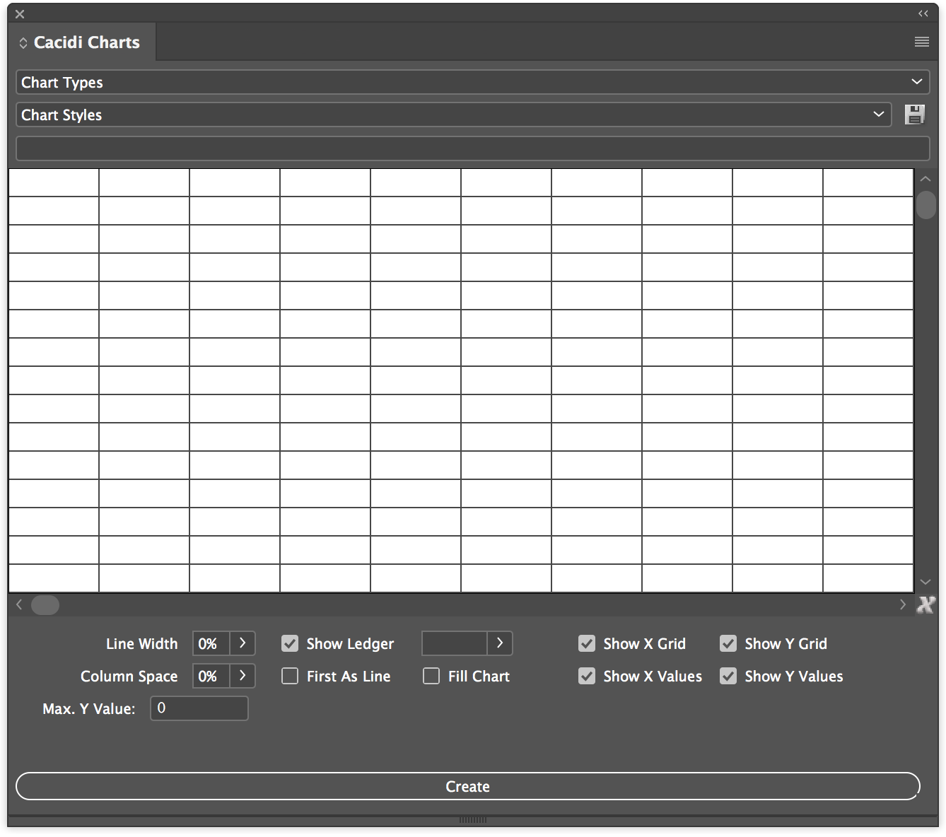
Figure 1: The Cacidi Charts Panel.
While it’s easy enough to enter data into the field to populate the grid, navigating the grid is cumbersome. You might expect it to work like Microsoft Excel or other spreadsheet programs, but it doesn’t: you can’t use the arrow keys to move between cells; pressing Return/Tab after entering data into the field does not advance you to the next cell; column width and row height can’t be adjusted; and if you have a large set of data, you can’t scroll about the input grid with a scroll-wheel mouse or track pad (you have to use the scroll arrows of the panel window).
Though there’s no rearranging your data using drag-and-drop or cut-and-paste, there is a command in the panel menu to Swap
Columns and Rows. This can be very helpful, as I found some charts could only be properly created once I swapped their orientation. Thankfully, you’ll find another command in the panel menu that will alleviate some of the frustrations of the input grid: Load CSV File.
A CSV (comma-separated value) file stores tabular data in plain text, separated by commas (or sometimes semicolons). Popular spreadsheet programs like Apple Numbers, Microsoft Excel, OpenOffice Calc, and Google Sheets can export your spreadsheets in this format, and Cacidi Charts can load from and save to this format. For all but the simplest of data sets, CSV is the method I would recommend you use with any data you want to chart with Cacidi Charts.
But you should be aware of one serious limitation when working with CSV files: only the header (the first row) and the ledger (the leftmost column) can contain any characters other than numbers. If your CSV file contains things like currency notation or comma separators, they will all have to be cleared before Cacidi Charts can chart the data.
Once your data populates the input grid, choose one of the six Chart Types from the menu. As you do, that chart’s options will appear underneath the grid. For instance, when creating a pie chart, you can choose whether to show a ledger and set its size. You can also add a “doughnut hole” effect to the chart, and “offset” one or more of the data points of the pie (Figure 2) by a specified distance.
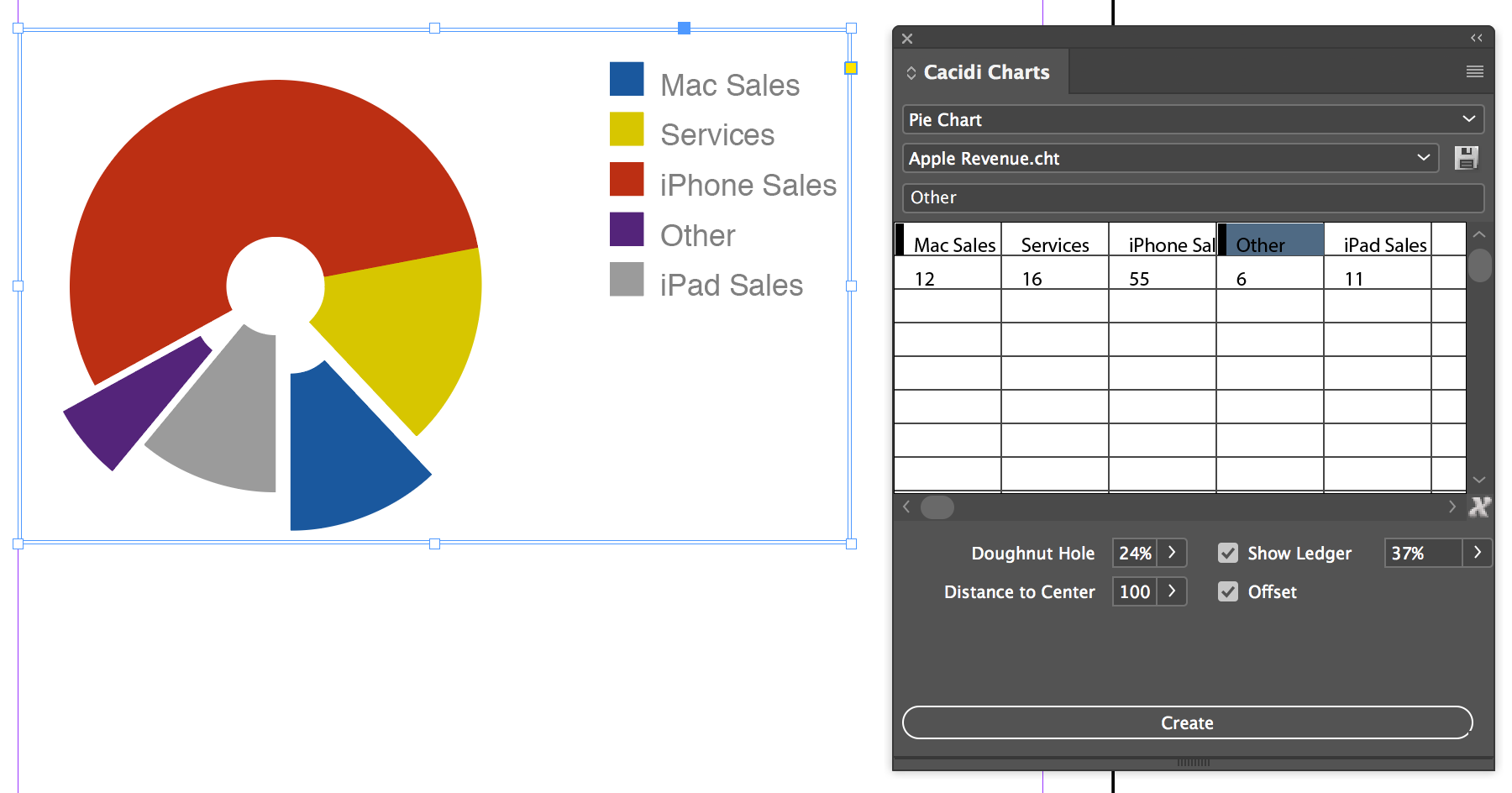
Figure 2: A Pie Chart utilizing the “Doughnut Hole” effect and Offsets, which are indicated by the black vertical bar(s) in their corresponding cells.
In the lower right of the input grid is an X icon. Clicking it will clear the grid of all data. If you press any of the modifier keys (Control, Command, Option/Alt) while pressing the X, Cacidi Charts will enter demo/test data into the grid for you to chart so you can familiarize yourself with its options.
The charts that Cacidi Charts creates are (mostly) dynamic postscript objects, meaning that they’re graphics that you can resize, apply effects to, and so on. (I say they’re “mostly” dynamic because while certain chart options adjust instantly as you change their values, others, such as the pie chart’s Offset option, require you to “Create” the chart again to take effect.)
Newly added to Cacidi Charts is the ability to edit individual elements using the Convert Charts to Objects command, located in the panel menu. When you choose this command, all parts of the chart are converted to individual InDesign objects—text, lines, boxes, and so on—that can be independently adjusted and styled (Figure 3).

Figure 3: Use the “Convert Charts to Objects” command to convert charts to native InDesign objects that can be adjusted individually, such as font, size, drop shadow, ands so on.
The converted chart objects are grouped and moved to a new “Cacidi Charts” layer in the Layers panel. Sure, other programs can be used to make charts, but only Cacidi Charts allows you to edit their individual elements in InDesign as easily as this!
Chart Styles
Cacidi Charts allows you to save styles—basically color sets—to use in your charts. It’s a great feature, but with a cumbersome implementation. To save chart styles, you need to first create objects (such as empty graphic frames) on your InDesign page, apply colors to them, select them all, and then click on the the floppy disk “Save” icon to the right of the menu in the Charts panel.
To me, this seems like a convoluted method to create a set of colors—I would rather just select a folder in the Swatches panel. The current method also affects how colors are applied to the data points: the order you color the drawn objects of your Chart Style determines the order in which the colors are applied to the data points. If you want to change the order of the colors of your chart, you need to either change the order of your data, or re-order your drawn objects and save a new chart style. I wish I could reorder the swatches in a swatch group and update/save the chart style.
That said, the developers at Cacidi told me the reason they implemented chart styles this way was to support future features they have planned. For instance, a recent update brought the ability to save the stroke color and thickness of your drawn objects as part of the chart style.
I’m hoping Cacidi has other compelling features planned for chart styles. It would be great if Cacidi Charts provided some more polish to this area of the plug-in, as there’s no way to edit, update, or remove saved chart styles.
Conclusion
Cacidi Charts is an interesting take on creating charts within InDesign. While it has some useful options for quickly creating pie, column, bar, stacked column, area, and line scatter charts, the current version is a little rough around the edges. That said, it is a new product, and Cacidi was always quick to answer my questions, and they promptly corrected some crashing issues I had in their early versions.
The plug-in is stable now, and I believe the recent update that includes the ability to convert chart elements to native InDesign objects could be its greatest feature, allowing you to customize every aspect of your chart—an incredibly complex and time-consuming process to complete by hand. I expect future updates will continue to improve Cacidi Charts, making it a very compelling option for chart creation in InDesign. Stay tuned!
Commenting is easier and faster when you're logged in!

Recommended for you

Free Script to Add an Antique Edge to Photos
I recently stumbled across an interesting script that changes the border of a re...
Designing Books
In in-depth look at the process of designing a book from start to finish, throug...

Preflighting eBooks for Overrides
With the help of the Preflight panel, a plug-in, or a cool script, you can spot...