
InQuestion: List Lines, Running Headers, and Table Cells
Erica Gamet highlights the best Q&A from the incredible InDesignSecrets Facebook group.


This article appears in Issue 126 of InDesign Magazine.
Our online communities on Facebook and LinkedIn are full of passionate InDesign users, at all different levels of proficiency. But no matter how long we’ve been using the program, there are always those questions that stump us. Luckily, our groups are full of helpful InDesigners who always bring unique solutions to the table.
In this Q&A column, I’ve collected several excellent questions and responses, and distilled them for you. Note that the discussions have been edited for brevity and clarity.
Creating Form and List Lines
A.M.M. asked:
Q: I’m creating a journal/notebook and I’m trying to create lined pages and boxes to write on… Can someone please describe how to do this in the latest version of InDesign? (Figure 1)

Figure 1. What is the best way to make a to-do list with a series of lines?
A: Like so many things in InDesign, there are several approaches you could take. That also means that there are pros and cons to each, so you’ll need to consider setup time, how the layout will be used, and the inevitability of changes to come.
Use lines
If you just need rows of lines—like you might find on a shopping or to-do list—the path of least resistance is to make them with the Line tool or the Pen tool. Draw a line with the desired length and line weight, and then use Edit > Step and Repeat to create multiple lines with the desired spacing (Figure 2).
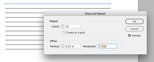
Figure 2. Use Step and Repeat to create multiple form lines.
If you don’t know the spacing
amount, but you know how much total vertical space you have and how many lines you’d like, use the Align function. Start with Step and Repeat as above, with a very small vertical increment. Then move the top and bottom line into position, select all the lines, open the Align panel (Window > Object & Layout > Align), and under Distribute Objects, select the Distribute Vertical Centers icon. This method works for simple lines, but changing the spacing means redoing the distribution. Bonus tip: Applying an object style to your lines makes it easy to change their appearance later on.
Use a table
I’m a big fan of tables for anything that needs to be consistent and joined together well. If there is a good chance that a design will be subjected to multiple changes, the stability and control of a table is worth the time it takes to create it. Using a table to create a simple set of lines—especially if there is no text involved—is a simple task. However, the setup takes a bit of work in the beginning, so take that into account before using this method.
Modify your table cells so that they have no column strokes by selecting all the cells and choosing Cell Options > Strokes and Fills from the Table menu. Select the vertical lines in the strokes proxy, and set the weight to 0. The horizontal row strokes on top and bottom become your form lines (Figure 3).
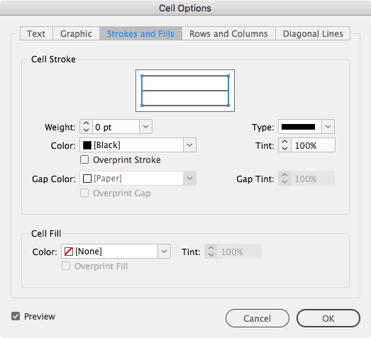
Figure 3. Select the vertical strokes (blue lines) and set them to 0.
Setting up cell styles makes it super easy to adjust the stroke attributes after the fact (Figure 4). And adjusting the space between lines is easily handled by setting a row height in the Cell Options (Table > Cell Options > Rows and Columns) or by Shift-dragging the bottom boundary of the table up and down.
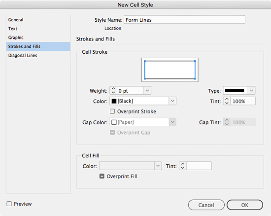
Figure 4. Save as a cell style.
Use tabs
If you’re creating a basic layout like the sample, this is a no-brainer: Create a text frame, and then open the Tabs panel (Type > Tabs). Next, select the right-justified tab icon, and click its position on the ruler. Set an underscore by typing one in the Leader box, and press the Tab key. Click in the text frame, press the Tab key, add a paragraph return, and then copy and paste that paragraph as many times as needed until you have all the lines you want (Figure 5).
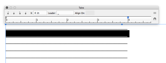
Figure 5. Create a right-indent tab with an underscore as a leader character.
To change the space between your lines, simply adjust the leading.
Note that using the underscore as a leader can sometimes cause issues, as settings like kerning and tracking might leave gaps in your rules. Also, if you have text in addition to the lines, the spacing between the two is often less than ideal. You might end up having to manually track or kern to get it looking just right.
With the tab method, I prefer to use a right-indent tab (Type > Insert Special Character > Other), which means my lines will stay right-aligned to the text frame, even as the frame changes width. However, it’s not readily apparent how to get an underscore with a right-indent tab. The easiest way is to create a tab (any alignment) with the underscore as a leader character as above, and then place that tab just to the right of the right margin in the Tabs panel. Keep in mind that you can’t incorporate a right-indent tab into a paragraph style (Figure 6).
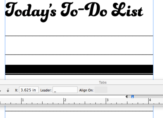
Figure 6. Using a right-indent tab with a leader character
Use a paragraph rule
Here’s another option: create a bunch of blank paragraphs, and then give them a Rule Above or a Rule Below. This option works great when you need lines by themselves, or want some text sitting on the lines. Two benefits to using paragraph rules are being able to apply the settings with a paragraph style, and the ability to have a different stroke color from the text.
Choose Paragraph Rules from the Paragraph panel menu, and select a rule above or below. If you’re not adding any text, it makes no difference which you choose. You can also set an offset amount and right and left indent quickly for all rules in the style. If you’re using numbering, set a left indent that accommodates all numbers you might need (Figure 7).

Figure 7. When numbering using paragraph rules, be sure to set the left indent in enough to accommodate all possible numbers.
Set the spacing for the lines using the leading from the paragraph. Remember that even though leading is always specced in points, you can set it by typing in inches or millimeters, as opposed to points, by using the proper unit abbreviation (in/mm, respectively). That makes it easy to mimic spacing from an existing document or on pre-ruled notepaper.
Getting Running Headers Right
T.D. asked:
Q: I’m preparing a dictionary for print and trying to make a page header with text variables. On the left side of the header is the first dictionary term on the page, and on the right side of the header is the last dictionary term on the page. The problem is, if a term starts on one page and continues to the next page, this term is shown in the header as the first term on that second page (Figure 8).
Figure 8. Running headers display the wrong entry when paragraphs span pages.
A: The problem here is due to the fact that InDesign’s features don’t always play nice with each other. In this case, those features are text variables and nested styles or GREP styles. Formatting like that applied to the dictionary terms is most often (and most efficiently) accomplished with either a nested style or GREP style. But neither one will be picked up correctly by a running text variable. If a nested style is used, the text variable finds the first paragraph where a dictionary term appears—even if part of that paragraph appears on the proceeding page, leading to the questioner’s problem. This is especially frustrating since it happens even if you base the text variable on a character style. A GREP style won’t help either, since it would be altogether ignored by text variables.
Instead, what you need to do is turn those GREP or nested styles into actual character styles—as though they were manually applied to the paragraph. The fastest way to do this is to use Find/Change. In the Text tab of the Find/Change dialog box, leave the Find What and Change To fields blank. Click in the Find Format area, and choose the character style that’s applied by the nested style. Do the same in the Change Format area (Figure 9).
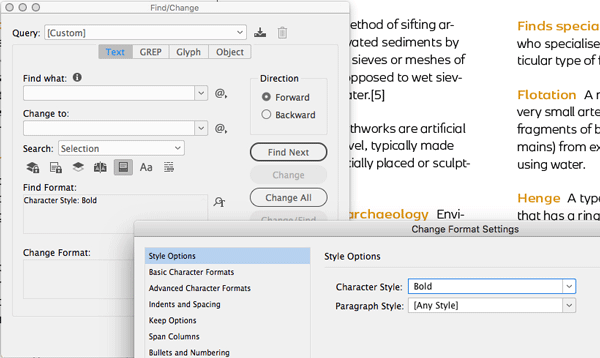
Figure 9. Finding where nested character style is being used and replacing it with the same style will un-nest it.
Then click Change all. Then, edit the paragraph style to remove the nested style. Finally, press the shortcut for Recompose All Stories: Command+Option+/ (Mac) or Ctrl+Alt+/ (Windows) to update the running headers (Figure 10).
Figure 10. The updated page with correct running headers
Tables with Gaps Between Cells
D.A.L. asked:
Q: How do I create a table with cells not connected to each other, like in the example (Figure 11)?
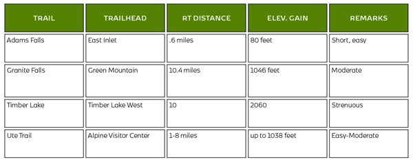
Figure 11. The desired look: a table with padding between the cells
A: D.A.L. wanted his tables to look like individual boxes, with gaps between the cells. The InDesignSecrets community offered two different—and clever—takes on how to approach this issue. While neither was perfect, either was still better than creating and maintaining a series of separate boxes. Both solutions kept the table as a table that could travel and update as a cohesive unit.
Add extra columns and rows
The first suggestion was to add very thin rows and columns between each existing row and column. These columns would have no strokes around them to complete the “floating” look. This method creates an alternating pattern of regular rows/columns with a skinny row/column between, and InDesign doesn’t allow for selecting non-contiguous cells, so updating content is done one row or column at a time.
To create this look, create the table, and do as much styling as possible before adding the extra rows and columns. When you’ve got all your content placed, select the first column in the table. Add one new column by choosing Table > Insert > Column and indicating one column to the right (Figure 12).
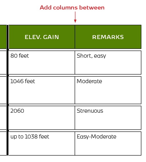
Figure 12. Insert an extra, skinny column between each existing column.
Select that new column, and go to the Table menu > Cell Options > Strokes and Fills. On the strokes proxy, select all the horizontal strokes (they should be blue), and change their stroke weight to 0. Next, move to the Rows and Columns tab, and indicate a small amount (I used .0625 in.) in the column width field.
Select a cell from this skinny column, and save as a cell style (Window > Styles > Cell Styles). The width of a column (or the height of a row) isn’t saved with styles, but the style will at least keep you from having to enter the stroke info each time. Repeat the process of adding all the columns you need, styling each with the cell style and making the width value the same.
Now select the first regular row, and add one row below (Table > Insert > Row). Select your new row and, in the Strokes and Fills dialog box, select the vertical strokes from the proxy, and set the stroke weight to 0. Go to the Rows and Columns section, and set the row to be exactly the height you want (I used .0625 inches again). Save this as a style also and repeat the process of adding, styling, and adjusting the height of your skinny, in-between rows.
Now, as long as you don’t need to make sweeping changes to your text-filled cells, you’re good to go. To make changes to a content-filled cell, you’ll have to select by row or column to avoid styling the skinny dividers.
Make the strokes do the work
The second solution uses strokes to give the illusion of the interior gaps, but comes with a few caveats of its own.
First, select all the cells in the table, and then head up to the Table menu and choose Cell Options > Strokes and Fills. Select all the strokes in the proxy, and make the strokes a bit thicker (I made them 3 points). Next, choose Thin-Thin from the stroke type menu. You could also choose Thick-Thick and adjust the stroke weight to suit your needs; you could even create a custom stroke if you desire. Create a cell style from these cells for easy future application.
This approach makes it a lot easier to adjust the separating gaps, since you would just update the strokes in the cell style, keeping in mind the gaps will be limited by what you can achieve with a stroke definition. Also, you’ll end up with a stroke around the entire table, which you might not want. If you do want it, then you’re done! But if you don’t want it, you’ll have to cleverly hide it. The easiest way to do this is to copy the entire table and paste it into a graphics frame, pulling the edges of the frame inwards to mask that outer stroke (Figure 13). Just remember to adjust it if the table updates.
Figure 13. Mask the outer stroke of the table.
Commenting is easier and faster when you're logged in!

Recommended for you

InDesign Magazine Issue 120: Proposals
We’re happy to announce that InDesign Magazine Issue #120 (April 2019) is now av...

InDesign Magazine Issue 93: Editorial Tools
We’re happy to announce that InDesign Magazine Issue 93 (January, 2017) is...

Sorting Text in InDesign
Stop cutting and pasting to rearrange text in InDesign! You have much better opt...