
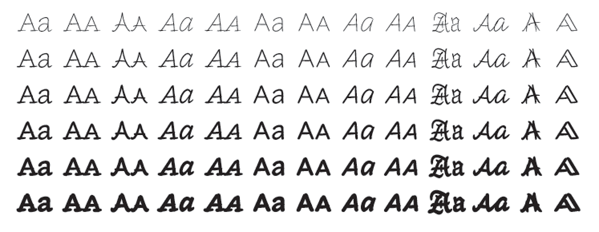
A very striking and unusual typeface family recently caught my eye: Inkwell. This huge family of casual typestyles initially based on the handwriting of its creator, Jonathan Hoefler of Hoefler&Co., is not quite a typeface, or even a family of typefaces, but more like a family of families. This mega font collection features a bookish Serif, a clean Sans, a conversational Script, a ceremonial Blackletter, a fancy Tuscan for decoration, and a stately Open (a style that has negative spaces within certain strokes) for titles. Each is offered in six weights, from a technical pen Thin to a graffiti marker Black.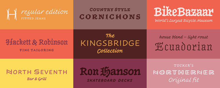
Not only were these designs made to be extremely legible, but have enough weights and versions that it can be used in almost any scenario that can benefit from this kind of small, informal type. According to Hoefler, “the entire Inkwell family is designed to be used interchangeably, which opens up some interesting opportunities for designers. At its heart, Inkwell is a text face, one with which you might letter an entire book if you had infinite time and patience.
But at the scale of the paragraph, it means that designers who are accustomed to shifting roman type to italic or bold will have new options, and can move from serif to sans, or script, or swash small caps, or blackletter, to achieve different kinds of contrast and emphasis.”
This also means that letterforms from different versions can be juxtaposed in unexpected ways – sometimes invisibly, other times with great flourish – making Inkwell a powerful tool for creating logotypes. While it was designed for serious content, it can effortlessly be used for detailed maps, complex reference books, or anything displayed in a digital app.

Inkwell’s six versions all have the same skeletal structure (cap, x-height, width, etc.), but with different finishing stylings and details. Here is a rundown of each of them;
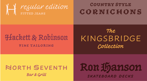
Inkwell Serif is a book face for text, and is designed to be the text face you’d write by hand if you had infinite time and patience. Drawn and fitted for text sizes (but beautiful in display), Inkwell Serif features
all the things a proper text face needs, including three sets of figures, an extended set of fractions and symbols, and both roman and italic small caps. Its roman styles include an unexpected set of roman swashes for both the caps and small caps.
Inkwell Sans is the companion sans serif, provided in the same twelve parallel styles, again with small caps and numerics throughout. Its capitals are reminiscent of inscriptional lettering, and its lowercase is again designed to be unmannered in style. This sans strikes a balance between simplicity and proficiency.

Inkwell Script strives to be informal, without the fussiness of the studied calligrapher. “Designers have been asking us for a script since we first opened for business in 1989, and we’re very pleased to answer with Inkwell Script,” says Hoefler. Casual yet sophisticated, Inkwell Script contains alternates and ligatures that are automatically inserted to preserve the fluid written line, and a full set of sans serif small caps to ensure that acronyms and abbreviations are easy to read.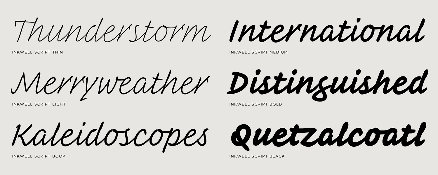
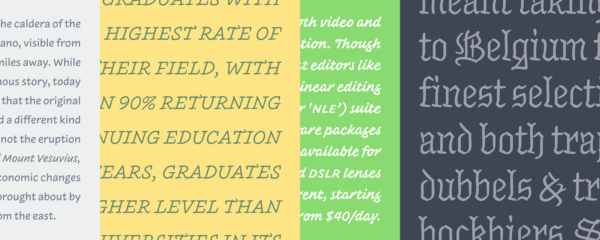
Inkwell Blackletter is Hoefler’s answer to his fondness for gothic forms. He says, “It’s tempting to write off the blackletter as an archaic style, but it’s very much alive today, and remains the easiest way to signal gravity in anything you do.” Blackletters are the ceremonial letters of weddings and graduations, and add a dash of tradition to the rustic and the highbrow alike. They bring gravity to everything they touch, from the Law Review and In Memoriam to heavy metal bands and prison tattoos.
Inkwell Tuscan is the decorative member of the family. Letters with split serifs have been called Tuscans since the nineteenth century, when they became one of typography’s most exuberant species of letterform. In most Tuscan faces, serifs are drawn as fishtails or figure-eights, a motif that’s difficult to apply to letters without serifs, most conspicuously the capital O. Inkwell avoids this gaffe by instead rendering each of its gestures with a pair of opposing, outwardly-bowed strokes, a unique approach in which the entire typeface can participate.
Inkwell Open takes its inspiration from a style of engineering letter traditionally used on diagrams, blueprints, and technical drawings. Carefully drawn and spaced as a titling face, Inkwell Open feels constructed without being stiff, decorative without being fussy. Its lofty letterforms offer a practical way to elevate the straightforward tone of its more elementary cousin, Inkwell Sans.
* * * * *
Inkwell brings a lot of versatility to the user, with a collection of styles that captures the qualities of the pen, but without the formality and mannerism of calligraphy. Each font contains all the OpenType bells and whistles designers have come to expect in a robust font, especially from Hoefler&Co. Although designed for print, these multipurpose fonts are also clear on screen at headline sizes and above. All in all, Inkwell is a tiny universe of fonts that combines the informality of handwriting, the expressiveness of lettering, and the versatility of type, and is worth exploring for any project requiring this expansive combination of features and characteristics.

This article was last modified on November 19, 2018
This article was first published on November 19, 2018
Commenting is easier and faster when you're logged in!

Recommended for you
Hidden Type Treasures
In a recent blog post, Jonathan Hoefler and Tobias Frere-Jones revealed, “...

10 InDesign Preferences You Must Change Today
10 ways you can customize your work environment in the panels of the Preferences...
The Art of Hand Lettering
There is something so fascinating about watching a true craftsman at work, espec...