is now part of CreativePro.com!

Ink Manager: Never Forget This Step Before Exporting a PDF

32

Talk to any printer and they’ll tell you: Designers are forever sending them PDF and InDesign files with spot colors when they really want process colors. Please: do yourself and your printer and everyone around you a favor and learn two things:

  • How to work with spot colors properly;
  • And even more important: Open the Ink Manager each and every time you export a PDF or send a file to a print provider!

You can tell how important the Ink Manager is by the fact that you can open it from five different places: the Swatches panel menu, the Separations Preview panel menu, the Export PDF dialog box, the Export EPS dialog box, and the Print dialog box. It doesn’t matter where you choose it from; they all go to the same place.
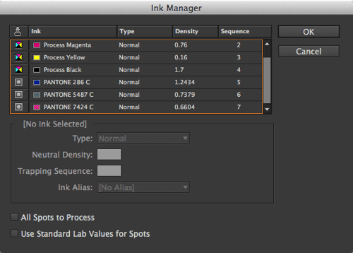
InDesign Ink Manager

Ink Manager lets you do all kinds of things, including aliasing one spot color to another and managing trapping sequence. It’s very rare you’d need to worry about the trapping stuff, but it’s very common that you need to think about something else here: converting spots to process colors.

The first thing you should do when you open the Ink Manager is to scroll through the list of inks at the top. This shows you all the different inks in your document — not the swatches, or colors, but specifically inks. That is, if you print color separations, how many plates will probably come out. The four process colors are always there, at the top, followed by spot colors.

If you didn’t expect any spot colors at all, this list may come as a shock! But as I said earlier, printers often open people’s documents and find not just a couple but a dozen or more! That’s bad.

Converting Spot to Process

So what do you do if you have spot colors in this list and you don’t want them? You can convert a single spot color to a process color by clicking in the column to the left of its name — the small spot color icon changes to process color. Note that this does not change the color swatch; it just signals to InDesign that this color should be converted to process when you print or export to a CMYK format.

Alternatively, you can convert all your spot colors to process by selecting the (surprise!) All Spots to Process checkbox.

There is another checkbox in there: Use Standard Lab Values for Spots. This appears to be “the appendix of InDesign’s color system.” That is, is used to have some use, but doesn’t appear to do much now. (Once upon a time, the Pantone colors were defined with CMYK values behind the scenes, so turning this checkbox usually resulted in a better output. However, in recent versions of InDesign, these spot colors have been defined as Lab already. That said, if you open old documents in which you saved and used spot colors, it’s possible that this checkbox would have an effect.)

Check It!

By the time you’re ready to print or export a PDF, I know you’re tired and you think you know your document well enough. But as I said: it’s always a good idea to check Ink Manager. It just takes a moment to look it over, and it can save you (and your printer) a lot of time and headache.

David Blatner is the co-founder of the Creative Publishing Network, InDesign Magazine, CreativePro Magazine, and the author or co-author of 15 books, including Real World InDesign. His InDesign videos at LinkedIn Learning (Lynda.com) are among the most watched InDesign training in the world.
You can find more about David at 63p.com

Follow on LinkedIn here
  • Jamie McKee says:

    Good point David. Luckily, these things can be checked for with Preflight Profiles, which we should all be using. Unfortunately, what can’t be checked for using Preflight, and which has been tripping me up lately, is Ink Limit. The FR has been filed…let’s hope it gets picked up in CC Next!

  • Eugene Tyson says:

    That’s a very good point that I think a lot of people miss. I constantly get adverts sent to us with spot colours inside them. I don’t really mind as I can convert them on export with the entire magazine, but I don’t want that responsibility of something going wrong.

    Here’s the kicker – any time I ask designers to resend the artwork without spot colours (as per our very specific specifications) – I usually get f’d and blinded on the phone, or by email about it.

    I don’t understand why people react this way.

    However, I think this post misses a very crucial part of the process – always always always contact your printers and ask what they want to receive.

    Some printers will accept PDFx4 and some PDFx1a – and some want all RGB, some want all CMYK, some want a mix of RGB, Spot, CMYK.

    It’s crucial to be in touch with your printers before proceeding with design. If the design is colour critical then you should get colour layout samples to the printers as soon as possible, and get colour proofs of those pages/spreads back as soon as you can to make sure it’s ok before proceeding.

    • Phillip Brown says:

      I believe they react the way you described because they are not willing to accept the color difference that is introduced when their Pantone they spent hours picking and sold a client on….. and that’s on them and should remain their responsibility. Some think it will just somehow magically be OK in the end.

      So many in our industry lack fundamental education regarding this very thing. They think they know, but they have no idea.

      • Euge says:

        I don’t agree with that. I think they are not willing to accept that they lack the knowledge. Akin to a bad driver f’ing and blinding people on the road. I don’t think they understand the repercussions of their actions.

        I think a bit more needs to be done to let a designer needs to know that if they are contacted by the printing company it’s something that needs to be fixed so that the output for both parties is good.

        At the end of the day, it’s the client that benefits, so making sure that colour is right, it benefits everyone.

  • Eugene Tyson says:

    I think I’ve said this before – InDesign should give the option in the Document setup to have a limit on the number of spot colours, I think it should be part of the Document Setup. CMYK, RGB, Spot colours could be an option, then you get only those sort of swatches.

    You could say at the File>New Document

    Spot Colours 2 – then it asks which 2 spot colours you want to use, and it gives those in the swatches panel from the start.

    Or if it’s a full colour job with no spot colours, then say it’s CMYK + 0 spots, then all your swatches are converted to CMYK if they are imported.

    It’s very easy to forget the ink manager step during a busy period, but then again, there are preflight profiles there, and there is the option of Preflight Checks in Acrobat – essentially there’s no excuse for a job going out wrong.

    But I think Adobe could make it better by asking what Colour Mode and if it’s to have spot colours and how many.

    Warnings could then pop up if more colours are being attempted to be imported that are not allowed.

  • Phillip Brown says:

    What you just said was what I was trying to express….. Maybe I didn’t word it clearly.

  • Michael says:

    There are a number of ways design files can be checked. In my company, we supply both packaged indesign files and press pdfs to a manufacturing department for archiving and printing. So, the native files get prefighted which flags up the number of colors, then we preflight the press pdf in acrobat, then our manufacturing department runs each job through pitstop to triple check before the pdf ever gets sent to the printer. I think the real problem is that most places don’t seem to have a production team any longer and designers are never properly trained on good production practices. I hear from friends in production all the time about the defensive attitude they get when they have to reject an ad or design because the clearly required specifications weren’t followed. I have designers I work with that regularly design using spot colors and leave them in the files, and then complain about the color shift when it has to get converted to CMYK.

  • Eugene Tyson says:

    I think there is a large knowledge gap, effectively what was referred to in college as becoming a “Mac Jockey” – and I’ve seen it happen so many times. A new person is trained on system that was set up for preflighting material back in the 1990s. And the preflight settings have never been changed since then – giving outdated instructions and flagging inappropriate things.

    For instance, a printer nearly refused to print a job I sent because the artwork was not 300 ppi, it was 275 ppi – when I asked him what LPI his RIP was running and he did not know. When he got back to me he said it was running at 150 LPI, and insisted that the ppi should be double.

    But I sent him a very long detailed description with diagrams of how DPI is calculated for litho printing.

    He printed the file – and you know what – it looked perfect.

  • Mary Quick says:

    Your column and dialogue is a great start for me. I have been using InDesign since Cs was introduced and have gotten each and every upgrade. I am, however, not a designer. Never studied design.

    But, I have made a hobby of it. I have NO education about the various types of ‘colors’. So, my question is: Where can I find a “tutorial” on SPOT , PROCESS and things of this sort?

    All my newsletter groups will thank you! Me, too! -Mary Quick

  • George Cowie says:

    It was always surprising to me how many graphic artists missed this step. As a proofreader for our newspaper’s ad production department, it had to be routine for me to check this step. Our artists worked constantly under newspaper deadline pressure, very often overburdened with quick turnarounds, and from time to time, nearly every day, one or the other of them would miss the check to automatically convert spots to process. There were some who never missed this step, but we proofreaders could never be sure, so it was our order of business to make sure colors were correct. Proofreading is a lot more than spell-checking. But that’s another story.

  • Eugene Tyson says:

    I hear ya George; a spell check is not a grammar check!

  • Nicky C says:

    Hi Guys, I have a question as I am getting a tad confused.
    I have a job where the client wants to use a spot colour for their logo, fair enough.
    I sent the artwork to one printer who said he needed all files in CMYK.
    Am I missing something here? if I convert this spot colour to CMYK will that not defeat the purpose of having a spot colour in the first place?
    What is the correct way for me to supply this artwork? all 5 colours as CMYK or CMYK + the spot colour.
    Thanks for the help in advance.

    • Nicky C: You really need to talk to your printer about this. And if your printer says they can’t do spot color, then you need to explain to your client that the color will probably not be as expected.

      • Minks77 says:

        I’m surprised no one has mentioned this yet but you can use a Pantone guide (or other relevant colour book) to convert your spots to cmyk/rgb/hex precisely. You should NEVER trust Adobe software to accurately convert your spots, that’s never been very close.

        Also, InDesign, Photoshop and acrobat have each long included ink density panels.

  • Justin Thompson says:

    I’ve been doing a lot of research on this, trying to understand Pantone+ and LAB colors. I keep seeing the phrase “LAB… to make printed colors appear closed to monitor/display.” Is that accurate? For example, Pantone+ Uncoated 7418 looks pink/salmon on all my screens, but the Pantone+ color wheel has it red, which is what I want. So then when I generate PDFs to give to my clients for proofs, they think my color choices are way off from what they want. So far, the best approach to dealing with this that I’ve found is: “revert to old Pantone color books that use CMYK instead of LAB.” But that just begs the question, if LAB is supposed to better match what’s seen on screen to what will be printed, why is it doing a worse job at that then the old CMYK color book?!?!? Am I not comprehending?

    • LAB will only make screen color consistent if you have a well-calibrated monitor (and even then not always). If you are using a spot color and you want it to look right on screen, you can always change it to an RGB color and choose the color yourself. Just make sure it still has the same Pantone spot color name. Of course, the RGB colors you see may not be the same as the ones you see, but it might be closer.

  • Olivier says:

    Hi all, ink manager is effectively a very important and interesting tool. But what is the reason of using spot color?? These are special inks that cannot be achieved with the common CMYK. If the client want a logo with spot color, maybe it’s the color which determine the make/product or whatever else. So we cannot or should not just simply convert a spot color into CMYK when sending files to the printer because definitely the result when using spot color or CMYK color on press will never be the same. I think that before taking this decision, we need to have the approval of the client, whether the logo need to be in spot color or if we can modify it. If it is the case, better find a printer that can print more than 4 colors. Or if we can convert into CMYK, we cannot only directly convert the spot into CMYK, we MUST do the color matching as to achieve the nearest result to the spot color. Spot colors are very important BUT we need to know how to use it.

    • Olivier: I agree with you! You should not convert spot to process without using your brain. :-)

      However, many designers create and use spot colors without realizing what they are or how they are supposed to be used.

      • Laura says:

        We use a RIP to generate plates on our DI. I’m actually referring to this conversation: https://creativepro.com/topic/lab-color, but the problem I’m having is relative. I’m also having the RIP problem with the Lab colors for Pantone. The color values change from what Illustrator says they are in CMYK. If you click over to process on a Pantone color swatch in Illustrator, it will say 100-45-0-18, for instance (Pantone 301U), but when I print to postscript and send to the RIP, it comes out 88-56-22-6. If I click on the Pantone color in INDD and then using the Color tool, click from Lab to CMYK, that’s the value I get. This is INCORRECT and our end product colors are off when printed. The CORRECT color value should be 100-45-0-8 on that color. The Lab color for Pantone in INDD is creating a HUGE problem with RIPs! I’ve tested all kinds of ps files generated from INDD to try to fix this problem, and the ONLY solution that has worked is converting the Pantone color to CMYK in Illustrator BEFORE placing in InDesign, then creating ps file. THEN the color comes through on the RIP in the correct CMYK value and all is good with the world. Any suggestions? (other than my workaround)

  • Charlotte A. Sinclaire says:

    This may be a dumb question (though my mom said there aren’t any of those …) or it might be mentioned in the thread up above, but I didn’t see it, if so. I’ve been aware for years about avoiding spot colors, and I know about converting them to process, but I’ve always wondered, if I convert a spot to process, and that newly converted swatch is hanging out there in the ink manager area in addition to the four CMYK inks, does that mean the printer will have to run a fifth plate? I mean, it doesn’t make sense that he should have to, since it is now CMYK. But on the other hand, all the regular four process colors are separate plates, so why wouldn’t this newly converted fifth color not be? Because of my uncertainty on this point, I have striven always to end up with no more than four process colors — the traditional CMYK — showing in the ink manager. But if I knew for sure that having a converted spot color hanging out there as a fifth item wasn’t going to cause the printer to have to run a fifth plate, it would sure save some time and effort as regards trying to get that fifth color to somehow absorb into the regular CMYK mix (though, to tell the truth, I can’t remember just at this moment if that might not happen automatically at some point…?). Can anyone confirm or otherwise instruct me on this? I know this post is a couple years old and the last comment was 8 months ago, but I’m hoping someone will still be receiving notifications about new posts or questions. Thanks in advance, anyone.

    • Charlotte: If you tell Ink Manager to convert it to a process color, then you will only get 4 plates. It is the equivalent (more or less) of opening the spot color definition (in the Swatches panel) and choosing Process instead of Spot.

      • Charlotte A. Sinclaire says:

        Thanks very much, David. That is reassuring. I felt like it was a safe thing to do, but there are so many twists and turns when it comes to color management! I’m just surfacing from a system crash and having to recalibrate everything, and I just didn’t want one more headache! Thanks much.

  • Dammacx says:

    One thing to keep in mind when doing Digital Output at a Printer that a) has a high-quality digital press, b) has invested in the software, and c) not only knows how to use it but is willing to; is that High-End Digital RIPS have a built-in Pantone Library System that will recognize the names of the Pantone colors in the file and apply internal CMYK values for that color for the best match to that Pantone Color. The values will be different depending on if the color is indicated as a Coated or Uncoated or even a CP as it is trying to emulate the color. These values can be adjusted by the operator (if they know how and are willing). This can be really useful since so many things can affect the color on digital including paper condition, environmental condition, equipment condition, etc…
    Also, ICC color profiles can greatly affect the color. GRACoL vs. SWOP vs. Sheetfed, etc… So simply clicking convert spots to CMYK may not solve color issues.
    Many printers simply do not know or do not care/are lazy and just push print when it comes to Digital. It is the same in how most printers insist on clients converting all images to CMYK if supplying the Design file.

  • Scotty says:

    Good article – an education for me. Also, what about when you are just printing a document on an office printer? Screened colours always seem to come out 100%, no matter how much I screen a colour back. Is it something in my settings (printing from PDF) or am I just expecting too much from an office colour laser printer?

  • Justin says:

    Wow!

    I learned something new today…just when I thought I knew it all ;-P Thank you for this article!

  • Rae Benedetto says:

    More and more people are skipping print and going direct to web and/or PDF. You can specify hex colors in ID and that should convert to web perfectly, but what about the change in color that occurs when an Indesign file is exported to PDF? In order to meet Section 508 requirements, the color contrast of text against a background must meet specific requirements, generally 4.5:1 for body text. When you test the color contrast of a specific color in an Indesign file for contrast using a checker (e.g., Tanaguru or Color Contrast Analyzer ) you may very likely NOT get the same result as you will get when you sample that color in the final PDF. How can this be controlled? Is there a way to ensure the color will sample the same?

  • ulrike kogl says:

    making films for screen printing. Using InDesign as layout to create 6 up (8.5X11 X6) 30X23 area. Very unique product using food color inks. File is SPOT colors only. I export my PDF out of inDesign. When the person at the RIP loads the PDF into RIP they get a file that does not allow the separations of the spot colors. It is now a 4cp file. I’ve followed the export info. Adobe PDF Print-high quality print, no color conversion checked. In the ink manager I have changed the opacity to opaque and checked used lab values. Also tried not changing opacity and leaving type at normal. still not getting separations at rip.
    What am I doing wrong, missing?

    • David Blatner says:

      Hard to know what is going wrong. Have you checked the PDF in Acrobat’s inspector to ensure that the spot colors are there? If they are there in the PDF, then it may be their RIP. If they are not there in the PDF, then perhaps ink manager is set to convert them to CMYK?
      More on Acrobat’s inspector here: https://creativepro.com/why-you-cant-trust-acrobats-separation-preview/

      • ulrike kogl says:

        Have not checked in Acrobat. Not sure about rip. Ink manager conversion unchecked. My work around is taking each color and making it 100% black and exporting that then sending it. Thank goodness there are only 4 colors! That works, so until i get to the rip itself to see settings this will have to do. they need to print today lol thank you.

  • >
    Notice: We use cookies on our websites to give you a great online experience. If you keep browsing, we'll assume you're ok with this. For more information, see our privacy policy. By closing this banner, you agree to the use of cookies.I AGREENo