InFocus: Spring 2018
Erica Gamet shares a new batch of cool stuff for InDesign users

This article appears in Issue 108 of InDesign Magazine.
More cool stuff for InDesign users
Now that our Northern winter weather is finally starting to subside, we’re looking forward to months of new growth and colorful things a-sprouting. While we listen to the first songbirds return and wait for the trees to really kick our allergies into high gear, let’s enjoy a few buds blossoming in the creativity department. Whether you’re hoping for a crop of new fonts, or a patch of scripts and add-ons, check out the bounty below.
Conductor Font
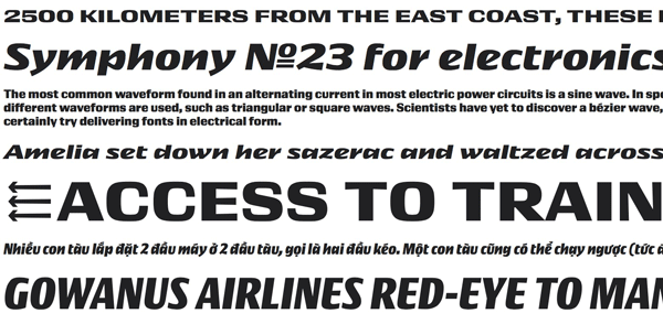
Conductor is the energized name of the latest font family to spring from the minds at Frere-Jones Type. Creators Tobias Frere-Jones and Nina Stössinger based their typeface on the numerals used on—of all things—vintage Bulgarian lottery tickets. Frere-Jones had stumbled upon the digits while he was researching another project and they then became the basis for this striking family of fonts. While the artwork on the lottery tickets was quite beautiful for such a pedestrian amusement, it was the utilitarian nature of the numerals that stuck in his mind and planted the seed for Conductor. Like most items with a mid-century flair, Conductor conveys a classic style that hints at earlier, more formal times while flirting with the modern and futuristic (Figure 1). Those contrasts are most visible when viewing the roman and the italic letterforms side by side.

Figure 1. Conductor’s four weights each come in regular and italic.
The Conductor family sports four widths—wide, normal, narrow, and condensed—each in a regular and italic style. The in-depth retelling of the font’s creation by Frere-Jones and his team explains that the italic, which is usually a direct offspring of the roman, is
really a standalone style with its own unique identity. There is an unevenness to the letterforms, both in consistency of thickness and also in the angles of many of the glyphs’ horizontal and vertical lines. More display font than one to be used in large swaths of prose, Conductor lies somewhere between the serious and the whimsical. Each width is available for desktop use for $75 and contains both roman and italic, or purchase the entire 8-font family for $200.
Keyboard Shortcut Mapper
We all know we should be using shortcuts to speed up our workflow, but they’re so hard to commit to memory, right? Luckily there’s always help to be found in the form of an app or tool. In the case of keyboard shortcuts, you might want to employ Fast Labels’ Shortcut Mapper (Figure 2).

Figure 2. The online Keyboard Shortcut Mapper
This online interactive shortcut tool includes keyboard mapping for InDesign, Illustrator, Photoshop, Premiere, Dreamweaver, and more using a virtual keyboard. To find where commands like Step and Repeat or Add New Page are hiding, just choose your program from the pull-down menu, and pick your OS (Mac, PC, or Linux) and language. The Mode menu gives you extra options for when you have focus on a particular task (such as InDesign tables or specific tools). Each shortcut is labeled on the corresponding keys. Either click the modifier keys onscreen, or press the actual keys on your physical keyboard and reveal those keyboard shortcuts as well.
If you know a particular function you regularly use, but you just can’t seem to find the accompanying shortcut, there’s a handy search field for that. Type in all or part of the function, and a list of possible shortcuts comes up. The keyboard equivalent is listed in the search return box and you can select those keys to verify the results. The functions the keyboard shortcuts reveal are printed in rather small letters, so keep your eye on the changing text at the bottom of the screen; each function is revealed as you roll over the keys. And keep the Fast Labels site bookmarked in your browser so you can easily find and view your Adobe shortcuts.
Stroke Alignment Script
The fact that InDesign offers three positions for aligning strokes (inside, outside, and centered) is one of those seemingly small features that can have big implications. For example, let’s say you have an image frame with a centered stroke set to a specific size, and you want the stroke to be entirely outside the image frame. Or maybe your image is set to size and as you add a thicker stroke, you want it to occupy the space inside the existing frame but not affect the image cropping at all. When you make the change to the stroke’s size and alignment, it affects the outside dimensions or how the image is cropped. Usually this situation requires a bit of math on your part—and a bit of eye-rolling for good measure—but fortunately it can also be solved with the help of the free Stroke Alignment script.
The script from Frédéric Robin takes away the pain and even does all that math for you! It lets you move from one stroke alignment setting to the next without losing the intended appearance. Switching from a center alignment to the outside setting will reduce the overall size of the frame to accommodate the stroke and also reduce the image so that it looks as it did before the transformation. Not only does it save you from having to calculate sizes, it also keeps you from having to switch between inches or millimeters assigned to your frame and points used in stroke weight (Figure 3).

Figure 3. Stroke aligned to the center (top); stroke aligned to the inside after running Stroke Alignment script (bottom)
The script works on all elliptical and rectangular frames as well as with most of the corner style effects. (Not “fancy,” but were you really using “fancy” corners, anyway?) Such a simple act of changing stroke alignment shouldn’t need a mathematical formula, but luckily this script knows the formula and makes it easy for you to execute.
Super Graphic: A Visual Guide to the Comic Book Universe
Do you like superheroes and infographics? Then Super Graphic: A Visual Guide to the Comic Book Universe by Tim Leong is right up your alley (and mine, it seems). Its appeal for me comes in the well-thought-out information presented in such a way that even the most casual fan can enjoy and understand it. And of course, it helps that the information is wrapped in a blanket of snarky humor. While the information is light-hearted—like explaining the The Joker’s favorite questions for Batman or a half-serious financial comparison of Gotham’s and Metropolis’ fictional companies—the presentation of the data is really spot on. From bubble charts to tongue-in-cheek pie charts to maps and matrices, Super Graphic is a study in how to convey data in simple yet compelling ways. The book would definitely be a good addition to your bag of inspiration tricks if data presentation is your passion (or on your need-to-learn list).
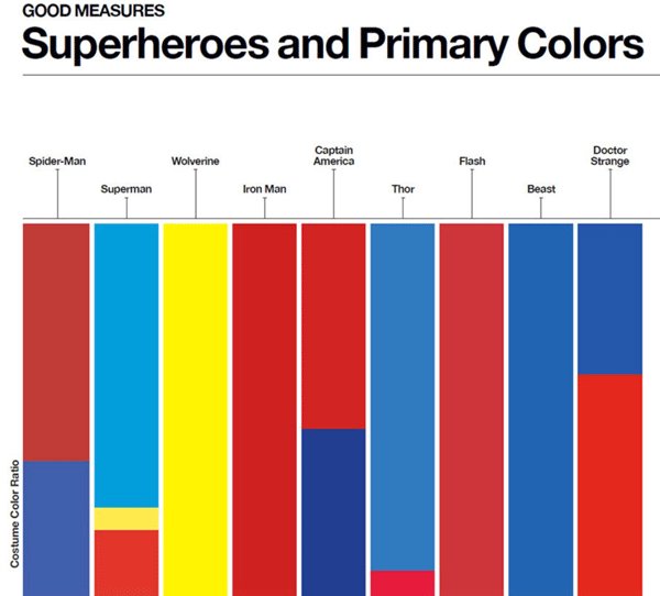
I particularly like the costume color ratio graph showing heroes’ propensity for primary colors, as the chart instantly brings to mind each mentioned character’s costume (Figure 4).

Figure 4. Chart showing heroes’ costume color ratios
Available in Kindle format, I’m not sure the digital version would be as striking as the print version. Still, I’m considering buying it so I can easily flick through the colorful infographics and charts for inspiration on my iPad. Even the table of contents and front matter is presented using infographics, complete with a chart explaining the purpose for the book’s charts. More than the data for the fictional worlds of Marvel, DC, and the like, the presentation of information is really what’s on display. And it’s quite amazing! Super, even! A real Wonder! OK, I’ll stop now.
Studio Bag and Folio
Artists who need to transport and display their large-format work know the very real struggle of lugging an oversized portfolio from place to place. The Studio Bag and Folio from Newport Works currently being funded via Kickstarter aims to alleviate some of those issues. Actually two separate products, the bag and folio can also work together as a complete system for all of your presentation materials.
Each product comes in a medium and a large version. The folio can hold all of your oversized artwork (about 50 sheets’ worth) secured internally with drawstring closures, sketchbooks, and business cards, all held tight by rigid construction and snap buckles (Figure 5).

Figure 5. The Folio for easily carrying oversized samples and portfolio items
When folded closed, the folio can be carried close to the body using the integrated side grab handle, instead of trying to awkwardly wrap your arm underneath. Having the handle on the side, you are able to hug it close and keep the folio in check, even on windy sidewalks and crowded subways. The padded studio bag holds oversized supplies, as well as the matching-sized folio, and even a laptop. It features quality waterproof fabric that comes in four colors and sports a tote-style shoulder strap and the same side grab handle for added stability—and to literally take some of the weight off your shoulder. The Kickstarter pricing lists the medium sized Studio Bag at £62 and the folio at £72, but that could change once the product goes into open production.
Translate Add-on
Have you ever wished for a “Translate” button in InDesign that lets you click it and magically converts your document into a different language? Well it’s here. Okay, not exactly, but the aptly-named Translate add-on from ID-Extras is a huge step in that direction. This little tool harnesses the power of Google Translate and brings the results directly into your InDesign document. You can choose to translate to or from the 100+ languages that Google Translate currently offers. There is even an option of adding your own technical dictionary to supplement Google’s word lists for your specific translation needs.
When running Translate, you have the option of replacing the original language text with the translation or creating conditional text (Figure 6).

Figure 6. After using the Translate add-on with optional conditional text
Having conditional text makes easy work of turning on and off the separate languages, which is a plus if you have other conditional text, such as independent pricing for each language. If working with conditional text makes layout and formatting more difficult, you could always choose to duplicate your text to a new layer, and then replace the text with the translation (thus maintaining the original text as well).
One of the most impressive features is the add-on’s ability to maintain formatting via styles across the translated text. For instance, if a word has been assigned a “bold blue” character style in the original English, the styling will carry over to the Spanish translation.
The add-on works on a pay-as-you-go model. Start with a purchase of a translation key (US$5) which gets you 100,000 characters, and then purchase in 100,000-character increments ($5 each) as you need them. There is an option to run a test to make sure your options are set correctly before paying for any actual translation, which uses gibberish for the results.
Obviously the translation itself will need massaging and checking by a real, live human, but the initial heavy lifting—which includes the building of conditional text rules and text formatting—has been done by the add-on.
Bellfort Font Family
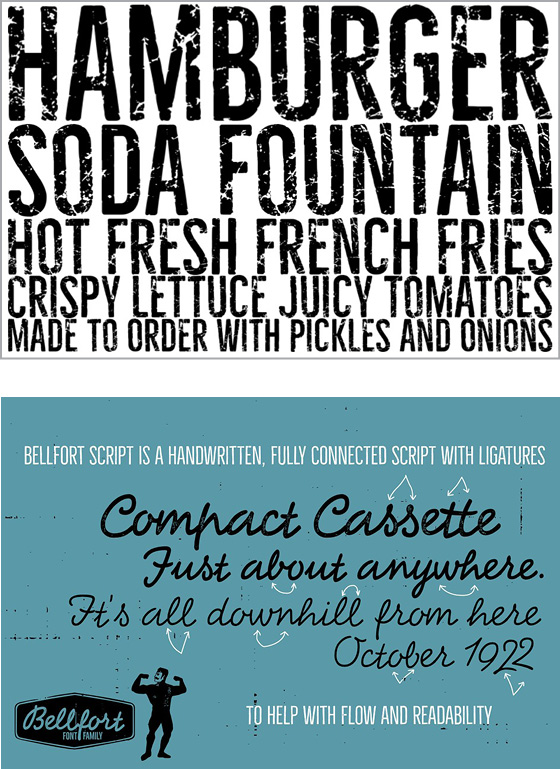
Font Bros is known for their large collection of display fonts, most of which are available for prices that don’t involve selling a vital organ. My favorite thing about their collection is that they’re categorized with monikers like “wacky,” “groovy,” “futuristic,” and “new wave.” Their Bellfort family straddles a few of the categories, mostly because this varied font family contains a whopping 25 fonts. From the distressed Bellfort Rough Demo to the quirky, handwritten Bellfort Script, the family is quite diverse (Figure 7).

Figure 7. Bellfort Rough Demo (top), Bellfort Script (bottom)
In fact, the family is comprised of seven subfamilies including a shadow-only to add depth to the Bellfort Press variations, as well as the Bellfort Extra, which includes distressed shapes and badges. Within each subfamily are up to four font weights, adding even more variety.
In an OpenType-aware program such as InDesign, Bellfort’s glyph variants automatically alternate to give each font an organic and natural feel. You can always override the random effects from within the Glyphs panel and choose specific alternate glyphs. These options further convey an organic feeling to the typeface.
The Bellfort Rough Demo font is available for free, while the rest of the fonts in the family are $19 each. But wait! Put that loan application away, because the entire 25-font family is available for only $48. The amount of diversity in the individual fonts, as well as the extras and the script and outline versions, make having the entire family at your fingertips a wise choice.
Game of Creativity
As creatives, we are often faced with a mere trickle when trying to get the ol’ creative juices flowing. A recent Kickstarter campaign might be just the tool to prime the pump when a creative drought hits. The Game of Creativity is more of a collection of prompts than an actual game (Figure 8).

Figure 8. Some of the prompt cards in the Game of Creativity
It’s more akin to a deck of tarot cards, in that a few cards are drawn, and then it’s up to someone to interpret their meaning and relation. Matt Vojacek created the cards to avoid the reliance on looking at other people’s work for inspiration, the thought being that it leads to mere imitation (intended or not). With these cards, the ideas are stripped down to their bare elements.
The Game of Creativity uses simple pictograms to convey an idea, and by choosing two or more cards, you combine these ideas into your own creation. The creativity and details are provided completely by you. The cards’ artwork ranges from names of well-known artists and styles to graphic elements to everyday items. Matt suggests starting with your creative brief, and then mixing in a couple of ideas from the drawn cards to begin to form a concept. He also suggests using them just as a fun exercise to stretch your creative muscles on a regular basis. All types of artists—from graphic designers to photographers to writers—would find this deck of ideas a fun way to, well, kick-start their creativity.
Ready to Spring
I don’t know about you, but I am ready for spring and all the newness that comes with it. More sun, everything in bloom, and songbirds chirping. But it’s also a time to clean out the digital cobwebs that live in tired typefaces, sweep out poor workflow habits, and blow the dust off stale inspiration. I hope some of these items will bring that warm ray of sunshine to your work with all the hope that spring brings with it.
Commenting is easier and faster when you're logged in!
Recommended for you

InQuestion: April 2017
InQuestion is a regular column devoted to answering your questions about working...

Improving Scripts
Scripts can give you nearly magical powers in InDesign, but that doesn’t mean yo...

InQuestion: September 2016
InQuestion is a regular column devoted to answering your questions about working...


