


This article appears in Issue 102 of InDesign Magazine.
What does autumn mean to you? Crackly, dried leaves and caramel apples? Fleece and flannel? For me, having just moved to the Pacific Northwest from the Desert Southwest, it means evergreen trees rustling in the cool evening breeze. And rain, probably. Not one to dwell on any less-than-positive byproduct, I’ll focus on the bounties of this season of harvest. This time around I’ve gathered up some newly-sprouted fonts, updated add-ons, and a new crop of books and prints for you to feast on.
Taxonomy of Typography
Having just moved into a new place, I’m facing blank white walls and hoping the interior decorating faeries will come and make it all better. Until then, I’ve been searching on my own, which has led to falling down the rabbit-hole full of posters splashed with witty sayings, beautiful photography, and well-designed graphic images. But sometimes simple is best. Even as a card-carrying member of the typographic illiterati, I was drawn to PopChartLab’s Taxonomy of Typography print. The design is compartmental in nature—like the type cases of yesteryear—except the forms aren’t segregated by typeface. Instead, it’s categorized by subject matter.

The Taxonomy of Type print explains type in all its glory.
As you would expect in any good discussion of type, there is the visual demonstration of type varieties (sans serif, decorative, script, etc.) as well as the different weights a typeface can have. Another section highlights and defines the different spacing—both horizontal and vertical—type might encounter, and visually shows how to measure that type. The “anatomy of type” section is probably my favorite, with a varied selection of typefaces, cases, and styles beautifully illustrating the bits that make up letterforms. Whether highlighting crotches, beaks, and hooks or
visually explaining tails, terminals, and tittles, it’s as informative as it is giggle-worthy. The individual sections round out with typesetting terms dealing with case, position, alignment, and layout. The muted colors and the cleanliness of the presentation really speak to my minimalist core. Type has never looked so appealing to me. The prints are printed on 100-lb. stock, measure 24″ × 18″, and at a reasonable $29, it seems I could get some artwork on these walls, yet.
Havelock Complete
Turns out, you can have it all… or at least all of the Havelock typeface. The Havelock collection of fonts brings together distinct styles of display fonts, combines patterns and geometry, and lets you layer those shapes within your type. It has a futuristic feel, yet it’s also somehow retro. There is a cold hardness to it—as sci-fi movies have us believe the future will be—but then a soft curviness exists within its forms as well. Havelock’s all-caps format is great for titles and other instances where a bold statement is needed. Or, you know, as a decal on the side of the next generation of intergalactic spacecraft.
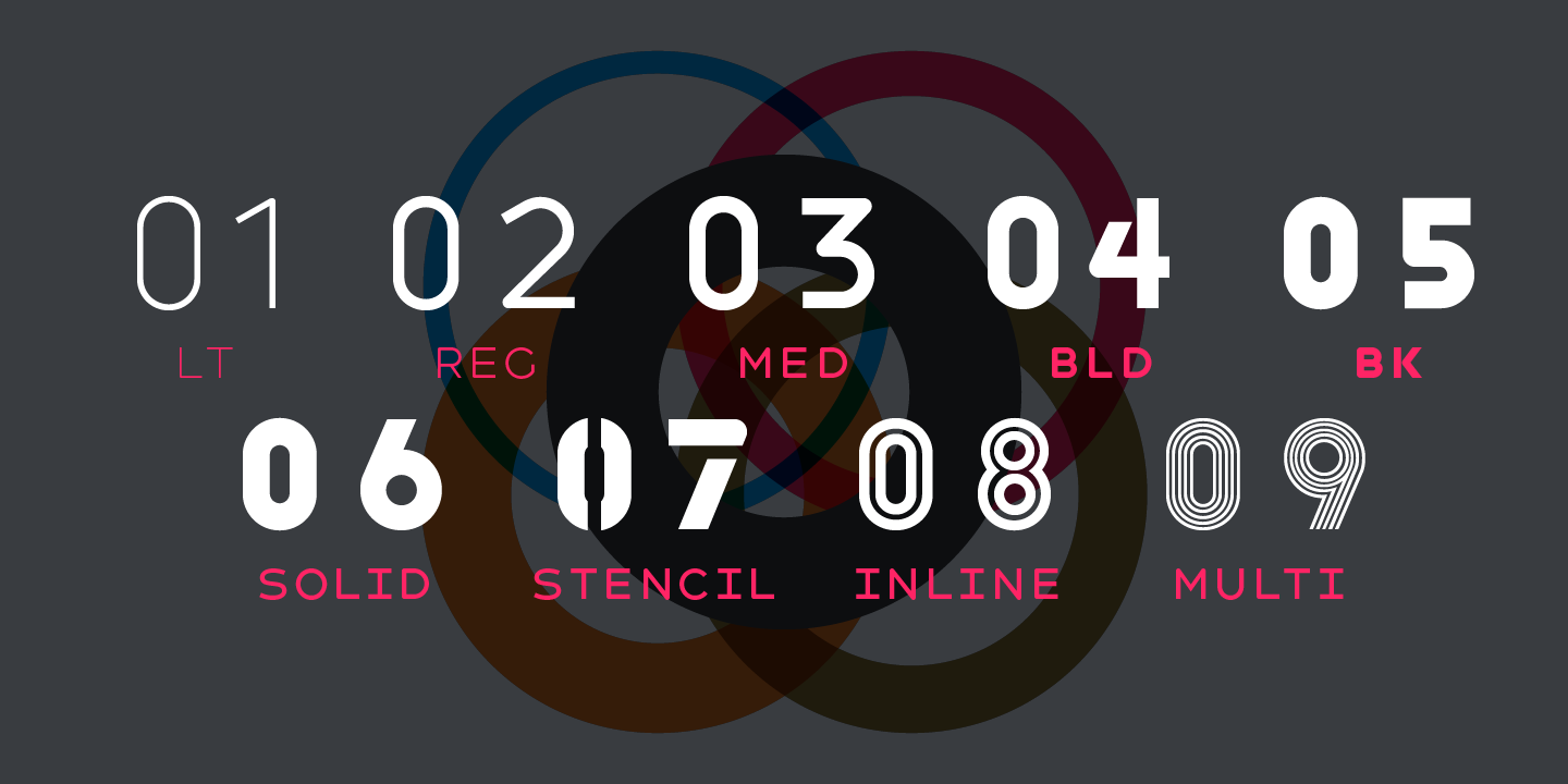
Havelock Complete gives you nine fonts for all your futuristic font needs.
The layering Havelock offers extends its visual capabilities. For instance, you can layer the multiline, inline, or stencil styles on top of the solid base or create new patterns by playing with each layer’s opacity and blending modes. Presented separately as Havelock and Havelock Titling, the combined 9-typeface family is available as Havelock Complete. While the Havelock group includes the four previously-mentioned individual faces that work so well together, each stands easily on its own merits. The fonts comprising Havelock Titling offer a consistent form, but are presented in five different weights: light, regular, medium, bold, and black. Havelock Complete is available for less than $255 (at the time of this writing) from MyFonts.com for the combined Desktop and Web license. A desktop-only version is $169 and the usual add-on licenses are available for ePub, app, and digital ad usage.
The Complete Color Harmony, Pantone Edition: Expert Color Information for Professional Results
Written by Pantone Color Institute’s executive director, Leatrice Eiseman, The Complete Color Harmony, Pantone Edition: Expert Color Information for Professional Results provides an in-depth look at color and its place in the world around us. This reference of what colors really mean comes to life in its well over 200 color-filled pages. The guide starts with what the author refers to as the phenomenon of color—a sort of “how color works”—and then moves into the basics of color theory, including terminology, the color wheel, and color harmony. This section includes brief but easily digested descriptions of tint, hue, saturation, and tonality, among other aspects of color.
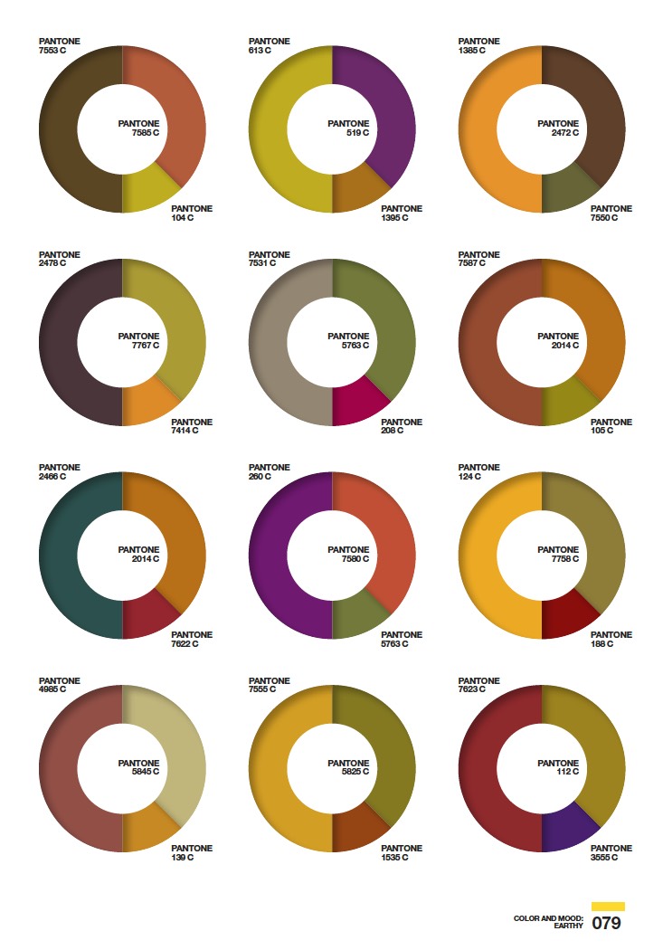
The Complete Color Harmony sets the mood.
From there, the book moves into the two largest sections, dealing with the psychology of color and how color and moods go hand in hand. In the former section, Eiseman looks at individual colors, what they represent, and the personality traits often associated with those that love—or loathe—each color. Speaking only for myself, I have to say that most associations were quite accurate. In the latter of these two sections, she discusses how color and their combinations can affect or convey moods. From the tasty pastels of the mood dubbed “Delectable” to the earthy palette of “Casual” to the spiciness of “Piquant,” the mood section is populated by collections of color combos. Each 3-PANTONE color wheel features a dominant, a subordinate, and an accent color to create a variation of that mood. Eiseman suggests starting with the mood to be conveyed in your design, and then using the combinations as a jumping-off point to inform your color choices. The final sections discuss marketing, color trends, and the ideas that go into naming colors.
Better Together
Ever since stumbling on this type family, I’ve had the song “Happy Together” stuck in my head. I’m pretty sure that wasn’t something Katsia Jazwinska—the creator of Better Together—intended, but I think the feeling might have been. This 4-font family ($45 in OTF or TT format) combines different handwriting faces that blend well with each other. Just as someone might change up the style of their handwriting, from scribbles made on a to-do list to the careful lettering on a holiday card to their secret crush, each face conveys a different mood. When used together, they meld beautifully like the harmonies of a seasoned quartet. And, like that little band, each font here is capable of carrying a solo when the occasion calls for it.
Better together is all about getting along
From the bold and precise Better Together Caps to the not-too-casual/not-too-formal BT Script, you’ll find combining faces comes easily and the results look natural. The Condensed and Spaced fonts have the look of a deliberate hand—attached to a person far more patient than I. Each font contains not only standard western characters, but Cyrillic as well. The fonts, even when used in combination with one or two others, play nicely with each other, which leaves out the guesswork for which display fonts to pair up for your next logo or whimsical headline. Use the ones that go together. Better.
Merge Textframes
Don’t you just love it when a good thing gets better? An example of an InDesign script that’s been given the new and improved treatment is Ajar Productions’ free Merge Textframes script.
If you’re not familiar, Merge Textframes lets you do just what you think: combine multiple text frames into one. Big deal, why not just thread text frames, right? For starters, this script gives you the ability to choose whether to size the merged frame to the text or to the size and layout of the frames you’ve chosen. And you can choose to merge by selected frames, all frames on a page, or batch merge all pages at once. Merge Textframes also lets you add a divider between the merged items. For instance, if text you are merging has different paragraph styles applied, you’ll want to tell the script to insert a hard return to maintain those styles. I use this one most often, myself, but other options include a soft return or even a tab.
Version 2 of Merge Textframes adds only a couple smallish features, but they fill in some gaps from earlier versions. This version remembers the settings you entered previously, instead of reverting to the defaults each time. A seemingly small change, but it helps when running the same operation multiple times. Which leads me to another improvement: one-step undo! Previously, if I ran the script with incorrect settings, I would have to undo through each step in reverse. Now I can see my results and immediately undo if it’s not what I intended. Prior versions of Merge Textframes wouldn’t work with linked text frames, but now you can merge those frames to your heart’s content. And lastly, if you don’t want to drill down through the Scripts panel to find the script, you can choose it right from the Object menu.
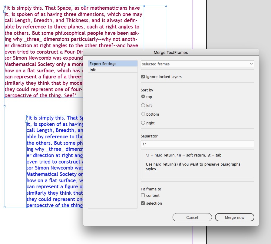
The Merge Textframes script hard at work
Free Icons
Who doesn’t love a well-designed set of icons? And who doesn’t love free stuff? No one, that’s who. Well, the creative minds (possibly cute li’l rodents?) at IconBunny have released two sets of their over 50,000 icons for the low, low price of free for us to enjoy. The Payment Methods set features over 700 icons, including the old standbys like Mastercard, Visa, and American Express, but expands to include international options, as well as online payment providers such as PayPal and WePay. There are about 50 logos, created in several styles, including simple line art, flat style, reversed out of shapes, low poly-filled, and icons sporting long shadows.
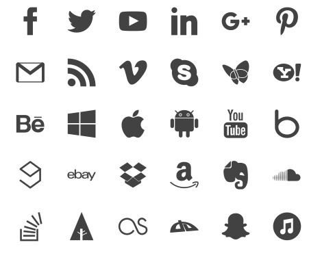
Some of the 2100 free icons available from IconBunny
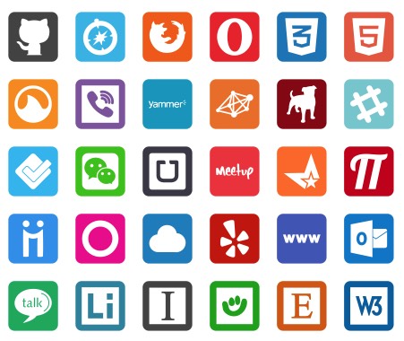
The other free IconBunny set is their social media pack. This bundle includes a whopping 1400 icons for 100 different social media, gaming, video, and myriad online platforms. From Twitter and Facebook to Vimeo, Xbox, and SoundCloud, choose from the same styles as their Payment Methods pack. Each download includes files in CDR, EPS, and PNG formats. You have to actually go to the Just Creative blog to get to the free download links. There you’ll find a great preview of what to expect within the sets. If you decide to stick around and shop at IconBunny, their filtering options even let you shop by individual icon style. Note: Although the download page additionally mentions AI, JPG, and SVG, the free downloads don’t seem to include these formats.
Burn Your Portfolio
Bookstore shelves—both virtual and physical—are brimming with books on design. Those books go into great detail on how to design, what to design, and all the creative aspects of design itself. And while having these skills is paramount to thriving as a designer, so is knowing how to navigate the business of design. That’s where Michael Janda and his book, Burn Your Portfolio: Stuff They Don’t Teach You in Design School, but Should, come in. The founder of the Riser design firm has put together a sort of survival guide for all the less exciting parts of the design business. From working with co-workers to building client relationships to real-world production tips, Janda lays out the rules of engagement for creatives from designers to photographers to writers to architects. He says that while a portfolio will get you in the door, learning these other skills will help keep you there and grow, whether as a freelancer, boss, or employee.
Infused with humor and real-world experience, Burn Your Portfolio lays out practical—and seemingly common sense—advice that can be applied across the creative industries. Using his experience in growing his agency from solo shop to a well-known firm, Janda’s dense 400-page tome lays out the realities of what to expect in the business of design. Chapters like “Floods Happen” recount how he has had to deal with events never planned for. He sprinkles anecdotes throughout practical chapters such as You Are Not Your Work, Go the Extra Mile, Be Nice, and Toot Your Own Horn. On the surface, we know this stuff, but having Michael Janda lay it out so matter-of-factly is more like having a humorous—and very experienced—friend give us advice we actually want to follow.
Burn Your Portfolio is full of good advice, but should not be taken literally.
Equalizer Pro
Equalizer Pro from Indiscripts is a powerhouse add-on that gives you the power to apply size and position attributes to objects across spreads or entire documents all in one go. Launch the script from the Scripts panel or by right-clicking on a page, object, or objects. The resulting control panel lets you define the scope of your search—including isolating specific layers—and target only specific items, such as text frames, rectangles, or even form field objects. With Equalizer Pro, you can easily select all polygons and make them the same height and width, or make all text frames 50% larger, with the added bonus of being able to control the reference point as well.
The newest iteration of Equalizer Pro adds the ability to swap two items on a spread, to target items on only left- or right-hand pages, and to copy an item’s coordinates to the control panel to apply to other objects. If you’re not ready to perform any of the actions yet, open the script’s control panel, input the settings, and then choose Close. Those settings will be retained and ready to run from the contextual menu when you need them. In addition, the control panel gives you options for units of measurement, swapping items, and removing the Indiscripts menu from your toolbar. One of my favorite features of any script—and Equalizer Pro doesn’t disappoint—is the one-step undo. For a script that performs many steps behind the scenes, not having to step backwards through each can be worth the price of admission. In this case, that admission is €22.
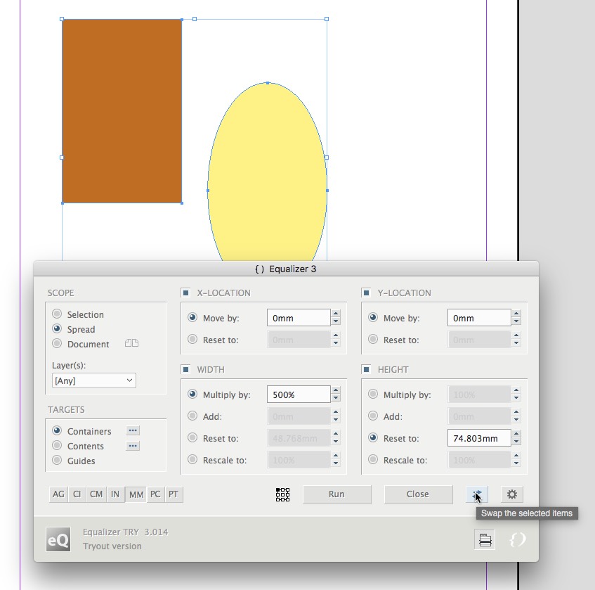
Equalizer Pro lets you swap items and batch modify page items.
The Feels of Fall
As the autumn days grow shorter and the evenings get colder, I find myself working late at the computer, basking in its warmth… or at least its 6500 K glow. And what could be better than reaping the benefits of all these tasty nuggets of wisdom and productivity while we work? Well, maybe a steaming cup of cider. You’re on your own with that one. Until next season, enjoy the fruits of this bounty.
Commenting is easier and faster when you're logged in!

Recommended for you

InReview: MagicTints
This InDesign add-on makes it easy to add a quick color tint to a photo or magic...

Confusing Type Terms, Part 2
Within the world of typography, there are a variety of terms that are either con...
Scanning Around With Gene: Fair Use Goes to the Movies
This week, I planned to look at type designs in the movie “Citizen Kane....