
InDesigner: RAND Review
Kelly McCathran looks at the design and production of the RAND Review, a publication devoted to major public policy challenges and solutions.
This article appears in Issue 101 of InDesign Magazine.
The RAND Corporation is a well-known think tank whose research and analysis influences public policy around the world. Their aim is to increase safety, improve decision making, and bring about healthier and more prosperous communities. (In this sensitive political climate, I’m sure we could all benefit from their independent, nonpartisan research.) With its core values of quality and objectivity, RAND focuses on key issues like education, health, justice, energy, the environment, military, and international affairs.
Available both in print, and as a downloadable PDF, RAND’s free magazine, RAND Review, has the challenging task of taking technical, medical, social, and educational research and presenting it in an elegant, accurate, easy-to-understand way.
When Senior Designer Dori Walker joined the corporation, one of her first orders of business was to reimagine the look of RAND Review by applying a layout grid (which hadn’t previously been used for the magazine). The grid was created “from scratch, with no preconceptions.” Once the grid was applied, Dori had to give herself permission to not use it in certain circumstances. “Some feature openings may require a unique look, the design may not like the grid—that’s okay.”
Dori also created consistent paragraph and character styles to control the font, color, and size choices. In the past, they were selected on an article-by-article basis.
As an Adobe Certified Instructor, I am a huge proponent of grid-based layouts. I feel that designing on a grid should be a prerequisite for anyone learning page layout. It’s a core design principle that works equally well for print and mobile, and if you create responsive mobile or web designs, it is required.
Dori learned InDesign’s DPS (Digital Publishing Suite) by creating iNosh (a food app) before using the single-user version of DPS to roll
out the RAND Review app. This helped her get comfortable with the process of converting print layouts to interactive mobile magazines. The requirements from Apple’s App Store were clear, well-documented, and the DPS portion of InDesign was very logical. Dori was able to publish the app successfully on her first try. But after trying different workflows with both in-house design staff and outsourcing, the company has ceased production of the app. RAND Review content has been merged into the existing RAND Corporate app.
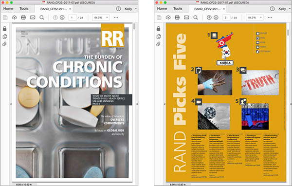
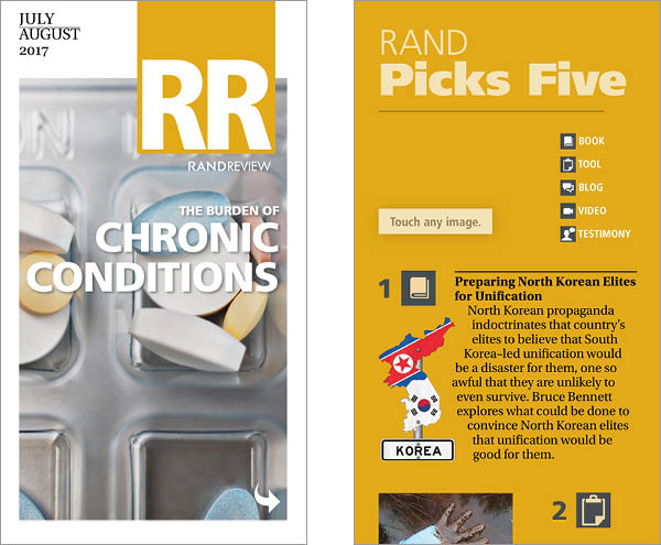
Now, there are two teams that handle each piece of RAND Review. Dori creates the print version of the InDesign file, and then posts it on an internal server for the web team. The web team picks up the assets and creates an HTML version with links for the PDF, which they post online.
RAND Review magazine PDF (above) and mobile version on iPhone 6 Plus (below).
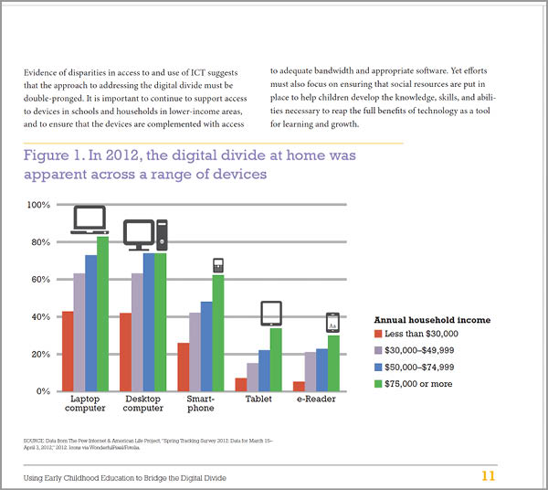
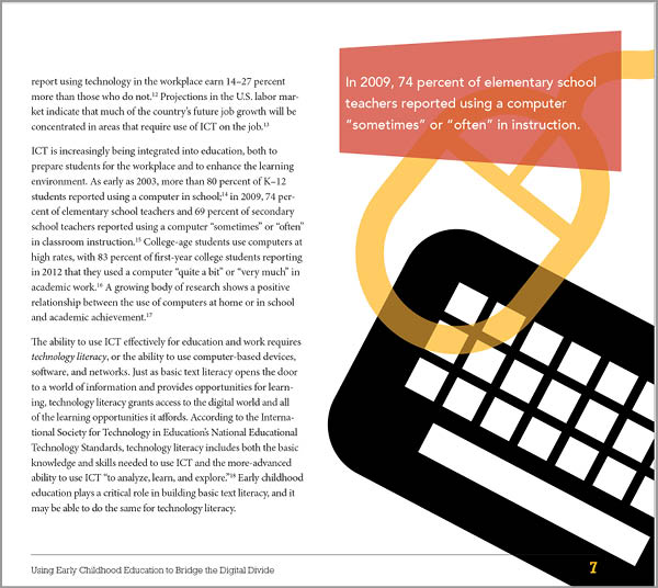
One of Dori’s first designs that I saw was a document called “Using Early Childhood Education to Bridge the Digital Divide.” This had a lot of fun, playful graphics that incorporate silhouettes of kids. She creates all of her graphs by hand in InDesign, which is impressive. In most of Dori’s documents, the magazine included, the master pages were brilliantly simple, leaving a lot of creative freedom to the designer.
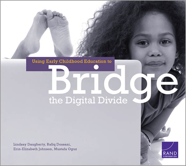
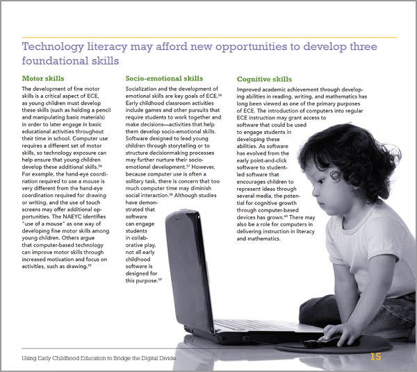
The use of duotones throughout this book on kids’ access to technology, allowed the bold graphics to pop.
Overall, many decisions had to be made in order for the design to work everywhere. Images may get different crops, the scale of graphics may change, column counts vary, and object positions may need to shift—all while remaining on the appropriate grid for the medium. Dori’s RAND Review redesign has created a stunning cross-platform product (which as many of us know is no easy task).
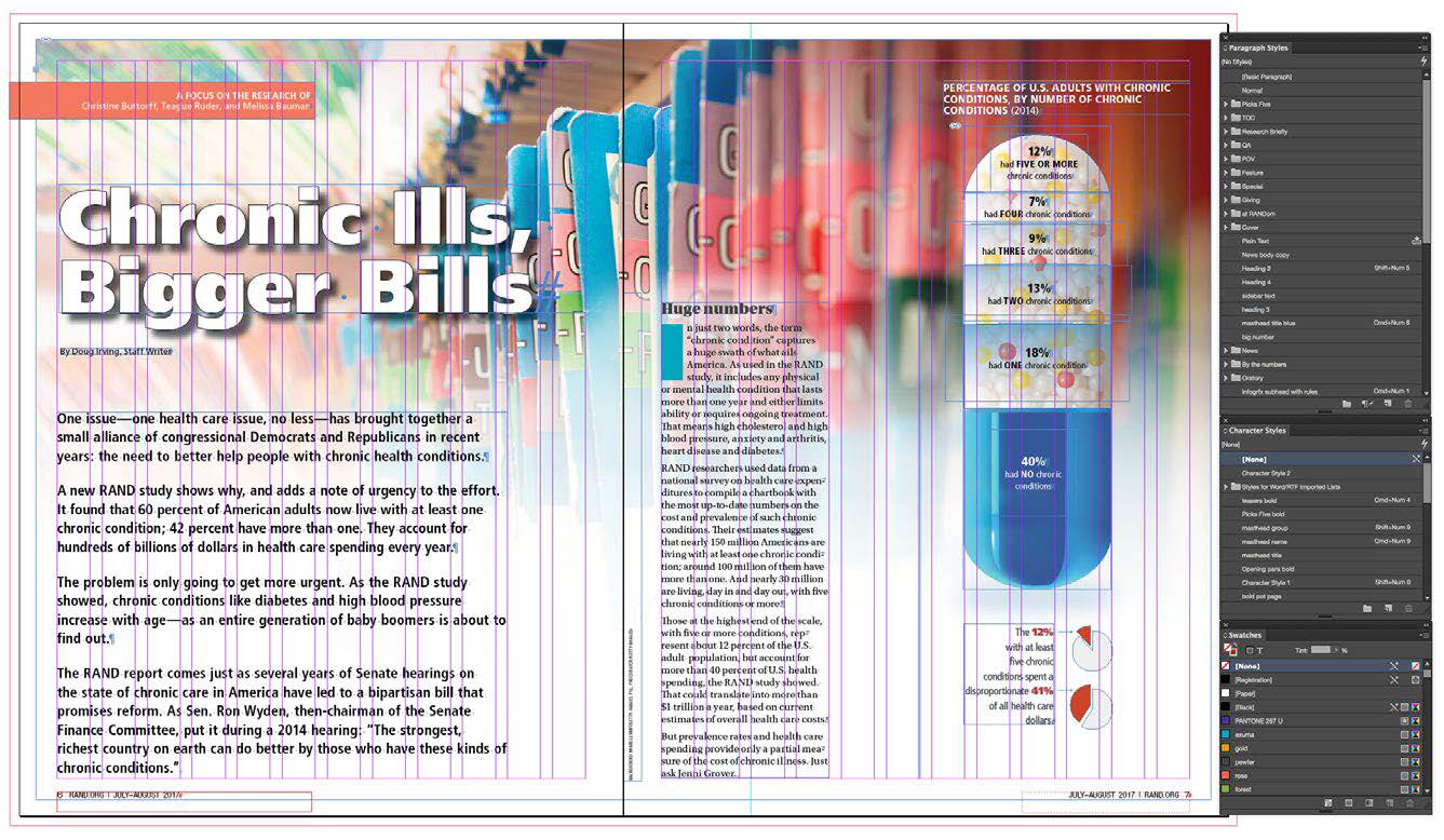
If you’re in the design business long enough, sooner or later (probably sooner!) you’ll be given a low-resolution image, with no way to track down a usable original and not enough pixels to make it printable. Once, while working on a collection of essays about China’s domestic and foreign policy priorities, Dori was given a crucial image as a low-resolution JPG. Instead of re-creating the graphic, she decided to blow up the low-resolution image for illustrative purposes. When she told me this, I was sure I had heard her wrong. “You enlarged it?” Yes, she said, explaining that was more impactful that way. The chart showed air pollution levels measured by the World Health Organization (WHO) in nearly every major urban area in China. Looking at the image, I realized the super-low resolution graphic blown up in the background would convey how far behind the times China was in their efforts to lower pollution levels, and just how severe the damage could potentially be. I must confess, I’ve never thought of making a bad image worse for illustration purposes: it was brilliant. Look for the red line in the graphic on the right.
The redesign of RAND Review is a beautiful example of how designing on a grid can lead to an elegant layout that reinforces brand identity. This technique is very effective in drawing the reader to the relevant content on the page and gives the magazine a cohesive look and feel.
You can download the PDF version of the magazine (with clickable links to research articles on their website) here. You can also subscribe to the print issue for free here.

Dori found a creative solution to a common issue. Her fix of making a low-resolution image (the graph) worse actually worked on two levels. It fixed the resolution problem and it drew attention to the graph itself, which was a key illustration in the article.
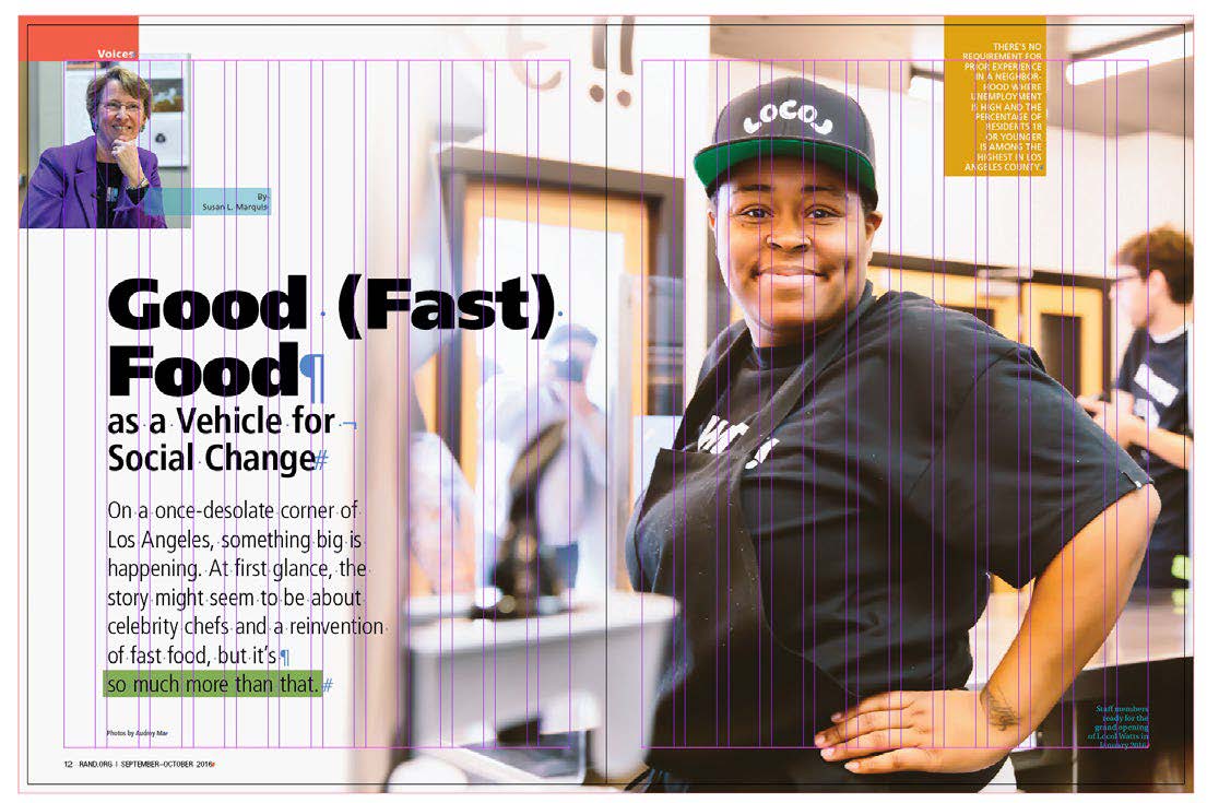
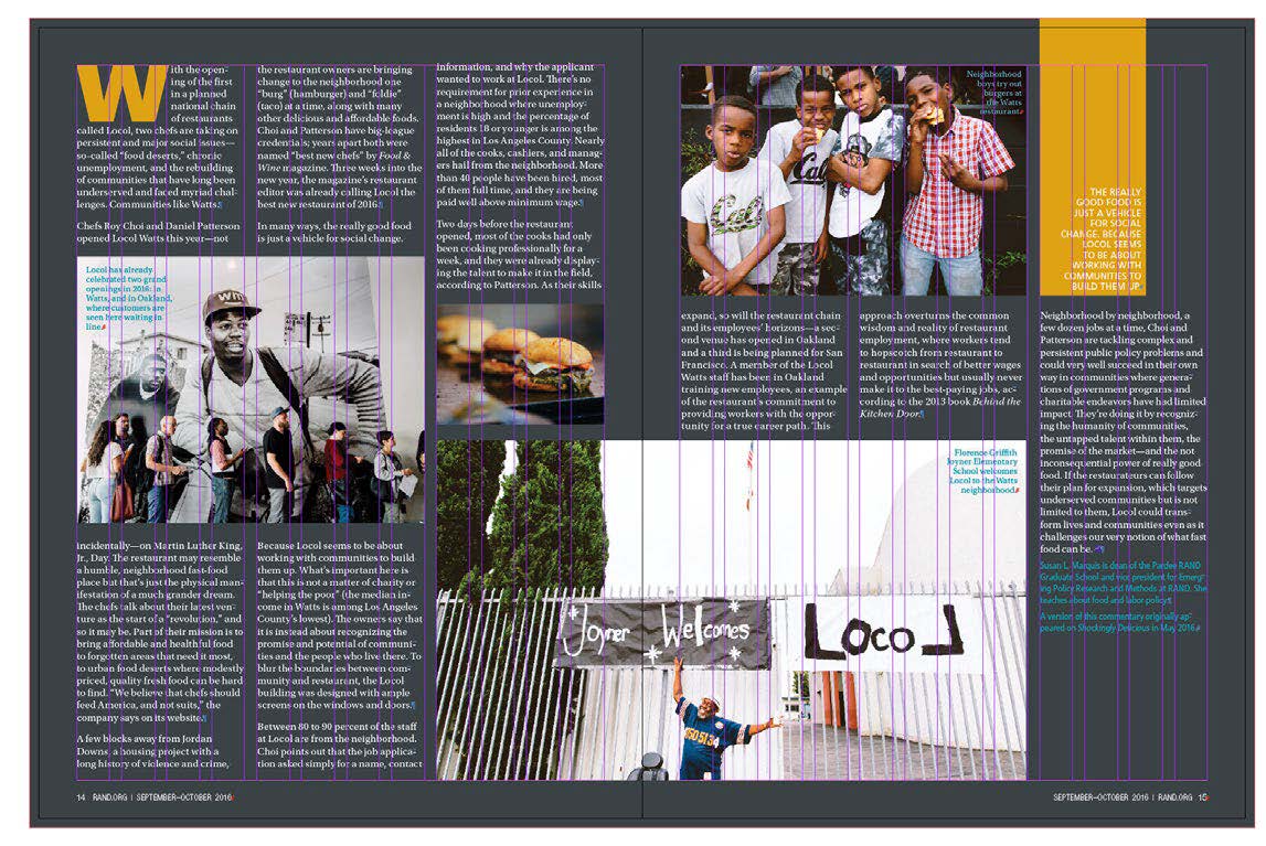
This article for RAND Review was filled with so many wonderful photos, and Dori wanted to be able to use as many as possible. She loves to open a spread with a full bleed when possible, but for the spread above, the grid gave the necessary structure to allow for a full range of crops. The dark background gave the page the feeling of an photo album.
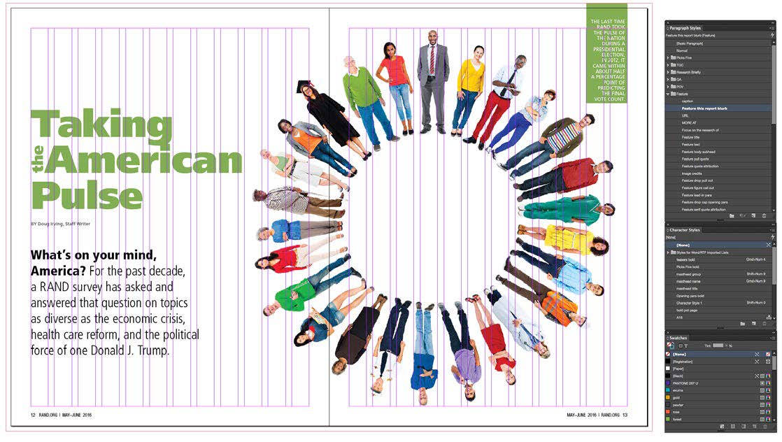
Well-defined style sheets were critical when designing for both print and digital, as seen on these two spreads from RAND Review. Every element on the page had a defined style so that when the text migrated to the digital template (which had the exact same style names but with different assigned properties) the fonts would automatically change.
Commenting is easier and faster when you're logged in!

Recommended for you

InReview: Zevrix Output Factory 2
A high-end solution for automating the printing and exporting of your InDesign f...
InStep: Making Figure Legends
Take the pain out of creating labels for complex figures and diagrams with the h...
InQuestion: Making a Diamond-shaped Text Frame
Q: I’m working on a layout that requires a diamond-shaped text frame. I’ve attem...