
InDesigner: Andrews McMeel
Addison Lalier finds out what it takes for one company to produce hundreds of different calendar designs each year.


This article appears in Issue 113 of InDesign Magazine.
From Hamilton and The New York Times crosswords to “This Is Us” and modern art, there is a calendar for virtually any of our interests. And Andrews McMeel Publishing, a division of Andrews McMeel Universal, is the leading publisher of calendars, producing over 180 different designs each year.
We asked Senior Art Director Jenny Mohrfeld to take us through the inspiration, creative, and production processes behind Andrews McMeel calendars.
Inspiration Behind Design
Calendar production begins about a year and a half before the on-sale date, and includes time to ship products to retailers for display in May or June. At Andrews McMeel, the creative work is a year-round process, but is mostly concentrated between April and January.
“Because nearly all of the calendars we publish are based on licensed properties, the process starts by Andrews McMeel Publishing acquiring the licenses for these properties,” said Mohrfeld. “The property is what starts your inspiration.”
Andrews McMeel acquires new properties based on trends, the Internet, best-selling books, television shows, movies, and pop culture in general. It currently works on properties ranging from Dilbert, Sarah’s Scribbles, Johanna Basford, Anne Geddes, and Pusheen, to its own brand, Posh.
From there, the creative and editorial team performs a complete audit of the brand. Is it fun, humorous, inspirational? What kind of feel does the calendar need?
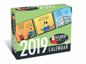
“For example, Dilbert calendars are based on comic strips, and each character is colored the same in each strip, so how are you going to make that something that someone wants to hang on their wall year after year?” said Mohrfeld.
With Dilbert comics, bold colors and fun, humorous text attracts consumers to the property. Conversely, some calendars emphasize the design work itself.
“Johanna
Basford is hand-drawn black-and-white art, so we let her artwork shine through in the calendar design,” said Mohrfeld.
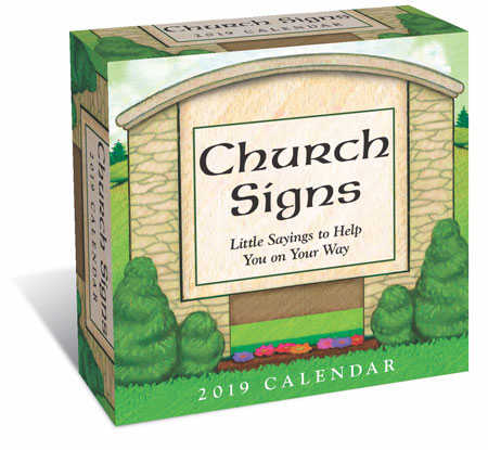
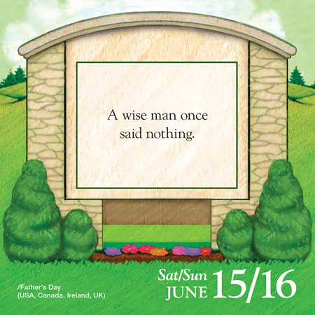
Church Signs is a brand that originated in-house at Andrews McMeel. It’s a daily calendar that features playful and quirky sayings you might see driving by a church sign in your neighborhood.
Whether it’s bold colors, monochromatic design, or playful wordplay, it’s important that you maintain the integrity of a brand throughout the design process.
Steps of Design
The actual design process begins after the team acquires a property license. First, Andrews McMeel determines how much the licensor wants to be involved in the design. This can range from simply turning over assets to being more hands-on.
The basic framework of a property includes title, logo, fonts, and images. These assets, along with design style guides, help determine the approach that best fits the property. With in-house brands, such as Church Signs, Andrews McMeel hires an illustrator to create blank designs on which they can place text.
From there, the team considers the look, feel, and function of the calendar, as well as the brand’s voice. The biggest question is, “How can I stay consistent with a brand, but make it new and exciting?”
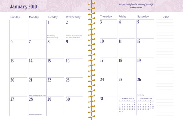
Next, Andrews McMeel considers the type of calendar it’s creating. For example, wall calendars are visually appealing, with the top half being the primary image that features the property. The bottom half is designed to be functional, so there’s always enough space to to write down appointments and other notes.
“You need to think about the decorative part along with how the dates, holidays, and months are presented,” said Mohrfeld.
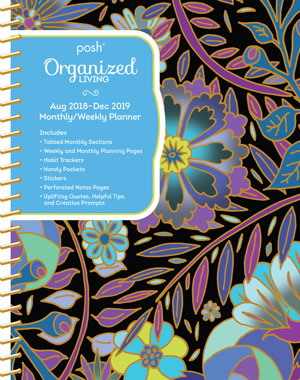
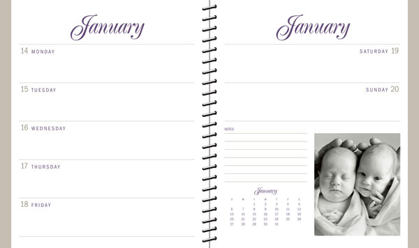
Weekly calendars, on the other hand, are more personal. The cover features the main image, and the interior is a balance of decoration and space for commentary (i.e. appointments, notes, reminders).
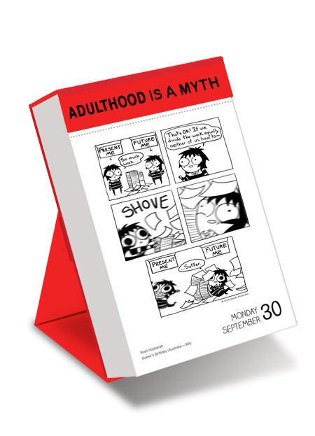
Day-to-day calendars are 313 pages (because Saturdays and Sundays share a page) and have text or a visual on every page. With these calendars, the emphasis is on the content, so it’s important to make each page visually appealing and interesting.
Technique and Function
As sources of information, calendars require their designs to focus on two areas: form and function. Designers need to consider months, dates, and holidays at all points in the design process, as well as brand style guides and licensor requirements.
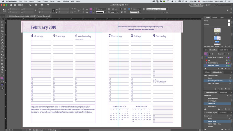
The process starts with a blank page in InDesign. This allows for creative grid design, making sure each calendar has its own look and feel.
Because calendars are basic grids, Andrews McMeel uses the Make Grid script, which comes with InDesign. (You can find MakeGrid.jsx in the Application folder of your Scripts panel in InDesign.) Not only does Make Grid speed up the production time, but it also guarantees consistent design and spacing. With Make Grid, you’re able to create rows and columns and add space between boxes quickly and easily. Check out this article for tips on using Make Grid.
Andrews McMeel also uses TextStitch to link text frames for dates and text. This plug-in lets you thread together any text frames in the order in which you clicked; it also gives you the option to unthread. (TextStitch is a free plug-in from Rorohiko, which you can learn about here.)
While master pages and paragraph styles are useful in most design processes, they’re especially helpful for calendar production and making sure each page has accurate, consistent style and formatting.
Mohrfeld notes that the biggest challenge with creating a calendar is making it visually appealing while preserving its functionality. As consumers, we want an appealing design that fits our interest, and enough space to be able to write down appointments and notes.
Because most of Andrews McMeel’s work is with licensed properties, a natural challenge is creating a calendar that stays on brand with the licensor, in both design and functionality.
“Plus, you always want something unique,” said Mohrfeld.
Whether you’re designing daily calendars or weekly planners, it’s important to focus on form and function; however, it’s equally important to make sure your design is appealing enough that your consumer would want to put it on his or her wall.
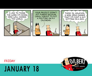
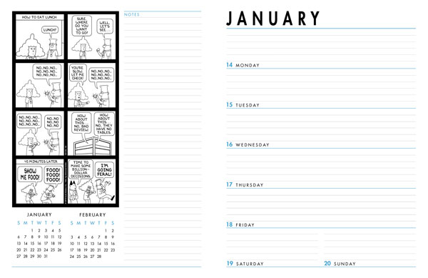
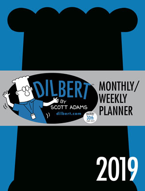
DILBERT DAILY + DILBERT MONTHLY/WEEKLY
Dilbert attracts consumers with its use of bold colors and trademark skewering of crazy corporate culture. While the daily calendar and the monthly/weekly planner remain consistent in imagery and tone, the main difference is in their function: the planner serves as a tool, while the daily pages are geared toward pure entertainment.
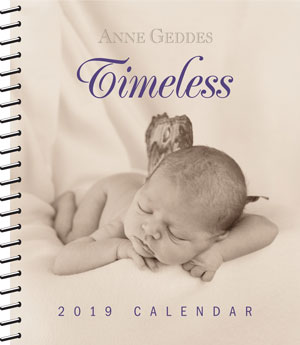
ANNE GEDDES
Anne Geddes’ weekly calendar includes both visuals and sufficient space for daily commentary and notes. This is a good example of a weekly calendar that focuses on function and organization rather than imagery.
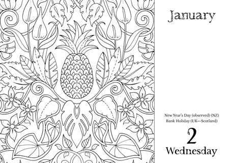
JOHANNA BASFORD
Johanna Basford’s daily coloring calendar is both functional and entertaining. It gives consumers a task to complete for each day, which differs from traditional calendar entertainments such as displaying photographs or comics. This calendar is very design-centric, with emphasis on engaging artwork and typography.

CHURCH SIGNS
Andrews McMeel’s in-house brand Church Signs focuses on illustration and text. The design template remains consistent, but the quirky sayings change on each page. For this brand, Andrews McMeel brings in an illustrator to create the page design.
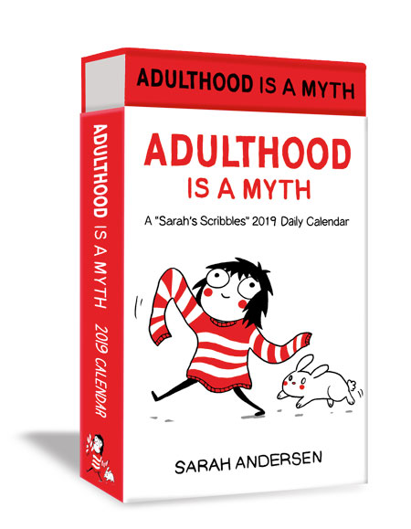
SARAH’S SCRIBBLES
Sarah Andersen, the artist behind Sarah’s Scribbles comics, uses a bright and playful tone. Andrews McMeel translates this into its calendars with fun and colorful design. This daily calendar, which focuses on illustration rather than function, features a mini comic on each page.
Commenting is easier and faster when you're logged in!

Recommended for you

TypeTalk: Mastering Type and Color
Discover how to master the powerful combination of typography and color to comma...

InDesign Magazine Issue 122: Cross-Media Color
We’re happy to announce that InDesign Magazine Issue #122 (June 2019) is no...

17 Great Tools for Designers
Every designer, regardless of their niche, needs certain tools of the trade to g...