


This article appears in Issue 92 of InDesign Magazine.
The Middle East region is home to over 370 million people in 17 countries. It’s the arid land of palm trees, camels, and dunes. The land of the Bible. The birthplace of Christianity, Islam, and Judaism. And the home of many enthusiastic InDesign users. I have been a designer for over 30 years. As a kid in Israel I was always into art, and I became a showing artist as a painter, printmaker, and handmade paper artist in New York. In the ’80s, I moved into computers for electronic art, and then into graphic design. Nowadays, I return to Israel at least twice a year and meet Israeli designers, artists, and creators. The design community there is expanding rapidly, and I’ve seen emerging talent from Israel and the Arab countries using InDesign, exploring the new features, and tailoring its capabilities to their own needs and unique design ideas, while figuring out the use of Middle Eastern fonts in a software that was first designed for the English language.
It is exciting, and rewarding, to see InDesign at the intersection of the very new with the very traditional—much like the Middle East itself. And, in turn, it’s exciting and rewarding to see that InDesign has a role to play in cross-cultural publishing, through its functions that allow for adaptive layouts to accommodate different alphabets and the rich cultures they represent. And with these tools, designers can convey a full spectrum of ideas, from the ideological to the medical to the practical, to an audience that includes two or more languages. To get a snapshot of how InDesign is used in the Middle East, I asked a group of designers from the region to share their thoughts and examples of their work. Here are their stories.
Gilli Nativ
class=”p1″>Gilli Nativ is an Israeli graphic designer specializing in logo design, business cards, stationery, and package design. She has owned and operated Gilli Nativ Design since 2008 (Figure 1).

Figure 1: The logo for Gilli Nativ Design
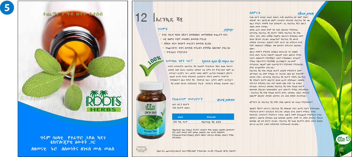
She rides her bike to the studio. This is her meditation time. She gets her inspiration from everything around her, nature, food, weather, animals, you name it. Her design is clean. For packaging, she takes her colors from the products and together finds a nice harmony. For Nativ, InDesign is very intuitive, and she is able to accomplish her works with just the ME version and no additional plug-ins. She finds the newer versions of InDesign much easier to use, but still there are challenges with the language at times as she juggles content in Hebrew, Arabic, English, Amharic, and Russian (Figure 2).
Figure 2: Gilli Nativ designed this catalog in Hebrew (1) and then translated it to Arabic (2), English (3), Russian (4), and Amharic (Ethiopian) (5).
Chana Messer: Tell us about your process.
Gilli Nativ: I started designing in CS4… I design mostly for print and PowerPoint presentations. Working with CC makes me love my job even more. Sometimes I go home thinking about a design challenge I have at the studio, like a complex table to build, and analyze the program for a solution.
CM: What kinds of challenges do you have when working with Hebrew, Arabic, or both?
GN: Hebrew and Arabic combine well together; sometimes the spacing is a problem because Arabic has lower letters.
CM: What are your favorite Hebrew and Arabic fonts?
GN: Spoiler in Hebrew. Adobe in Arabic—I use it technically, but I can’t read it.
Dr. Mamoun Sakkal
Dr. Mamoun Sakkal is an independent scholar and designer of Arabic typefaces from Aleppo, Syria who lives and works in the United States. He is the founder and principal of Sakkal Design in Bothell, Washington. Providing graphic design and communication solutions to major national and international corporations, his firm has focused on Arabic calligraphy and typography since the 1990s.
Dr. Sakkal uses the ME version of InDesign and does not use any other plug-ins to help with language support. However, for Adobe After Effects, which doesn’t use the “world-ready text engine,” he uses the Arabic Text.jsx script to get proper Arabic. You can obtain the script here.
CM: What do you like about InDesign?
MS: I like numerous features about InDesign, such as good typographic and layout control, ability to mix graphics and text in the same document with ease, and robust output options that make it the software of choice when dealing with printers and publishers. If we focus on features related to Arabic script, one can narrow down to a few more easily identified ones. For example, the Reverse Layout feature provides a lot of control over changing the formatting of a document when converting it from Latin to Arabic script. As you know, English text and documents are written and read from left to right, while Arabic documents have the opposite direction for text and layout. So when a document is converted from English to Arabic, one can specify if objects such as text frames, graphics frames and content, tables, and paths should be flipped. Often, I want the text frames flipped but the graphics to remain in the same orientation. This is a time-saving feature, since I often receive requests to create the Arabic script versions of an existing English document, book, or report.
I also like InDesign’s support for OpenType features, especially for stylistic sets. The ability to insert glyphs directly from the Glyphs menu is very useful, since I can see what these glyphs look like directly on the screen and insert any glyph I want with a simple click. I can also see what alternate forms of each glyph exist in the font by holding down the mouse over any glyph with a small arrow on the bottom right corner.
With the superior control I have over text specs and formatting in InDesign, I often find myself composing text, converting it to outlines, and then copying it to Illustrator or Photoshop to complete graphic design projects such as posters and logos. I receive many commissions for this type of work, so I use this feature on an almost daily basis.
CM: What parts of InDesign are frustrating?
MS: Before CC 2017, one of the most frustrating things in InDesign was access to stylistic sets. I use them extensively in the Arabic typefaces I design, and in documents where these typefaces are used.
Another area where I see a need for improvement [for Arabic text] is Automatic Justification. Rather than adding space between words, line justification in Arabic is usually achieved by extending the connections between letters, commonly called kashida, and by using swash letters with extended tail strokes. These result in more evenly balanced distribution of words and letters in the lines without creating unsightly and distracting valleys of white gaps (Figure 3).
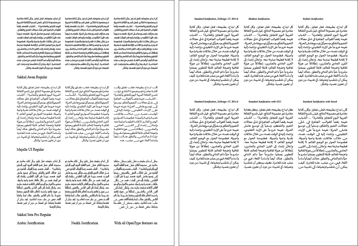
Figure 3: These two documents illustrate the issue of automatic justification of Arabic text. Left: samples prepared for the Arabic Font Specimens Book in 2008. Right: similar text with the new justification settings used in the current version of InDesign.
In earlier versions of InDesign, the automatic justification algorithm handled the above features reasonably well, and provided users of Arabic text with good choices for justification options. These included Arabic Justification, where kashidas are distributed evenly throughout the text block, and Naskh Justification where kashidas are applied in locations consistent with calligraphic traditions and based on the Justification Alternates OpenType feature.
This justification behavior has been replaced with new options that include short, medium, and long kashidas but ignore Justification Alternates, thus missing a distinctive feature in Arabic typography.
CM: Do you have any favorite fonts or type designers?
MS: There are now many excellent designers of Arabic fonts. I admire the work of the late Said al-Saggar, DecoType, Sultan Maqtari, Nadine Chahine, Tim Holloway, and Pascal Zoghbi, among others. I often use my own Arabic fonts in order to see how they would perform in real life projects.
In Figures 4–9, you can see a variety of Dr. Sakkal’s design projects, from simple layout to typography design. To check out more of Dr. Sakkal’s unique typography design, visit fineartamerica.com.
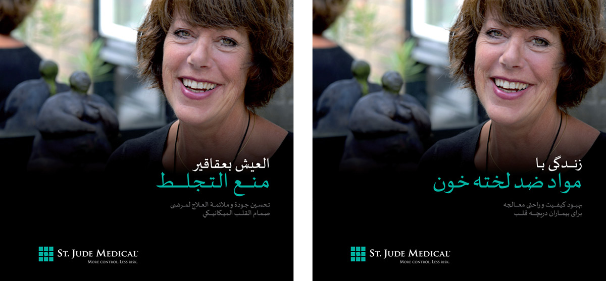
Figure 4: Two versions of medical booklet in Arabic (left) and Persian (right).
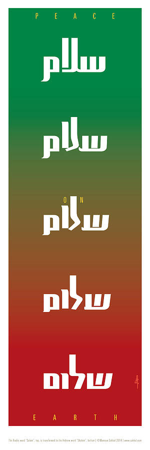
Figure 5: This graphic shows the Arabic word Salam (top) transformed to the Hebrew word Shalom (bottom).
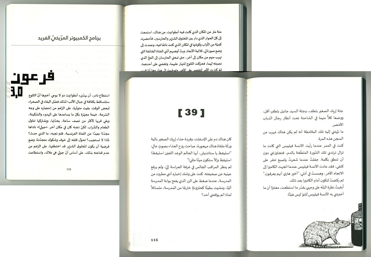
Figure 6: A youth book series called Riwayat, produced with InDesign ME and published by Kalimat Group, Sharjah, UAE. Design and typesetting by Mohamed Khalil.
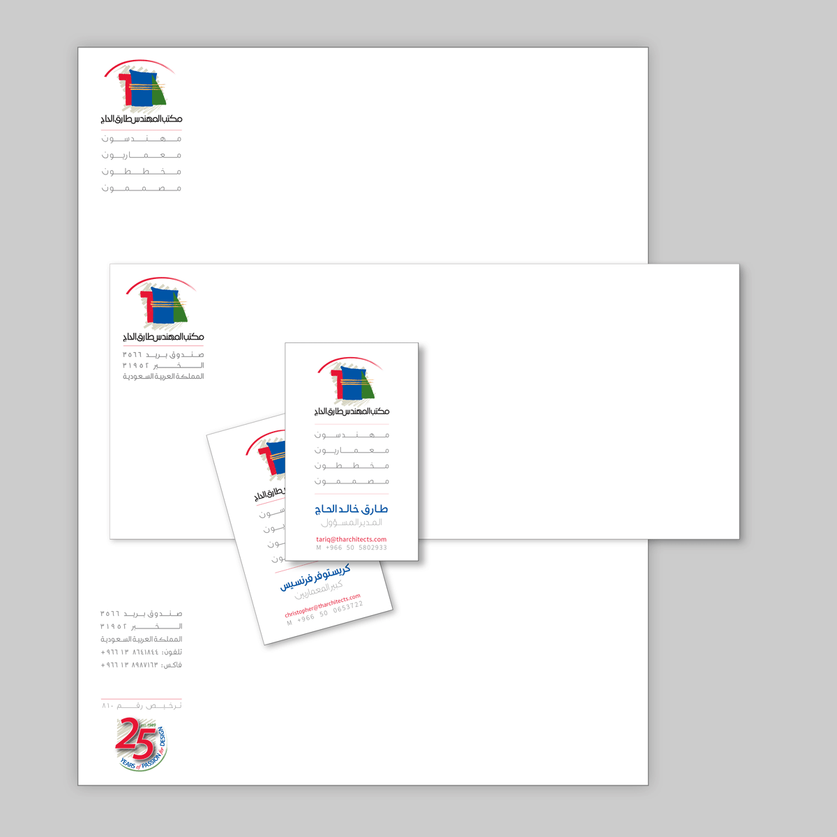
Figure 7: Stationery set designed by Dr. Sakkal.
Note the use of kashidas to justify the lines of text.
Figure 8: Annual report designed by Dr. Sakkal

Figure 9: Naturally, Dr. Sakkal uses InDesign to produce typographic samples and documentation for his ME fonts.
ME Languages 101
Arabic and Hebrew are two of the most widely used Semitic languages in the world. Written and read from right to left, they don’t have vowels or separate upper- and lowercase versions. Based on three-consonant combinations called roots, words come in families, with several versions, all based on the same root letters, that signify different forms of that word or concepts such as a noun form, verb form, or adjectival form.
In beginner texts, vowel sounds are indicated by “vowel points” (dots and dashes) to help learners. The underlying idea is that in a language system where the roots of the words already imply the meaning, vowels are unnecessary since a native speaker would know them by experience and context.
Modern Hebrew has a cursive (hand-written) version and a non-cursive (printed) version. The use of cursive or connected letters in Arabic is more a question of degree. The letters are generally the same, but the extent to which serifs, kashida (justification marks), and various connectors and decorations are used varies greatly depending on the application.
Yaron Levi
Yaron Levi is an Israeli graphic designer. He works from his small studio in Tel Aviv.
He has studied art since he was 13. At 22, he was accepted to the Visual Communication Department at Bezalel, Israel’s most prominent art and design academy. He studied Visual Communication for one year, and then transferred to the photography department. After receiving his BFA he began to build his career as a graphic designer and artist.
Chana Messer: You do a lot of print work; can you tell us how you got involved in that?
Yaron Levi: I started working with Arye Sabinsky, who was known in Israel as a master printer. Working with him opened my way to work with high-quality print. Today I have a small studio in Tel Aviv, I mainly design and produce printed books. I like making objects! And I think books will stay in our world for many more years. My specialty is making books in the field of culture, including art, architecture, and poetry (Figure 10). What I like to do the most are artists’ books, small editions of special books. Some of them contain original works of art right inside of them (Figure 11).
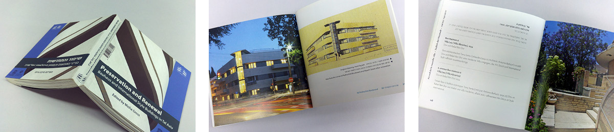
Figure 10: Preservation and Renewal: Bauhaus and International Style Buildings in Tel Aviv. Designed by Yaron Levi, this book features a cover that opens on both sides (one side in English, the other in Hebrew) and a mixture of Hebrew, French, and German throughout the book (often on the same page).
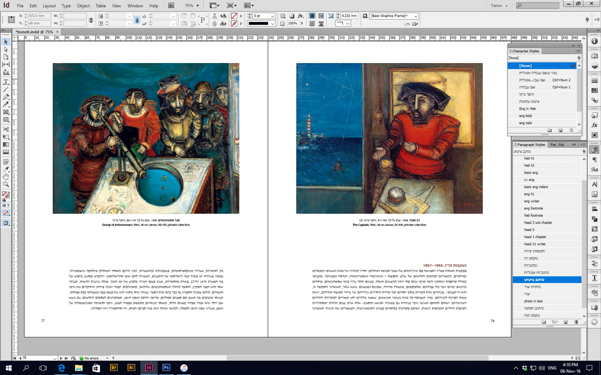
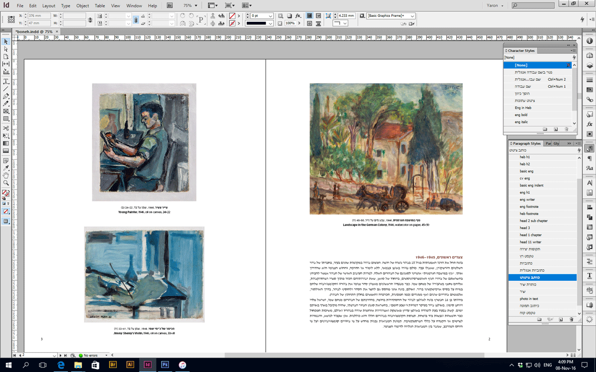
Figure 11: Multilingual art books require sets of paragraph and character styles to accommodate the requirements of each language.
CM: When did you start using InDesign?
YL: I started working with InDesign when version 1.5 ME came to Israel. I saw a demo at a sales conference and purchased it right away. For me it was like a dream come true, making layouts of text in Hebrew almost with no effort. Before that, I used an Israeli layout software program or QuarkXPress and PageMaker, which were not so easy to work with in Hebrew. Since then, I continued to work with InDesign in its ME version. I don’t use any other tools for Hebrew. Today I use InDesign CS6 ME.
CM: Any challenges working with InDesign in Hebrew and Arabic?
YL: Working with Hebrew and Arabic from right to left in InDesign ME really feels natural and intuitive. I use paragraph and character styles for working with Hebrew or Arabic, and English (or any other Latin language). I also use GREP styles for mixing the two languages together (e.g., an English word appearing inside a Hebrew text). I wish that in the future versions of InDesign this will be even easier. Imagine if InDesign were able to track Latin, Arabic, and Hebrew in the same paragraph, and treat each language with other predefined character styles! Today, we still have to do part of this work manually.
CM: Any other challenges or suggestions for folks taking on similar work?
YL: There are a few more challenges when working with two languages, each in a different direction: a book has a linear quality to it. When working in both directions—left to right and right to left—one has to make special consideration to not confuse the reader. The reader must feel comfortable when he takes the book in his hands; he should understand from what direction to open the book and understand the logic of what he sees inside. This is very difficult to get with two different directions. I usually create a cover that can be opened from both sides so there is writing in English on the right side and Hebrew/Arabic on the left side (Figure 12).
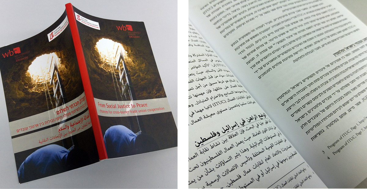
Figure 12: From Social Justice to Peace: chances for cross-border trade union cooperation, a report for Willy Brandt Center, Jerusalem. In this report, Hebrew and Arabic go from right to left, side by side, with Hebrew on the right, Arabic on the left, and English goes from left to right.
Page numbers are another problem, as they also go in the opposite direction in each language. This problem I solve in different ways according to the structure of the book. Sometimes, if the book is mainly in one direction, I use page numbers in that direction and put a remark about page numbers on the other side (Figure 13).
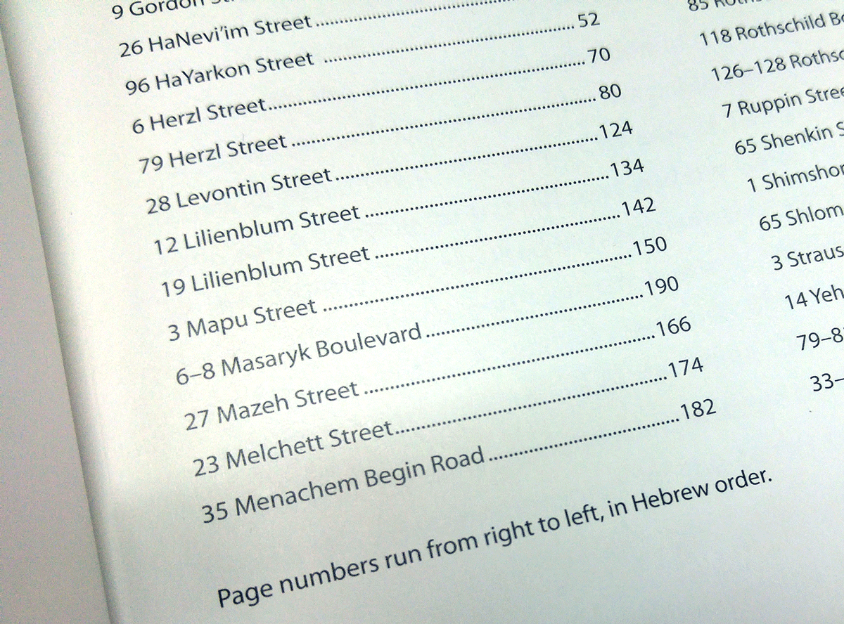
Figure 13: A little guidance is sometimes needed to help readers decipher page numbering.
Sometimes I use page numbers from right to left for the Hebrew part and from left to right for the English part. Fonts are another issue: the difference between the languages is not only in the direction. A line in English text has two heights—cap height and x-height. Hebrew is more square, and almost all letters are the same height. Arabic has a script alphabet. So when I choose typefaces, I try to choose ones that suit the type of work, and then search for a combination that will work harmoniously in all languages in the book (Figure 14).
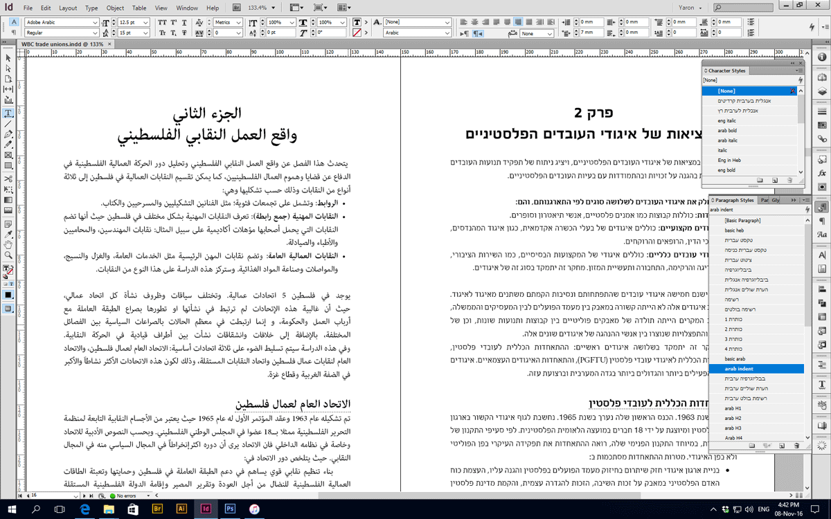
Figure 14: Choosing typefaces to blend Hebrew and Arabic on the same spread is a common challenge in ME publishing.
These are only a few of the problems and challenges when working in Hebrew/Arabic/English. I can tell you that I like designing books and I like solving the challenges that using different languages brings up, and I like working with InDesign because it is an easy and intuitive tool to use.
Working with ME text: Getting Started in the Right (or Left) Direction
When you need to work with InDesign documents containing Middle Eastern text, you have two main options: install a MENA (Middle East/North African) version of InDesign CC, or use the International English version of InDesign alongside scripts, or a plug-in such as In-Tools’ World Tools Pro ($179). So what’s the difference?
If you have a Creative Cloud subscription, you can download a MENA version of InDesign at no additional cost. But you will have to choose a language to localize the application (English, French, Hebrew, or Arabic) and the entire InDesign interface will then use that language.
World Tools Pro, on the other hand, allows you to continue using your localized copy of InDesign, with all its panels and menus in any language InDesign supports. It also allows you to work with Asian text, which is not supported in the MENA version of InDesign. World Tools Pro also includes unique features like a composite font editor and the ability to intelligently apply character styles to texts of different languages. Note that the plug-in works only with InDesign. So if you need to work with live ME text in Photoshop, Illustrator, or other Creative Cloud applications, a MENA version is your only option.
For more information about World Tools Pro, see Diane Burns’ review in issue 51. And you can pick up some good tips and tricks for working with right-to-left text (including the World-Ready Composer options you already have but might not know about) in this post at InDesignSecrets.
Medhat Eid
Medhat Eid lives and works in Jordan. He is an Adobe Community Professional (ACP) and an international trainer. He is also considered to be the first Arab recognized internationally for using Adobe design software, having more than 40 international certificates and three international awards in graphic design.
Medhat is one of the people consulted by Adobe in creating and supporting the Arabic language in its programs. He is also one of the activists in Adobe conferences, seminars, and workshops in Jordan and elsewhere in the Middle East. The Inspire ME conference, which was founded by Adobe experts, is one of the most famous creativity conferences in the Middle East and the Arab region. Inspire ME includes the latest developments at Adobe, and it conducts monthly workshops, seminars, and sessions to spread knowledge, especially among creative entrepreneurs and startups to hone and discover their talents.
In addition to his design work (Figure 15) and involvement with Adobe, Medhat is also the Founder of Graphsense Institute in Jordan, pioneering in delivering high-quality training in graphic design and web design through its experienced instructors in these fields. As part of his work with the creative community he meets and works with talented designers, and sees a growing passion for learning and development.
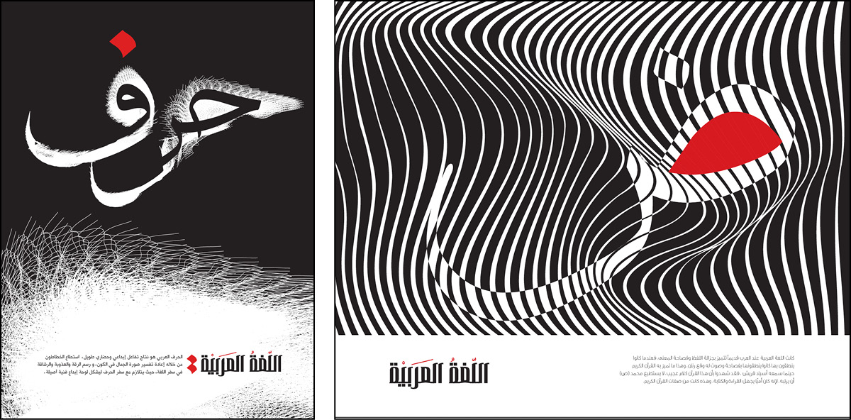
Figure 15: Designs by Medhat Eid
CM: What do you like about InDesign?
ME: I’d say the fast evolution for supporting both print publishing and digital publishing features. My favorite InDesign feature is being able to publish documents with full interactivity by using Publish Online.
CM: What parts of InDesign are frustrating for you?
ME: My biggest challenges in using InDesign are working with AXT fonts* and using Adobe Digital Publishing when integrated with Adobe Mobile Experience.
* AXT (ArabicXT) fonts are non-Unicode fonts in which Arabic glyphs are substituted for the Roman glyphs. They were designed to work only with the QuarkXPress ArabicXT™, and can contain only 256 glyphs. Source: tptq-arabic.com
Commenting is easier and faster when you're logged in!

Recommended for you

TypeTalk: The Creative World of Gail Anderson
Anderson's bold and innovative type work has graced the covers of book covers, B...

Finding a Graphic Design Job in 2015
Even with the recovery of the economy, many graphic designers and other creative...

5 Ways Photography Skills Can Improve Your Graphic Design
For some, making the connection between photography and graphic design is pretty...