

This has been one of my most popular tutorials in books, magazine articles, videos, and live presentations since I first wrote about in 2002. That’s also why it’s the first recipe in my new book, InDesign Masterclass: Text Techniques, 150+ Step-by-Step InDesign Recipes.

The simplest techniques are often the most popular because simplicity often equates to versatility.
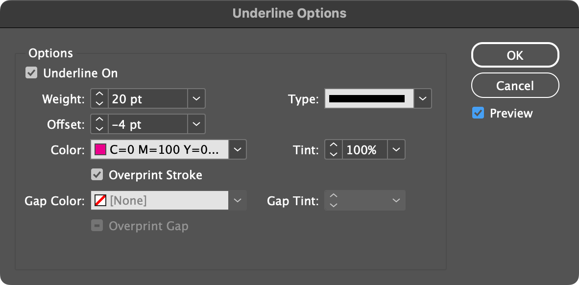
To highlight text in Adobe InDesign, you can use the Underline Options feature to create a custom underline that mimics a highlighter effect. Here’s how:
- Use the Type Tool to select the text you want to highlight.
- With the text selected, open the Character panel by navigating to Window î Type & Tables î Character.
- On the Character panel menu choose Underline Options.
- Turn on and watch your underline take shape by activating the checkbox controls beside Underline On and Preview.
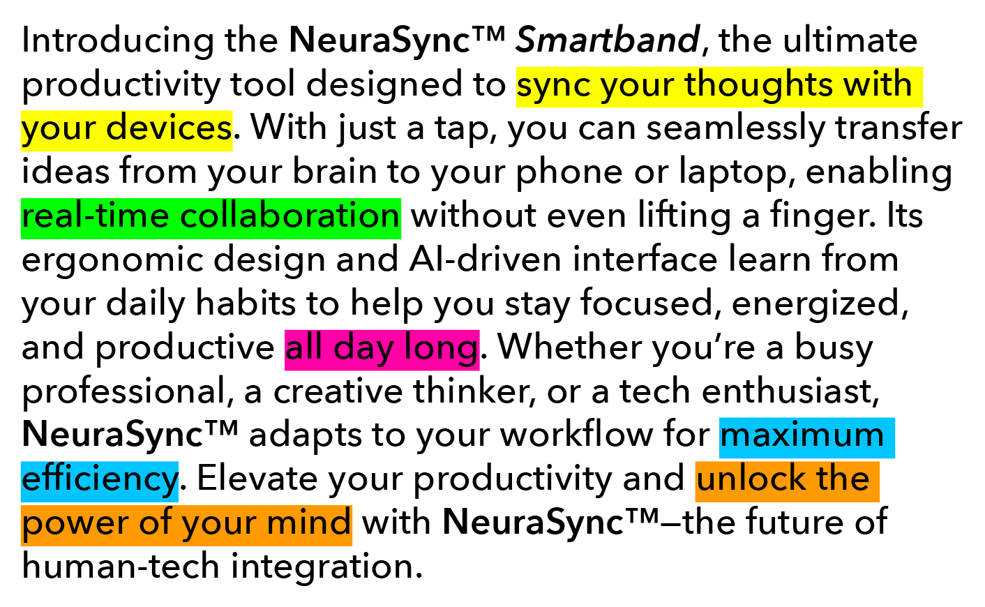
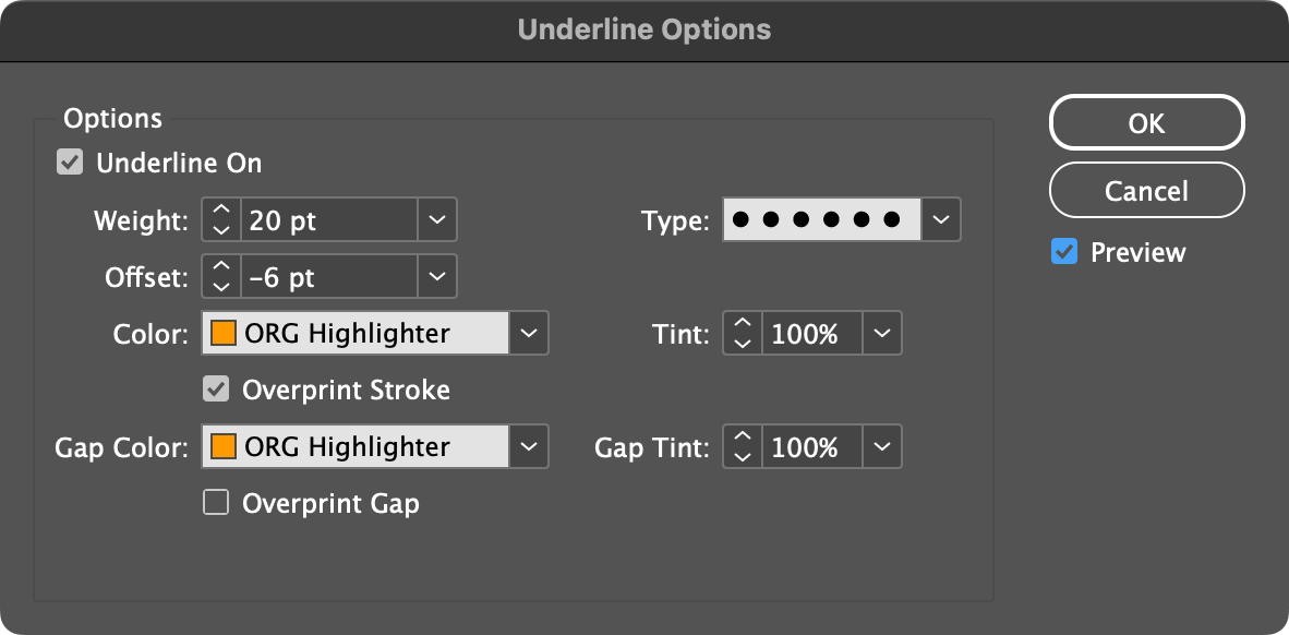
- Set the Weight of your underline to be around 120-140% of your type size. For example, if your text is set at 10 pt, the Weight should be 12 pt or higher to account for ascenders and descenders, and to give a little bit of highlight color above and below those. Be careful not to make the Weight so high that the highlight actually underlaps the text in lines above or below your selected text.
- Leave the Type as Solid (other techniques will show how you can use other line types shortly).
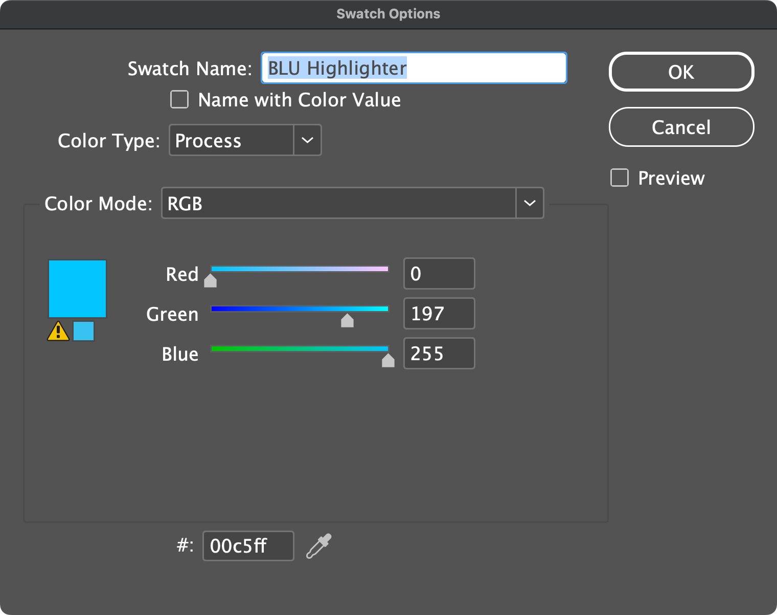
- Skip the Offset for a moment and set the Color to any color swatch you’d like as your highlighter color. In my effect, I used a modified version of the Magenta swatch to create a pink highlight. Adjust the Tint field, too, if you like.
- Leave Overprint Stroke, Gap Color, and so on alone, and go back to the Offset field. At this point, you have a thick pink (or other color) line below the text you want to highlight. The Offset field is how we make it underlap the text directly.
- By default, the Offset field is set to Auto, revealed by a value wrapped in parenthesis. Click the down arrow to open the Offset drop-down menu and set it to 0 pt. Your underline should be partly behind the selected text now.
- Click the down-pointing-arrow button on the left side of the Offset field to go down from 0 pt offset into negative values. Keep pressing that button until your highlight has risen up to fully encompass—and highlight—your selected text.
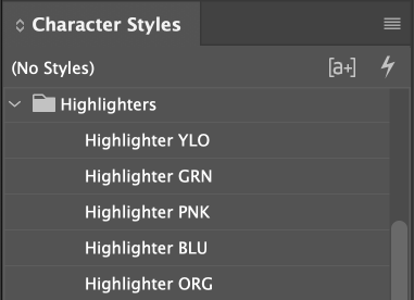
- Click OK, and, for best practice, make a character style from your highlighted text. You’ll have magenta-highlighted text like mine.
Highlighter Colors
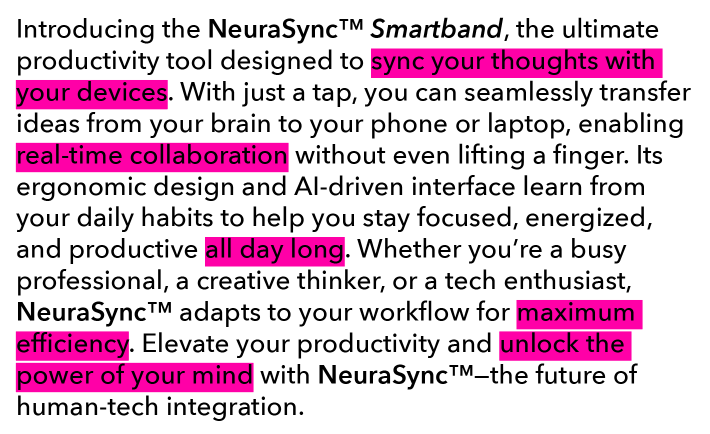
You can use any color you want for highlighting, of course, but if you want to recreate the effect of standard highlight markers, use the following colors, presented in both RGB and Hex formulas. Just create a swatch from each, and, if appropriate, a character style from each—as I’ve done.


Round End Text Highlighter
A refinement I came up with to the original highlight marker effect is to round the ends of the highlighting.

- Follow the steps in the “Highlight Text at the Character Level”, but stop before clicking OK.
- Go back and change the (Stroke) Type field from Solid to Japanese Dots. You should now have a polka dot highlighting, which, by itself, can be cool for the right project.
- Go to the Gap Color field, which is now active because you chose a (Stroke) Type other than Solid, and set it’s color swatch to be the exact same as the Color field above it. If you adjusted the first Tint field, make the Gap Tint filed match.
- Now you have text highlighting will rounded ends, creating the classic pill shape.
Note: The rounding often leaves out of the highlighting parts of the first and last glyphs of the selected text. To counter this problem, apply the round end highlighter to the spaces and punctuation before and after that text.
This article was last modified on May 29, 2025
This article was first published on December 2, 2024
Commenting is easier and faster when you're logged in!

Recommended for you

Before&After: Design a Peekaboo Brochure
This brochure with a narrow front panel gives a peek at the inside, which opens...

This Week in InDesign Articles, Number 133
I’ve been sitting in a dark soundproof booth recently, recording videos for lynd...
How to Customize Style Packs in InDesign
See how easy it is to switch up InDesign layouts at the touch of a button, using...