InDesign CS: Adobe Ups the Ante Once Again

How good is the new InDesign CS? It’s good. It’s very good. It’s so good that in my mind there can be no more debate between QuarkXPress and InDesign. InDesign is the winner. Fight’s over, finished. But rather than spend my time comparing InDesign to QuarkXPress (which soon will be covered in a separate article by creativepro.com contributing editor David Blatner), this review will look at InDesign’s features on their own. Fortunately, there is a wealth of new features InDesign CS (otherwise known as version 3).
The Story Editor
PageMaker users who moved to InDesign grumbled about the lack of a Story Editor, a separate window in which you can work on the story’s content without the distraction of formatting. (QuarkXPress users, who never had a Story Editor, wondered what all the fuss was about.) With InDesign CS, Adobe adds a Story Editor to InDesign that goes far beyond PageMaker’s. InDesign’s Story Editor lets you view your document in an all-type galley, but it also lets you control the Story Editor’s display (see Figure 1). This lets you change the font, point size, the colors, even the shape of the cursor to make it easier edit text. You can also work with the Story Editor window open on one side of the screen and the regular document window open on the other. This lets you see the effects of the changes you make in the Story Editor in the page, which is extremely helpful for seeing overflow text and so on.
If I had to ask for any improvements in the Story Editor, it would be to have an indication of when a story jumped from one text frame to another. It would also be nice to have a mode that showed the exact word wrap in the text frame. However, anyone who wants that type of editing environment should look to InCopy CS, which is the word processing partner to InDesign CS.

Figure 1: The Story Editor Preferences let you change the display of the text in the Story Editor. Here, the same story is shown with three different settings.
Flattener Preview
InDesign 2.0 revolutionized page layout by adding sophisticated transparency effects such as opacity, blend modes, drop shadows, feathers, and support for Photoshop transparency masks. Unfortunately, many people didn’t understand how to make files with transparency print properly, which caused many prepress folks to curse loudly. InDesign CS, on the other hand, makes it much easier to work with these transparency features by adding a special Flattener Preview that shows which objects on the page will be affected by any transparency effects.
For instance, many users complained that adding a drop shadow to any element that was near text could cause the text to become thicker or bolder when printed. This was because there was no way of previewing how transparency effects would ultimately print. But by using the new Flattener Preview palette you can check to see which, if any, objects will be affected by the application of drop shadows, blends, and other transparency effects (see Figure 2). You can then move text or other objects so they are no longer affected.
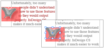
Figure 2: These two images show the Flattener Preview in action. In the top image, the red text indicates that the drop shadow applied to the butterfly also affects the text. In the bottom image, the text has been moved above the drop shadow to avoid being affected.
Separation Preview
Another stumbling block for many designers is trying to control how many color plates will be produced from each page. Some designers make “paper separations” on laser printers before sending the job out. Now, Adobe has added a Separation Preview — one of my favorite features to InDesign CS — that lets you see color separations right in the document window (see Figure 3). You can easily tell which colors have been defined as spot or process inks and see how images will separate when printed.

Figure 3: The Separations Preview lets you display the different color plates in a document. Here the magenta and black plates have been turned on while the cyan and yellow plates are hidden.
Another feature in the Separations Preview palette is the Ink Limit. This lets you see exactly which areas of the page will print with more than a certain percentage of ink (see Figure 4). While many designers may not use this type of feature, it is a real benefit to production managers and print shops that need to see how much ink will be on the page.
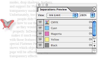
Figure 4: Here, the Ink Limit preview highlights the area in the image that will print with more than 280 percent ink.
Document Presets and Print Controls
Adobe has added some nifty features for working with documents. First, you can create custom document presets that are available under the File menu or in the New Document dialog box (see Figure 5). These presets hold all the settings for page size, margins, columns, gutters, etc., making it much easier to setup complicated documents. For instance, I have three main page sizes that I work on regularly. The document presets make it easy for me to access those settings.

Figure 5: The Document Presets let you quickly choose various document sizes.
InDesign also has new features for working with the bleed and slug areas of a document. The bleed area is outside the page boundaries and lets ink extend beyond the printable area. Before version CS, you could set the bleed amount, but you couldn’t actually see the bleed area in the document window. Now a guide indicating the bleed area appears surrounding the page. In addition, you can set the slug area for a document. Advertising agencies often use a slug to hold information about the ad, the publication it will appear in, the client, and so on. (If you have never heard of a slug, then you probably don’t need to set one.)
InDesign also provides three preview modes that show how the file will print with the trim, the bleed, and/or the slug areas for the file (see Figure 6).
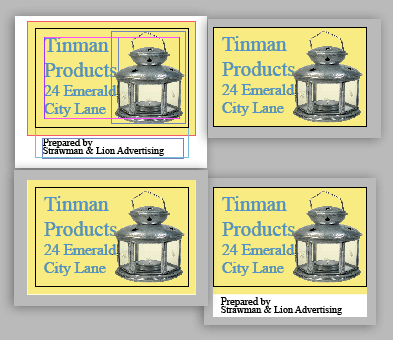
Figure 6: The complete document is seen in the Normal view (upper left). The three Preview modes let you see just the trim (top right), the trim with the bleed (lower left), or the trim and slug area (lower right).
Ending Palette Clutter
QuarkXPress users (and others) who looked at InDesign, often walked away muttering about the huge number of palettes to control various features. Strictly speaking there were ways of working in InDesign 2.0 without all that palette clutter, but Adobe has answered their gripes with several new features.
First, InDesign CS has a contextual Control palette. This palette goes far beyond Quark’s Measurement palette in providing contextual feedback for each type of object chosen (see Figure 7). Click inside a text frame, and you have a choice of all paragraph or character attributes. This even includes the ability to choose paragraph or character styles from the Control palette. Select an object and you get the object attributes including the transformation controls and stroke width. Click inside a table and you have control of almost all the table attributes. Select several objects and you have several of the commands from the Align palette. All told, the Control palette contains the controls for eight different palettes as well as many menu commands. This one palette makes it much easier to keep your screen uncluttered.

Figure7: The contextual Control palette changes its features depending on the object’s chosen. From top to bottom: a portion of the character controls, paragraph controls, object controls, and table controls.
Of course, the Control palette can only do so much to tidy up your screen. So Adobe has added the ability to define workspaces to help organize your palettes. You can save your favorite palette arrangements and recreate them by choosing them from the workspace menu. This lets you choose one palette arrangement for working with text and another for working with pages and layers.
Finally, InDesign CS has borrowed collapsible palettes from GoLive CS. You can drag a palette tab to the side of your screen to show just the tab. Then, with a click, the palette opens or closes along the side of the monitor. The effect is similar to window shades that pop open or closed.
The combination of all these features makes it easy to keep your screen clutter-free and should end gripes about palette overload once and for all.
Pathfinder Commands
Another feature that XPress users complained about was InDesign’s lack of commands for joining, subtracting, and intersecting overlapping objects. To do so meant trekking out to Illustrator and then reimporting the object. InDesign CS adds an Illustrator-like Pathfinder palette with five variations on these kinds of commands (see Figure 8). Simply select your objects and apply the appropriate Pathfinder command.
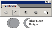
Figure 8: The Pathfinder commands allow you to turn two overlapping circles into a crescent moon.
Custom Strokes and Underline/Strikethrough Controls
Another feature that former Quark users have complained about was the lack of custom dashes and stripes. Actually I have no idea if other former Quark users complained about this, but I complained bitterly. One of the reasons I wanted this feature was for automatically creating callout lines with white edges to set them off as they crossed other colors. I even wrote an article for creativepro.com about how I do this in QuarkXPress. Now I am thrilled to report that InDesign CS has added controls that allow you to create all sorts of stripes and dashes.
Adobe has gone further by adding something that all page layout users have been clamoring for: the ability to customize underlines and strikethrough lines. You can change the width, color, or type of line applied to text. While you applying underlines may not thrill you, this feature does let you create interesting effects, such as highlighting a word with a marker pen (see Figure 9). Instead of pasting in separate frames as a highlight indicator, a highlight can easily be applied as a stroke with a single click. This is a long-sought-for feature — at least by me — that has been finally found.

Figure 9: These yellow highlights were applied to text with a custom underline style.
Mixed Inks
Another feature that QuarkXPress users missed was support for multi-inks, or combinations of spot and process colors. This feature in XPress allows you to darken spot colors by adding black. This has been a terrific feature for working on two-color jobs. Now, InDesign CS has a similar feature, which Adobe calls Mixed Inks. You can take any spot color and mix it with another spot or process color (see Figure 10).
Instead of having to define inks one at a time, you can also generate mixed-ink groups that automatically create different combinations of colors. Although the dialog box for the mixed-ink groups is non-intuitive, and the names of the swatches are confusing, the feature is much more powerful than the multi-inks in XPress.
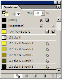
Figure 10: The mixed-ink group shows the five combinations of adding black to Pantone 102C.
Table Headers and Footers
One of the more exciting features in InDesign 2.0 was the ability to not only create tables but to flow them across pages or columns. But tables that continue from page to page also need a way of restating the table information on each new page — header and footer rows that automatically appear on each page. InDesign 2.0didn’t have that, but InDesign CS does. You can define rows to act as headers at the top of every instance of a table or as a footer to appear at the bottom.
Other new table features include the ability to unmerge cells that have been previously merged. You can also apply custom strokes to table cells, and even control whether the row or column stroke appears on top of the strokes it crosses. Finally, a new viewing option enables you to view cell frame edges even if there is no stroke applied to the frame. The only thing missing from InDesign CS tables are styles that allow you to quickly apply complicated table formatting such as custom cell borders, alternating row colors, and so on. (If you do a lot of tables, you should consider investing in the separate plug-in WoodWing Software’s Smart Style.)
Nested Styles
Perhaps one of the most revolutionary advancements in CS is the nested styles feature. These are character styles that can be automatically applied inside a paragraph style. For instance, many magazine designers like to start a paragraph with the first sentence is in bold or small caps, or some other special character style. With nested styles, you don’t have to manually select each instance to apply that style (see Figure 11). When you apply the parapgraph style, the character style is applied at the same time. For example, if you want the first line in small, red caps, InDesign automatically applies that until the end of the sentence; the rest of the paragraph will be in the standard body test style(see Figure 12). (How does the program now where the end of the first sentence is? I don’t know. It’s a computer application; it’s supposed to know these things.) Nested styles make it very simple to apply complicated formatting to any type of structured paragraphs such as classified ads.
There’s even a similar feature that allows you to format the initial character in a drop cap with its own separate formatting.

Figure 11: The control for the nested styles lets you define how the character styles will be applied. Here the Small caps character style is applied through the first colon in the text. Then the regular paragraph style is applied up to the first parenthesis in the text. Then the bold style is applied through one sentence.

Figure12: This figure shows how nested styles can be used to style text. The top example show the text before the nested style is applied. The bottom shows how by simply applying the paragraph style, the character styles are applied.
In the two months that I’ve been using nested styles, they have allowed me to work much faster. Instead of applying character styles manually, or even using the Find/Change, I can apply complicated formatting using nested styles.
Creative Suite Integration
Much has been written about how applications in the CS package have been integrated to work better together. InDesign 2.0 was already well integrated with Illustrator and Photoshop. With InDesign CS, Acrobat 6 Professional and GoLive are better integrated as well. With InDesign CS, you can create interactive buttons as well as add sounds and movies for PDF export. This makes it possible to create enhanced PDFs without even having to open Acrobat.
Adobe has also created a “Package for GoLive” feature that translates the InDesign document into a format that can be opened by GoLive for Web pages. Sadly, this feature is complicated to use and is of no help at all to the overwhelming majority of Web designers who use Dreamweaver. Adobe also took out the very basic Export to HTML feature that was in InDesign 2.0. The result is a very unsatisfactory situation. Most designers don’t want to use GoLive and aren’t going to package their InDesign documents. Taking out the Export to HTML feature seems a mistake. I’m hoping that some third-party (such as ALAP or Gluon) will step in to fill this gap.
So, What’s Missing?
Is InDesign CS perfect? Not quite. There are still many more book- and long-document features that are missing. These include cross-references, numbered lists, and figure numbers. Many users want to be able to drag and drop text from one place to another. (Others demand the flexibility to turn off that feature if it’s put in!) There also needs to be a way to wrap text around inline graphics. And I want some kind of graphic style sheets as well as a Find/Change for graphic formatting.
Finally, Adobe has to add backward compatibility into the next version of InDesign. Currently you cannot save InDesign CS files in a format that InDesign 2.0 can read. As the CS manual mentions this feature, it seems Adobe obviously wanted to have that compatibility, but as the ReadMe file indicates, that feature is not available. As the user base for InDesign grows, Adobe needs to consider that this is a bad precedent to set (you can’t save backward from version 2.0 to 1.0, either). Even the folks in Denver make it possible to save QuarkXPress files back at least one version (you can save QuarkXPress 6.0 files as version 5.0 files, although not as 4.11 files). While I don’t feel that there should be total roundtripping between versions, there should be a way for freelancers who work in version CS to save backwards for a client that only has version 2.0.
But one can’t complain too much given the strength overall of the new features added to InDesign CS.
Read more by Sandee Cohen.
This article was last modified on March 10, 2025
This article was first published on December 16, 2003
Commenting is easier and faster when you're logged in!
Recommended for you

InDesign GREP Essentials: Ready-to-use Expressions
This article is part of in a series of posts on using GREP in InDesign for begin...

Scanning Around With Gene: Matchbook Wisdom on Traffic Safety
Regular readers will undoubtedly note that I’m a bit obsessed with safety messag...

5 Tips for Working with Animation Motion Paths
Since InDesign animations are supported in fixed-layout EPUB and Publish Online...


