

Most of the hyphens that end up in your pages are placed there by your software — for better or worse. Text processors and page-layout programs are pretty good at knowing where a word can be hyphenated, but there’s too much riding on those decisions to have blind faith in a sightless piece of software. In this column we’ll look at how your control over hyphenation can not only make your type compose better, but read better as well.
Unless you tell them otherwise, your programs will always try to fill each line of type as fully as possible before breaking it and starting another. The more text it can fit onto each line, the less it will have to alter spacing to fill out lines in text with justified margins, and the more consistent the line lengths will be in ragged-margin copy.
The main tool your programs use to pack lines is hyphenation.
To hyphenate words, programs can rely on either a hyphenation dictionary or an algorithm (a mathematical formula that divides words using logical analysis). Adobe InDesign uses a dictionary, QuarkXPress uses an algorithm, and both do excellent jobs.
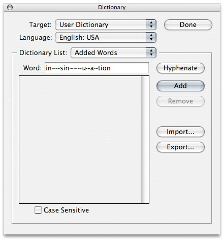
In this view from InDesign’s hyphenation dictionary, the possible break points of a word are ranked in order of their desirability. Break points with more tildes are preferred. This process is called ranked hyphenation.
Different languages — even different countries using the same language — have different rules for hyphenating words. For example, British English is normally hyphenated according to word derivation (know-ledge), whereas in American English, words are divided according to pronunciation (knowl-edge). Language is normally a character-based attribute, so you can get individual words in foreign languages to hyphenate according to their own rules. Creating a character style to apply a specific language dictionary is an easy way to assure that foreign words are hyphenated correctly.
Programs don’t always hyphenate words where you want them to. You can coax them to hyphenate in a specific place by manually inserting a discretionary hyphen (sometimes called a soft hyphen). This kind of hyphen appears only when it’s needed to divide a word. If the text re-rags and that word appears in mid-line, the hyphen disappears; if needed again, it reappears. Adding discretionary hyphens during the editorial stage is a good way to assure that proper names or unusual technical terms divide properly when they’re set into final pages.
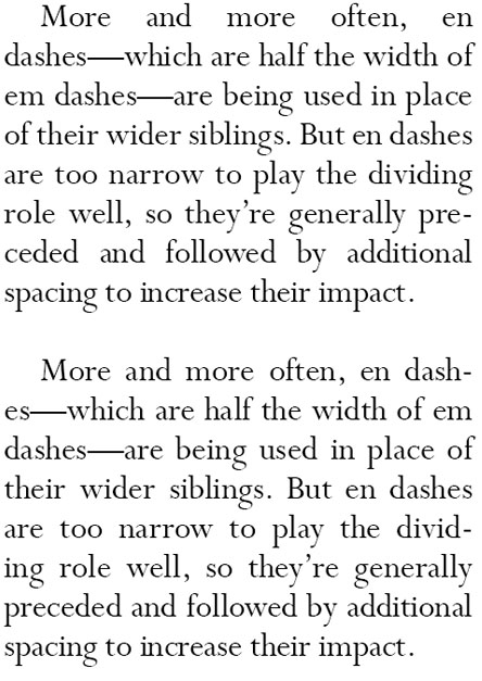
In the upper of the following samples, InDesign opted not to hyphenate the word typeface, leaving the first line of the paragraph noticeably too loose. In the lower sample, adding a discretionary hyphen prompted the program to break the word, creating more even spacing throughout.

The keyboard shortcut for inserting a discretionary hyphen is generally Command-/Ctrl-hyphen (in InDesign, it’s Command-Shift-hyphen). If your program refuses to take this subtle hint and readjust its hyphenation, you can insert a marker that bars hyphenation at the point your program prefers, obliging it to hyphenate elsewhere. Keep in mind that this marker is a permanent addition, and if your text reflows, it might prevent desirable hyphenation later on. Nevertheless, here’s how to do it: In QuarkXPress place the cursor at the hyphenation point and go to Utilities/Insert Character/Nonbreaking Special and choose Word Joiner. In InDesign, select the characters on each side of the hyphen and choose No Break from the Character palette menu. Creating “no break” text is also handy for keeping “words” such as Web addresses intact and on one line.
Another handy character is a non-breaking hyphen, which the New York Times could have used when setting the headline for this story from its Web site:

A non-breaking hyphen — like any typed, hard hyphen — is also a permanent addition to text, but it’s not a legal line-breaking point.
Never use a hard hyphen — typed into the text using the hyphen key — to force a line break. A hard hyphen is a permanent part of the text stream, and you can never be sure that your text won’t re-flow for some reason, dragging that hyphen to a place you don’t want it.
The reason your program isn’t hyphenating optimally — or even correctly — may be that it doesn’t know the word in question. Proper names and technical terms, for example, may not be in its dictionary, and certain words are simply oddballs that confuse even an algorithmic hyphenator. For these, virtually all programs offer an exception dictionary, in which you can record such troublemakers. Take advantage of this; it’s a great tool. Note, too, that there are certain words that hyphenate differently in different situations, such as pro-gress (verb) and prog-ress (noun). Programs have a default position on such words, but you can overrule it using your exception dictionary, which takes precedence over all other hyphenation rules.
Program Preferences for Hyphenation
Most program tools for controlling hyphenation are self-explanatory, but some have their subtler aspects. A case in point is the number of characters that you will allow before and after a program-inserted hyphen. This is a copy-editing issue more than a typographic one, and most style guides say that for a word to be hyphenated, it should contain a minimum of five letters. Furthermore, the minimum number of letters before the hyphen should be two, and the minimum after is three. In very narrow margins, though, this rule may need to bend in the interests of good type composition. I still wouldn’t hyphenate a four-letter word, but in a pinch I’d allow two characters after a hyphen (e.g., bad-ly). Check with your editor, if you have one, before proceeding.
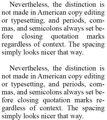
In the upper sample below, a loose first line occurs because the program has been instructed that at least three characters must follow a line-ending hyphen. In the lower sample, this limit has been reduced to two characters, resulting in better spacing.
Most page layout programs also allow you to define a hyphenation zone. This is a mechanism for controlling the wildness of the rag in ragged-margin copy. Different programs define this somewhat differently, but the net effect is that the larger the value you specify for this zone, the greater variation you’ll have among line lengths, because fewer words will be hyphenated.
InDesign also has a slider in the Hyphenation dialog of the Paragraph palette that allows you to opt for more or fewer hyphens. I never use it because I prefer controls expressed in discreet numeric values, and I can’t see exactly what I’m doing with it. For the more visually inclined, put a check in the Preview box so you can see the effect of your changes, and slide away.
Hyphens: The Good and the Bad
Good hyphenation is crucial for good type composition when using justified margins. It lets your program put as much type on a line as possible before having to flex character and word spaces to fill the measure. In ragged-margin text, it allows you to create the tightest rag possible. But hyphens make for more laborious reading, especially when the front end of a hyphenated word fools you into incorrectly anticipating the back half, as in re-ality.
Where measures are wide, then, hyphenation is normally minimized — because in most cases any excess space on the line can be soaked up among its numerous word and character spaces without causing the type to appear too loose. Where measures are narrow, as in newspapers, having lots of hyphens is a necessary evil. For these reasons, programs let you control the number of consecutive hyphenated lines you’ll tolerate. In book work, this may be as low as one; in newspaper work, as many as three.
In the following example, the loose line in the upper paragraph occurs because the program isn’t allowed to hyphenate three lines in a row. By relaxing that rule and allowing a third hyphenation, the problem is cured in the paragraph below it.
When too many hyphens are a problem, the reason is usually that the point size of the type is too big for the measure. Knocking back the point size by even half a point may help a great deal.
Another hyphenation no-no is a double hyphenation. This occurs when a word containing a hard hyphen gets another hyphen when your program divides it at the end of a line. Few programs have any tools to prevent this. The cure is to cause the paragraph to re-rag by one of three means: forcing a new line ending manually; adjusting the tracking to cause the text to set slightly tighter or looser; or editing the text.
From H to J
You can control the way your program composes text by tweaking the rules for a process called hyphenation and justification, a.k.a. H&J. Now that you know about the H, you’re already halfway there. To go the rest of the way, see my column “The ABCs of H&J.”
This article was last modified on August 13, 2021
This article was first published on March 3, 2010
Commenting is easier and faster when you're logged in!

Recommended for you

TypeTalk: Scaling Logos
TypeTalk is a regular blog on typography. Post your questions and comments by cl...
Freudian Glyphs: The Sigmund Freud Typeface
Let’s “kick” off the week with a cool new font-related Kickstarter project. This...

Wood Type Museum Urgently Seeks Donations
The Hamilton Wood Type & Printing Museum, which hosts the largest collection...