

Now that 3D modeling functionality has been removed from Photoshop, a replacement has appeared from an unlikely direction: Adobe Illustrator. Its 3D tools are slowly evolving, but they’re already in a state where they can provide workable solutions to common problems. Here, we’ll see how to use Illustrator to add realistic 3D text to an image.
The Starting Image
I’ve added a spaceman to this view of a corridor, ready to tack a huge Welcome to Mars sign on the wall. It would be easy enough just to make it look painted on the wall – but let’s give it some extra depth and presence.

Start with Your Text
One of the most useful features of Illustrator’s 3D tools is that you don’t need to turn text into outlines before extruding it. This is a single text block, set in Avenir Black.

Extrude the Text
Use the Extrude & Bevel effect to produce the basic off-axis, isometric view shown below. Choose Effect > 3D and Materials > Extrude & Bevel to open the panel and select that option.

Rotate the Text
You can rotate the 3D text using the Custom Rotation sliders in the 3D panel, or using the crosshair controls in the middle of your extruded object. Get the angle approximately right before moving onto the next stage.

Add some Perspective
The Perspective slider in the 3D panel is the way to make your text fit the space in which you’ve set it. At this stage you’ll likely have to tinker with the rotation as well to ensure a good perspective match.

Adjust the Extrusion
This is a good time to adjust the default extrusion for a more convincing result. Here, I’ve reduced the Depth to 10mm to make the lettering thinner. It’s also worth adding a small bevel to the extrusion: this rounds the edge slightly, and gives a surface for the light to glint on.

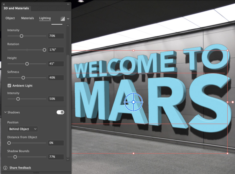
Add some Shadows
Switch to the Lighting pane within the 3D panel. Adding a Shadow, by clicking the Shadows toggle, makes it easier to see the light direction. The Position should be set to Behind Object. The other option, Below Object, assumes that the object is standing on a horizontal surface.

Change the Direction
Use the Lighting controls to adjust the Rotation and Height of the light. Because the scene is lit by those overhead panels, it makes sense for the light to come from directly above.

Fix the Shadows
In the previous step, you’ll notice that the shadow beneath the S is cut off in a hard line. This is easy to fix: drag the Shadow Bounds slider un the Shadows section to reveal the whole shadow.
Choose a Material
Switch to the Materials tab in the 3D panel, and choose an Adobe Substance Material. There’s a range of surfaces to choose from. I opted for Spotted Concrete, which seemed the most appropriate for this setting. If you scroll down in the Properties section, you’ll see a whole range of parameters that can be adjusted for each material.

Final Positioning
With the 3D panel moved out of the way, I was able to center the text on the wall. Note that it isn’t possible to move the horizon up and down; the easiest way to correct minor perspective abnormalities is to use the Free Transform tool (shortcut: E) and drag the center handle on either side to shear the text up and down.

The Final Render
So far, you’ve just been working with a preview view of the extruded object. Click the Render button at the top right of the 3D panel, turn on Ray Tracing and choose Low, Medium, or High, then click the Render button. The result is a smoother, more refined version of the 3D object.

It’s Alive!
And just to prove that the text is still live, let’s change it. Double-click it with the Type tool, and type whatever you want. I’ve also changed the Material to Larch Wood, just because I can.

This article from CreativePro Magazine is for members only. To continue reading, please log in above, or sign up for a membership today! Thanks for supporting CreativePro!
Commenting is easier and faster when you're logged in!

Recommended for you

CreativePro Video: Sizing Outlined Text in Illustrator
In this week’s CreativePro video, Von Glitschka shares how to size outlined text...

Illustrator Downloadable: Sun & Sea Graphic Set
This downloadable package includes graphics, swatches, symbols, and patterns for...

CreativePro Video: Using the Touch Type Tool in Illustrator
In this week’s CreativePro video, Mike Rankin demos how to adjust type with Illu...