


When designed well, timelines can turn a boring list of events into an engaging narrative. We usually think of time in a linear way, but timelines can take on many different shapes to complement the content and viewing context. This article covers the basics of designing a timeline and shows a variety of timeline formats, each with design tips.
Horizontal timelines
1. Create tick marks. Draw a short vertical line and duplicate it to match the number of time steps you want for your timeline. Then, selecting all lines, distribute them evenly. In this example, I want 11 increments, one per decade from 1900 through 2000.
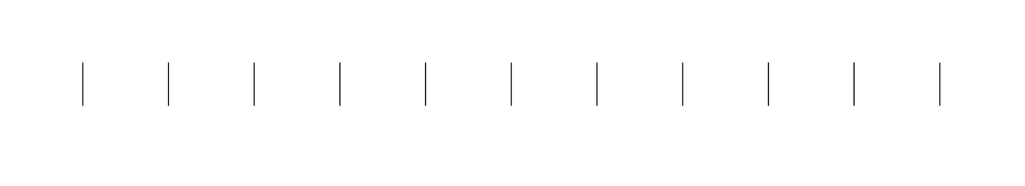
2. Design the horizontal line. Draw a line that connects the first tick mark with the last mark. Adjust the scale, thickness, and color as you wish. Label the tick marks as desired.
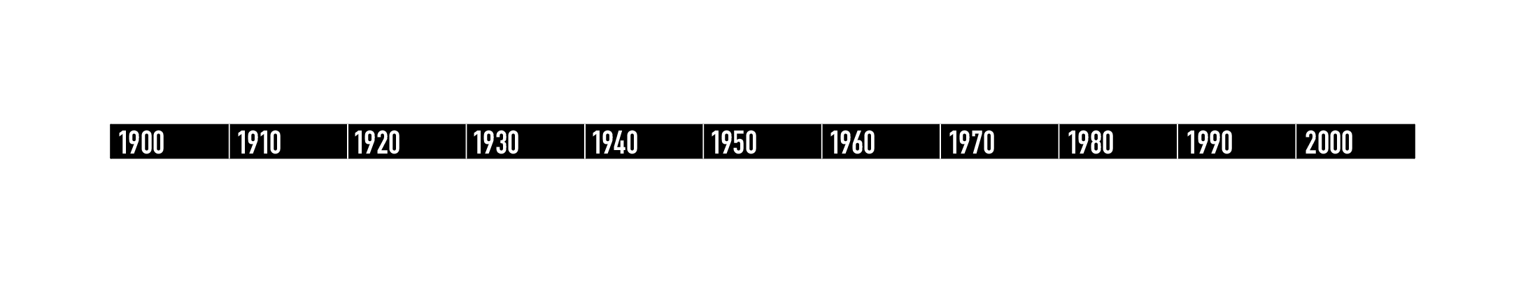
3. Set an underlying grid. If you want to place events in proportionally accurate positions, design the grid to match up with the tick marks, with as many subdivisions as you need between time steps. But if time accuracy is not critical (as in this example), the grid will simply help to structure the content in an organized way.

4. Place your content. Following your grid, place text, images, and navigational guide lines. Deviate from the grid wisely.
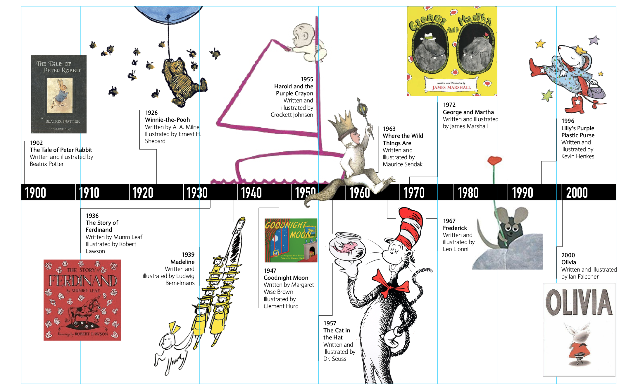
The final effect:
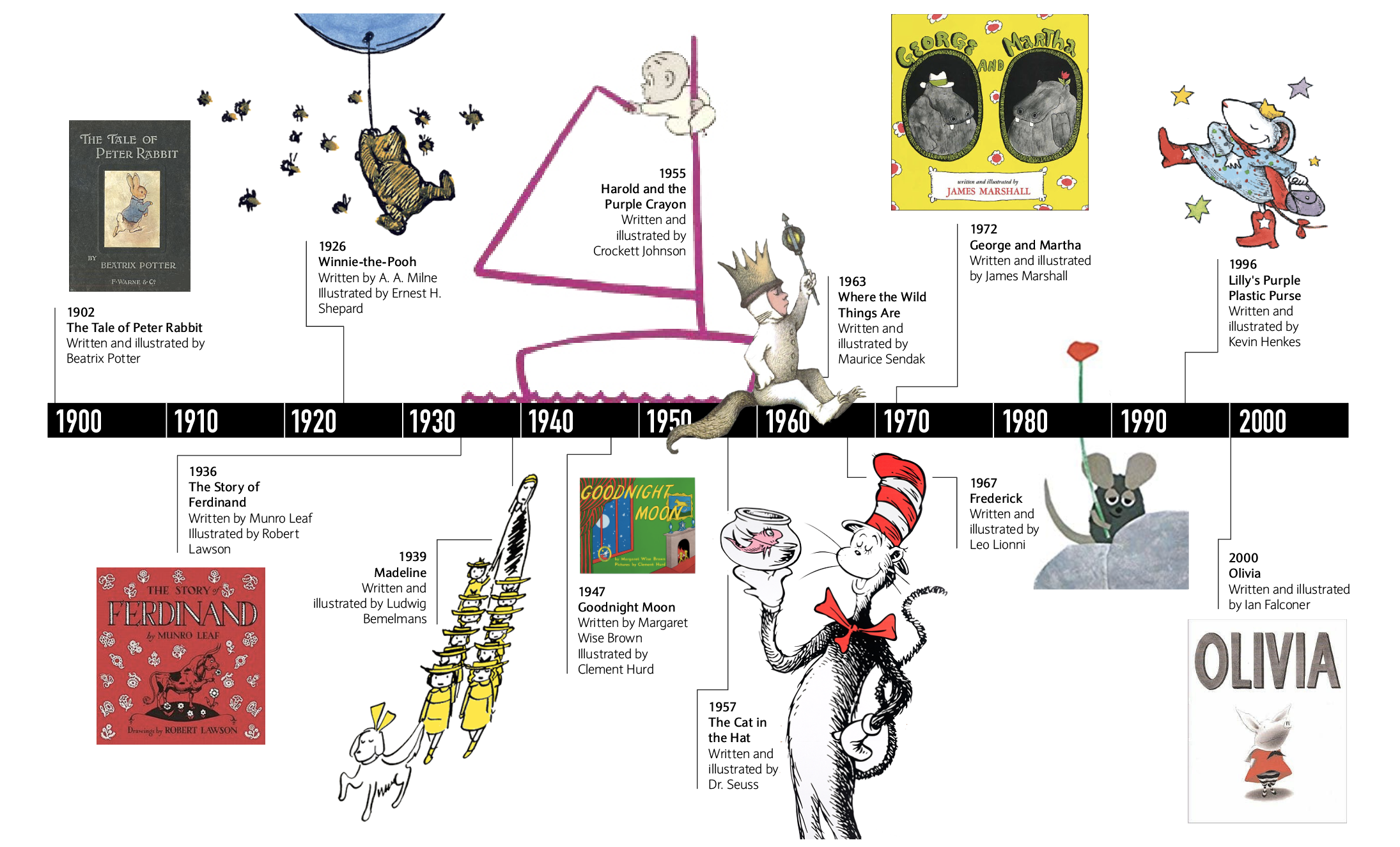
Tips:
Navigational guide lines can quickly make a timeline look like a maze. Play with line thickness, style, and color, or even removing lines altogether if the items can be placed close enough to their appropriate position on the timeline. Knocking some images out of their rectangular frames can create liveliness and introduce a variety of forms.
Text-only timelines
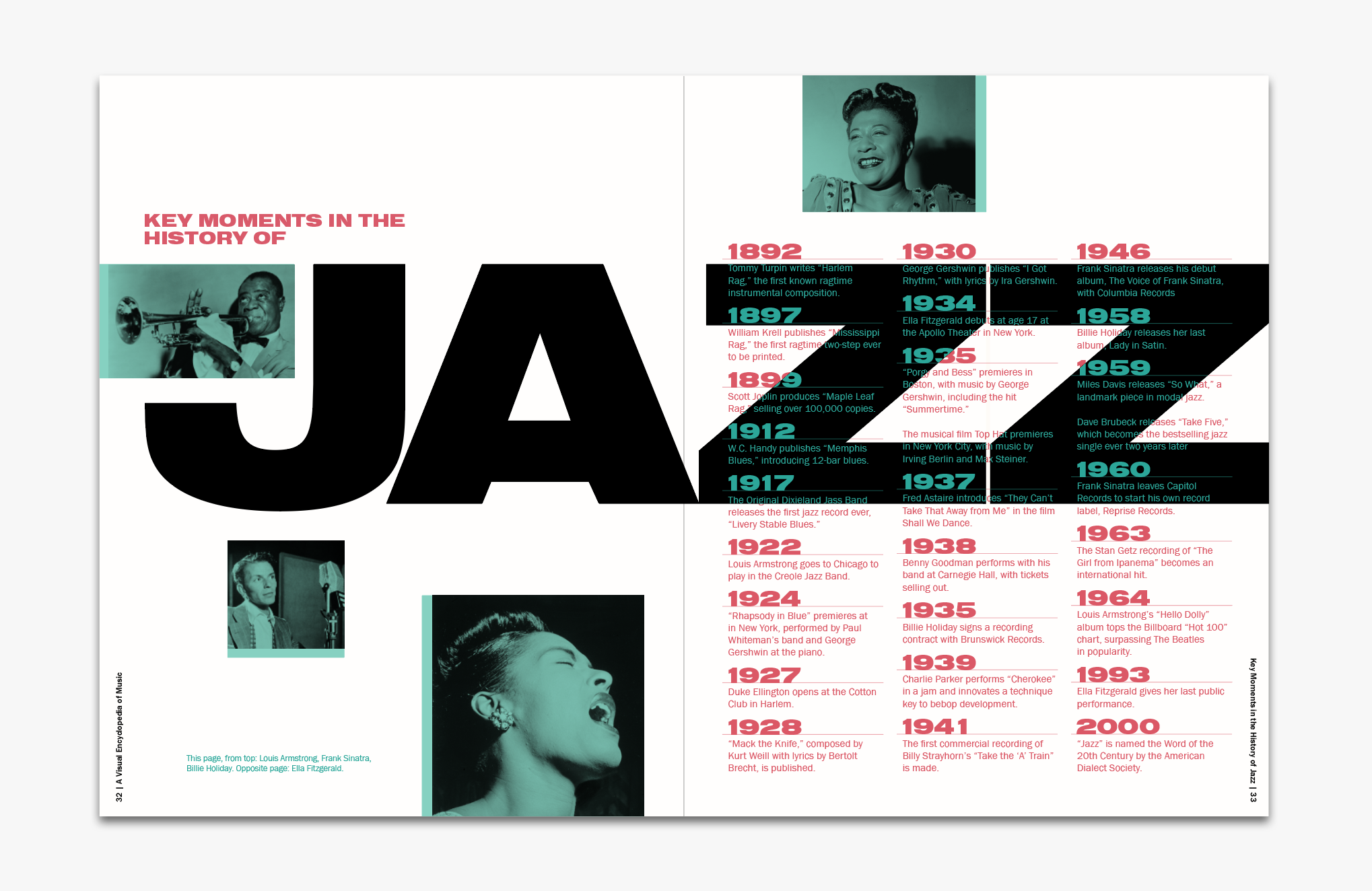
Text-only timelines can be an elegant option for reading-intensive contexts, and can be especially useful when you have only a few images. Here is an example of a timeline for a book, using only four photos.
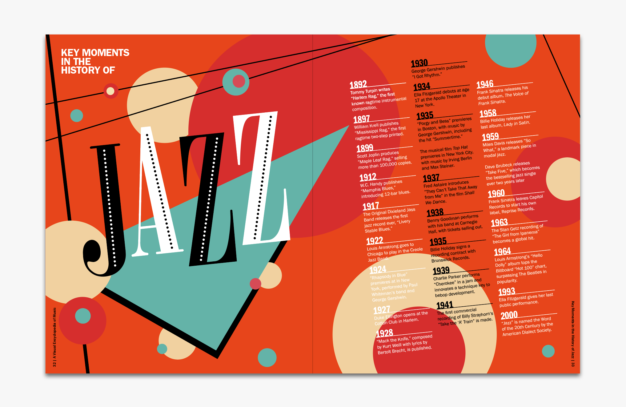
Text-only timelines can also be an effective choice for emphasizing background art. Here is the same timeline, redesigned with a background illustration that sets the stage for jazzy content.
Tips:
Use contrast between dates and event details to make the timeline easy to navigate. Play with different arrangements and colors of the timeline text.
Split timelines
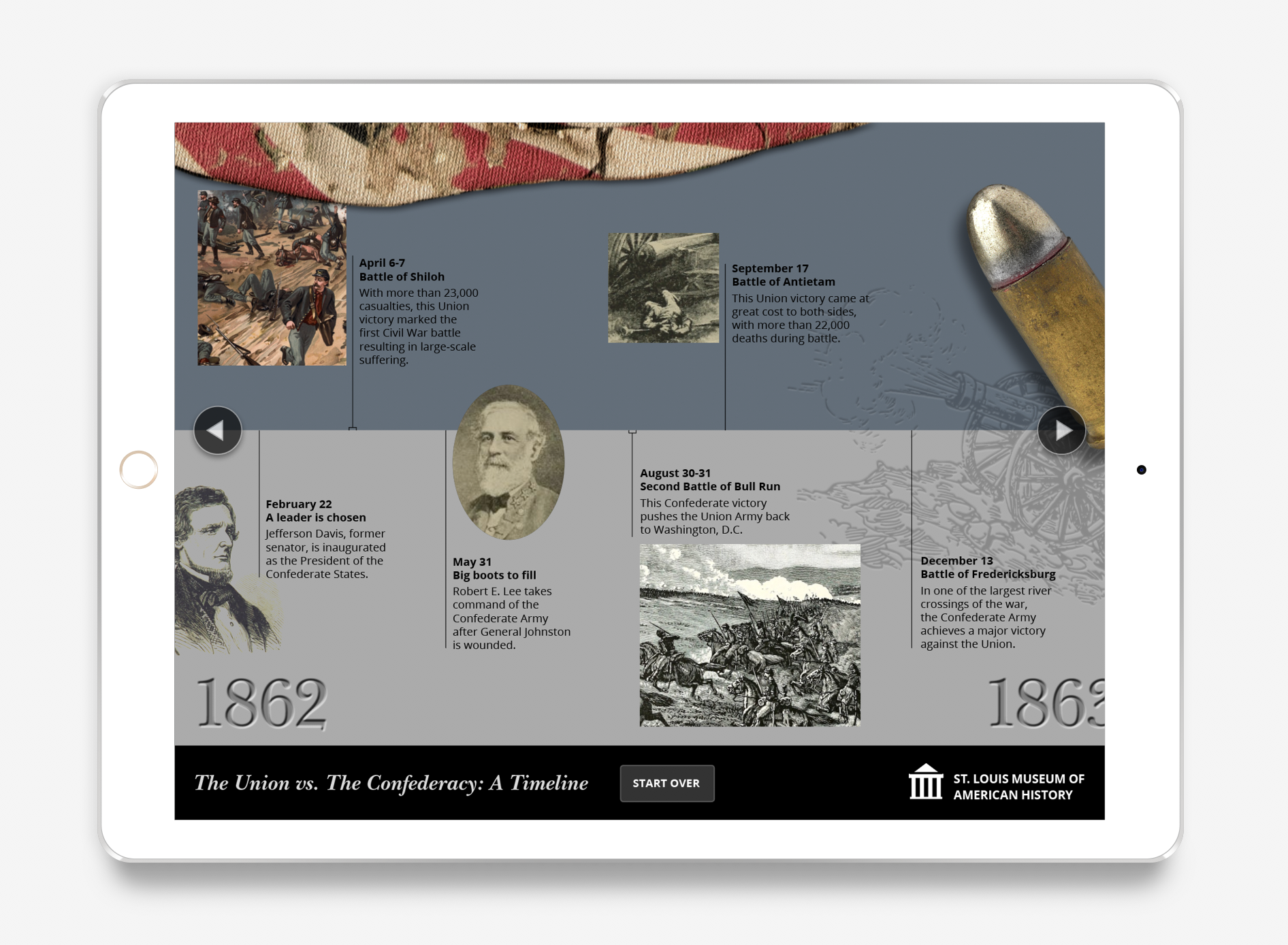
Some types of content lend naturally to a comparison or split-view, such as competitions or battles. In this snapshot of an interactive learning module about the American Civil War, the upper half in blue contains major events for the Union and the lower half in gray contains major events for the Confederacy. The significance of the color (the uniform colors) and position (upper half for the North, lower half for the South) can be introduced at the start of the module.
Tips:
Both sides of the timeline should share the same time scale, so events can be read as one story or compared at a glance. In this context, the sequence of events is more important than the precise amount of time passing between each event, so each event is placed for best legibility, rather than by the exact location on the timeline according to its date. Silhouetting some objects and setting them upon the timeline creates a scrapbook-like sense of exploring history. Watermark, embossing, and engraving effects can enhance the illusion of a tactile, immersive experience.
Circular timelines
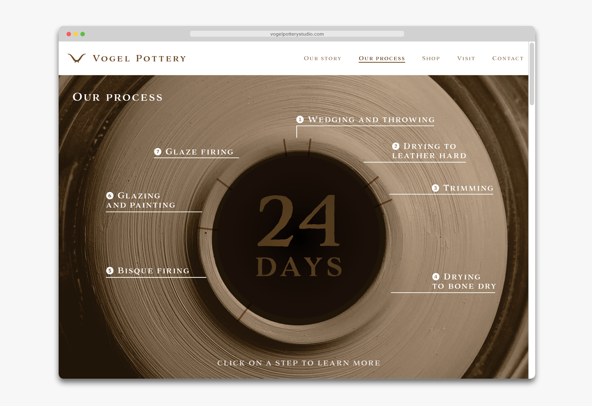
Some timelines don’t end…they cycle. This diagram explains the work process of a pottery company. Animation can be used to show where the process begins, but if a static image is preferred, numbers next to each stage can work.
Tips:
In circular timelines, the design should accurately reflect the amount of time spent in each stage. This helps the user to compare the lengths of the stages and to see how much time one stage takes out of the entire process. To create guides for tick mark placement, simply rotate a line by the appropriate number of degrees.
Vertical timelines
Vertical timelines can be effective for screen-based applications with vertical scrolling. Continuing with the pottery company, here is a snapshot of a timeline that reveals the history of the company as you scroll down the page.

Tips:
Use contrast to add utility and beauty. Setting the years in a large text size makes it easier to scan, while making some images larger than others emphasizes the beauty of the ceramics.
Wavy or zig-zag timelines
Timelines don’t have to be in a straight line—curves and zig-zags can work, depending on the content! In this example of direct email marketing for a travel agency, a wavy timeline conveys the feeling of wandering through a city.

Tips:
In non-linear timelines, the timeline’s shape can easily become the focal point of the design, so take extra care with the balance of text and supporting images to communicate your key messages effectively.
At the end of the day…
Timelines are a storytelling device. They can be immersive, interactive, informative, and fun to make and use! Share your timelines with us on Twitter @CreativeProse and @MayaPLim.
This article was last modified on May 28, 2019
This article was first published on May 28, 2019
Commenting is easier and faster when you're logged in!

Recommended for you
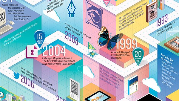
Building an Isometric Timeline of Modern Milestones in Design and Publishing with Illustrator
Anticipating another great CreativePro Week in Seattle, I was excited to get a c...

Can’t Save or Save As or Save a Copy or Undo… Help!
Oh yesterday was such fun… after working on a document for a while, pressing Cmd...

Linotype's New Serif, Script, and Stencil Fonts
Malabar For the next 30 days, all customers who purchase any font licenses at Li...