

Stock artwork is useful for many types of assignments and for clients on limited budgets. You can find a rich trove of vector stock art with appropriate licensing from various sources including Adobe, VectorStock and Creative Market. Consider stock images as starting points for a final illustration. You can customize and edit stock art to meet design requirements, conform to branding guidelines, and help clients get the look they want.
The Starting Point

This bakery artwork is a suitable starting point for a client’s upcoming ad campaign. Though not an exact representation of their store, they found it charming and want you to make some changes to better match their actual location. Here’s how you can transform this stock image:
1. Recolor the Artwork
As a first step, you can change colors in the image with the technique that was covered right here on CreativePro, in this video by Laura Coyle. Use the Magic Wand tool to select the blue hues and alter them with the Recolor Artwork panel. (Choose Edit > Edit Colors > Recolor Artwork…)

Use the Layers panel to de-select items that should not be recolored, like those in the window. You can Command- or Ctrl-click in the right-most column of the Layers panel to select and deselect elements. The figure below shows squares in that column, indicating active selections.

2. Change the composition.
Let’s move the planter from the left edge of the image over to the entrance, to frame the door. Start by moving the bicycle and its shadow over to the left. Use the Layers panel to selectively lock content you don’t want to affect, and more easily select the elements to move.
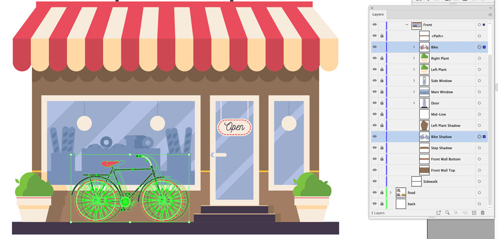
It’s worth taking a few extra minutes ahead of time to rename the layers; You will find it easier to navigate when default layer names like “Path” and “Group” are changed to more descriptive labels like “Door” and “Bike.”

Next, change the sign; The client’s sign is above the awning on the building façade, so you will need to raise that. The sign’s shape and lettering are different too. First use the Rectangle tool to draw new elements, and the Eyedropper to pick up colors from below. Then you can type the business name with a font that matches their brand.

Next, select the sign with the Direct Selection tool. Use the Corner options to complete its look. Remember to select the text and Convert to Outlines once spacing and placement are final.

3. Add Background Elements
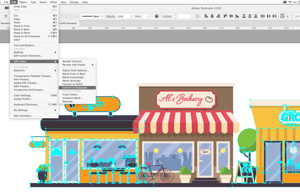
The client’s bakery is on a busy street with other stores. Fortunately, three other store graphics were provided in the same stock art file. Place two of these on either side of the bakery. You can make them fade to the background by choosing Edit > Edit Colors > Convert to Grayscale. Adjust the darkest elements of the adjacent stores to reduce contrast and make the bakery stand out. Keep the sidewalk color consistent to tie everything together across the entire illustration.

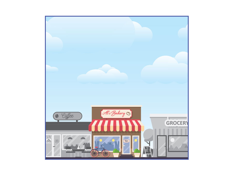
Now, create a new layer at the bottom of the stack. Paste in a stock blue sky image with a few puffy clouds, and you now have a much richer illustration with room for text. Nice!
For the last step, create a mask layer above all the others to constrain the composition to a square. Add a new layer at the top of the layer stack, draw a square, and position it. Select All and choose Object > Clipping Mask > Make Mask to complete the illustration.

Here’s your finished image, with new colors, composition and background elements:
This article was last modified on August 9, 2021
This article was first published on November 17, 2020
Commenting is easier and faster when you're logged in!

Recommended for you
CreativePro Video: Style Multiple Items at Once in Illustrator
Learn a quick and easy way to change the appearance of multiple icons all at onc...
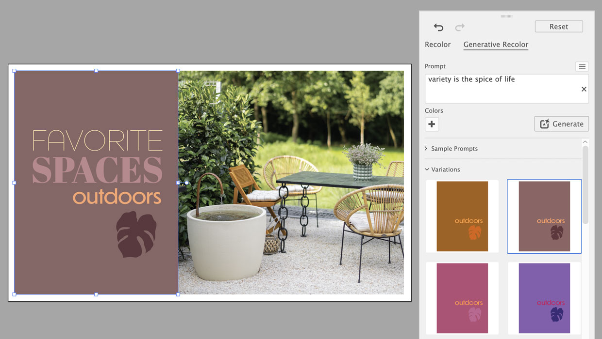
Using Generative Recolor in Illustrator
Refresh your color workflow by pairing a time-honored technique with the latest...
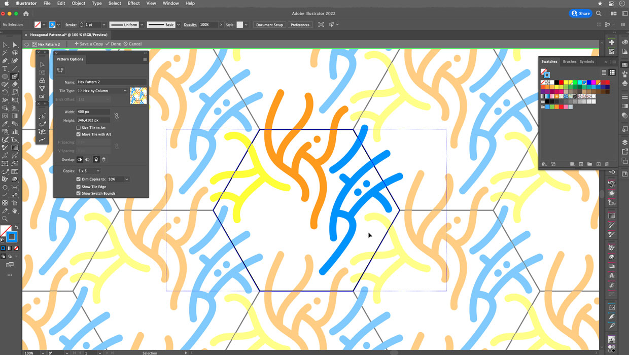
Creating Hexagonal Patterns and Pattern Brushes in Illustrator
Use these advanced techniques to put hexagonal patterns and pattern brushes to w...