

In a recent InDesign Secrets article, Keith Gilbert explored How to Add a Rule Around a Paragraph. It is a very cool trick using gradients composed of bands of color that transition sharply from one color to the next. One of our readers then commented: “I wonder if anyone has worked out a way to combine this with underline to create a hacked shaded box.” And today I will explain how to do just that. This technique uses both InDesign and Illustrator.
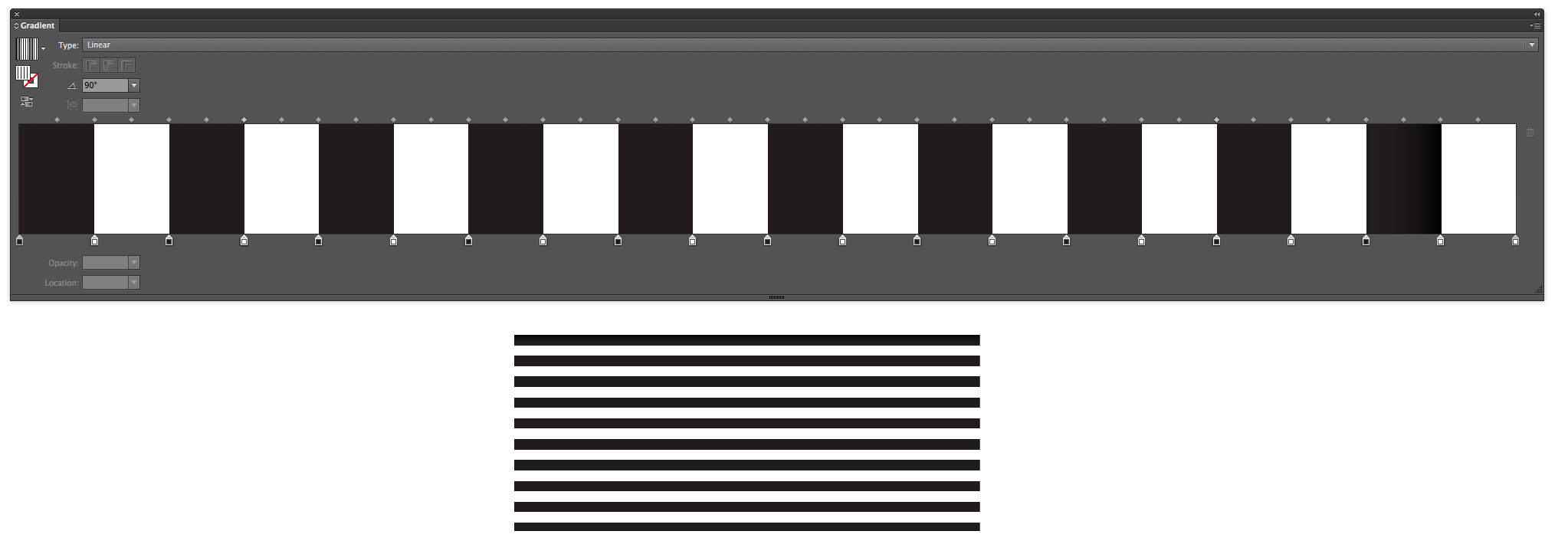
I started using the same technique that Keith used, but I wanted to see how far I could push the limit of InDesign gradient. Methodically, I added and adjusted gradient stops until I had a gradient consisted of 20 distinct color breaks. Now, initially, these stripes look quite similar to the American Flag Stroke Style I made a couple of years ago. But notice that this simple line is a solid stroke style, and the stripes are created just by the use of precisely positioned gradient stops.

The Advantage of Making Gradients in Illustrator
Before we get too far into this, I want to remind you that you can Copy Vectors from Illustrator to InDesign (or vice versa). And when editing complex gradients, it’s a heck of a lot easier to do it in Illustrator than it is in InDesign because in some Illustrator panels (including the Gradient panel) are super-expandable! I was able to expand Illustrator’s gradient panel to the entire width of my 27″ monitor! (Compare that with the teeny tiny width of InDesign’s Gradient panel.
Illustrator Gradient panel
So using your vector-editing program of choice, build a nice, complex, gradient consisting of 20 different stripes. If you edited your gradient in Illustrator, now is the time to copy and paste your line back into InDesign. Just by doing so, InDesign will automatically add the gradient as a new swatch. If you decide to make more or fewer stripes in your gradient, be sure to use an even number of stripes.
Reverse the Gradient
The reason for the even number of stripes is because we’re going to flip the gradient. In the Gradient panel, click the “Reverse” button. Now make a second swatch.

You’ll see that we have two distinct (though similar) swatches: one begins with white and ends with black; the second begins with black and ends with white.

Black and White Gradient Swatches
Since those swatches are very small, and the thumbnails are too small to accurately represent the gradients, try applying the gradients to a couple of lines in order to better see how the gradients are reversed.
Create a Paragraph Rule
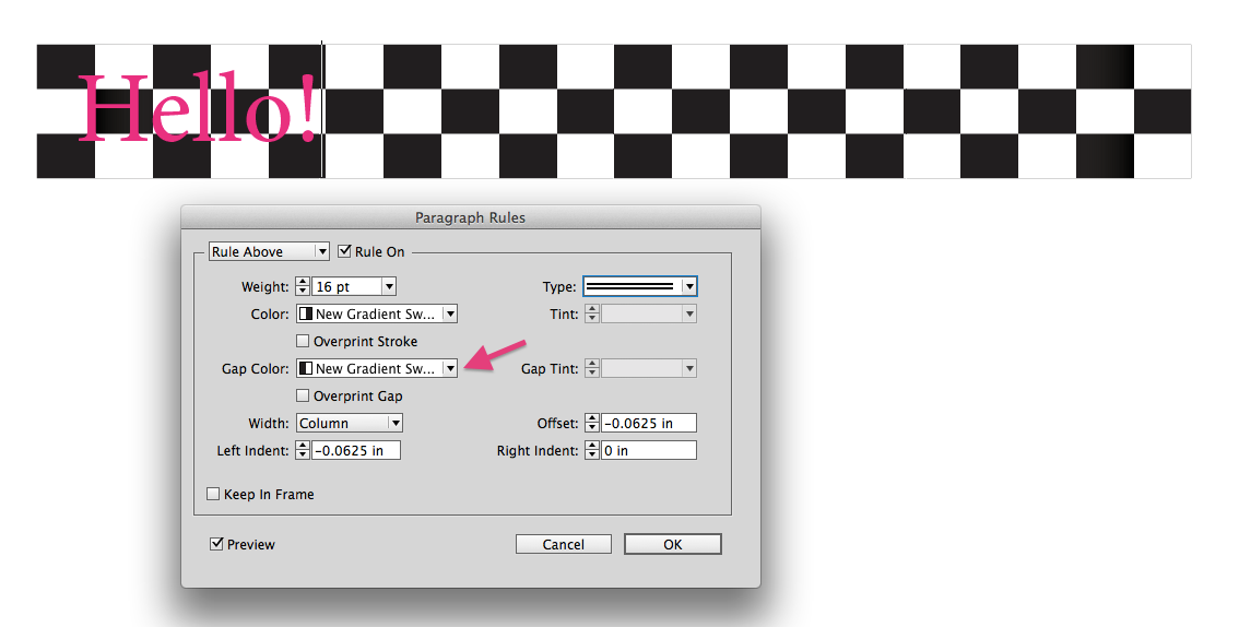
Now, let’s apply the first gradient to a Paragraph Rule to see what happens. With your text insertion point inside the word, go to Paragraph panel menu and choose Paragraph Rules.

Then apply the following settings. Because the Paragraph Rule will extend the entire width of whatever you specify (Column or Text), the width of the individual stripes is flexible and dynamic.
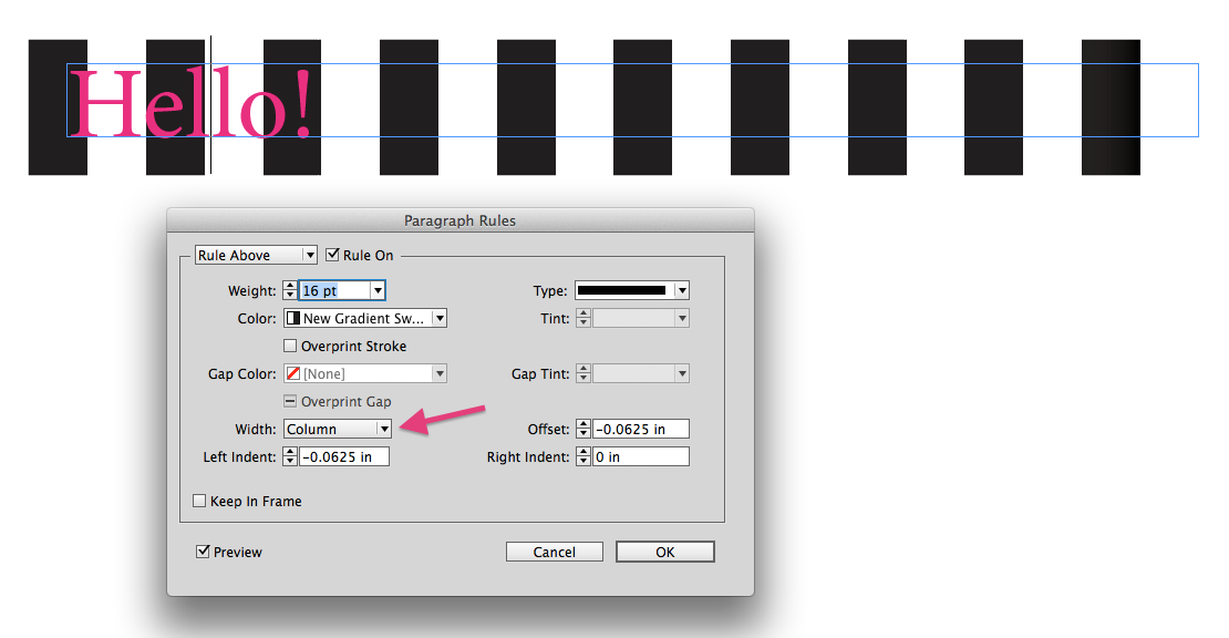
Paragraph Rule Applied To Column Width
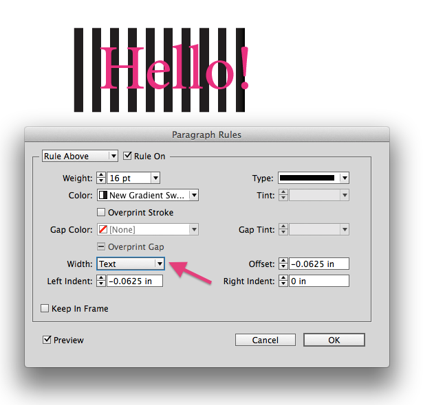
Paragraph Rule Applied To Text Width
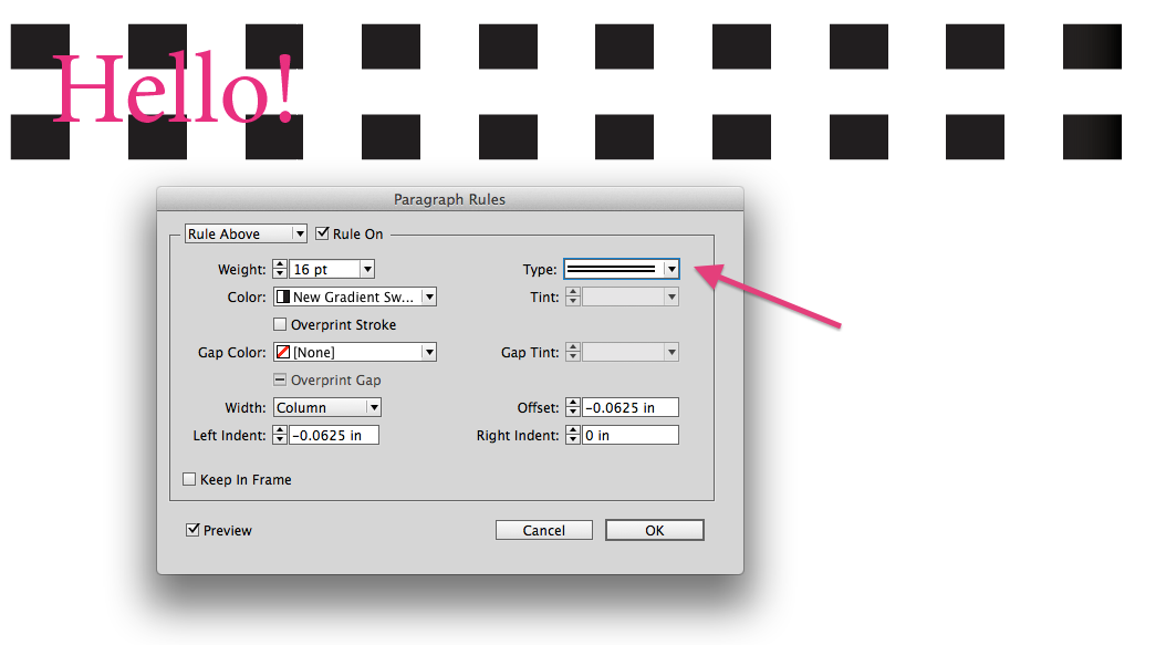
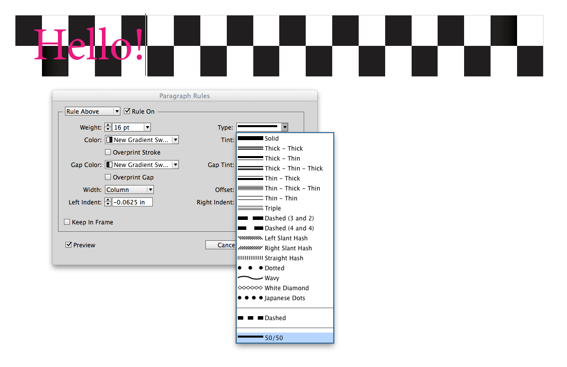
Change the Stroke Style Used in Your Paragraph Rule
By changing the Stroke Style of the Paragraph Rule (this example uses “Thick – Thick”), we can quickly see how this is moving toward the checkerboard effect we’re after. What we need next is a way to fill in the center area with our second gradient swatch.
Using Gap Color
By choosing our second gradient swatch (the reversed one) for the gap color, we instantly create a checkerboard pattern.
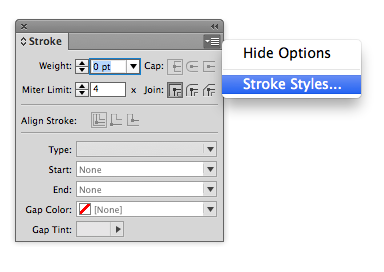
But what if you just want a stack of two checkerboards instead of three? No problem! You just need to make a custom Stroke Style that covers only 50% of the stripe width. Go to the Stroke Styles Panel flyout menu > Stroke Styles.
Create a new Stroke Style with the following settings: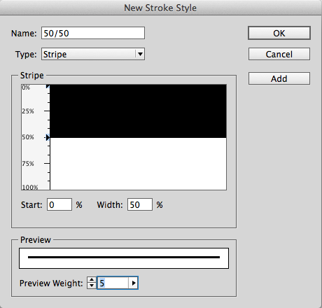
Now go back to your Paragraph Rules and choose the new Stroke Style you just made.
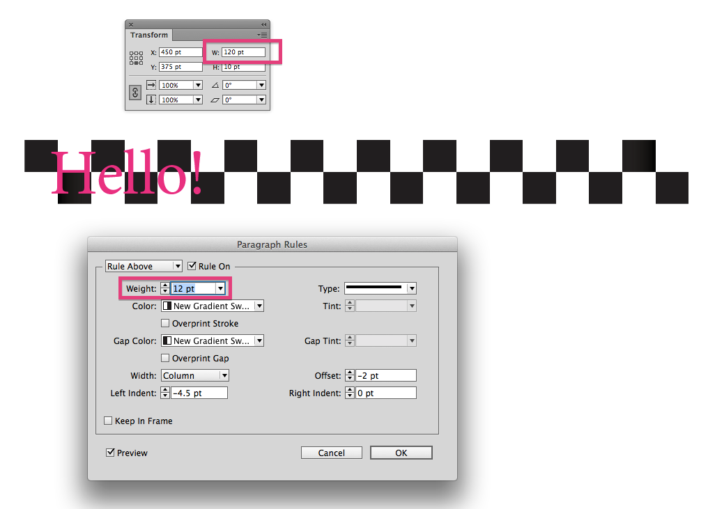
Making Perfect Squares in the Checkerboard Pattern
You may notice that the rectangles in the checkerboard aren’t perfectly square. To make them square, you’ll need to adjust the measurements of your text frame and the point size of the paragraph rule, so that the point size of the paragraph rule is evenly divisible by the width of the text frame. In my case, I made the text frame 120 points wide and the paragraph rule 12 points thick.
Changing the Color of the Checkerboard
So now comes the inevitable dilemma: you spent all this time creating the gradient (which was no small task) and now your boss/client wants to change the color. Here’s how.
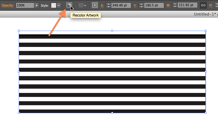
- Apply the gradient to a line.
- Copy and paste it into a new Illustrator document.
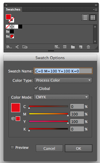
- Delete all the default swatches and create a new Color Group with a single swatch. (Bonus tip: make the new color swatch a Global Color for easier editing down the road).
- Select your gradient line and choose Recolor Artwork.
- Choose the “1 color job” preset.
- Choose Library: Document Swatches
3. Create a new Color Group with a Single Swatch
4. Recolor Artwork

5. Recolor Preset: 1 Color Job

6. Color Library: Document Swatches
Voilà! A red and white striped gradient that didn’t take 15 minutes to create! 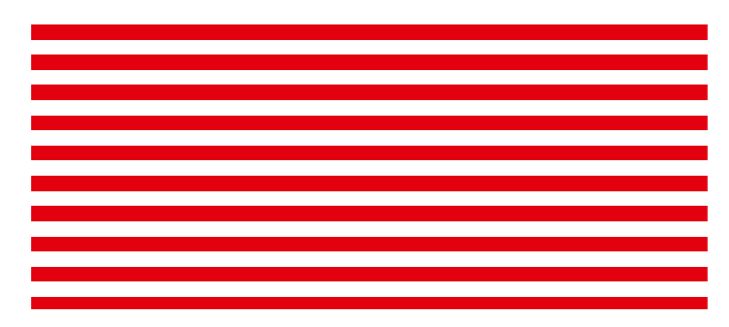
Copy and paste the object back into InDesign. When you do this, InDesign automatically adds a new red and white gradient swatch to your Swatches panel. Next you’ll need to reverse it in order to get the second version of the swatch that you need. Once you’ve reversed the gradient (using the Gradient panel) add the new gradient to your Swatch panel.
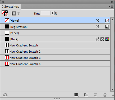
4 Gradient Swatches in InDesign
Now go back to your paragraph rule and apply the new red and white gradients to your rule and gap colors.

The final step to make the effect complete is to apply the appropriate font and color to the typeface.

Because the checkerboard is an actual paragraph rule, it can be included as part of a paragraph style, and the checkerboard will always reflow along with the text.
Premium Member Bonus
If you’re currently logged in to InDesignSecrets.com as a Premium member, a link appears below for you to download a snippet file of the checkerboard rule.
Enjoy!
Click here to download a snippet file of the checkerboard rule. Premium members, please log in at the top of the page, or become a premium member of InDesignSecrets.
This article was last modified on July 8, 2021
This article was first published on December 3, 2015
Commenting is easier and faster when you're logged in!

Recommended for you

Adjusting Word Spacing in InDesign
Robbie S wrote: Here’s a problem for you: I know there are keyboard comman...

Reshaping Objects
You don't have to limit your designs to use just the few basic shapes you can dr...
Free InDesign and InCopy CS3 Trials Available
Adobe just made free trials available for all their web and design Creative Suit...