
How to Build a 3D Object in Illustrator
Learn how to apply materials and lighting to a simple vector drawing to make a realistic 3D object in Adobe Illustrator

This article appears in Issue 26 of CreativePro Magazine.
 In this tutorial, I’ll show you how to build a 3D object in Illustrator. Specifically, we’ll be building a font. Not the sort of font we typically talk about at CreativePro—this is the kind you’d get baptized in. Making a realistic 3D object is a job you might previously have done in Photoshop, before the 3D features were discontinued. Now, we can turn to Illustrator to achieve the same task. Illustrator’s 3D tools are still in the early stages of development. At the moment you can’t combine more than one object into a 3D construct. Nor can you apply different materials to different parts of an object. So here’s a demonstration of what can be achieved with the limited toolset available.
The Background Image
We begin with a photograph I took of an altar in a church in France. That empty space at the front is crying out for an additional ecclesiastical element. 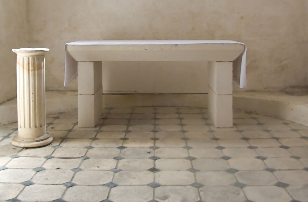
Start with an Outline
Use the Pen tool (or the Pencil tool, if you prefer) to draw the profile of the font. You don’t need to worry about getting it exactly right, as you can always modify the profile later, once it has been turned into a 3D object. 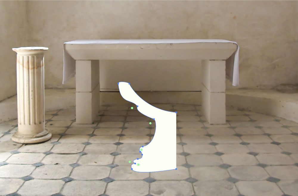
Into 3D
Choose Effect > 3D and Materials > Revolve to spin the profile around the vertical axis. By default, Illustrator will rotate around the left edge; so if you’ve drawn the left profile, as I have, change this in the 3D panel to offset it from the right edge. 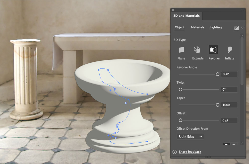
Choose a Material
Illustrator ships with a number of materials, including fabrics,
metals, and fantasy designs. But there’s no built-in marble. So click the Find More Materials button to open the Substance 3D web page. 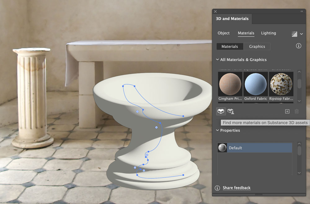
Find a New Material
The website substance3d.adobe.com contains a huge range of materials. Search for Marble, and you’ll find four free materials, all from SBSAR & SBS. I chose Skyros Marble as the one that best matched the subject. As long as you’re logged in, you can just click to download it. 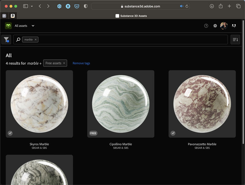
Load the Material
Back in Illustrator, click the + icon in the 3D panel and load the file you just downloaded. Here it is applied to the model: It’s a close but not perfect match for the background textures. 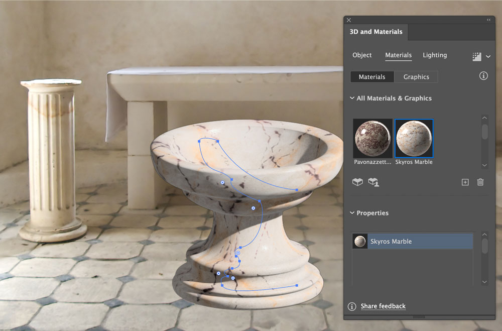
Fix the Perspective
The perspective of the 3D model needs to match the background. This is easily achieved: scroll down to the Perspective slider in the 3D panel, and drag it until the model looks right. In this case, a setting of 50° works well. 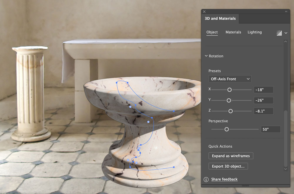
Fix the Lighting
The background is lit from the left, as can be clearly seen on the short column. To match the model’s lighting to the scene, click on the Lighting tab in the 3D panel, and drag the representation of the light to the left. Click the color swatch to change the light color from pure white to a low-saturation orange, to better match the background. 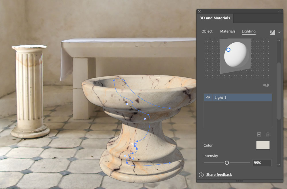
Adjust the Material
One of the benefits of Substance materials is that you can adjust any of the parameters. Here, we’ll change the dark purple veins in the original to match the background scene. Click on the Veins Color swatch to open the Color Picker. There’s no eyedropper facility here, so you have to pick the color manually. Choose a color close to the background and click OK. 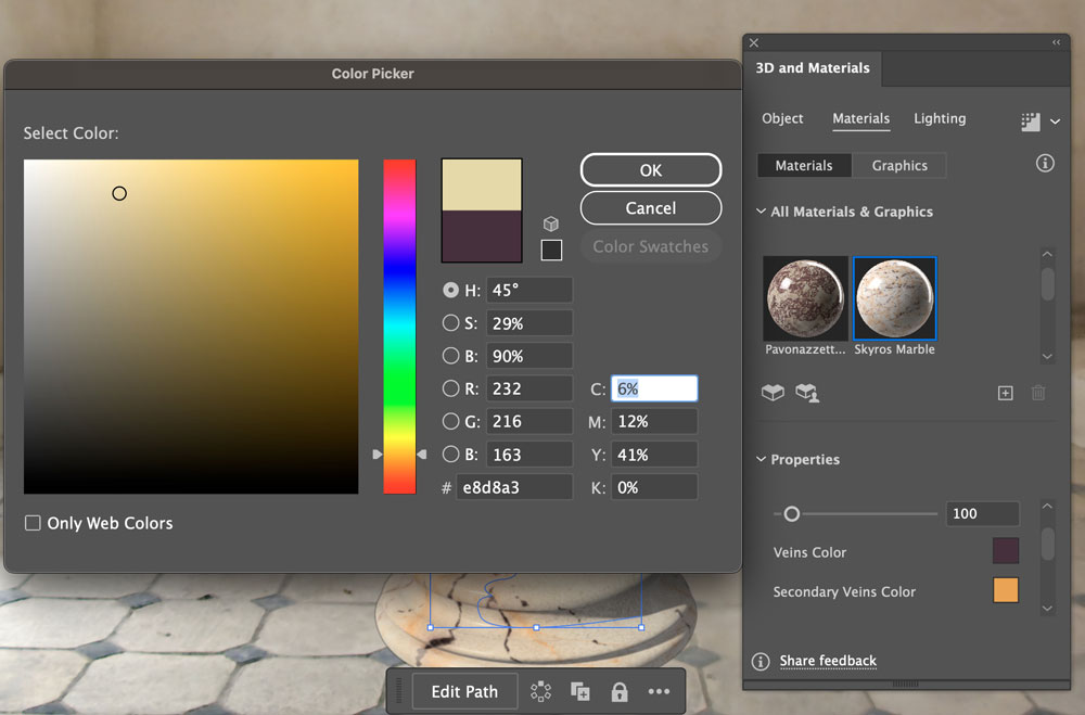
The New Color in Place
The veins haven’t disappeared entirely, but the color is a much closer match for the scene. The orange secondary veins are good as they are, as they match the orange on the top of the short pillar. 
Back to the Lighting
Now that the color of the font material is correct, we can have another look at the lighting. Reducing the intensity of the main light matches the lighting on the altar, rather than the column (which is in direct light from the window). The column also has a highlight on the right, so here I’ve added a new side light, at low intensity, to bounce a little light off that side. 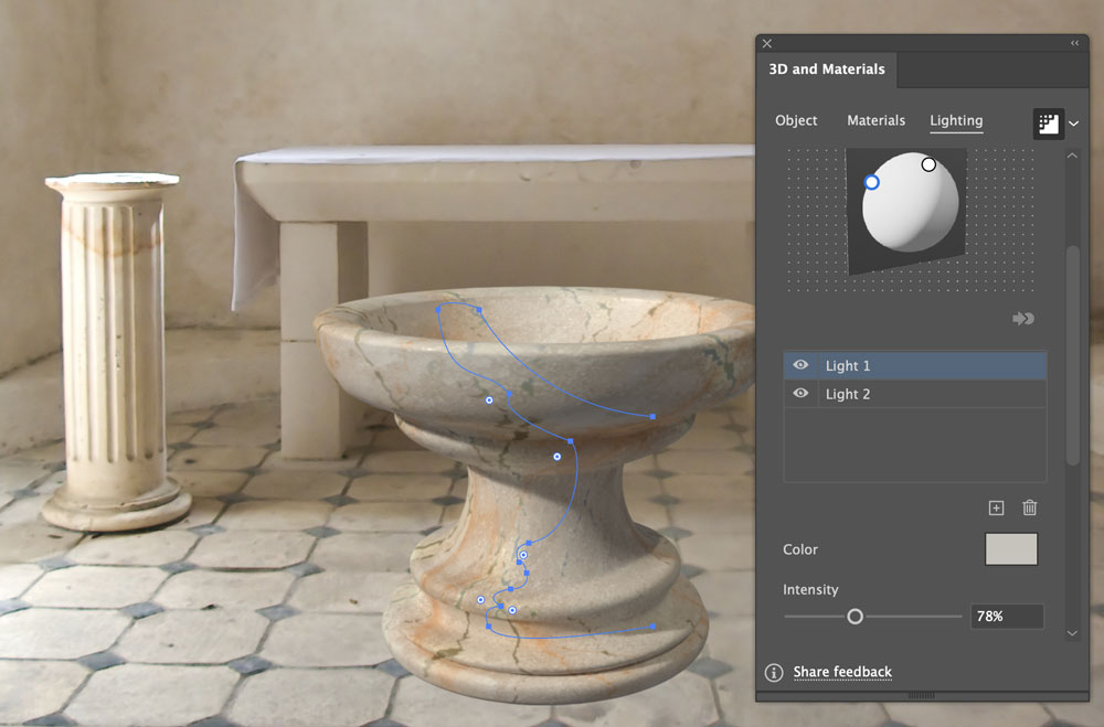
Add Some Shadows
Illustrator can generate shadows automatically, by clicking the Shadows toggle at the bottom of the Lighting section of the 3D panel. But it’s a very hit-and-miss effect, and often – as seen here – gets it completely wrong. The solution is to turn off the effect, and make the shadows manually. 
Start to Draw the Shadow
Use the Pen tool to draw a rough shape that approximates the shadow that would be cast. It’s not important to match it exactly. 
Apply a Gradient
Change the solid color of the new shadow for a gradient – the standard black-to-white is a good starting point. 
Change the Gradient Colors
Click on the black point in the gradient to open the Color Picker, and choose a very dark brown. Pure black will look too monochromatic as a shadow. Copy this setting to the other end of the gradient – the one that’s currently white. 
Change the Gradient Opacity
Click on the right-hand end of the gradient, and change the Opacity to zero. Now the gradient will fade smoothly with distance from the object. 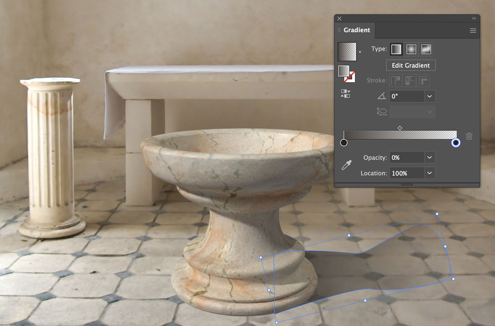
Add some Blur
Choose Effect > Blur > Gaussian Blur, and increase the Radius until the shadow looks right. In this case, a 10 pixel blur works well. 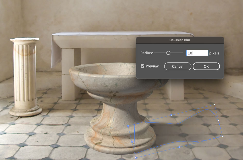
Duplicate the Shadow
Drag a copy of the shadow to the other side, and rotate it to come from the other light source – as you can see on the short column. 
Add a Final Shadow
As a final step, draw a black-filled ellipse and move it below the font. Then add some Gaussian Blur and lower the opacity to make the ground shadow beneath the font. 
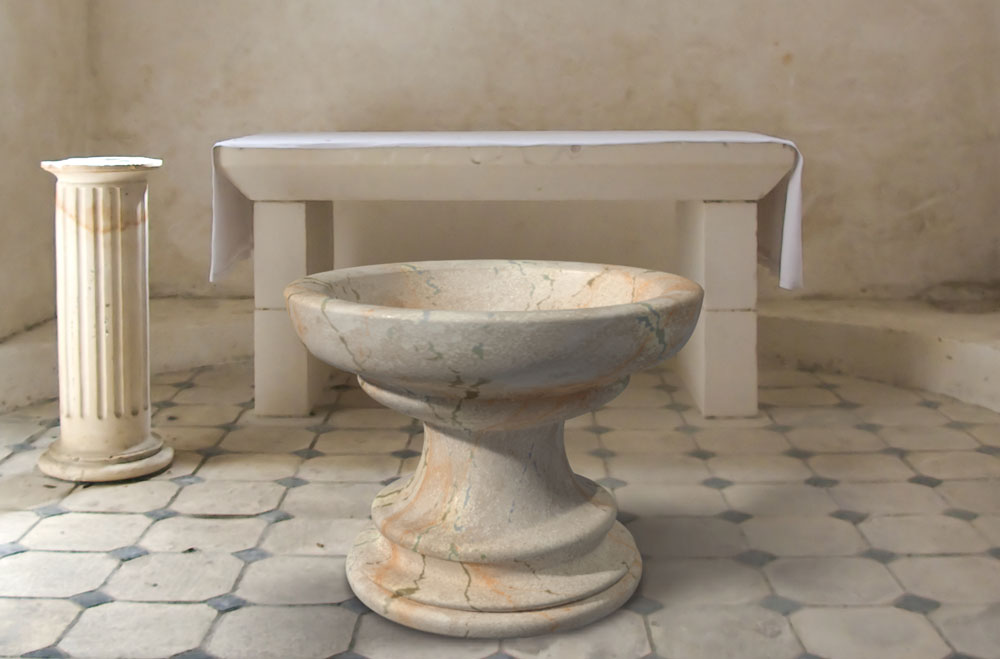
The Final Artwork
Here’s the completed image. The font looks like it could really be in place in front of the altar.
Commenting is easier and faster when you're logged in!

Recommended for you

How to Create 3D Objects Quickly in Illustrator
See how easy it is to create great looking 3D objects in Illustrator quickly. Us...
New 3D Tools for Designers
Adobe is making 3D easier for graphic designers, and you can do it, too!

How to Make a Solid Gold Ring With Photoshop
When a Welsh friend wanted to propose to his girlfriend, he thought it would be...