
How to Be a Better Designer: Learn About Type
Not everyone who knows about type is a good designer, but all good designers know about type.


This article appears in Issue 42 of CreativePro Magazine.
It’s all about the type. Or, as James Carville might have said, it’s the typography, stupid.
Type is the foundation for all good graphic design, and if the type is poor, the design fails, regardless of its other merits. Type sends a message, whether it’s conscious or not. Treat it with respect, and you enhance legibility, facilitate readability, and ensure that the content is understood in the way that is intended.
Poor typography, on the other hand, can confuse, distract, frustrate, and unintentionally amuse. And worst of all, it looks like you just don’t care.
Of course, other elements—the images, the texture of the paper, the combination of colors, the folds, the size and format—all contribute to a project’s success, but type is the foundation upon which everything is built.
If the type looks like an afterthought, even the most stunning design will fail—just like next-level special effects can’t save a bad action movie from a script written by the director’s brother-in-law on a budget of $50.
No Bad Fonts
These days, everyone knows a thing or two about fonts, and everyone seems ready to weigh in with opinions on “bad” fonts, with Comic Sans and Papyrus being the obvious punching bags.
Harmless fun, perhaps, and examples of either used by government agencies or scientific reports are worthy of derision (Figure 1), but these putdowns belie the fact that there are no bad fonts—just fonts used badly. Deployed in the right context, any font, no matter how childish, or froufrou, can be effective.
Figure 1. There’s nothing wrong with a bit of Comic Sans… but in the right context.
As the designer of Comic Sans, Vincent Connare, says of his creation, “If you love it, you don’t know much about typography [but if] you hate it, you really don’t know much about typography, either, and you should get another hobby.”
Thankfully, even though everyone’s a typographer, it doesn’t take much to set yourself aside from the crowd. When it comes to improving the quality of your work, making it bulletproof through the application of typographic best practices is the biggest return on your investment of time and money you can get.
There are many good books and learning resources about typography, and you can make the transition from neophyte to practitioner within a few months and at a cost of under $100. In doing so, you rise a whole division in the design league rankings. Figure 2 shows three popular texts.
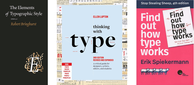
Figure 2. Three classics that belong on every graphic designer’s bookshelf
It’s Mainly Common Sense
The rules of typography are mostly logical, mostly consistent, and easy to abide by.
Making informed choices about leading, kerning, tracking, font selection, and alignment isn’t rocket science, and the payback is instant in the discernible improvement in the look of your work. Beyond these easy-to-grasp mechanics, a graphic designer should also be well-versed in such concepts as contrast, alignment, hierarchy, and differentiation and how they relate to type.
They should also know the story of type: Where did all these different styles of letters come from, who made them, and why do they look the way they do? How are they classified? To communicate meaningfully and unambiguously about type, a designer should be familiar with its nomenclature.
All in all, it’s a study that requires a degree of pedantry about small and fussy details (Figures 3–6), like using the right dash, knowing the difference between a humanist and geometric sans, and when to use optical rather metrics kerning, as well as an encompassing view of the bigger picture. It’s the little things—and it’s the big things, too.

Figure 3. Know your leading… indicated here by the red strips between the lines. The total leading is measured from the baseline of one line to the baseline of the next.
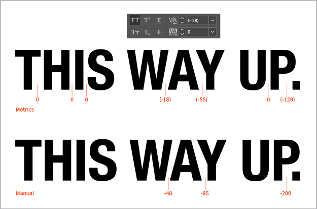
Figure 4. …and know your kerning
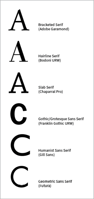
Figure 5. …and be able to identify different classes of type

Figure 6. …and be a pedant about dashes and spaces
Geeky it may be, typography is also a fascinating and compulsive study. Letters are everywhere, and if you nurture a curiosity about why printers and designers have used them how they did—as well as how they might have used them differently—you’ll never be bored waiting for a bus or a train. And like every craft or discipline with a centuries-old pedigree, there’s depth and variety, lots of color, and a whiff of intrigue. (Check out the story of The Doves Type.)
There’s plenty to keep you busy over a lifetime. Just keep your perspective, and don’t let the bad letterspacing on the restaurant menu spoil your meal (Figure 7).

Figure 7. The food was great—despite the letterspacing.
There may come a time when the rules feel too constraining, and if that time comes, your ongoing challenge will be to break them effectively—conveying your awareness of convention and your conscious decision to toss it out the window. Art director and graphic designer David Carson’s famous statement that you should not confuse legibility and communication is a sobering warning about focusing too much on the rules at the expense of the bigger picture (Figures 8 and 9).
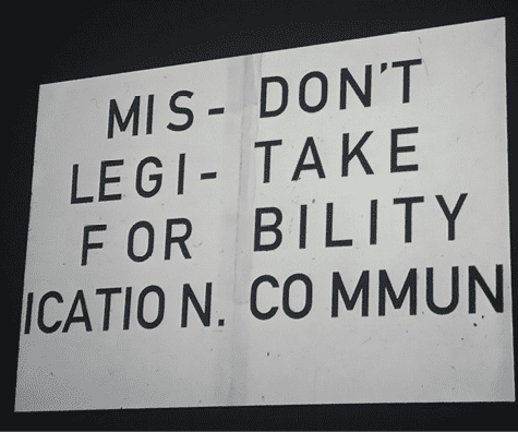
Figure 8. David Carson: “Just because something is legible doesn’t mean it communicates and, more importantly, doesn’t mean it communicates the right thing.”
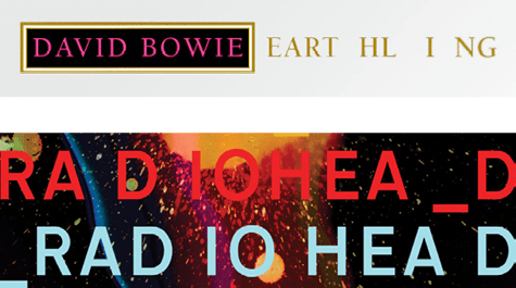
Figure 9. Sometimes, normal rules don’t apply.
Follow the rules, and you dodge the banana skins. But avoiding a bad design does not guarantee a successful design. (We’ll talk more about rule breaking in a later installment.)
For now, whether you’re playing by the rules or burning the rulebook, the mantra of “keep it simple” applies equally. This is woven into all aspects of design, but it is never more important than when it comes to type.
It’s often said that you shouldn’t use too many fonts. Many of us have heard—perhaps even given—the advice, “No more than three fonts per page.” It’s not a bad starting point, but it’s too proscriptive for a guiding principle. Learn the conventions of type, combine them with a dose of common sense, and you won’t need to rely on such oversimplifications.
You will inevitably and instinctively gravitate to simpler designs because they communicate more effectively, while at the same time acknowledging that you will sometimes find that simplicity doesn’t cut it, when you need a medley or even a cacophony of styles—and more than three fonts on your page (Figure 10).

Figure 10. Thankfully, the Victorian printer responsible for this wonderful circus poster didn’t get the memo about no more than three fonts per page.
Another piece of common wisdom is that it’s better to know a handful of fonts well than to have a mile-long font list with which you’re barely on speaking terms. This is the typographic equivalent of it being better to have a few good friends than lots of casual acquaintances. And if you are forced to choose between these two extremes of knowing a few really well and many hardly at all, then it’s true.
Build upon a foundation of a few trusty stalwarts—an elegant but hardworking serif and sans serif family, a friendly script, a utilitarian monospace. Over time you can broaden your palette and explore more niche typographic options—after all, you can’t have too many good friends.
Simply put: You can’t be an effective graphic designer if your typography is poor. And while not everyone who knows about type is a good designer, all good designers know about type.
Commenting is easier and faster when you're logged in!

Recommended for you

How to Be a Better Graphic Designer: Keep It Simple
In a world that shouts, the voice we truly hear is the one that speaks with calm...

How to Be a Better Designer: Know Your Colors
To use color effectively, you have to be intentional, grasp the different color...

How to Be a Better Designer: Step Away from the Computer!
Look away from the screen to find yourself as a designer