
A number of designers have contacted me wondering how to achieve the “retro” colors and look of letterpress and other vintage printing methods using modern desktop tools. While theoretically in a program like Photoshop you ought to be able to reproduce all possible colors and effects, the answer is pretty much “you can’t.”
A good designer can certainly simulate qualities of any printing method using computer technology, and I’ve seen some very well done graphic tributes to the past. But seeing them always feels like watching Woody Allen’s movie “Zelig” — no matter how much he scratches the film and makes it flicker, you’re not convinced. Our current desktop technology does everything perfectly. We’re even getting close to having perfect color matching. But just as many musicians have learned they must return to old instruments and recording methods to get an old sound, designers have to return to old printing methods to get old looks. And sadly, in many cases, it may be too late for some methods of yore.
The good news is, most of the actual printing processes can still be had in the marketplace — there’s enough demand for letterpress these days to support a small industry, and other printing methods and equipment have a way of hanging around well past their prime. But the “look” that most designers are striving for goes way beyond the press and involves the state of ink manufacturing, papermaking, photography, engraving, and a number of other factors present at any single point in history. Those qualities are much harder to reproduce-in some cases environmental regulations alone have rendered many production methods impractical.
To better understand why a San Francisco postcard from 1938 looks the way it does (see Figure 1), or a 1949 issue of “Popular Mechanics” has such unique halftones (see Figure 2), you have to get into a little detail about each process. So here’s a primer on the three major historical methods of printing (relief, intaglio and planographic), all of which are still in widespread use today in one form or another.
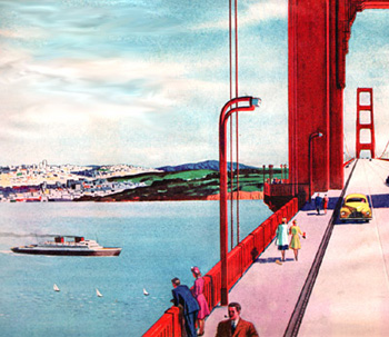
Figure 1: The Golden Gate Bridge was never gold, and in this 1938 letterpress illustration it is an unusually bright red.

Figure 2: In 1948, the color illustration of a workshop has a color quality that would be hard to reproduce today.
The Sticky-Outy Method: Relief Printing
This is one of the oldest methods of putting ink on paper, and includes wood-block printing, letterpress, and flexography. The matter to be printed is raised on a surface, ink is applied, and an impression is made against the print material — just like a rubber stamp only faster and with more accuracy.
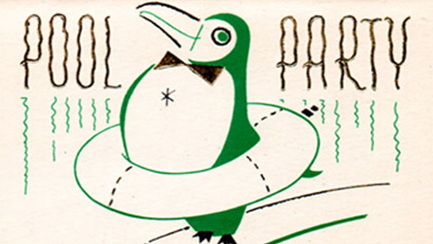
Relief printing allows a pretty heavy lay down of ink — more than offset but less than gravure. This makes solid-color areas more dense (see Figure 3), but also makes it harder to achieve subtle transitions in halftones, and tends to exaggerate colors (see Figure 4).

Figure 3: Relief printing methods allow for bold, opaque colors, but can also hold good detail.

Figure 4: Halftones etched in metal tend to exaggerate colors and contrast, but make for some interesting results.
The method by which halftones are made is an important part of the equation — early color separations were done mechanically by shooting photographs through colored lenses and glass screens. Variation in film, processing, camera-type, operator skill, and any number of other factors could change the results. And many of the color photographs printed in the early half of the century were hand-tinted or color plates were fabricated and laid over black and white photographs to achieve the look of full color (see Figure 5).

Figure 5: Due to the cost of full-color reproduction, many companies, like the Royalchrome furniture company, used two and three-color overlays, as shown in this 1935 letterpress catalog.
Flexography, which is also a form of relief printing, takes the letterpress concept of raised printing surfaces a step further by making a rubber or flexible plate. This makes printing on uneven or difficult surfaces much easier, and allows for the use of faster-drying inks. Flexography is used extensively in the packaging industry, and as quality has improved, in newspaper and other roll-fed printing (see Figure 6). In the early days, this process was called aniline printing — the term flexography was chosen after an industry-wide naming contest in 1952. Because of the softness of the rubber, early flexo presses tended to reproduce poor halftones and small type (see Figure 7).

Figure 6: Flexographic printing is used extensively in the packaging industry and can hold decent quality even on poor paper and cardboard surfaces.

Figure 7: Because of the softness of the rubber plates, flexographic printing can cover uneven surfaces, but it is difficult to hold fine detail.
The Sticky-Inny Method: Intaglio
With intaglio printing processes (the best known is Gravure), the image to be printed is etched out of the plate, making all of the ink surfaces recessed (the exact opposite of relief printing). The depth of the recess determines the tonal gradation for that color. Ink is applied to the entire plate, then essentially wiped off by a blade or other method, leaving ink only in the lower areas. This plate is then pressed against the paper, which draws the ink out of the recessed areas and creates an opposite image. This inkwell approach allows for thicker ink application, so blacks tend to be much denser with intaglio methods (see Figure 8).

Figure 8: Gravure printing has the highest density ink coverage and is popular today for use in advertising inserts and catalogs.
Partly because of the set-up costs, gravure printing makes the most sense on high-speed, long runs. It is popular for catalogs, newspaper inserts, and other advertising printing, partly because the inking process allows for images that look more continuous tone (see Figure 9). But because even solid type needs to be screened in the gravure process (otherwise too much ink would build up in the recess) early presses did a poor job at small type sizes or type reversed out of black.

Figure 9: The bright colors and high saturation possible with gravure printing made it the method of choice for promoting brands like Disneyland, shown here.
The other intaglio method most designers will be familiar with is steel-die engraving, often referred to simply as “engraving.” In this process, which is used for high-quality letterheads, invitations, and certificates, a plate is etched in metal, ink is applied to the recesses, and when the plate is smashed against the paper, it transfers the ink and raises the paper slightly at the same time. High-quality engravings have multiple levels of raised area, depending on the thickness of the line or other artistic factors (see Figure 10)

Figure 10: Steel-die engraving is at the top of the printing mountain for important events like the inauguration of a president.
Engraving inks are very opaque, so it is possible to print on colored surfaces without show-through, and in good hands the process can easily handle fine detail and small type sizes. Since there is no halftone process in steel-die engraving, tone has to be simulated through line work. (see Figure 11). Engraving can also be done with metallic inks, and is often accompanied by foil stamping (see Figure 12). Don’t be confused with thermography, however, which simulates raised engraved surfaces through a chemical process.
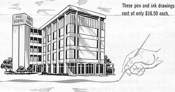
Figure 11: In 1970 the East Texas Engraving Company (which is still in business in Tyler) would turn your photograph into a line drawing suitable for engraving for only $16.50.

Figure 12: The combination of engraving and foil stamping is popular in the greeting card industry and for high-impact correspondance.
The World-is-Flat Method: Planographic Printing
I’m not going to cover this in any depth, because it’s the process most people are familiar with. Correctly called offset lithography, this process uses a plate that has neither raised nor lowered surfaces. With origins back to the early use of litho stones, this method of printing relies on the basic principal that water and oil don’t mix. Surfaces of the plate are chemically treated to either attract ink (the imaged areas) or repel it (the blank areas). And instead of direct contact with the paper, offset lithography uses a rubber transfer blanket as an intermediary step.
Offset printing allows for very fine halftones, it’s typically cheaper, especially for shorter runs, but it doesn’t allow for ink coverage as dense as gravure, and it’s a bit harder to achieve consistency throughout a press run. Trying to get a gravure or letterpress “look” with offset would involve some fancy presswork.
Methods Still to Come or to be Revived
It may not be too long before designers are trying to recreate that great old offset look, which in some cases will be superior to new methods, at least until on-demand printing improves in quality. As toner-based and inkjet presses become more common, we’re already seeing an entirely new look to printed material. These methods have created a fourth major printing category where the plate is essentially eliminated or reused at high speeds-most folks are calling this “non-impact” printing. There are both limits and advantages to these new methods, but there is no mistaking them for the more traditional ones.
There are a number of secondary printing methods, like screen printing (see Figure 13), letterset (a combination of letterpress and offset), and collotype (using dyes that achieve a continuous-tone image). Each of these methods has a unique look that can’t be measured with a spectrophotometer. And each is suited to a particular style of design.

Figure 13: The screen printing process has changed little over the years and this 1937 Christmas card could easily be reproduced by simple means today.
I like the fact that every new development has eventually gotten us closer to perfect, accurate color reproduction. I see printed material now that looks much better than real life. But personally, I prefer the exaggerated colors, illustration-like photos and simple duotones in the 1949 edition of “Popular Mechanics” to the near-perfect issue on the newsstand today. As with all our media, we’ve taken out the element of imagination.
Read more by Gene Gable.
This article was last modified on March 2, 2021
This article was first published on September 4, 2003
Commenting is easier and faster when you're logged in!

Recommended for you

Fast Formatting with Nested Styles in InDesign
Learn how to format a column of classified ads with a nested style.

InDesign GREP of the Month: \x (Unicode)
Target any range of characters: Hebrew or Hirigana, Cherokee or currency, Devana...

Scanning Around with Gene: Giving Until It Hurts (to Bring in the Mail)
I sincerely appreciate the many comments regarding last week’s post about...