
Between the era of hot metal and digital, we had a brief period of phototypesetting that everyone referred to as “cold type.” In context, this term referred to the fact that the process of creating type did not require heat, other than perhaps the small amount needed to warm up the processing chemicals. But I’ve always considered the term “cold type” to have dual meaning, and one of them is still near and dear to me today.
You see, I have to confess to being a compulsive ice chewer, a malady that apparently affects up to 20 percent of the population. I’m not sure if it’s because of this addiction or just a general interest in corny typefaces, but I’ve always had a soft spot in my heart for typefaces that are “frosted” or “chilled’ or “iced.” When you spend as much time as I do perusing the freezer section of local liquor stores and markets, you get to know this cold type very well. I can’t think of any phenomenon that more regularly deploys decorative typefaces as a visual element than that of things cold or frozen.

On the West Coast of the United States, you’ll see lots of these machines from Glacier Ice Company, with distinctive blue, red and white signage and the slogan “I only have ice for you.”
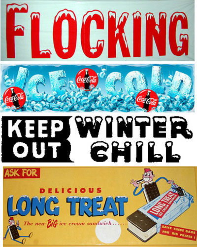
Brrrr. A recent trip to the county fair found these examples of cold type.
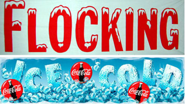
Sure, you’ll sometimes see an occasional flaming typeface to connote heat, or a slanted typestyle that says “windy,” or shaky baselines for the world “earthquake.” But it seems that nearly every time you see the words “ice” or “chilled” or “air conditioned,” the lettering is decorated with snowcaps or icicles. Now that winter is here, the sign makers, package designers, and freelance window-painters are dusting off their best ice fonts.
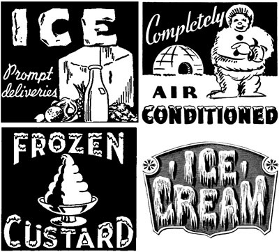
Four examples of early advertising art for things cold and icy.
A Pibble by any Other Name
Most type foundries refer to these cartoonish fonts as “decorative,” and lump them together in the novelty area of their catalog. You can find many examples available today with names like Snocap, Snowgoose, and Brrrr. Snobbish typesetters often consider these fonts as amateurish and somehow crass — the same way they look at people setting things in all-cap script, or using Old English for a wedding announcement. Too obvious or too ugly. But I’ve always coveted them, and use them whenever I can find an excuse.
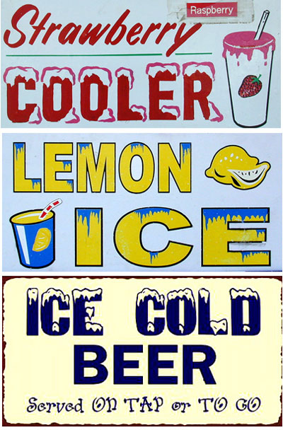
Baby, it’s cold outside. Four examples of ice type.
Many years ago while researching an article of type terms for “U&lc” magazine, I came across a reference which named typesetting that visually conveyed a specific emotion or state (cold, hot, funny, sad, scary, etc.) as “pibble.” I can no longer cite the reference, and a Google or Dictionary.com search of “pibble” only turns up my original article or any number of references to pet names. Clearly that is not a name that stuck, and in my mind not a very good word anyway.
But I think this art form deserves a name, and I’d love to get some nominations.
You’re As Cold as Ice
One term I can verify, is the word “pagophagia, “which is the medical description for the compulsive eating of ice. Interestingly to those of us in the graphic arts, pagophagia is classified as a “pica,” which are any number of eating disorders involving the compulsive consumption of non-food items (dirt, grass, sewing needles, etc.). These cravings are thought to be caused by the lack of iron or other minerals, and are particularly common among pregnant women and children.
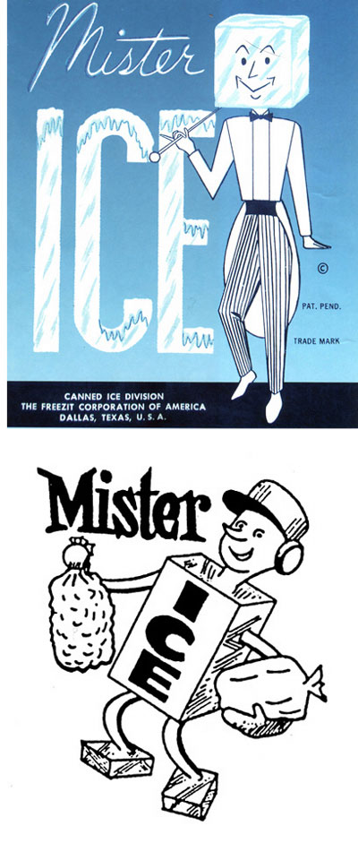
Several companies have gone by the name Mister Ice over the years, and until recently, none of them were rappers.
But for me, chewing ice and eating Sno-Cones has consumed me for as long as I can remember, even during periods where I’ve supplemented my diet with vitamins and minerals. My dentist told me this habit has ruined my teeth, and my wife tells me it has ruined our relationship, but no matter how hard I try, I can’t stop. When I go to a fast-food restaurant or movie theater, I ask for “extra ice” in my soda. At home I often “pour” myself a big glass of ice with no liquid to accompany it. And the guy at the local corner market thinks I’m a complete nut, often buying 10 or 15 children’s Sno-Cones at a time.
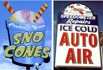
A Sno-Cone shop sign from the Web site roadsidephotos.com., and a Dayton, Ohio auto repair shop.
There is some consolation in knowing I’m not alone. At parties or dinners, I often spot fellow ice chewers trying to hide their habit by crunching as quietly as possible, only to get caught with a mouthful of ice at an inappropriate moment. The cold sometimes numbs the mouth enough to hide the taste of food, and when I think about my mother’s cooking that may explain my early childhood addiction.
If you are afflicted by the ice-chewing bug, and can identify your favorite brands of ice-making machines (crushed, hole-in-the-middle, crescent-shaped, etc.) then you may want to check in at icechewing.com, home of the Ice Chewers Forum.

Penguins and ice seem to go together. And don’t forget that not all ice comes as cubes — some are nuggets.
“Type that Speaks to Us”
We all know that the choice of a type style can make a big difference in the perception of a message. Car dealers and schlock retailers “scream” at us with type that is bold and loud. Chic eateries use letter-spaced, minimalist styles to describe their baby-endive salads and kiwi compotes. And government agencies struggle with finding type styles that say the least — stepping aside for the sake of readability and function.
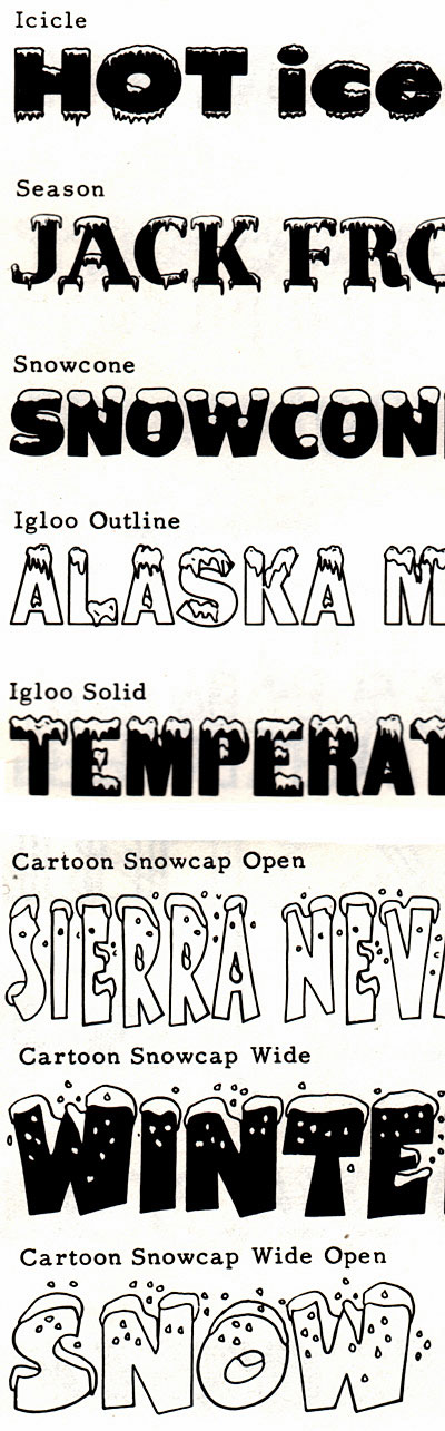
A roster of cold typestyles from the original Solotype catalog of the famous Berkeley typesetter.
I don’t really know if ice merchandisers sell more product when they typeset their logos and signage with white-capped lettering. On a hot day, does cold type make a bigger impact? Do people in the dead of winter really want a typeface to be remind them of how cold it is?
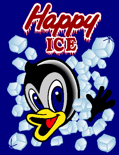
In New York, there’s a good chance you’ve run across Happy Ice, which is not only cold, but also smiling. They produce over 550 tons of packaged ice per day.

When you want more than cubes get brix of ice, just like the Eskimos. And they know a thing or two about ice.
It probably doesn’t matter all that much, but for me, any typestyle that conveys two literal messages — one verbal and one visual — is more interesting somehow, despite it being so obvious.
I just don’t think ice would taste as good if it came out of a machine or a bag where the contents were described in Helvetica or Palatino. Those faces just aren’t cold enough for the job.
Read more by Gene Gable.
This article was last modified on May 19, 2023
This article was first published on December 2, 2004
Commenting is easier and faster when you're logged in!

Recommended for you
Using Bleed for Print Design
Based on an article originally published in the DesignGeek e-zine. One of the fi...

Saul Bass, Master of the Movie Title Sequence
Mention movie titles to any designer in the know, and undoubtedly the name Saul...
How to Create Ring Charts in Illustrator
Learn an easy way to make a ring chart in Illustrator by using dynamic shapes an...