This article appears in
Issue 54 of InDesign Magazine.
InDesign’s Paragraph Styles feature is the perfect tool for styling text, and the Nested Styles pane inside the Edit Paragraph Styles dialog box makes it easy to apply different character styles to specific locations inside a paragraph. But Nested Styles are limited in their ability to format text because they only look for sequential patterns of text. For example, a nested style can apply a character style to “the first five words,” or “up to and including the first punctuation,” or “up to a tab.” Nested styles fall flat when you want to apply formatting to characters that may appear anywhere in the paragraph.
Fortunately, InDesign provides a terrific alternative, called GREP Styles, which offers a far more powerful environment in which to style precise and definable patterns of characters. And yet despite their power, GREP styles represent one of the most underused features of InDesign. This is, to a large extent, because GREP is so impenetrable at first glance. (Read: it scares people off!) In this article I’m going to step you through the process of making a GREP style, and I think that you’ll see it’s not nearly as painful as you might expect, and that most of you will find it worth the ride.
What the heck is “GREP”?
GREP was invented in 1973 by the programmer Ken Thompson, for use with his text editor for the Unix platform. He used it to search for global uses of a regular expression, and then to print the results-hence the G|RE|P acronym. Some sources attribute the
acronym to “general regular expression parser.”
The challenge
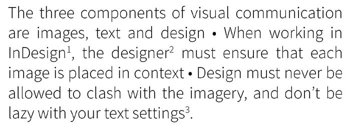
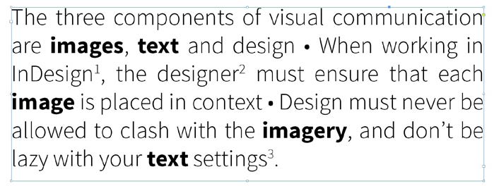
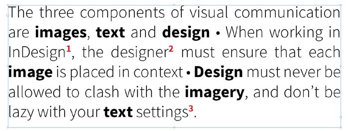
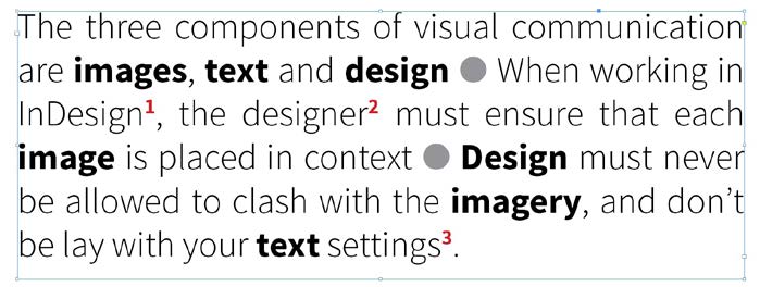
Below you’ll see the text we’re going to use. We want to make every instance of the key words image, text, and design be bold. In addition, let’s make this more visually interesting by changing those small bullets to much larger ones and setting all the superscript numbers in red. It should be straightforward enough, but as we’ll see, there are potential pitfalls along the way.
Start Grepping
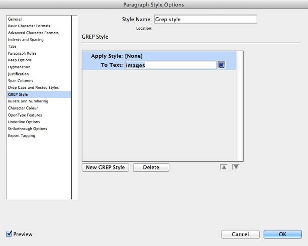
First, we need to define and apply a Paragraph Style for the text, assuming it doesn’t already have one. Then, in the Paragraph Style Options dialog box, click on GREP Style on the left, and then click the New GREP Style button at the bottom. The first word we want in bold is the word images, so click in the To Text field and type the word in here. So far, we’ll see no changes; we haven’t told it what style to apply yet.
Define a Character Style
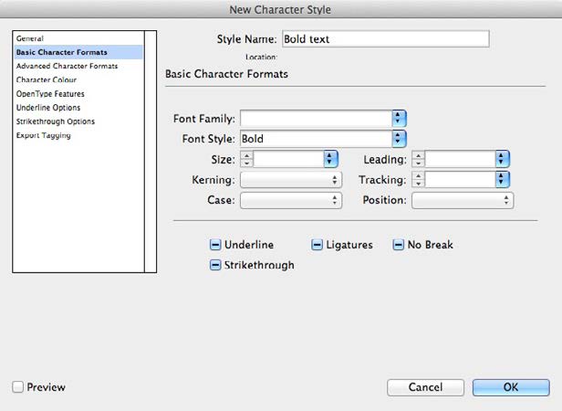
In the Apply Style box, a drop-down menu shows all the Character Styles currently in the document. There’s no need to create one in advance, though, since we can do it on the fly. Choose New Character Style from the list, and the Character Style dialog box will open. Now, in this instance we’re using Source Sans Pro as our text font, but that might change—and we don’t want to have to redefine the GREP style if that happens.
So rather than choosing a specific font, we just choose Bold as the weight. This will apply the bold version of whichever font is currently in use.
The result so far
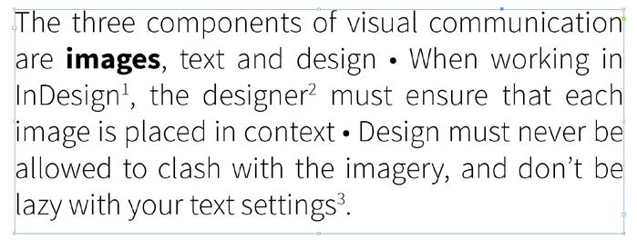
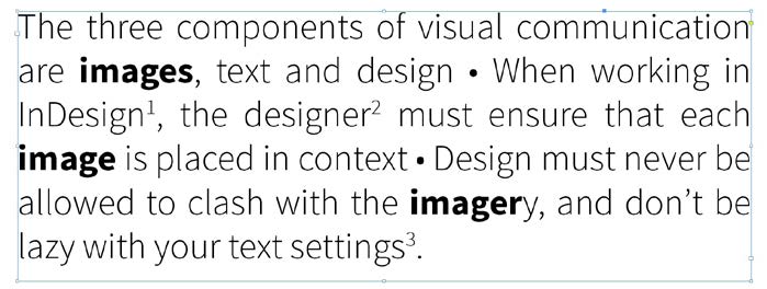
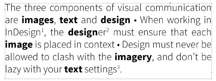
Here’s how the text looks now. In response to our directive, the word images is duly bolded. But, further down the text, the word image—in its singular version—is still unabashedly “roman.” How can we make that bold as well? We need to enable the GREP style to cope with variations of the key word.
Refine the instruction
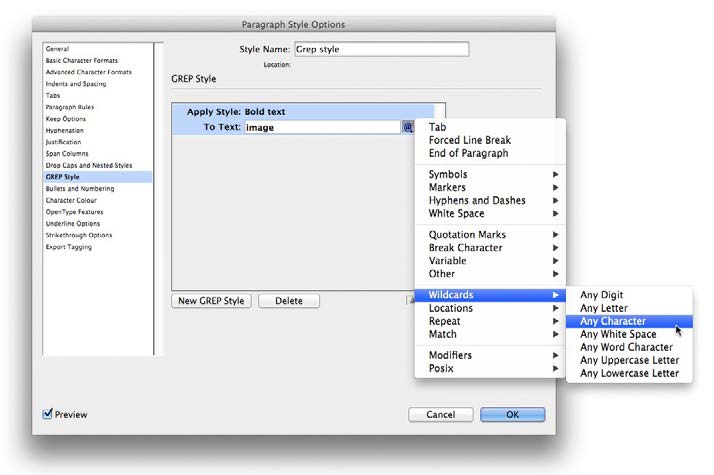
Let’s remove the plural, so the word searched for is image rather than images. The @ symbol that appears at the end of the To Text field is actually a nested menu. We can navigate through this to the Wildcards submenu, and choose Any Character. As with all GREP commands, this is replaced in the instruction by a shortcut-in this case, it’s a full stop. So the command now looks like this: To Text: image.
The plural works
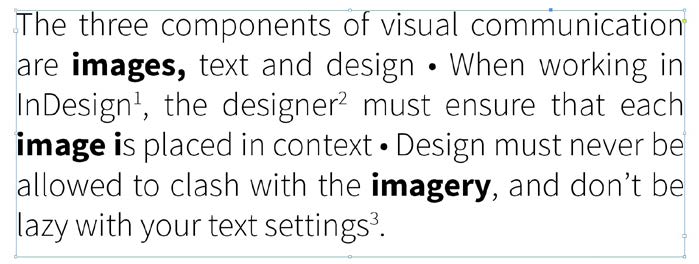
This is how the text now looks: both the words image and images have been made bold, since the wildcard allowed the GREP command to look forward one character. But there’s another problem: the word imagery is only partly highlighted. We need to define a GREP that will cope with a variable number of characters.
Variable variables
We can tell the GREP system to look for a variable number of characters after the word image by adding a code to specify that. This takes the form of the minimum and maximum number of characters placed within curly brackets. So the code now looks like this: To Text: image.{0,2} But as we can see, this produces a problem. While image, images, and imagery have now all been set in bold, the i after the word image is also bold.
Change the wildcard
Why did that happen? When we told InDesign to look for Any Character as its wildcard, this includes a space—so both the space and the i after it were made bold. We can fix this by changing Any Character to Any Word Character (also selectable from the Wildcard menu). The shortcut for this is \w, so the code now reads:
To Text: image\w{0,2} Now, the three words are set correctly.
Add the next word
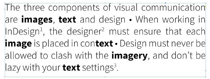
One GREP style can be applied to several different words; they’re separated by a vertical bar I with no space on either side. So to add the word text to the definition, the code reads like this: To Text: image\w{0,2}|text As we can see, though, the word context has also been picked up, with the text component set in bold. So back we go to the Style definition.
Set the position
In order to prevent InDesign from finding text when it’s in the middle of a word, we can tell it to apply the style only when text is the beginning of the word. We can do this by choosing Location > Beginning of Word, which abbreviates to the shortcut \>. Note that this shortcut must be placed before the word, rather than after it: To Text: image\w{0,2}|\<text The word is now correctly formatted, and context is left alone.
Have the final word
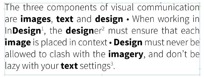
We can add the word design to the list, using the I character to separate it from the other words. This is how the code will read: To Text: image\w{0,2}|\<text|design A couple of problems appear. The word designer has been partially highlighted, and the second appearance of the word, after the bullet point, has been omitted, because it begins with a capital letter.
Modify the spec
To make the capital letter appear, we can choose Modifiers > Case Insensitive On, which places the code (?) before the word in question: To Text: image\w{0,2}|\<text|(?i)design Now, though, while Design has been picked up correctly, so has InDesign. D’OH! That’s the next thing to fix.
Start and finish the word
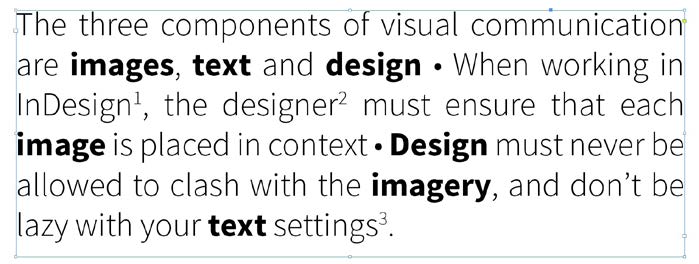
We can tell InDesign to pick up the word design only when it’s both the start and the finish of the word by choosing these options from the Location submenu. We can also type the codes in manually by placing \< before the word and \> after it: To Text: image\w{0,2}|\<text|\<(?i)design\> Now, all the words are set correctly.
Highlight the numbers
In this piece of text, three words are linked to footnotes by superscript numbers. To make them stand out, we can set them in red. To do this, we’ll need to create a new GREP style, using the button at the bottom of the panel. In the To Text field, we can choose Wildcards > Any Digit, which will use the shortcut \d:To Text: \d All we need to do next is to define a Character Style for the footnote, and it will be picked out in red.
Bite the bullets
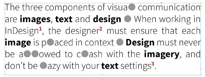
Rather than using full points, the setting of this text uses bullets for emphasis. These are the standard Option+8/Alt +8 bullets, and they’re small and mean. They’d look much better if, say, we used a Zapf Dingbats character, at a 50% tint so it’s not too strong. The letter l (that’s a lowercase L, not the number 1) will work well. To implement this, we first have to manually change each bullet in the text into a lowercase I.
But while we can define a new Character Style that sets the letter in Zapf Dingbats, obviously this would set every l in the document in that style, which would look ridiculous. One thing you can’t do with GREP styles is to tell them to change one character for another. (Anyone out there want to write a script?)
Add a custom code
To fix the problem, we can make custom code characters of our own. Let’s replace each bullet in the text not by I, but by Iz—the z standing for Zapf Dingbats. So now, we tell InDesign only to search for those two characters together: To Text: lz
Now, every l is left alone, and only the characters lz are changed to Zapf Dingbats. The question now is, how can we stop that z from showing up as a rectangular gray block?
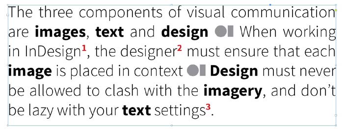
Find the hidden style
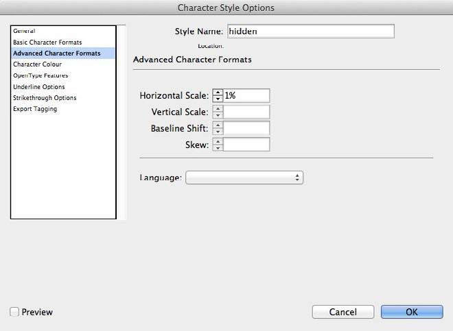
We can’t tell InDesign to ignore a character altogether, but we can define a Character Style that’s invisible. First, make a new Character Style, and set the Character Color to None. That’s a good start, but the character still takes up space, even if it’s invisible. So in the Advanced Character Formats pane, set the Horizontal Scale to its minimum value of 1%. Now, the character will take up virtually no space.
Define a hidden GREP
We’ll need to make a new GREP style to apply to the letter z. It’s straightforward enough: we simply apply the style Hidden (or whatever you’ve called it) to the letter z. And as you can see, it works perfectly! Right?
Well, not quite. Did you spot the error? Look at the last line of text: it reads “be lay with your text settings.” The letter z has disappeared from lazy, and that’s not an error that your spell-checker will catch.
Look behind you
We can fix this by telling InDesign to apply the Hidden style only when the letter z is preceded by the letter I. To do this, choose Match > Positive Lookbehind from the pop-up @ menu. The code for this is (? <=), and it needs to be placed before the letter to which it applies. Since the letter we want to look out for is l, we must type that after the = sign: To Text: (?<=l)z Now, the entire text is formatted correctly, with large chunky bullets.
Conclusion
As we’ve seen here, GREP styles can be used for many different purposes. This example is a bit extreme; you rarely have this much styling to do in one paragraph. But at some point you might need to apply special formatting to all dates, or to change all numbers to old-style glyphs, and so on. In some fonts there’s too much space after certain characters; it’s easy to set up GREP styles to apply tighter spacing. Once you become familiar with the options that GREP styles give you, you’ll quickly start to recognize the opportunities to use them to save time and effort. The major drawback with GREP styles is that while they can apply Character Styles to text, they’re unable to replace text with different characters. It would be useful, for instance, to be able to automatically recognize and replace every space-hyphen-space with an em dash, but this remains a task for Find/Change.
The GREP system may have its limitations, but it’s a hugely powerful way of incorporating automated styling into your design. The only problem that’s likely to arise is that another designer, inheriting your files, won’t know about GREP and will be driven mad trying to figure out why he or she is unable to stop particular words from appearing in bold.
Be kind and leave them a note, so that they too may learn the amazing power of GREP.
Learn how to create a list in InDesign using custom bullets that are also access...
×By signing in, you agree to our Terms of Use and acknowledge our Privacy Notice.
Manage your privacy
This site uses cookies, but not the kind you eat. We use cookies to remember log in details, provide secure log in, improve site functionality, and deliver personalized content. By continuing to browse the site, you accept cookies.
Functional
Always active
The technical storage or access is strictly necessary for the legitimate purpose of enabling the use of a specific service explicitly requested by the subscriber or user, or for the sole purpose of carrying out the transmission of a communication over an electronic communications network.
Preferences
The technical storage or access is necessary for the legitimate purpose of storing preferences that are not requested by the subscriber or user.
Statistics
The technical storage or access that is used exclusively for statistical purposes.The technical storage or access that is used exclusively for anonymous statistical purposes. Without a subpoena, voluntary compliance on the part of your Internet Service Provider, or additional records from a third party, information stored or retrieved for this purpose alone cannot usually be used to identify you.
Marketing
The technical storage or access is required to create user profiles to send advertising, or to track the user on a website or across several websites for similar marketing purposes.
We use technologies like cookies to store and/or access device information. We do this to improve browsing experience and to show (non-) personalized ads. Consenting to these technologies will allow us to process data such as browsing behavior or unique IDs on this site. Not consenting or withdrawing consent, may adversely affect certain features and functions.
Functional
Always active
The technical storage or access is strictly necessary for the legitimate purpose of enabling the use of a specific service explicitly requested by the subscriber or user, or for the sole purpose of carrying out the transmission of a communication over an electronic communications network.
Preferences
The technical storage or access is necessary for the legitimate purpose of storing preferences that are not requested by the subscriber or user.
Statistics
The technical storage or access that is used exclusively for statistical purposes.The technical storage or access that is used exclusively for anonymous statistical purposes. Without a subpoena, voluntary compliance on the part of your Internet Service Provider, or additional records from a third party, information stored or retrieved for this purpose alone cannot usually be used to identify you.
Marketing
The technical storage or access is required to create user profiles to send advertising, or to track the user on a website or across several websites for similar marketing purposes.