
Get Creative with Spot Colors
Explore these ingenious ways of using spot colors and coatings with InDesign.

This article appears in Issue 43 of InDesign Magazine.
There has never been a better time to produce print. I love designing for digital, but there are some things print does that digital doesn’t. First among them is that print is tactile. The paper a piece is printed on, the inks used to print it, the coatings applied, and the way it’s folded, bound, or otherwise finished conveys in a visceral way what an organization perceives as the most positive qualities of its brand. If you believe that marketing’s goal is to distinguish a product, service, or idea from all others, the fact that less print material is making its way into consumers’ hands is good news. It means that the creative presentation of ideas in print are more likely than ever to be noticed.
Sometimes Less Color Is More
Not so long ago, an organization distinguished itself from others by using four-color process. The majority of desktop printers, copiers, and commercial printing presses produced collateral, newspapers, books, and so on, in black and white. In the last decade, though, that notion has been turned on its head—in 2011 seemingly everything is four-color. To draw readers of today into your story, experiment with using fewer colors more creatively; try unusual combinations of spot colors and paper types; and, the next time you use four-color process, consider adding spot colors and coatings to raise the project’s creative temperature.
Defining the Terms
For the uninitiated, the four-color printing process uses overlapping screens of four colors—cyan, magenta, yellow, and key (black)—to simulate a wide range, or gamut, of colors. The critical distinction is that the unaided human eye can discern a far larger color gamut than four-color process can reproduce. If you want vivid colors or you want to match a specific color precisely, four-color process printing
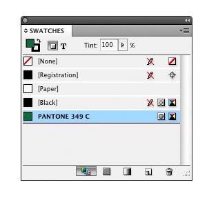
is not ideal. So what is ideal? Solid or “spot” inks. A spot ink is physically mixed to match a specific color formula—a formula, in most cases, provided by an authority such as PANTONE. The PANTONE Matching System (PMS) is the de-facto ink formulation standard that most of the world’s ink manufacturers and commercial printers have adopted. To me, spot color and specialty inks are infinitely more interesting than four-color process. In addition to a full palette of colors, metallics, and fluorescents, there are phosphorescent inks that glow in the dark, scratch and sniff inks that release a fragrance, there are glitter inks, security inks, and others. You need three things to use spot colors and specialty inks in InDesign: First, get familiar with InDesign’s PMS solid color swatch library. You access it from the Swatches panel menu by choosing New Color Swatch > Color Type: Spot > Color Mode: PANTONE solid… (Figure 1). Select the version—coated,uncoated, or matte—based on the paper stock the color will be printed on (Figure 2). Select a color, click the Add button, and the new spot color appears on the Swatches menu (Figure 3).
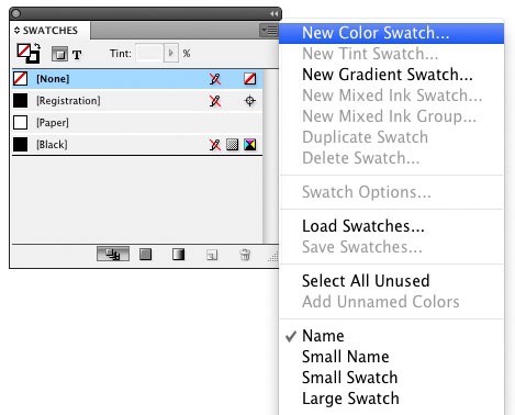
Figure 1: Going to New Color Swatch is the first step in adding a spot color to your InDesign document.
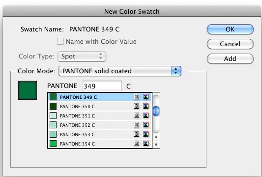
Figure 2: Next comes selecting a Pantone version appropriate for the project’s paper type.
 The second thing you’ll need is a PANTONE chip book or fan guide, which is composed of printed samples of each of the 1,300-plus colors PANTONE provides formulas for. Because your computer screen also has a limited color gamut, you need a physical sample of a color printed on paper to see the true value of a color. The third thing you need, perhaps the most important, is some inspiration. That’s where this article comes in.
Getting Bold with One or Two Spot Colors
The business card in Figure 4 was printed using a single PMS spot color. The combination of the logo, the color choice, and the paper make it out of the ordinary.
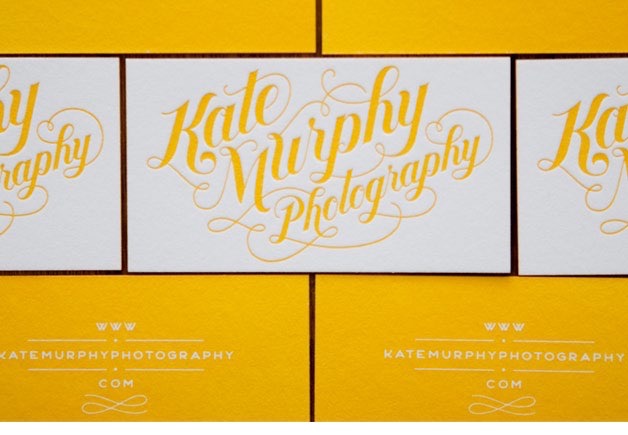
Figure 4: This example demonstrates the power of limited spot colors. Typography and design by Jessica Hische
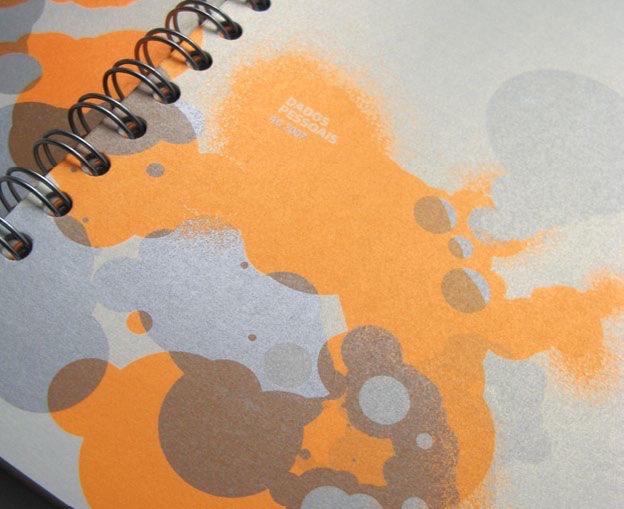
Figure 5: Metallics are spot colors, too. The designer was Filipe
Lizardo of the Flúordesign agency
Creating a Simple Duotone in Photoshop and InDesign
A duotone is a halftone printed using two spot colors. I used the technique for the client’s brochure in Figure 6 because, in addition to showing the reader its property, I wanted to pick up on what I perceived as the Inn’s style and mood.
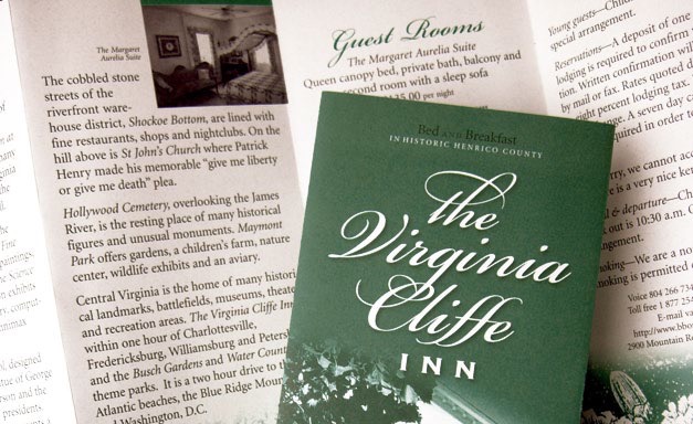
Figure 6: A duotone suits the subject of this brochure, which I designed.
Figure 7: Creating duotones in Photoshop gives you more control than doing so in InDesign.

Figure 8: Choosing the colors that will make up your duotone.
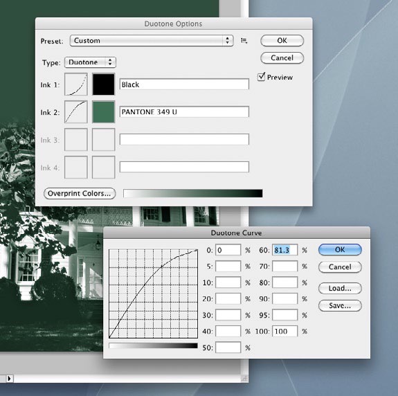
Figure 9: Adjusting how Photoshop distributes the two colors.
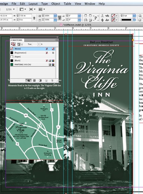
Figure 10: The duotone placed in the InDesign layout.
Using Six Colors to Save Money
I’m showing you the following project to make an important point. The piece in Figure 11 was printed by passing the sheet through the press twice. The first time through, the printer laid down the areas of black and a spot PMS metallic silver. (The logo, some of the type, and the areas beneath the green and gold are printed in silver.) The second pass was four-color process and produced the green and orange, plus what amounts to a second hit of black. The printer used a process called “dry trap” that allows the first run to dry completely before you print over top of it. Does that sound complicated? It is. The funny part is, they produced it this way not just to achieve the desired effect, but to save money in printing the eight different brochures in the series.

Figure 11: In this brochure, the logo, some of the type, and the areas beneath the green and gold are printed in silver. Designers: Jerome Calleja, Virginia Teager-Haenni; Creative Director: David Jensen; Photography: Tom Hollar; Agency: JDA, Inc.
Creating Drama with Spot Varnish
A spot varnish can be a bit mysterious-looking (Figure 12). Because it’s clear, it’s there… but it isn’t. It invites you to run their hand across its surface and to tilt it ever so slightly to catch the light and set off each glossy element.

Figure 12: Do you see the shine on the dotted lines,solid paths, and icons? That’s spot varnish. Designer: Cat Townsend, www.notpretty.net; Agency: Open Agency
Printing with a Palette of Spot Colors
Wow. The brochure in Figure 13 was printed using three PMS colors (one fluorescent pink) and a satin aqueous coating that, as the art director put it, keeps the piece from looking “garish.” Imagine the same brochure printed in four-color process. It would be well designed but not nearly as striking. Spot colors and the coatings make it stand out in a way CMYK simply would not.

Figure 13: This brochure gets its pop from fluorescent pink and its polish from a satin aqueous coating. Art Director: Woody Holliman; Designer: Nicole Kraieski; Agency: Flywheel Design. Printer: Classic Graphics, Morrisville, NC
Commenting is easier and faster when you're logged in!

Recommended for you

Before&After: How to Design a Second Page
You've designed a beautiful outside. How do you follow it up inside? Simply.

Publishing Leader Quark Adopts New Logo and Identity
There’s a friendly sign of change at Quark: a new logo and visual identity...

How to Create a “Ken Burns” Effect in InDesign
Learn how to add subtle motion to still photos and create compelling visual effe...