
Freshen Up Your Fonts
Clear the cobwebs out of your font closet and bring in some fresh new options.


This article appears in Issue 146 of InDesign Magazine.
If you’re anything like me, you fall into the habit of using the same fonts over and over again. Like an old pair of shoes, they’re familiar and super comfy. Eventually, however, they won’t be as fresh as they once were, and you’ll need to bring in some new styles. So, here are some new choices to spruce up your font collection. And leave your credit card behind, because these puppies are all free for commercial use!
Fonts for Every Fashion
Josefin Slab
Josefin Slab is a clean, bright typeface that comes in seven weights in both Roman and italic. There is also a variable version that lets you tweak the amount of italic and overall weight. Weight is equally dispersed throughout each glyph of this open slab font. The tilted lowercase e adds a little whimsy to the already playful typeface (Figure 1).

Figure 1. Josefin Slab
Skaters
If I had to pick one word to describe this next font it would gnarly, dude. Skaters (Figure 2) is a geometric display font that comes ready to show off its moves, sporting several modern stacked ligatures. It also features a collection of punctuation, symbols, and chunky lowercase letters.

Figure 2. Skaters
Oxanium
Oxanium is a sans serif typeface that evokes a familiar and not-too-distant future (Figure 3). It comes in several weights from extra light to extra bold, each with several characters boasting angled finials and terminals. The squareness of the letterforms evokes a futuristic feel and would fit well in a sci-fi or high-tech scenario. Make it so!

alt=”” width=”784″ height=”378″> Figure 3. Oxanium
Vollkorn
This pay-what-you-want typeface takes its name from the German word for wholemeal and purports to be for “bread-and-butter” use. Gluten-filled puns aside, this classic serif font sports new additions and weights, adding to Vollkorn’s already rising breadth of offerings like historical forms, localization, and stackable accents.
Alatsi
To my eyes, there is something about pointed caps in a typeface that make it seem modern and nostalgic at the same time. Alatsi is a sans serif TrueType font that could be equally home in 2020 or 1920. With a regular weight that has an even heft to it, it also includes old style numbers and a small set of fractions.
Girassol
The moment I saw the Ks in the display typeface Girassol, I fell in love! The Rs and Ps are just as tasty and brought to mind classic Parisian signage.
The Girassol fonts are made up of caps and small caps with many a jaunty angle. And can we talk about the crossed 7? Not traveling for a year has forced me to satiate my wanderlust in typography instead, and I’m not mad.
Margherita
With its lofty x-height and curly lowercase g, does anyone else get a “practically perfect in every way” Mary Poppins vibe from the Margherita typeface? Margherita comes in six flavors: five separate widths as well as an experimental variable version.
Oliver
Oliver is a clean, airy sans serif typeface that is more modern than its name might suggest. It boasts wide-open, strictly uppercase glyphs. It contains a delightful mix of angled terminals and sharp vertices. With three weights ranging from light to bold and both OpenType and TrueType included, Oliver won’t leave you begging for more (Figure 4).

Figure 4. Oliver
Great Sejagad
Despite their retro cool, some brush scripts can seem a tad dated, so it’s nice to encounter ones that feel fresh. The tongue-twister-y Great Sejagad gives off a fat-paint-marker vibe with its broad and multiple strokes on each letterform (Figure 5). This font would be at home on anything that conveys a personal or impassioned message, from high school student council posters to event announcements to protest signs.

Figure 5. Great Sejagad
Cormorant
Cormorant’s namesake—a large black bird—leads my mind to Edgar Allan Poe, and how fitting it would be to set “The Raven” in this clean serif typeface. The TrueType font comes in five weights, each with a Roman and italic version.
Mexcellent
Since the Olympics were pushed into 2021, it seems a perfect time to reflect on the iconic typeface of the 1968 games in Mexico City! The Mexcellent typeface recalls the tri-linear forms from that year’s branding. Note that the most recent update of the full Mexcellent font includes stackable styles and fills, but only the regular and 3D formats are being offered for free.
Restora
I can’t decide if Restora is more Art Nouveau or Art Deco. I’m no type historian, so maybe it’s neither, but I like the old fashioned vibe it gives off (Figure 6). It definitely feels friendly and welcoming. The full Restora family offers up 16 fonts, two of which are available for free.

Figure 6. Restora
Ethnocentric
If your vision of the future was formed while watching sci-fi shows in the 1960s and 1970s, you’re probably going to like Ethnocentric. It only has the one semi-chunky weight, in regular and italic versions. The latter—along with the chiseled and open letters—give the illusion of speeds we can only hope to reach in our vehicles of the future (Figure 7).

Figure 7. Ethnocentric
Spectral
As someone who struggles to identify fonts as quickly as many of my designer friends can, I have a blind spot when it comes to classic, old-school typefaces. But if I get a particular feeling from one, I tend to take note. In the case of Spectral, it feels old but friendly. A solid, classy look—served up in eight weights, two styles each—that doesn’t feel outdated.
Rochester
I’m a sucker for a nice script typeface, especially one that is easy to read and not so frilly it would be fitting only for an invitation from the Queen. Rochester isn’t overly formal, with the right mixture of verticality and thick strokes (Figure 8). It’s bold—less in the typographic sense and more of character—and never comes across as too stuffy.

Figure 8. Rochester
Ostrich
Like its long-legged, feathered cousin, Ostrich Sans is tall and lanky. The recently added inline font brings the family to eight fonts, which also includes one of the thinnest thin fonts you’ll ever see and also a delicate dashed form (Figure 9). This ostrich won’t be hiding its head in the sand any time soon.
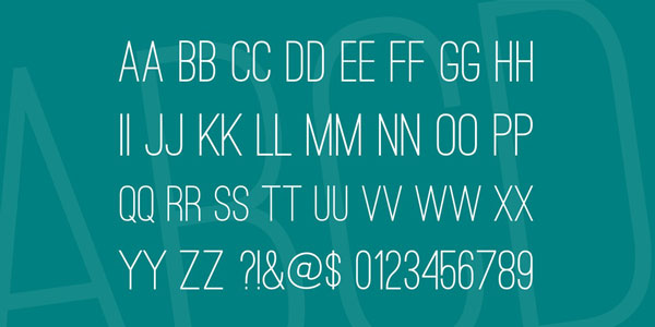
Figure 9. Ostrich
Courier Prime
Courier Prime is an update of the 1956 classic, Courier. Less of a sequel and more a reboot, this monospaced typeface features a more cursive italic and subtly bolder and wider glyphs than the original. Designed for use in screenplays, Courier Prime features a basic set of regular, bold, italic, and bold italic styles (Figure 10).

Figure 10. Courier Prime
Norwester
The condensed, chiseled letterforms of Norwester would not look out of place carved into marble. It lends itself nicely to lofty ideas that need to fit in tight quarters, such as on a monument or building dedication. But Norwester would look equally at home atop a banner ad or splashed across a newsletter masthead. What I’m saying is, this timeless typeface would look equally commanding wherever you use it (Figure 11).

Figure 11. Norwester
Anybody
Anybody could be called Anysizeyoucouldpossiblywant for its wide variety of typographic offerings. This sans serif family comes in 90 (yes, 90) sizes in OpenType formats, from extra light to black and condensed to wide. And in the unlikely event that none of the built-in options suit your needs, Anybody also includes a variable font that lets you precisely dial in the exact weight, width, and slant you want (Figure 12).

Figure 12. Anybody
Edge
The Edge typeface is billed as a display font, but its friendly form could take it beyond that (Figure 13). While it would be at home headlining an event poster, it would also fit in on a menu, in a book’s chapter dividers, or as the focus of a new app’s logo. I can’t decide which glyph is the coolest: the angular lowercase g, the slashed uppercase q, or the funky ampersand (the latter being a great name for a designers-only nightclub, don’t you think?).

Figure 13. Edge
Sparking Joy
Even if some of these typefaces aren’t your cup of tea, hopefully they will give you a little inspiration and get your creativity flowing. Any time is a good time to gather new fonts that spark joy in your design work, and clean out the ones that just don’t fit you anymore.
Commenting is easier and faster when you're logged in!

Recommended for you

Identifying Fonts
New artificial intelligence software (and some good old-fashioned human knowledg...
InDesign Magazine Issue 69: Wireframing and Prototyping
We’re happy to announce that InDesign Magazine Issue 69 (January, 2015) is now a...