
Fresh Tips for InDesign
Here’s a fresh batch of timeless tips from some of the world’s best InDesign experts.

This article appears in Issue 77 of InDesign Magazine.
Here’s a fresh batch of timeless tips from some of the world’s best InDesign experts.
Text and Tables
View Custom Baseline Grid Only
When you create a custom baseline grid for a text frame (Object > Text Frame Options, go to the Baseline Options section), and then choose View > Grids & Guides > Show Baseline Grid, you see both the frame’s grid and the document’s grid, which is governed by settings in Preferences > Grids.
Tiplet: Empty frames don’t show custom gridlines. Add some text to the frame to see the grid.
Thomas Dahm, an InDesign user whose eyes were crossing with all these gridlines (Figure 1), asked if there was any way to show just the frame’s custom grid and not the document grid.
Custom baseline grids ignore the View Threshold percentage in Preferences > Grids. That is, frame-based baseline grids are always visible (when you’ve enabled Show Baseline Grid) regardless of how much you’re zoomed in or out. Document baseline grids, on the other hand, wink in and out of view based on how much you’re zoomed in. The default View Threshold is 75% for baseline grids.
Assuming Thomas most often views his layout at 100% or so (zooming in for detail work), the answer is to change his Preferences > Grids > View Threshold setting to 150% or more.
That way, the document baseline grid will not be visible most of the time, but the custom frame grids (which ignore the View Threshold setting now) will always be visible (Figure 2).
Thomas and I decided it’ll be called the Dahm View. Click here to read the full Twitter conversation. —AC
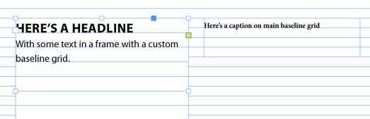
alt=”An InDesign page with two text frames. On the left, text that reads "Here’s a headline" in all caps, then "With some text in a frame in a custom baseline grid." On the right, text reads "Here’s a caption on the baseline grid." The frame on the left has a custom baseline grid. The top of both frames are aligned, snapped to one of the main baseline rules.” width=”523″ height=”169″ /> Figure 1. Seeing two different sets of baselines at the same time can be distracting, to say the least.

Figure 2. Changing your View Threshold settings will clear up some visual clutter by displaying just the custom baseline grid, not the document default.
Create a New Table
There’s a much faster way to create a new table in an InDesign document. Instead of creating a text frame and then choosing Table > Insert Table, you can skip creating a text frame first and simply press Command+Option+Shift+T (Mac) or Ctrl+Alt+Shift+T (Windows). This opens the Create Table dialog box, where you can choose the number of columns and rows you want. After you click OK, the table will be in a place gun, and you can then simply click in the document and drag out the new table to the size you want it to be. — MN
Make the Paragraph Stand Out (On Screen)
You can make paragraph styles really stand out on screen (for easy identification) by giving them background colors, but of course you wouldn’t want those colors to print out or show up in exported files. So try this: Add paragraph shading to the paragraph style definition, and turn on the “Do not print or export” checkbox (Figure 3). This way, the paragraph shading is very obvious on screen, especially when you zoom back to fit one or more pages in the window (Figure 4), but it won’t show up in your final output. —DB
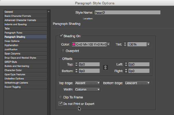
Figure 3. Select “Do not print or export” in the Paragraph Style Options dialog box to keep your visually-helpful paragraph style formatting as a personal, not a public, tool.
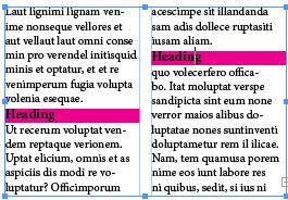
Figure 4: In a text-heavy situation, temporary formatting to call out headings or other important markers could be a helpful production tool.
Duplicate Table Rows and Columns by Opt/Alt Dragging
Got a table row or column you want to duplicate? Don’t bother with copy and paste. Select a table row or column (click just above a column or to the left of a row). Hold Option/Alt and drag the copy, dropping it where you want it in the table. —MR
Quickly Turn a Text Cell into a Graphic Cell
A quick way to turn a text cell into a graphic cell in your table is to use File > Place to load an image file. Position the loaded graphic icon over a text cell, and then click (Figure 5).

Figure 5: Just do it—click the loaded graphic icon in a text cell within a table.
The image is placed into the table cell, which is automatically converted to a graphic cell (Figure 6).
Figure 6: The placed graphic automatically converts the text cell into a graphic cell.
Use the Selection tool to select the Content Grabber and reposition or resize the graphic within the graphic cell. —CJ
Power Grid
Need a flexible layout grid? Here’s an approach that works well: Start with a 12-column document, and then, on your parent page spread, add guides to subdivide these into 3- and 4-column versions.
To cut down on clutter, add these guides to their own layers: Create a new layer and call it 3 column. Choose Layout > Create Guides, and choose 3 columns.
You’ll want to be sure of two things: first, that the gutter width is the same as gutter width you specified in the new document setup, and second, that the guides are fit to the margins rather than the page. Repeat this for the 4-column grid (Figure 7). With 3- and 4-column guides on separate layers, you can show and hide these layers as appropriate.

Figure 7: For easy flexibility, create separate layers to hold variations of your guide setups.
You can further subdivide the 12 columns: into 2 × 6, 6 × 2, or 5 × 2 + 2. Optionally, you can color code the guides: choose Layout > Ruler Guides, and then choose a color for each. Using this approach, a single parent page spread can serve many functions—and your layouts will have both variety and consistency. —NF
Get Rid of Ghostly Content
Are you seeing ghosts in your InDesign files? By “ghosts,” I mean things like phantom spell check errors, mysteriously bloated hyperlink destination lists, and zombie-like swatches and styles that refuse to die.
These can all be the result of tracked changes. Open the Track Changes panel (Window > Editorial > Track Changes), and click the Show Changes button.
Then put your cursor in a text frame, and open the Story Editor (Command+Y/Ctrl+Y). Chances are you’ll see the deleted text that used those styles, swatches, hyperlinks, etc. Use the Track Changes panel to accept changes, and you’ll bust those ghosts. —MR
Selecting a Graphic Cell in a Table and Adjusting its Cell Options
Before you can adjust the cell options for a graphic cell, the cell must be selected. Two quick ways to select the graphic cell again and adjust its cell options:
-
1. With the Type tool, drag across the graphic cell (Figure 8)
2. With the Selection tool, click on the graphic cell, and then press Esc (Figure 9). Note that the Type tool becomes selected.
With the graphic cell selected, you can now choose Table > Cell Options > Graphic to adjust the cell options for the graphic cell (Figure 10). —CJ
Figure 8. Drag across the graphic cell with the Type tool.

Figure 9. Click the graphic cell with the Selection tool, and then press Esc. (Hey, how did the Type tool get selected?)
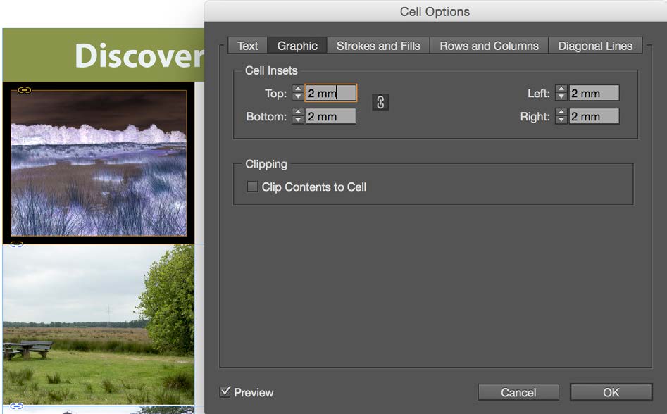
Figure 10. Selected graphic cell (left). Graphic cell options with inset set to 2mm (right).
Multi-Column Mastery
Use Span columns and Keep Options to quickly format multi-column text. In this cookbook, the text is created within a single five-column frame (Figure 11).

Figure 11. What look like 2 distinct frames of text in this cookbook are actually 5 columns within a single frame.
The first three paragraphs span all columns, the ingredients span two, and the instructions span three. To move the first instruction to the third column, a Start Paragraph in Next Column Keep Option is included in the paragraph style.
The advantage of this approach is that you don’t have to fuss about threading text from one frame to the next—just apply the paragraph styles, and everything falls into place. —NF
Prevent Packaging Problems
Fonts synced from Adobe Fonts cannot be packaged with an InDesign file to archive or send to someone else in your workflow.
So you may want to avoid these fonts in some situations. And you may want InDesign to warn you if a font from Adobe Fonts shows up in a document. For that, create a custom preflight profile that will flag protected fonts as an error (Figure 12). —MR

Figure 12: A simple custom profile can alert you, painlessly, when your file contains protected fonts.
Get Granular with Grids
In addition to your layout grid and baseline grid, you need to use a document grid to really make efficient use of the smallest building block of space (Figure 13). For best results, set the grid increment to your body text leading value with a subdivision of 1.
If your page width and height are divisible by your leading value, you’ll have an even number of grid squares on the page. If necessary, you can reset the zero point to the top left margin to align the document grid to the type area; unfortunately, the document grid does not reset itself on the facing page. —NF

Figure 13: The document grid completes the triad of grids that can help you get peak performance from your layout.
Script to Change Cases in Character and Paragraph Styles
If I need to change styled headings that have been typed in uppercase to sentence case, I can use a Peter Kahrel’s Title Case script to change the case of a chosen character or paragraph style.
Gabe Harbs offers a similar but more powerful script that can also ignore specific words or letters. More information on that script can be found here. —CF
Script to Map GREP Styles to One (or Many) Paragraph Styles
Ever made a GREP style, only to realize it has to be applied to other paragraph styles? Unless the styles are based on each other, the only other way to do this is to go into each paragraph style and make the GREP styles all over again.
That was the case until this free GREP style-mapping script was made. It works by selecting the paragraph style containing the desired GREP styles and then selecting the desired paragraph styles that the GREP styles need to be applied to.—CF
Automatically Adjust Text Frame Height for Sidebars and Breakout Text Frames
Do you find you frequently have to resize (and resize and resize) the same text frames containing breakout text or sidebars in your publication, as a result of client changes? The Auto-Size feature may become one of your best friends.
Select the text frame and choose Object > Text Frame Options to open the same-named dialog box (Figure 14).
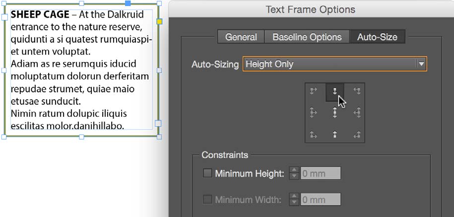
Figure 14. The Height Only option in the Text Frame Options dialog box is a real time-saver.
- Click on the Auto-Size tab.
- From the Auto-Sizing menu, choose Height Only.
- From the grid image, select the point from which you want to size the frame. In our example (Figure 15), you’ll see that the top of the frame keeps its position, and the bottom is pushed up or down depending on text decrease or increase. —CJ

Figure 15. The amazing auto-expanding (or auto-contracting) text frame!
Show Locally Formatted Text Easily with a Startup Script
It can be difficult to know what text has been formatted properly with styles and what text has been formatted locally.
Scripter Marc Autret of Indiscripts created a script that highlights locally formatted text with a red strikethrough, available from indiscripts.com.
The script was built upon by Gabe Harbs, who made a version that is instead installed into the startup scripts subfolder of the scripts folder, allowing the script to become part of the user interface. That version is available from in-tools.com. —CF
Aligning Captions
The challenge of using a baseline grid is working within its constraints and still having design flexibility. An issue that frequently comes up is how to combine captions or supporting text with the body text, especially when these paragraphs are side by side. If you align the captions to the grid, the leading is too loose. If you don’t? Well, you’ve broken the grid—and not to good effect.
There is the “third way”—aligning the first line only. That is, you align the first baseline of the caption to the baseline grid, and after that, the leading does its own thing.
To really get the most from this feature, the leading of the caption should resolve with the baseline grid on every third or fourth line. All it takes is some simple math to make this happen.
If your body text leading and baseline grid are both 12 points, then make your caption leading 9 points. The caption will resolve with the baseline grid on every fourth line: 3 × 12 = 36, 4 × 9 = 36.
If your numbers are not conveniently rounded, you can use the Control panel to do the math for you. To determine the caption leading, in the Leading field, enter your baseline grid increment value, then add the math—*3/4—to synchronize with the baseline grid on every fourth line (Figure 16). —NF
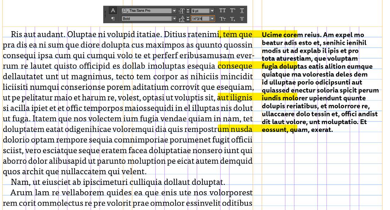
Figure 16. Align the first baseline of the caption to the baseline grid to keep your layout “compliant,” yet flexible.
Color
Organize Your Swatches with Color Groups
Do you have a swatch list so long that you sometimes have a hard time locating the swatch you want? Organize those colors by putting them in color groups. Shift-click (or Command/Ctrl-click) to select the swatches you want to group. Then right-click and choose New Color Group. —MR
Deleting the Undeletable Cyan
In a new document with nothing selected, choose the Select All Unused option from the Swatches panel menu. Apart from the default colors that cannot be deleted (the ones in the square brackets), notice that the default cyan is not selected. This is because it is used as the default paragraph shading color in the paragraph style called [Basic Paragraph].
If you’re a neat-freak like me and you want to see only truly used colors in your document, close any open documents, go to the Swatches panel, select all colors that are not in square brackets, and then click the trash can at the bottom of the panel.
In the Delete Swatch dialog box that pops up and asks how you want to replace the colors you’re removing, choose [Black] to replace the deleted swatches—including default cyan!—wherever they were used (Figure 17). Then press the D key on your keyboard to switch back to default stroke and fill values.
From this point onwards, your new documents will start out with just the truly undeletable swatches: [Registration], [Paper], and [Black].—CF
![Delete Swatches dialog box shows warning for removing Defined Swatch and replacing it with the [Black] swatch.](https://creativepro.com/wp-content/uploads/2024/12/fresh_tips-fig17.jpg)
Figure 17. Delete the default cyan swatch (used for paragraph shading) and replace it with black.
Sample Colors from Anywhere on Your Screen
Don’t forget you have a little eyedropper tool in RGB swatch-options dialog boxes (Figure 18) that you can use to sample a color from anywhere on your screen! —MR
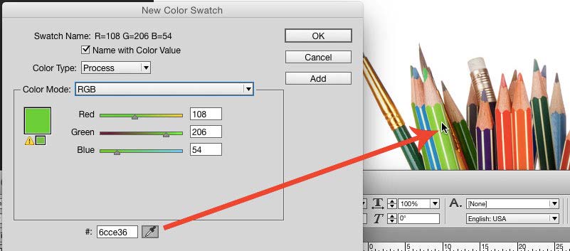
Figure 18. Use this new-color-swatch eyedropper to sample RGB colors from anywhere on your screen.
Merging Color Swatches
You notice halfway through a design job that you’ve used several colors that are very similar, and you want to quickly change the colors on all objects you’ve used to just the one color and remove the similar color swatches from the Swatches panel in the process.
First, determine which of the swatches you’d like to keep, and make sure that you don’t have any objects selected (Edit > Deselect All).
Select the swatch you want to keep, and then press Ctrl (Windows) or Command (macOS), and click on the other swatches that are similar.
From the Swatches panel menu, choose Merge Swatches (Figure 19). —CJ
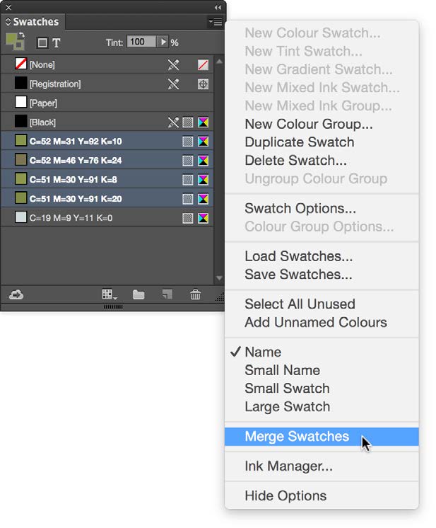
Figure 19. The Merge Swatches option makes it easy to coordinate and clean up your use of similar colors.
Creating a Color Theme from a Selection
By default, when you click on an image with the Color Theme tool, it analyzes all of the colors in that image and then generates themes based on that data (Figure 20). But what if you want to create a color theme from just a section of that image?
Just select the Color Theme tool, and drag a marquee around the area from which you want to generate the new theme (Figure 21). —CJ

Figure 20. Color theme from the full image
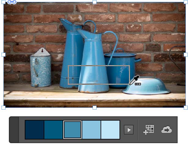
Figure 21. Color theme from a selection
Applying Colors from the Color Theme Panel
With the Color Theme tool, you can select colors from your document (or another document), and add a color theme to CC Libraries or add swatches to the Swatches panel. You can also easily apply sampled colors from the Color Theme panel to an object’s fill or stroke, or to text (Figures 22–24).
- Keep the Color Theme tool selected and the Color Theme panel open.
- Click on the color you want to apply, and then position the cursor over the object you want to apply the color to. Keep a close eye on the cursor, as it will reveal whether you are applying the color to a stroke, fill, or text. —CJ
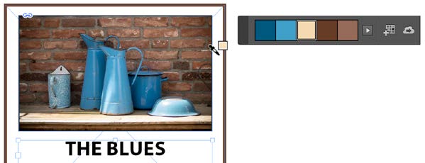
Figure 22. Getting ready to add a fill color
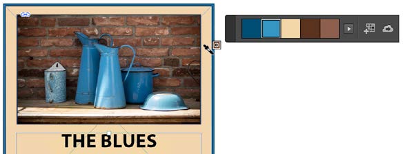
Figure 23: Now a stroke
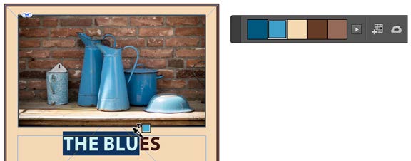
Figure 24. Finally, selecting a color for the text
Adding One Color from a Color Theme to the Swatches Panel
Want to add only one of the colors of a color theme you captured with the Color Theme tool to your Swatches panel instead of adding the full theme as a color group?
- Select the swatch in the Color Theme panel.
- Alt-click (Windows) or Option-click (macOS) the Add Theme to Swatches button
- in the Color Theme panel, or, alternatively, drag and drop the swatch from the panel into the Swatches panel (Figure 25). —CJ
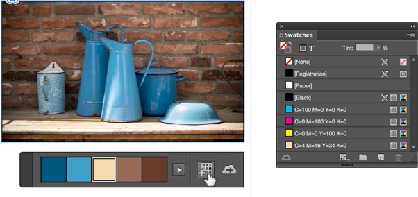
Figure 25. Keep your Swatches panel tidy by adding only the colors you want from a color theme.
Creating a Color Theme Based on Choosing an Individual Color and Selecting a Color Rule
When clicking on an image with the Color Theme tool, you can choose from a set of five provided themes, ranging from Colorful to Bright, Dark, Deep, and Muted (Figure 26). But did you know you can also use the tool to create themes based on color rules that are created by sampling one color in your document?
Shift-click a color area in an image to source the base color around which the different color rules will be created.
Then, from the menu in the Color Theme panel, choose the color rule that works best for your designs (Figure 27). To capture a color theme for future use, add it to the Swatches panel as a color group, or to the currently active CC Library to share color themes across applications and with other users. —CJ

Figure 26. Five variations are available for every generated color theme.
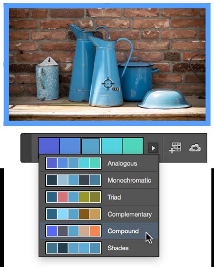
Figure 27. A single color that you choose can be the basis of multiple color themes.
Layout
Spacing Out Multiple Selected Items
You’ve worked hard to distribute a series of objects in your layout, all of them aligned at their tops and equally spaced. You then realize you need a bit more space between each object. So you select the farthest object on the right, move it a bit to the right, select the rest of the objects, and then click the Distribute Horizontal Centers button in the Align panel. Then you repeat all that because the spacing between the objects still isn’t quite right.
Sound familiar? There’s a better way—use a hidden feature called Live Distribute!
Simply select your objects. Then, click and hold on a transformation handle, and then hold down the spacebar as you drag. Voilà! Instead of resizing the selected objects, you resize the space between them.
For extra bonus points, pause for a second after clicking on the transformation handle before dragging. Pausing first will allow you to see the objects as you redistribute them (Figure 28). —MN

Figure 28. To use Live Distribute, select some objects, click and hold on a transformation handle, add the spacebar, pause for a moment, and then drag.
Placing Multiple Objects in a Non-Rectangular Shape
Here’s a quick way to create a badge-type design using an image and a text frame placed in a circle.
First, get the design elements ready: the artwork and the circle. With the Selection tool, drag over the objects that are to be inserted into the circle to select them. Next, choose Object > Group to group those objects (Figure 29).

Figure 29. Group the artwork elements you’ll want in your “badge.”
Create the circle (if necessary) and position the circle above the grouped objects, so that you’re happy with the overall composition. Note that to see the circle better, I’ve given it a temporary 1-pt [Paper] stroke (later to be set back to [None]). With the circle positioned, click on the grouped objects (Figure 30), and choose Edit > Cut.

Figure 30. The selected grouped object, just before cutting. (The circle is not selected.)
Now for the magic: Select the circle shape again, and choose Edit > Paste Into. Because InDesign remembers the position of the group in relation to the circle, the grouped content is positioned as intended (Figure 31).

Figure 31. Once the artwork is pasted, you can finesse the newly grouped design with effects.
To edit the text within the group later on, select the Type tool and set text insertion point (Figure 32). —CJ

Figure 32. Even within this close-knit grouping, it’s still easy to go in and edit the text.
Quickly Select One or More Objects that Overlap
It can be frustrating working with objects that are overlapping, especially when you need to edit them. So how can you select objects through stacks and layers?
Here are two techniques:
Press the Ctrl (Windows) or Command (macOS) key and, with the Selection tool, click on stacked objects until you have the object selected that you want to edit (Figure 33).

Figure 33. Ctrl- or Command-click to cycle through stacked objects until you’ve selected the one you want.
Or, you can use the Layers panel. Click the expansion triangle to the left of a layer name to see the objects, images, groups, or other items in a layer. Then click the blank box to the right of the object to select the object (Figure 34).
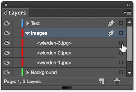
Figure 34. Locate the desired object hierarchically using the Layers panel.
When you click the similar box next to a layer name, all the objects in that layer become selected (Figure 35). Note: Keep in mind that objects that are locked or hidden won’t be selected using this technique. —CJ

Figure 35. Be sure you’ve selected the item you want, and not everything in the layer.
Interactivity
Add Signature Fields to PDFs Right in InDesign
You can add a digital signature field to contracts, agreements, and other documents with a couple of clicks right in InDesign. Just draw a rectangle where you want the signature to appear, right- click on the rectangle, and choose Interactive > Convert to Signature Field. Then, after you export your document as an interactive PDF, you can use Acrobat’s nifty Send For Signature workflow to obtain the required signatures. —KG
Attach an Animation to a Button
The Fixed-Layout EPUB format has brought life back into InDesign’s Animation panel (Figure 36). I often need to initiate an action using a button, and I dreaded the steps involved to do so until I came up with this easy way to attach an animation to a button.

Figure 36. The often-overlooked (but highly useful!) Create Trigger button in the Animation panel
Apply the animation to the object that will be animated. Keep that object selected. Now click the Create Button Trigger button, and then click on the object in the InDesign document that you want to become the button that triggers the animation. Quick and easy! —CC
User Interface
Open Book Documents Before Syncing
Here’s the best tip you’ll ever read for working with InDesign books: Open all the InDesign documents before you synchronize them. It’s way faster than waiting for InDesign to open and close everything in the background, and you gain the option of cancelling an unwanted change by closing documents without saving or reverting. —MR
Customize your Control Panel
When you have text selected, some of the paragraph-level text controls no longer fit in the Control panel at the top of the screen when you’re using a small laptop screen.
One way to manage this is to customize the icons that appear in the Control panel. Choose Customize from the Control panel menu (at the far right side of the Control panel). Then, turn off the sections of the panel that aren’t as important to you. Here is how I have mine set up (Figure 37). This allows the contents to fit on my MacBook Pro 15-inch screen. —KG
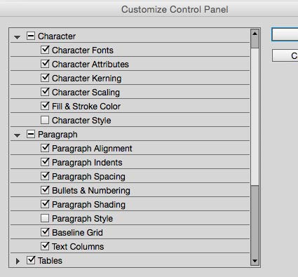
Figure 37. To save valuable Control panel real estate, show only the sections and functions you use most.
Restarting a Stalled Sync
Adobe Fonts won’t sync? Try turning font syncing off and then on again in the Creative Cloud app. Go to Creative Cloud > Preferences. Then from the Services section, disable Adobe Fonts (Figure 38). Wait a minute, and then click On. All your Adobe Fonts should now be synced. — MR
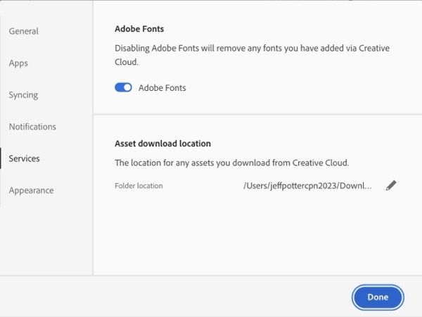
Figure 38. Restart font syncing in a CC app if your Adobe Fonts haven’t been resyncing.
Use the Character and Paragraph Panels
Many people no longer use the Character and Paragraph panels, found in Window > Type & Tables, since most of their functionality is duplicated in the Control panel at the top of the screen. I suggest you keep these panels handy, however. They provide at least one big benefit: When you have a table cell, row, or column selected, most of the type options no longer display in the Control panel. But the Character and Paragraph panels let you change the type options for multiple table cells at one time. —KG
U-Turn in Find/Change
When using the Find/Change dialog box, you can press Command+Option+Enter (macOS) or Ctrl+Alt+Enter (Windows) to toggle between searching forward and backward. —MN
Create a Project Font Menu with Favorites
Want to show just the fonts for a particular project in the Fonts menus of the Control panel and Character panel? Mark those fonts as favorites by clicking the star to the left of each name in the menu. Then click the star next to Filter at the top of the menu (Figure 39). InDesign hides all the fonts that aren’t tagged as favorites, and you have a project-specific font menu. —MR

Figure 39. Filtering just your “favorite” fonts creates a streamlined font menu for a specific project.
Align to Key Object
For those unfamiliar with this feature, it allows objects to be aligned based on one key object that determines the position of others. For example, in Figure 40, I would like all objects to align to the bottom of the orange object and be spaced out with 3mm between each. —CF

Figure 40. Select all of the objects, but then left-click on the object that is to become the key object. Choose the appropriate align options from the Align panel. In this case those options are Align Bottom Edges and Distribute Horizontal Space (of 3mm).
Use the Split Window View
Many people overlook the Split Layout command, but with today’s large-screen monitors, this feature is a productivity boon! With a document open, just click the Split Layout icon in the bottom-right corner of any document window (Figure 41). This splits the window into two separate views.
You can manipulate the views independently. For example, you could be zoomed in on one side, and zoomed out on another. Or you could work on a master page in one view while viewing a document page in the other view. To unsplit the layout, click the icon again or double-click the vertical dividing line between the two views. —KG
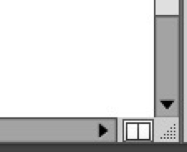
Figure 41. Click the Split Layout button to open a second (adjustable) view of your document.
Quick-Paste Copied Information
Oftentimes when doing a find/change in InDesign, you need to copy text from one location and paste it into the Find field of the Find/Change dialog box. Rather than manually do a copy/paste, try this.
When you open the Find/Change dialog box, select the text in your document that you want to find or change. Press Command/Ctrl+F1 to insert the selected text into the Find field, or press Command/Ctrl+F2 to insert the selected text into the change field. Easy!
Keep in mind that on a laptop, you may need to add the fn key to those keyboard shortcuts. —CC
The Tipsters
Commenting is easier and faster when you're logged in!

Recommended for you

Tip of the Week: Three Text Tips
Sign up for the InDesign tip of the week to get a new tip, roundups of new artic...
Tip of the Week: Customizing the Control Panel
This tip was sent to Tip of the Week email subscribers on July 30, 2015. Sign up...

Hot Tips
Your favorite InDesign experts bring the heat with this collection of fresh tips...