


Excerpted from “Welcome to Oz: A Cinematic Approach to Digital Still Photography with Photoshop” by Vincent Versace. Copyright © 2007. Used with permission of Pearson Education, Inc. and New Riders.
“Light, gesture, and color are the key components of any photograph. Light and color are obvious, but it is gesture that is the most important. There is gesture in everything. It’s up to you to find the gesture that is most telling.” — Jay Maisel
In this chapter, you will apply the image-harvesting concept to the image-editing process in order to support the aesthetic choices you make regarding light, shape, gesture, and color when you first take the picture. Picasso said, “Art is the lie that tells the truth.”
The concepts behind this lesson are the outcome of conversations that I’ve had over the years with two great photographers: Jay Maisel, who has forgotten more than I will ever know about light, gesture, and color, and who first introduced me to the concept; and my uncle, photographer CJ Elfont, who taught me photography and, most importantly, how the eye “sees.” When you master this lesson, you will have grasped the heart of what I have discovered about how it all works. The real journey begins now.
On Light, Color, Shape, and Gesture
The late painter and designer Josef Albers said that “shape is the enemy of color.” By that he meant that when shape is in the presence of color, we tend to remember the shape and not the color. In this sense, shape isn’t necessarily a friend to color. But if you understand how to control color — regardless of whether the photograph is color or black and white — you will have complete mastery of the images you create. The key is to find a way to cause shape to become color’s unwitting ally, and thereby make color a “shape” that the viewer will remember.
This is easier said than done, of course. What you need is a catalyst to make shape and color work in harmony. And this is where pattern comes in.
Patterns are shapes we tend to see in things, sometimes when they aren’t really there. Patterns tend to manifest themselves as shapes. Whether it’s light coming through tree leaves, a paper bag in a subway trash can, or raindrops on a windshield, everything can form or be perceived as a pattern. Patterns are interesting, but a pattern interrupted is more interesting. If you interrupt the pattern, you are on the path to finding a way to using shape as the unwitting ally of color.
As Jay Maisel says, light and color are obvious, but it is gesture that is most important. In the photograph of my niece, the gesture is obvious. The pattern we recognize first is her face, and the finger stuck in her nose interrupts that pattern (Figure 1).

Figure 1. A universal gesture.
Let’s look at an example of an image where gesture is not as plain as the nose on my niece’s face. Look at Figure 2’s image of the flower and the leaves, then look away.

Figure 2. Do you see the green or the magenta?
Which color do you remember? Most people would say magenta, purple, or red. Even though 90% of the image is made up of greens, we tend to remember the part with the most shape. The shape has become an unwitting ally of the color. The color is further reinforced because the magenta flower’s shape and circular pattern is interrupted by the linear pattern of the green blades. Further, the magenta flower appears to be moving away from the green blades, and this pattern holds the gesture that is most telling.
Of light, gesture, and color, light is the most frequently taken for granted. We see it, it’s there, end of story. But rather than merely accepting its presence, why not consider viewing it as an object? Treat it as if it were a solid and a part of the experience being expressed in the photograph.
Take, for example, images from the “Seattle Sequence” series. The light tells the story of the moment in each image, whether black and white or color. (If you can see something, it has color. The artist Matisse said, “Black is the queen of all colors.”)
Note: The 12 images that are the Seattle Sequence were shot in 45 minutes. My skill as a photographer had nothing to do with how quickly I shot; I had forgotten to charge the battery. I saw the charge eroding as I watched one of the prettiest displays of light that I have ever seen. Shafts of light broke through a departing rainstorm while a new rainstorm was moving in. Knowing that I had little time to record these images, fear became my caffeine, and I shot until my battery died. Among the images that came from those 45 minutes were 12 that I thought were particularly outstanding. The lessons that I learned were to just shoot the image, don’t think about shooting the image, and carry an extra battery.
In each instance, no matter how brief, I perceived the image in its final form as I photographed it, and that perception determined how I harvested the images. In each one, the light informs the image, makes the patterns and interrupts them. In each instance, light is as physical and tangible a thing as the flowers. What is at play here is the use of positive and negative space as well as dark and light isolates (Figures 3a, 3b, 3c, 4a, 4b, and 4c).
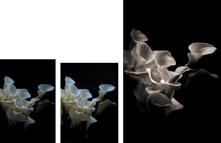
Figure 3a, 3b, and 3c. Part of the Seattle Sequence.
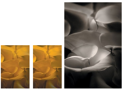
Figure 4a, 4b, and 4c. Part of the Seattle Sequence.
Varying Positive and Negative Space
In the next image of calla lilies, the light isolates are the two flowers that are slightly to the right of center. The gesture that is most telling is the spiral that starts from the upper right in the dark isolate. This is the darkest area in which there are definable structures, and it continues to the center of the photograph, where there is a light isolate. This particular pattern occurred by happenstance, but I reinforced it by varying the use of positive and negative space, which often occupies the same spaces as dark and light isolates (Figures 5a, 5b, and 5c).
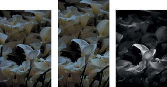
Figure 5a, 5b, and 5c. Part of the Seattle Sequence.
The Isolate Theory (a Very Brief Version)
The Isolate Theory, conceived by CJ Elfont, explains the interrelationship of the elements (or isolates) in a photograph. Properly used, they result in effective composition; i.e., one that communicates the photographer’s vision to his or her audience. The primary isolate is the first element (either light or dark) in the composition to which the eye is drawn. Supporting isolates are different in density from the primary one, but they complement and enhance it. When the supporting isolates flow within the composition and support the primary isolate without conflicting with it, you get the viewer’s attention and communication happens. Here’s an example. If two dark isolate buildings are separated in a field of intermediate isolates, the eye has no focal point on which to start. But if three dark buildings are positioned closer together at an angle or in an S-curve or C-curve, then a flow occurs. That flow allows for a gradual appreciation of the buildings alone, as well as their relationship to one another, without dividing interest and interrupting the feeling that the buildings belong together and have something to say as a group.
By varying the levels of positive and negative space, and by using selective contrast and sharpness, I gradually created the dramatic effect of motion in a still image. I also interrupted the pattern of the background with the spiral of light-to-dark, and in this way found the most telling gesture. All of this was already present in the image, but it had to be brought out. Like Michelangelo, who claimed that he simply removed everything that wasn’t his sculpture from the stone, I removed everything that wasn’t my vision of the image from the file.
If gesture is the expression of the photograph, and light is its language, then colors are its words, and contrast, saturation, and sharpness are the alphabet. Without words, language and expression have no meaning. Without the alphabet, there are no words.
If the words of color are lost in a cacophony of shapes, the image will be less than it could be. The better you support color and its expression, the better your images will be appreciated. And just as in a street fight, the only rule is that there are no rules. All elements are available for you to use and exploit. Everything you do is in service of the print, which will always be in service of what is ultimately the most important: your voice and vision.
© 2007 Pearson Education, Inc. Informit. All rights reserved.
This article was last modified on December 17, 2022
This article was first published on April 16, 2007
Commenting is easier and faster when you're logged in!

Recommended for you

CreativePro Video: Fix Distorted Perspective in Lightroom
In this week’s CreativePro video, Nigel French shows a quick way to adjust issue...

Upgrading to Photoshop CC FAQ
Adobe Product Manager Jeff Tranberry has posted an extensive FAQ on his blog abo...

Creating Editable Extruded Text in Photoshop
Extruded text is a popular effect, and it’s not difficult to create...