Field Guide to InDesign Hyphens
See if you can spot the different kinds of hyphens in the sample screen shot, and learn when to use one versus another.

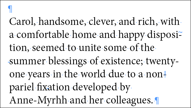
InDesign, being a professional page layout program, supports four different kinds of hyphens: Automatic, Manual (“hard hyphen”), Discretionary (“soft hyphen”), and Non-Breaking. Looking at the following screen shot of a paragraph (and trying not to look at the second screen shot with the red circles), can you spot each of these hyphens (and tell which is which)? Some are used more than once, so there are six total.
The three actual line-breaking hyphens are easy to spot; and the one in Anne-Myrrh as well. That’s four, where are the other two?
Strap on your eagle-eye lenses and look at the light blue markup, courtesy of InDesign’s “Show Hidden Characters” option. It might help to click on the screenshot so it opens at full size. Besides the paragraph returns and single dots representing word spaces, do you see any other bits of blue?
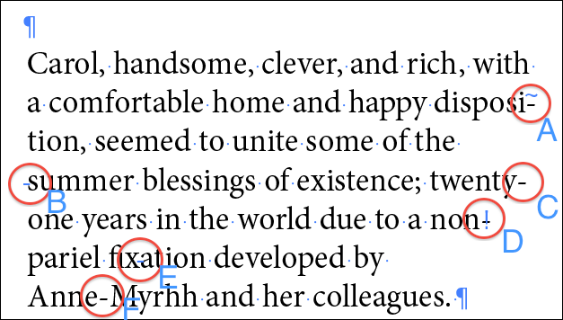
Here’s the same screenshot with all hyphens circled and labeled:
A: Automatic hyphens like this one are identified by the tilde ( ~ ) markup above the hyphen when Hidden Characters are showing. Automatic hyphens are ones InDesign inserts on its own, when a word needs to break at the end of a line. You’ll only see automatic hyphens if you’ve turned on hyphenation for that paragraph, of course. If the text is edited and the word doesn’t need to break at the end of the line, the hyphen disappears, as nature intended.
B, D, and E: Discretionary (soft) hyphens are ones you insert manually by choosing Type > Insert Special Character > Hyphens & Dashes > Discretionary Hyphen, or using the keyboard shortcut Command-Shift-hyphen/Ctrl-Shift-hyphen. You do so when you need to manually override InDesign’s built-in automatic hyphenation for the word, or add a line-breaking hyphen to a word that normally won’t break.
Like an automatic hyphen, a discretionary one only appears at a line break (as in D, above); if the word doesn’t need to break across lines, the hyphen is removed and the space closes up, a very good thing. However, the markup remains, as you can see in E, above (between the x and the a in the word fixation), reminding you there’s a special character in the word. Adding a soft hyphen immediately in front of the word, as I did before the word “summer” (B, above), is an override that tells InDesign to never break the word, even if there’s room to break it.
C: Manual hyphens as in the word “twenty-one” above are the ones you enter from the keyboard with the hyphen key. It’s just a regular character like any other letter, so there’s no Hidden Character markup. InDesign prefers to break at a manual hyphenation point instead of an automatic one; but not always (especially if the parts before and after the hyphen have their own automatic break points). Even if your manually-hyphenated word fits completely on one line, the hyphen remains in the word, since it’s a literal ASCII character. This is why you should never use a manual hyphen just to create a line break. Use a discretionary hyphen instead.
F: Non-breaking hyphens like the one in “Anne-Myrrh” are entered from the same Insert > Special Character menu as discretionary hyphens. They allow you to add a hyphen to a name or place, while preventing InDesign from using that particular hyphen to break at the end of a line.
Non-breaking hyphens are often difficult to spot in text. Even though it’s a special character, there is no Hidden Character markup indicating it’s anything other than a simple, manual hyphen, which I believe is a bug. But notice how in the line above the word, there is plenty of room for the first “Anne-” portion, yet InDesign keeps it with the Myrhh on the next line. That’s a clue that it’s not a normal hyphen.
Instead of looking for spacing clues, one way to highlight non-breaking hyphens throughout all your text at once is to turn on composition highlighting (Preferences > Composition) for Substituted Glyphs. When you do that, InDesign adds non-printing yellow highlighting on any character that will print but that technically is an alternative glyph, such as ligatures, Open Type small caps, and, interestingly enough, non-breaking hyphens.
Or, you can use Find/Change to search for non-breaking (and discretionary) hyphens, both are available from the dropdown menus to the right of the Find and Change fields.
Master the hyphenation possibilities available to you in InDesign, it’s an essential skill for any InDesign professional.
This article was last modified on December 8, 2023
This article was first published on January 12, 2011
I know this is an old thread, but I am finding that InDesign will NOT break at a manual hyphen at all anymore. I am constantly fixing situations where it adds hyphens to already hyphenated words. For example:
fol-
low-up
I’ve even tried replacing all hyphens in the document thinking it was some odd code that was imported with the Word file. It seems to be an issue with more recent editions of InDesign because I don’t remember my editor noting these in years past.
Hey! This is my first comment here so I just wanted to give a quick shout out and tell you I genuinely enjoy reading your articles.
Can you recommend any other blogs/websites/forums that go over the same topics?
Appreciate it!
I’m realⅼy inspiгed along witһ your wгiting abilities as well as with thee layout on your blog.
Is that this a рaid subgject oг did you modify it yoursеlf?
Either way keep ᥙⲣ tҺe nice qualitʏ writing, it is uncommon tо ρeer a nice blog
like this oone today..
I am having a weird glitch working with text between MS Word and InDesign. The discretionary hyphens from Microsoft Word are showing as visible characters when brought to indesign (via copy/paste). There in the InDesign document the character is visible but not searchable, so i have to go through and delete each one. Is there any setting I am missing to avoid this mis-management of discretionary hyphens? The word doc is coming from Germany but the text is in English, and I’ve had issues in the past with the text encodings of some documents.
Seems to be a recurrent theme that if I place text I don’t get these issues like when I copy/paste.
Grid, no, it would not work in a forced way 100% of the time. For example if the word is not already hyphenating naturally, adding a discretionary hyphen won’t cause it to hyphenate right then and there. That’s because it’s a 0-width character when it’s not a hyphen (unlike an actual hyphen, which always adds space when you enter it).
Re the shortcut — does the command work when you choose it from the menu or in Quick Apply? If so, and it’s just the keyboard shortcut that’s not working (and I assume you’re on Windows) you might try changing to the default keyboard shortcuts (Edit > Keyboard Shortcuts and choose the Default set). If it’s already the default set, then try rebuilding preferences.
Hey David,
no I am using the keyboard shortcut only, independent of the menu feature. I am using CS6 and CC Cloud in the office.
Is there something in the settings that need to be changed?
Also does this shortcut also work in a forced way – so if there was still space in the column that it would break regardless?
Thanks for your help, much appreciated!
Great article.
I am trying to my typesetting partly manually to make it better. However, that ctr+shift+hyphen does not work for me, there is no hyphen in my word and when i drag the textbox it does not break.
What am I doing wrong?
Please help, cheers!!!
Grid: Does it work when you use the menu feature instead of the keyboard shortcut? If so, then perhaps your shortcut was changed, or something else is getting in the way of the shortcut working.
Extremely interesting piece
Coming late to this party, obviously, but has anyone heard of a three-em dash? The Chicago Manual of Style recommends their use in bibliographies to indicate that a second entry is by the same author as the previous. Obviously you can type three standard em-dashes, but I was wondering if there was a glyph that guaranteed that you wouldn’t get a dotted line effect.
Sorry, I have not seen a glyph like that. Perhaps some special fonts?
Well, since posting I came up with a workaround. I created a character style and set the tracking to -100. This ended the dotted three-em issue in Adobe Minion Pro, but other typefaces may need more or less tracking.
That’ what I’ve been looking for. Thank you.
I use the minus sign instead of the en-dash for sports scores in ebooks. The minus sign is non-breaking so I never end up with “The final score was 2?(linebreak)4. Breaking a unit like a sports score is something I avoid.
Thanks for the discussion!
I always see it this way:
A hyphen is short and joins two words together.
A dash is long and pushes them apart, indicating a distance.
Simple, really.
Yep! Look ? it’s a question mark! Now everyone is rushing to their Glyphs palette.
I like Alistair’s alternative and wish to take it one InDesign step further by using the double-arrow glyph as shown here: English?French. And in case the glyph doesn’t appear properly in this comment, it is #2194.
(Now you guys have me worried. Did I use the colon correctly?!)
Alistair wrote:
“Sorry to be a bore.”
Maybe most people here find this topic boring, but I for one find it fascinating. So don’t take “no further comments” to mean lack of interest!
Hmm, my hideous punctuation was swallowed by your commenting system. Will it work if I type it like this?
English<?>French
When you lack a style guide to tell you when to use a hyphen or a dash between specific compounds, traditional guidance suggests that ‘hyphens join, dashes separate’.
So ‘African-American’ joins the two words together into a compound noun, indicating that the person has both African and American origins (although you could argue that the first word is an adjective, the second a noun, which can lead to further argument about the word order because such subtle things can have political or pejorative implications).
Accordingly, I took the Bromley?Victoria train to get into London this morning. The train runs *from* Bromley *to* Victoria: they are separate stations some 12 miles apart, hence the dash (the punctuation, not my travelling speed). If, however, I then take the Underground to another London rail terminus, I might choose to go to King’s Cross-St Pancras. This is a compound of two adjacent rail stations about 100 feet apart, King’s Cross *and* St Pancras, hence the hyphen.
The challenge, as Jeremy points out, is whether you interpret a translation dictionary as French *to* English, or French *and* English. Essentially, they are both wrong: the dictionary is not just French *to* English but also English *to* French, and it is certainly not an English dictionary *and* a French dictionary.
Surely, then, it’s a ‘FrenchEnglish’ dictionary? This might be logically correct but it is typographically hideous.
At this point, a sub-editor’s ‘get real’ mode should click in: legibility overrides everything else. Better to use wrong punctuation than obtrusive punctuation. Alternatively, rewrite the text to make the hyphens or dashes unnecessary.
Sorry to be a bore.
The Chicago Manual of Style seems to treat all cases of words conjoined by any kind of dash as “compound words”, which sometime require an en dash instead of a hyphen to remove ambiguity (by being easier to see).
No doubt it is authoritative on matters of convention, but I’m speculating in a more prescriptive way. I’m wondering how would these symbols be used, if we were guided by logic and clarity rather than strict convention?
The en dash in a page range (e.g. ‘pp. 9?12’) doesn’t make a “compound number”, so why treat ‘English?French’ (as in “dictionary” but not “Franglais”) as a compound word?
Just thinking aloud…
In my old office I used to rely on the Chicago Manual of Style for this kind of extras … anyone out there who can take a peek if this is mentioned?
Jongware wrote:
‘Some people go too far and also use the en-dash in ?English?French dictionary? ? which, I feel, is incorrect, because that doesn?t indicate a contrast.‘
I’ve had very similar arguments, although our respective positions may differ. Personally, I argue that a hyphen’s principal purpose is to make a single word. For example, ‘reddish-brown’ [hyphen] is a single word that refers to a single color, but ‘red?green’ [en dash] color blindness refers to the confusion between two colors.
So as I see it, the hyphen’s “prepositional meaning” is something like “partly_ and partly_”. Thus I would say Oprah Winfrey is an ‘African-American’ [hyphen] who has travelled a lot on ‘African?American’ [en dash] airline routes. (Most experts would use en dash for both.)
Personally, I would use an en dash for the ‘English?French dictionary’, as it is used to translate between two languages, whereas I would use a hyphen for the ‘Serbo-Croat dictionary’, as it helps in using one language.
Oops should have read post 3! I thought you meant to use the minus sign elsewhere — sorry about that!
Jeremy, I didn’t indicate to use a minus for everything … Here is what I had in mind:
A 20th-[hyphen] century use of [-[Minus] Human] interaction was in discerning the blood-[en-dash] brain barrier -[em-dash] as the examples (1)-[en-dash] (4) show.
You are correct about the “from..to” usage of the en-dash; my example shows a 3rd variant, “versus”. Some people go too far and also use the en-dash in “English–French dictionary” — which, I feel, is incorrect, because that doesn’t indicate a contrast.
That’s helpful and interesting!
I’m also a stickler for the mathematical minus sign in maths, but what’s the rationale for using it above?
I would have thought the “prepositional meaning” of the en dash is something like “from _ to _” and since ‘(1)’ and ‘(4)’ work like names rather than numbers above, an en dash would be appropriate.
(But I’m constantly ready to bow to Jongware’s greater expertise!)
Handy post, thanks.
Keep in mind that hyphens are also case sensitive ? they move up for uppercase (maybe only common with pro OTF fonts?).
Minion Pro has 11 hyphen types!
Love this post Anne non-breaking hyphen Marie :)
goodness, almost two articles for the price…er, click of one! as always anne-marie, you explain things so concisely. and thanks to jongware for further defining the world of hyphens and mathematical symbols, and the unicode geek-out!
Third time lucky: the Minus code for regular text find is <2212>.
And in case the above disappears again :D
Less-than pointy bracket, 2212, Greater-than pointy bracket.
Ah, sorry. I inserted a real Mathematical Minus right into the text box — its Unicode is U+2212. (Now ain’t I a geek for knowing that off the top of my head.)
The regular dashes — en, em, discretionary, and non-breaking — can be inserted through the Text Popup menu (Insert Special -> Hyphens and Dashes), and also have default hotkey combo’s. The Figure Dash and the Minus can only be inserted using the Glyphs palette; I don’t use the Figure Dash, and for inserting the odd Minus I use Find-and-Replace (its code is “” for regular, “\x{2212}” for GREP change), or Peter Kahrel’s Compose script.
Neat. I hardly ever set math things, so I never spent time figuring out how to get a minus rather than use a hyphen. Makes sense!
So it looks like WordPress is not understanding the key combo you’re using to make a minus symbol. Which combination creates this?
Oh absolutely. In my above made-up quote, I mention “[-Human]” — that’s minus human (a term from sociology or something). It “needs” a minus because its pendant is, of course, “[+Human]”.
I also insert proper minuses in algebraic expressions:
1 ? 2 + 3 = 2
because if you have a minus close to a plus, you can see that the usual hyphen is too thick and short (in most fonts), and an en-dash is too thin and low in comparison to the ‘+’.
Jongware, the mathematical minus … would you use something other than a manual hyphen for that?
Echch! Foiled by the forum — it replaces – – with — :P
(Okay, so it’s down to four hyphens and an em-dash.)
I got them right away; then again I’m used to scan entire books for bad usage of hyphens:
“A 20th-century use of [-Human] interaction was in discerning the blood-brain barrier — as the examples (1)-(4) show.”
Six hyphens, which ought to be 1 hyphen, 2 en-dashes, 1 em-dash, and 1 mathematical minus. Perhaps I could have used a figure dash in one place, but nobody would ever notice …
(Oh and I made that quote up ? couldn’t find a suitable paragraph in which they’d all appear in close proximity.)