Fast Double Underlines
A client who does a lot of financial study guides, and is a fairly recent Word to InDesign switcher, e-mailed me a bunch of "how do I" and "where is...

A client who does a lot of financial study guides, and is a fairly recent Word to InDesign switcher, e-mailed me a bunch of “how do I” and “where is the” questions yesterday.
One thing that’s driving her crazy is InDesign’s lack of a Double Underline formatting option, which she needs to apply repeatedly to the last number before a sum total, also known as an “accounting underline:”

In Word, Command/Control-Shift-D adds a double underline under a selection, in InDesign, it opens and closes the Links panel. A search of the Help file proved fruitless, so she’s been hand-drawing a double underline (using the Line tool and the Thin-Thin line style) under instances of text that need it. Which means that she needs to adjust those repeatedly as the text flow changes. Yuck!
A better method in InDesign is to apply a custom underline, then save that as a Character Style (to which you can optionally assign a keyboard shortcut). If you add that style to InDesign’s default set of styles, then voila, you have a keyboard shortcut that applies a double underline in every document you create from then on.
Apply a Custom Underline
Select the text to which you want to apply a double underline and click the Underline button in the Control panel to apply the default single underline. In the screen shot below I’ve done so, and then deselected the text so you can see the underline more easily:

Keep the text selected — you might want to zoom in a fair amount as I’ve done — and open the Underline Options dialog box from the Control panel menu. (Or, just Option/Alt-click the Underline icon in the Control panel, which is a shortcut to the same dialog box.)
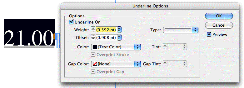
Turn on the preview checkbox in the dialog box so you can see the result of your settings as you modify them. You’ll want to change the line type to Thin-Thin (Thick-Thick is too much) to start with:

Underlines change their weight and offset relative to the size of the text they’re underlining, that’s what the measures in parentheses mean. For this 12-point text, though, the double-underline is barely visible. So increase both the weight (which increases the amount of space between the two thin lines, as well as the weight of the thin lines themselves) and the offset a bit until you’re satisfied:


When you’re done, click OK to close the dialog box.
Keep in mind that changing from an Auto to an absolute measure for the weight and offset means the underline will remain the same, even if you change the size of the type it’s underlining. If you’re going to turn this into a Character Style (next step), and you’ll be using the double-underline for significantly different sizes of type, you might want to re-do this step for each size, adjusting the weight and offset as appropriate, and create multiple Character Styles from them.
Minor variations are fine, though — one double underline works just as well for 10 pt. as it does for 12 pt. type, in my experience.
Make a Character Style with a Keyboard Shortcut
With the custom underlined text selected or your cursor blinking inside it, create a new Character Style by Option/Alt-clicking on the New Style icon at the bottom of the Character Style panel or by choosing New Character Style from the panel’s fly-out menu.
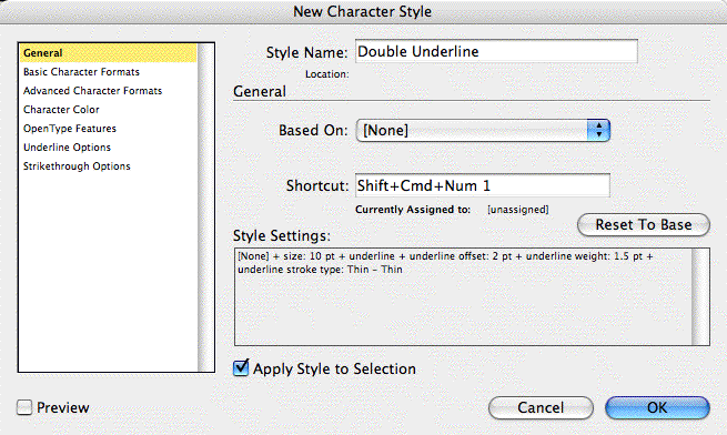
The resulting dialog box should show you that the new style “sucked in” the custom double underline formatting of the text surrounding the Type cursor (or the text selection), and only that formatting — not the typeface or color or anything else. (This means you can apply the style to any text and all it will do is apply the underline.) You can verify that by looking at the Style Settings summary area at the bottom.

Still in the General panel of the dialog box, name the style and give it a keyboard shortcut. Remember, InDesign has a special rule for style shortcuts. They need to include both a modifier key and a number from the keypad. So, we can’t assign “Command-Shift-D” a la Word. Here I’ve used Command-Shift-Num 1 for my shortcut.
If I needed to create multiple double-underline Character Styles, one for each size of type I’d be applying it to, I’d probably name them “DoubleUnder-10pt” and “DoubleUnder-14pt” and so on, and keep the keyboard shortcuts similar as well.
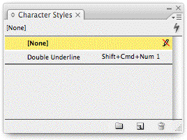
Click OK to close the dialog box, and test out your style. Select some text and click on the style name or press its keyboard shortcut, and you should see a double-underline appear underneath.
To make the double-underline extend beyond the numbers, add spaces, and apply the same style to the spaces (the tabs below are decimal tabs):

Add the Style to InDesign’s Default Styles
With InDesign running but no documents open, open the Character Styles panel and choose Load Character Style from its fly-out menu. Navigate to an InDesign file that contains the style you created and double-click it to invoke the Load Styles dialog box, listing all of that document’s styles:

Click the Uncheck All button if necessary, and then turn on the checkbox next to the style you want to load — Double Underline, in this case. Then click the OK button, and the style is added to the default Character Styles panel.

From now on, in every new document you create (until you rebuild Preferences) you’ll see this style in your Character Styles panel, meaning you can apply the double-underline to a text selection by pressing its keyboard shortcut. To import the style into an existing layout, just go through the same Load Styles steps using that document’s Character Styles panel.
This article was last modified on December 18, 2021
This article was first published on January 8, 2008
Commenting is easier and faster when you're logged in!
Recommended for you

Tip of the Week: Using Power Zoom
There are three new Links panel icons in InDesign CC that you'll see when workin...

Tip of the Week: Right-click to Reveal
This tip was sent to Tip of the Week email subscribers on June 26, 2015. Sign up...

How to Fix SVG Images That Look Blurry in InDesign
How to edit code to improve the appearance of SVG images placed in InDesign.


