
OpenType fonts may include an expanded group of characters useful for the typographic variation with features like Discretionary Ligatures, Fractions, Ordinals, Swashes, Titling & Contextual Alternates, All Small Caps, Tabular or Proportional Figures, etc. Unfortunately, these rich extended character sets are ignored or misunderstood by many users. So let’s take a close-up look at the features of OpenType fonts and the hidden gems you can find when you’re willing to explore your fonts.
First, a bit about naming. OpenType “Pro” fonts provide support for the Central European (CE) languages, whereas OpenType “Std” fonts don’t. The best part is that all OpenType fonts are cross-platform i.e. they work with both PC and Mac operating systems.
See also: Adobe Drops Fonts, Leaves Users Stranded
Applying the OpenType font attributes
- Select text.
- Choose OpenType from the Character panel menu, and then select an OpenType attribute, such as Discretionary Ligatures, Fractions, or Swash.
Note: If an OpenType feature is not supported or unavailable in the current font, it appears in square brackets, such as [Swash] in the screenshot below.
You can also define these OpenType font attributes in your paragraph or character style. You can also use the Glyphs panel to view and insert OpenType attributes such as ornaments, swashes, fractions, and ligatures.
Selecting alternate glyphs in OpenType font
- Open the Glyphs panel.
- Select ‘Alternates for Selection’ from the Show list.
- Double Click on the glyph in the Glyphs panel to insert the glyph.
See also: More Font Info for InDesign CC Users
OpenType Attributes
Let’s review the options you’ll find in the OpenType menu of the Character and Control panels.

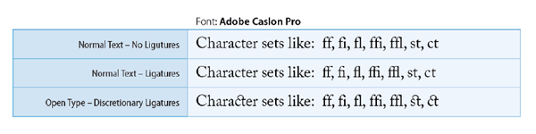
Discretionary Ligatures
A ligature is created when two or more letters are joined together to create one glyph; for example, ‘fi’, ‘fl’ and ‘ff’. These ligatures improve the appearance of letters to avoid overlapping of the characters. Some OpenType fonts contains optional ligatures, known as Discretionary Ligatures. These optional ligatures are decorative in nature and can be used to add beauty and elegance to your text.
See also: 5 Cool Things You Can Do With GREP Styles
Fractions
Fractions are an integral part of typography. Working with manuals, textbook, or accounting books requires frequent usage of fractions. Typographically, a fraction can be described as a digit followed by a slash and then another digit like 1/2. In older fonts prior to OpenType, only basic fractions such as ¼, ½ and ¾ were available. But today’s modern OpenType fonts provide wide variety of true fractions from Basic to Arbitrary.

See also: Formatting Fractions
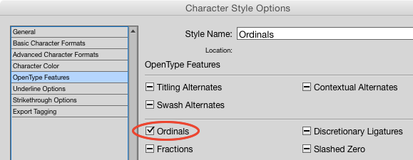
Ordinal
Ordinals are ‘st’, ‘nd’, ‘rd’ and ‘th’ that follows just after the number in an ordered sequence. For example: 1st, 2nd, 3rd, 4th, 21st, 25th etc. These ordinals are supposed to be in superscript position. Again these are better in comparison to Superscript.

How to use: With the help of a GREP style and a character style to apply Ordinals via Open Type Features.
Character Style: Ordinals (Open Type Features > Ordinals)
GREP Style: (?<=\d)(st|nd|rd|th)

See also: A Quick GREP to Superscript Ordinals
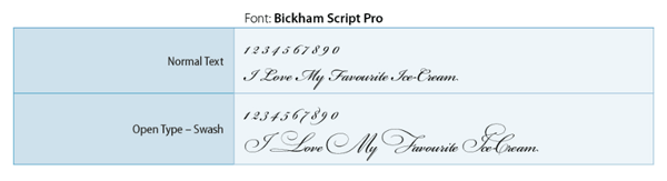
Swash
Swash characters are decorative, usually at the beginning or at the end of the glyph. In addition to regular characters, swashes can add elegance, emphasis, and flair to your type.
Titling Alternates
These are specially-designed letters used for display purposes with fine kerning that looks better in larger font sizes. In the example given below, it’s difficult to see the differences in the details. However, by overlapping the Normal Text and Text with Titling Alternates (the text in Red) you can see the differences. The larger the size, the more beautiful it looks.

We’ll continue our look at OpenType features next week, in Part 2. Don’t miss it!
This article was last modified on July 25, 2019
This article was first published on September 14, 2015
Commenting is easier and faster when you're logged in!

Recommended for you

Tip of the Week: The Fast Way to Apply OpenType Features to Text
How to make whitespace characters visible in GREP expressions in InDesign.

Choosing Type for Digital Documents
Nigel French shares his best advice for using type effectively in PDF, DPS, and...

20 Obscure Features
David Blatner shares his favorite 20 obscure features that every InDesign users...