
[Note: This is a guest post from a longtime reader, Masood Ahmad. See links at the end for other methods of achieving text wrap around drop caps.]
How often many of us have faced queries or requests from our clients or friends, which are beyond the limits of software, we are working on. Experience and learning makes a difference in these situations. People like me love to troubleshoot these queries and ends up with some fun-tricks, some called it magic too.
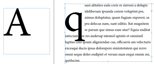
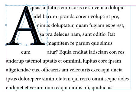
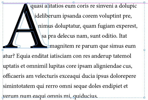
A few days back, I was asked by my client to reflow the text as close as possible to the Drop-Cap character ‘A’ as shown in Figure 1, in InDesign.

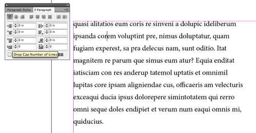
Whereas the Drop-Cap feature, wraps the text vertically, i.e. moving all the text to the right after auto-calculating the width of the Drop-Cap character (see Figure 2)

First, I informed my client that it is not possible through styles as it was a standard book, but he insists and asked me to do some magic. So I, used the old trick of manually creating the Drop-Cap and applying the Text-Wrap to it. The process is quite simple and most of us might be using it or might have used in the past. Prior to InDesign, I have used this trick in many other applications, where the software doesn’t even contain the Drop-Cap feature. The process involves extracting the Drop-Cap character, making a copy, outlining it with Text-Wrap and then repositioning it with the actual text. Don’t worry, I’m not going to end this way, I’ll explain the things step by step. Let’s get started…
Step 1: Create a simple Drop-Cap (decide the number of lines by yourself) as in Figure 2.
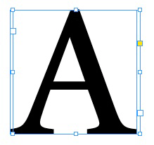
Step 2: Cut the Drop Cap character (in this case ‘A’) as shown in Figure 3.

Step 3: Paste the (previously Cut) character on the Pasteboard as shown in Figure 4.
Step 4: Now remove the Drop-Cap from the actual body text. Remember that you have already cut/removed the first character from your actual text and have pasted it on the pasteboard. See Figure 5. Your body text will now start with the second character.
Step 5: Now select the pasteboard item which is your Drop Cap character and press ‘alt+ctrl+C’ to Fit Frame to Content.
Then select the Drop Cap character with your Arrow tool and make a copy of it using Copy and Paste in Place. Nudge it to the right a few times with your right arrow key or with shift dragging as shown in Figure 6.
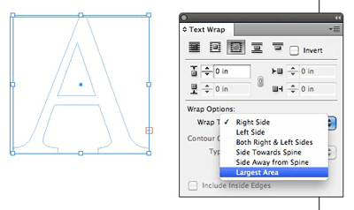
Step 6: Now select the nudged text box and convert it to curves, then apply No-colour to it to make it transparent, as shown in Figure 7.

Step 7: Press alt+ctrl+w to apply Text-Wrap to the outlined text box using the ‘Wrap around object shape’, the third icon on the Text Wrap panel, and selecting the Largest Area from the Wrap Options, as shown in Figure 8.
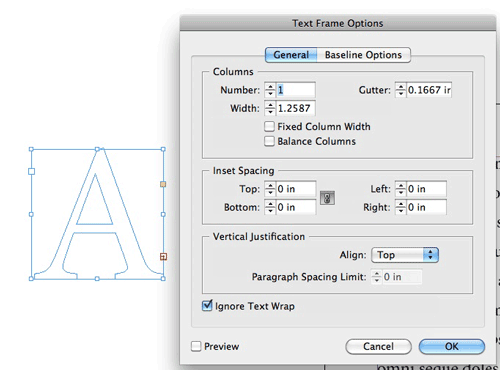
Step 8: Oops, there seems to be something I have missed. I can judge it by seeing the Overset Text. Don’t worry, just select the Text box with the letter ‘A’ and apply ‘Ignore Text Wrap’ from the Text Frame Options dialogue box, as shown in Figure 9.
Step 9: Now select both the frames (the text frame and the Outlined text frame) and move them towards the actual body text frame. In simple words, align it with the body text frame on the page, as shown in Figure 10.
Step 10: You might have noticed some uneven spacing between words just below the Outlined Frame (see Figure 11). The space is due to the Text Wrap feature and can’t be avoided even if the offset is zero.

To avoid this, I nudge the Outlined frame upwards a little. You can see the difference in the image below. (Figure 12)

Step 11: Finally, to avoid messing up the things, I group all the three boxes in one (Figure 13)
This trick can be applied on all the slanted characters like: A V W Y etc. and also with circular characters like: D G O P Q R S, just give it a try. The only problem with this trick is that it is not live. If the text changes, then you have to re-do the steps, if the first character is slanted in shape.
Other articles on a similar topic:
- Non-Rectangular Text Wrap Around Drop Caps
- Adjust the Space Between a Drop Cap and the Next Letter with Kerning
- Wrapping Text Around an Anchored Object
- InDesignSecrets Podcast 202
This article was last modified on December 30, 2021
This article was first published on April 16, 2014
Commenting is easier and faster when you're logged in!

Recommended for you

InDesign How-to Video: Wrap Text Around Image Edges
In this week’s InDesignSecrets video, Anne-Marie Concepcion shows the easiest wa...
New Contest! The Mystery of the Inconsistent Indent
Solve this InDesign mystery for a chance at winning a great prize.

Auto-Reflowing Images in a Grid
How can you make a grid of images reflow automatically around a page when you ad...