


A common interactive feature in Adobe Digital Publishing Suite (DPS) apps is “pullout tabs”. These are created using InDesign’s Edit > Paste Into command and the DPS Scrollable Frame Overlay feature. Full instructions for creating the tabs can be found here.
These pullout tabs can be used for a number of interesting and useful interactive effects. But they all have one drawback: pullout tabs always create a “dead zone” the size of the tab content. Consider the following example:


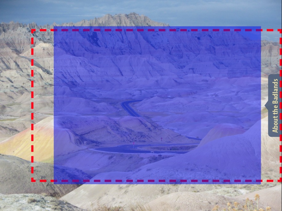
In this example, there is a “dead zone” indicated by the dotted line below. If you swipe right-to-left anywhere in this zone, the tab will pull out, not necessarily what a user would expect. One would expect to have to swipe directly on the tab to pull it out, but because of the way scrollable frame overlays work, the entire region that is occupied by the “body” of the pullout tab causes the tab to pull out when swiped.
This behavior can cause users to get “stuck” on a screen like this, as they try to swipe right-to-left to move to the next article, but instead the tab pulls out.

One way to get around this is to include a button to navigate to the next article, or to include some visual cues indicating where the user must swipe to advance to the next article.
But another way to enhance the user experience is to minimize this dead zone. Here’s the trick:
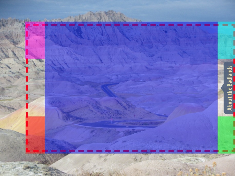
Begin by creating a frame that “masks” part of the dead zone. In this example, you could create a frame like this (indicated by the blue region):
Note that I didn’t mask the entire pullout tab region. I left space on both the right and left so the user can grab the tab to drag it open, and to drag it closed.
Your frame should have no fill or stroke.
In the buttons panel, click on the plus button next to Actions, and choose the Go To Page action. Specify the page that your pullout tab is on, and then click on the Click Appearance to create a Click state. Your panel should look like the one below when complete, except the page number will vary. What you’re doing is creating a button that, when tapped, goes to the page that you are currently on, so it effectively does nothing.

Thats it! This button now creates a zone on top of the scrollable frame that will allow the user to swipe left, right, up, and down to navigate to different screens.
One minor drawback of this approach is that this button creates a dead zone of its own. If the user taps anywhere within the bounds of the button to try to reveal the DPS top/bottom bars, the bars will not appear.
Remember, buttons in InDesign/DPS are always rectangular regions. So if you want to get fancy and create a mask like the one below, you need to create 5 different buttons, one for each different-colored rectangle.
Shameless self-promotion: If you need to create these “super buttons” frequently, my Digital Publishing Pack 2 set of scripts includes a script called “Create Super Button” that creates these buttons with a single click.
I’ll be talking about how to create these pull out tabs and other kinds of interactivity at my PePcon pre-conference session DPS Bootcamp: Building Folios for Digital Publications. Hope to see you there!
This article was last modified on December 30, 2021
This article was first published on February 20, 2014
Commenting is easier and faster when you're logged in!

Recommended for you

Thinking about Upgrading to Creative Suite 4? Think Fast.
It doesn’t seem that long ago that Adobe had the most liberal upgrade poli...

Using Animated GIFs in InDesign
You can place animated GIFs in your InDesign document. How you get them to work...

Fun with the MakeGrid script
Keith wastes way too much time playing with the handy MakeGrid script that's inc...