


Gudrun on Paper
While Hermann Zapf’s work has had several sumptuous books devoted to it, his wife Gudrun’s career has not, until now, been given the same treatment. Gudrun Zapf von Hesse would probably have a much higher profile if she weren’t married to such a prolific husband; only in comparison to his career could hers seem less than richly productive. She began as a calligrapher and bookbuilder before the Second World War, and her hand-tooled leather bindings (using her own tools and her own alphabets and ornaments) are given a large section in this book. The reproductions of the bookbindings are especially stunning.

A variation on the title page of the book on Gudrun done for the Mark Batty, Publisher brochure.
“Gudrun Zapf von Hesse” is largely visual: a short biographical introduction by Hans A. Halbey, and captions for each of the 150 full-color plates, are the only text. The typography—that is, the design of the book itself—was done by Hermann, using Gudrun’s digital type family Nofret. The English-language version is published in an edition of 900 trade copies; there is a simultaneous German edition. The captions to the U.S. edition are in German, with a supplement that gives English translations (for the simple reason that printing two versions for such a small amount of text would have been prohibitive, and silly). In addition to the “regular” trade edition, there are two special editions: a “limited” of 80 copies, specially bound by Judi Conant and including a portfolio of six type and printing specimens chosen by Gudrun Zapf, and a “deluxe” edition of 20 copies, bound in silk, with still more rare specimens, some from the past half-century and some printed specially for this book.
My only criticism is more of a wish: that the plates showing type specimens could have been printed in all the individual spot colors used in the originals, rather than only in four-color process color. The effect is, nevertheless, stunning.
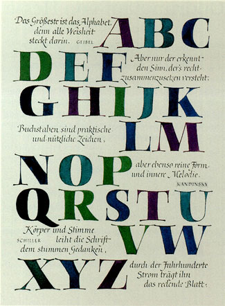
An alphabet and quotations demonstrating Gudrun Zapf von Hesse’s lettering style in watercolor and ink.
To see the range of Gudrun Zapf von Hesse’s impressive visual work, from rarely seen paintings to the hand-lettered books that led to her first typeface designs and that caught the eye of the young Hermann, this book is an invaluable and beautiful tool. It belongs on your bookshelf. Get it now; those 900 copies won’t be available forever.
Together at Last
A third book, the catalog of last year’s Zapfest exhibition, devoted to the work of both Hermann and Gudrun Zapf, should by rights have been reviewed along with these two volumes, but its publication by Gingko Press has been delayed and I haven’t seen a copy yet. Judging from the laser proofs I did see (and the expertise of the people preparing it), it should complete the Zapf triptych nicely.
This article was last modified on March 11, 2022
This article was first published on March 8, 2002
Commenting is easier and faster when you're logged in!

Recommended for you

dot-font: The Type Show Goes On
dot-font was a collection of short articles written by editor and typographer Jo...
dot-font: Type now
dot-font was a collection of short articles written by editor and typographer Jo...

dot-font: Dot-Dot-Dot Dis
dot-font was a collection of short articles written by editor and typographer Jo...