


dot-font was a collection of short articles written by editor and typographer John D. Barry (the former editor and publisher of the typographic journal U&lc) for CreativePro. If you’d like to read more from this series, click here.
Eventually, John gathered a selection of these articles into two books, dot-font: Talking About Design and dot-font: Talking About Fonts, which are available free to download here. You can find more from John at his website, https://johndberry.com.
For several years, I’ve been waging a quiet campaign against the prevalence of light, spindly typefaces for text. We’ve gotten used to overly light text faces, largely because so many of them are adaptations of classic metal typefaces to digital technology (and before that to photosetting technology); too often, the new versions just translated the original drawings into digital outlines, without regard for the differences of ink-spread between a letterpress and an offset press. Our notion of what famous 20th-century book faces such as Bembo and Caledonia (themselves often revivals of earlier models) really look like has been warped by the spindly digital versions we see in modern books and magazines.
But if you look at the original faces, used the way they were meant to be used, you see a very different effect: a clean, darkly printed page of easy-to-read text. The letters are robust enough for use at text sizes, and they look at home in the long history of book printing. There’s a reason that printing was dubbed the “Black Art,” not the “Light-Gray Art.”
One of the digitally designed typefaces that counters this trend is Dolly, a solid, robust text face released by the Dutch-based Underware in 2001. Recently I had a chance to put Dolly to use, where it proved its worth.

Dolly in use, as the text face in a book of short stories.
New Old Style
Dolly is squarely within the tradition of Dutch type design, with its roots in the sturdy 17th-century book faces that grew out of more delicate 16th-century French types. Clearly, Dolly also owes a debt to Fred Smeijers’s FF Quadraat (1992)—another typeface designed digitally but with a strong old-style feel. Some of the letter shapes in Dolly are similar to those in Quadraat, though this probably owes more to common inspirations than to imitation. And Dolly avoids some of the quirkier choices that Smeijers made with Quadraat. Most obviously, Dolly’s italic is not drastically narrow and upright, like Quadraat’s; it’s more rounded, more what you’d expect.

From the title page of the same book, showing Dolly italic and small caps.
Dolly doesn’t have a lot of contrast between thick strokes and thin ones. This is generally a good thing in a text face, meant to be read comfortably at 9pt or 10pt. But more than an even color, Dolly offers a dark color; even the thin strokes are pretty thick, and the thick strokes have generous, fat curves. This might sound exaggerated, but the effect is not exaggerated at all; on the contrary, it’s very effective. Even when printed with overly light inking, a page of text (assuming it’s competently designed) typeset in Dolly is easy to read.

Dolly stands up to typographically complicated arrangements in running prose.
Erik Spiekermann, writing in the ambitious specimen booklet that Underware put together, says of Dolly: “In small sizes—the ones we read—it looks like a warm, comfortable Garamondish, Minion-like Roman. Close up, we notice dozens of subtle curves and unusual shapes.” Dolly is in fact quite a curvy typeface, with lots of rounded ends and flowing joints. There is nothing rectilinear about its outlines, yet the effect in text is straightforward; it doesn’t look soft or flaccid, like Souvenir.

A sketch from the development of Dolly.
Intelligent Prose
I chose Dolly for a book of short stories by the fantasist Eileen Gunn, whose fiction has a surreal wit that’s hard to pin down. (I admit that I’m not exactly an objective judge of Eileen’s stories, since I live with the author.) I wanted to make a trade paperback in a small, portable format, though since the publisher was a small press, I had to work within their limitations and those of their printer. (But then, all design work is done within restrictions; that’s what makes it interesting.)
The text face had to be traditional but not too “literary”; it had to be invisible to the reader but still give an impression of straightforward, modern, intelligent prose. There is no one style to Eileen’s stories, so I couldn’t choose a typeface to match a particular “feel.” I tried a number of text faces that I had used before (including Quadraat), experimenting with various combinations of point-size and leading and line length on the fairly narrow page.

A full page—the opening page of the book’s introduction.
The real test is simply reading a passage of the text, typeset, and seeing how it works. I can’t be more specific than that; it’s a judgment that can only be made by the reader, and in book design, the designer represents the reader. When I tried reading a page of Eileen’s prose in Dolly, after the appropriate adjustments to the typesetting specs, it read right. I tried other passages, from other stories, to make sure the design was flexible enough. It still worked. The line length is short enough in this book that occasionally I would get loose lines (something I always try to avoid), but overall this was a price I was willing to pay in order to get a comfortably readable text block. (Never, under any circumstances, do I let the page-layout program increase the letter spacing in order to justify a loose line. Any looseness should appear only in the word spaces.) The sturdiness of Dolly made even those loose lines hold together, as a lighter typeface might not have.
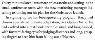
Real-world use of a text typeface, where the lines don’t always break the way the designer might wish.
Underware is a sort of “dispersed” type-design business, with “homes” in three cities: The Hague, Amsterdam, and Helsinki. The three principals are Akiem Helmling, Bas Jacobs, and Sami Kortemäki; nothing in their publicity material says which of them did the actual design work on Dolly. (When Dolly first came out, Underware also included a fourth member, Lars de Beer. On their Web site now, they mention a newer addition, Hugo Cavalheiro d’Alte.) They not only produce interesting typefaces, they promote them in witty and well-crafted publications, such as the “Dolly” book.

Combining roman, italic, and small caps in a promotional blurb.
Like any good text typeface, Dolly includes a roman, an italic, and true small caps, all with old-style figures. There is also a rather heavy bold, which stands out well in headlines and in striking contrast to the roman in text. Oddly, although Dolly sports a number of f-ligatures, it does not include any double-f ligatures; the designers insist that the design of the letters and their fit make this unnecessary, but I’d like to have the option.
The name? It’s their office dog, a French bulldog (I think) named Dolly. The dog theme crops up quite a bit in the Dolly specimen book, but otherwise there’s no connection. No paw-print dingbats, no “canine” details to the design. You asked.
This article was last modified on January 18, 2023
This article was first published on August 30, 2004
Commenting is easier and faster when you're logged in!

Recommended for you

dot-font: Hermann Zapf at 87
dot-font was a collection of short articles written by editor and typographer Jo...
dot-font: An American Typeface Comes of Age
dot-font was a collection of short articles written by editor and typographer Jo...

dot-font: Can a Book Teach You to Set Type Perfectly?
dot-font was a collection of short articles written by editor and typographer Jo...