


dot-font was a collection of short articles written by editor and typographer John D. Barry (the former editor and publisher of the typographic journal U&lc) for CreativePro. If you’d like to read more from this series, click here. Eventually, John gathered a selection of these articles into two books, dot-font: Talking About Design and dot-font: Talking About Fonts, which are available free to download here. You can find more from John at his website, https://johndberry.com. Old type-specimen books can be a cornucopia of design ideas. One of my favorites is a casebound book I picked up years ago, called “Caratteri Nebiolo”—a specimen book of the typefaces available at the time from the Italian type foundry Nebiolo, in Torino (see Figure 1). There’s no date in the book, but it must have been published in the 1950s, judging from some of the typefaces shown. It reflects what was then both new and old: the latest releases from the foundry, and the older faces that were still in demand. All of these typefaces reflected the trends of their day; some of them helped to create the trends of the future.
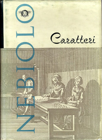
Figure 1: A 1950s book of type specimens from the Nebiolo type foundry in Italy.
Aldo Novarese’s Early Types
Nebiolo was one of the major Italian type foundries, at a time when Italian design was on the cutting edge—though the type business, unlike some other aspects of visual communication, was quite conservative. You wouldn’t know it to page through “Caratteri Nebiolo,” but the foundry employed one of the best-known modern type designers in Italy, the prolific Aldo Novarese, whose myriad typefaces have spread around the world. His most influential typeface design appears in
this book (although no designer credit is given): Microgramma (see Figure 2).

Figure 2: Detail from the opening page of the Microgramma section.
Microgramma was a quintessentially modern typeface—not “modern” in the type-history sense, as a high-contrast roman letter with a vertical axis, but modern in the 20th-century sense: streamlined, clean, sleek, stripped to its essentials. It’s a sans-serif typeface built on the form of a rounded square—or rather a rectangle, slightly upright in the normal width, stretched out in the wide, and strictly narrow in the condensed. There’s a bold, but the fairly light-looking regular weight defines the face—and the look of Italian modernism in print. The rounded corners and squared turns make Microgramma look like machined wire (see Figure 3).
Figure 3: Microgramma bold extended in use.
In digital or photo type, the flat-sided forms would make it possible (and tempting) to set the letters too close together, but these were metal types; even fitted tight, they kept enough room to breathe. Microgramma was a purely uppercase typeface; Novarese’s later extension of it into a lowercase, which was released under the name Eurostile, does not appear in this specimen book. But other Novarese creations do, in a variety of weights and widths and styles. His Egizio, for instance, which has been much imitated, took 19th-century slab-serif display faces and introduced their lively but slightly clunky vigor into the 1950s (see Figure 4).

Figure 4: Egyptian-style types from the Nebiolo collection.
Samples and Show-offs
The creators of the specimen book wanted it to be both a reference and a way to show off their type and how it might be used. Some pages simply give sample settings of words and phrases at different sizes and in different languages, to reflect their international clientele (see Figure 5).

Figure 5: Sample settings in graded sizes of Quirinus.
Others show well-constructed pages that suggest ways to use the typeface in real-world situations (see Figure 6).
Figure 6: Part of a page showing Athenaeum in use, including one of its decorated initial caps.
Still others show imaginative juxtapositions of different typefaces (see Figures 7-9).

Figure 7: Several weights, styles, and sizes of Quirinus in practical use.

Figure 8: Contrasting Microgramma with a script typeface, and using the Microgramma M as a graphic element.

Figure 9: Detail from the opening page of the section on the typeface Fluidum.
Many of the sections of the book start with an opening page announcing the theme of the typeface (see Figure 10).
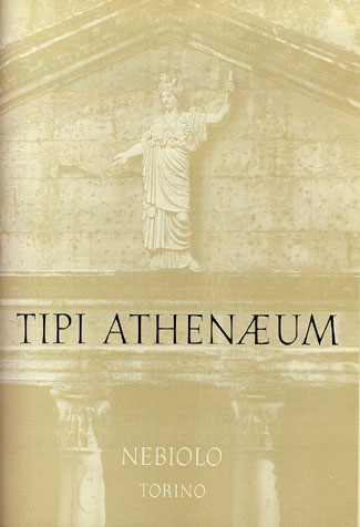
Figure 10: Opening page of the Athenaeum section.
And sometimes the book designer just plain shows off, pulling out all the stops and flinging ornaments, borders, and ornamental caps into the fray (see Figure 11).
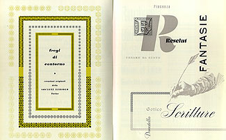
Figure 11: A double-page spread, showing typographic borders and graphic elements as well as a variety of sizes and styles of type.
Modular Book(lets)
Many of the most exuberant demonstrations of the various typefaces in use were first created as flyers or brochures to promote individual new faces. Tucked into the back of my copy of the book is a four-page, three-color specimen of a condensed version of Egizio (“Egizio stretto neretto”), combined with a showing of a script face in what they call “tipo inglese” (English copperplate style), called Juliet. These brochures could be bound into signatures for a new specimen book, or kept separate as a promotional hand-out (see Figure 12).

Figure 12: Opening page showing a then-new condensed version of Aldo Novarese’s typeface Egizio.
Custom Casting
At the front of the book is a short section on ordering type from Nebiolo carefully explained in five languages. Since this was a true foundry, casting type in metal to order, the instructions on “How to Place Your Orders” includes worries that would never occur to a user of digital type, such as the printing height (how tall each piece of type must be) or the weight of the metal type to be shipped: “The weights given refer to types delivered in Italian fonts and are approximate with a tolerance of plus or minus 5 to 10%. For types to be supplied in French, Spanish, German, English, Portuguese, Dutch, Belgian, etc. fonts, weights vary according to the font wanted.” It gives new meaning (or rather, a much older meaning) to the notion of “the weight of a font.” We don’t order type in the same way today, but the printed specimens presented in this 1950s book can give us inspiration for designing with type—and send us scurrying to try and find some of these typefaces in digital form. The nature of these once-new type designs is both elusive and insistently material: it would be hard to come by most of them as metal type today, but the printed manifestation of the types in use remains.
Commenting is easier and faster when you're logged in!

Recommended for you
Marrying Types: All in the Family
My “Marrying Types” series looks at which typefaces blend well with...

QuarkXPress Tips: Synchronizing Text
This story is taken from “QuarkXPress 6 for Macintosh and Windows: Visual...

GREP in InDesign Excerpt: Learning by Example
Get started learning the basics of GREP in InDesign in this free excerpt from Pe...