


dot-font was a collection of short articles written by editor and typographer John D. Barry (the former editor and publisher of the typographic journal U&lc) for CreativePro. If you’d like to read more from this series, click here.
Eventually, John gathered a selection of these articles into two books, dot-font: Talking About Design and dot-font: Talking About Fonts, which are available free to download here. You can find more from John at his website, https://johndberry.com.
We’ve all heard the cry: “Just give me plain text!” But there’s no such thing. And the myth of plain text has done a lot of harm to our ability to communicate on the Internet.
Form vs. Content
As educators know very well, everybody learns differently. Some of us think visually; we learn best from images. Some of us think verbally; we absorb information best from hearing or reading words. A few of us even think both ways at once. But no matter which kind of information is more important to us, we receive various kinds of input all at once, and they’re inextricably linked.
There’s no way, in fact, to separate content from form. The content—the words—always takes some form, and even if we pay no conscious attention to the presentation, that form has its influence. The subtleties of typography, of which 99 out of 100 people are completely unaware, make the difference between words that those 99 people will want to read and words that they’ll skip over.
String Theory
The assumption behind the idea of “plain text” is that you can somehow separate words from what they look like, turning them into pure content. One of the strengths of computers is that you can do this, to a point: You can turn a sentence into a string of ones and zeroes that represent particular characters in the alphabet, along with a handful of other characters such as commas and periods. We can transmit this string of digits (as e-mail, for instance) and then reassemble it and read it. What the characters actually look like at the other end depends on outside factors such as choice of font and size and spacing—matters of “style” that can be applied to the content as easily as you might slip on a jacket or a different pair of shoes.
There are two things wrong with this concept.
- The Typography of Text: One is that, as I’ve said, the way words look has a huge effect on how well they communicate. This is the inherent problem of the Internet, with its basis in HTML: The words look different to each reader, depending on the kind of screen they’re using and the browser settings they’ve chosen (or not bothered to change). Since the default settings for type are usually terrible, the result is a serious degradation of communication. And since the essence of typography, especially text typography, is space—space between letters, space inside letters, space between words, space around paragraphs, the length of lines, the exact placement of each character on the screen or page in relation to all other characters and visual elements—having control over what font is used isn’t even the most important part of the story. The font itself is only the beginning; what counts more is how the font is used. And how the font is used is precisely what we have almost no control over online, either as content publishers or readers.
- The Net Is Not a Typewriter: The other thing wrong with the “plain text” idea is that the definition of “plain text” is so primitive. Anyone who’s seen e-mail with garbled characters where the sender typed an accented letter or used an em-dash knows what I’m talking about.The standards for “text” in computer terms seem to have been set by people with severe limitations. For one, they only spoke English. (American English, most likely.) For another, they mostly wrote with keyboards that derived from 19th-century typewriters, with their drastically simplified complement of typographic characters. How many times have you seen—even today—a date that begins with a lowercase L instead of the numeral 1? It’s a holdover from the old manual-typewriter habit of using the l for 1 because there wasn’t room for an extra key—and the typewriter faces were designed so that the two characters looked the same. A century or more of confusion has ensued.
Learnèd Confusion
The fact is that even the English language cannot be adequately written without a few accents and other diacritical marks. We think of English as a language without accents, but it does have a few—in words brought in from other languages, such as French and Spanish, or words with confusing combinations of letters that need a little typographic help. The word cooperation is a good example, or at least should be. My great-great uncle’s 1927 Third Edition of Merriam-Webster’s Collegiate Dictionary gives coöperation as the proper spelling of this five-syllable word. My copy of the Concise Oxford Dictiontary—also a Third Edition, from 1934—gives it as “co-operation,” with a hyphen. My 1993 Tenth Edition of the Merriam-Webster Collegiate drops the diaeresis, and follows our current pathological fear of hyphens as well—thereby leaving the word undifferentiated. If you don’t already know how to pronounce it, you’ll probably guess that it has only four syllables. Because of a fundamentalist sort of theory that English ought to be written without accents, we’re forcing our language into a straitjacket and adding to our own confusion.
There are very few other languages written with the Latin alphabet that pretend to be accent-free. Even Italian requires accents on some words, to distinguish them from other words or to tell a reader that the stress falls on an unusual syllable. German requires umlauts and, properly speaking, needs the double-s as well. French is completely incomprehensible without accents. Hungarian requires several accented characters, including a u with a double acute accent, which tends to get left off of even “multilingual” character sets.
Don’t Fall off the Platform
Our “plain text” doesn’t take any of these essential elements of writing into account. But these days, the more “common” accented characters do exist in digital fonts, and we do have basic typographic signs like em-dashes and real apostrophes. Trouble is, no one bothered to define these characters the same way for different computer platforms and programs. It’s crazy, but it’s true: You can’t type “Götterdammerung” or “the New York-Génève flight” in your e-mail program and assume that it’ll come out the same on the recipient’s screen. Or that it will appear correctly on a Web page, either.
Reality
Let’s stop pretending that we have an adequate method of transmitting text information without the aid of “layout” and “design.” We don’t. We have to invent systems that take into account the visual as well as the verbal.
Written communication is entirely visual. The visual symbols and how they’re arranged are what communicate the meaning to us, through our eyes. We cannot—ever—separate content from form.
Layering and Brayering
Here’s a footnote to last week’s column, about the keepsakes in the goodie bag of the ATypI conference in Leipzig.
Brian Allen, who designed and printed the small letterpress poster distributed by Agfa Monotype, offers this bit of background on how he created such a striking piece:
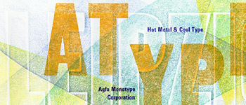
“I made that by debossing the paper (Zerkall Book, a printmaking paper) with the large wood type LEIPZIG, brayering over with the 3 colors of oil base printers ink (the edges of the debossed letters being too low to be inked), and then overprinting with both wood and metal type. The paper makes all the difference. The vellum finish (and the unsmooth surface of the Speedball brayer) combine to pull off small bits of color, so there is not solid coverage; under a loupe you can see the mixing of little bits of the colors, more like stippling or halftone. The effect fails with a smooth sheet of paper.
Aside from the general art I was producing, I was secondarily trying to show that you don’t need computer graphics to produce the depth and layering effects so prevalent now in graphic and Web design. Each piece is unique, because of the brayering, and I did more than 300 of them. It took quite a while, but it was worth it, judging from the response to it (not to mention my personal satisfaction in doing it). There is still a place for the hand crafted!”
This article was last modified on July 18, 2023
This article was first published on November 10, 2000
Commenting is easier and faster when you're logged in!

Recommended for you
dot-font: The “X” Appeal of James Montalbano
dot-font was a collection of short articles written by editor and typographer Jo...

dot-font: Judge for Yourself
dot-font was a collection of short articles written by editor and typographer Jo...

dot-font: Designing Running Heads
Learn the best practices for designing these inconspicuous but essential book pa...