


dot-font was a collection of short articles written by editor and typographer John D. Barry (the former editor and publisher of the typographic journal U&lc) for CreativePro. If you’d like to read more from this series, click here.
Eventually, John gathered a selection of these articles into two books, dot-font: Talking About Design and dot-font: Talking About Fonts, which are available free to download here. You can find more from John at his website, https://johndberry.com.
Writing a style guide is a thankless task, since virtually every reader will take exception to one thing or another. Attempting to write a style guide that deals not only with the written word but also with the way it’s formatted on the page, and doing this for technical and scientific writers with no special graphic sense, is downright Herculean. Yateendra Joshi, of the Energy and Resources Institute in Delhi, has done this in a form that can be used across the entire English-speaking world.

Communicating in Style (Delhi: TERI, 2003) is published in India and is aimed first and foremost at Indian technical professionals—a very large and active class of writers. But, although India has the largest English-speaking population in the world, Joshi’s book is in no way limited to his native country; the book is every bit as useful to someone working in the United States, Britain, or anyplace else where our common tongue is used for business and technical communication. For an American reader, this book has the added interest of explaining details of Indian usage that we might not be aware of. In the international flow of information, however, we can all benefit from learning these details.
A Field Guide to Form and Content
The primary focus of this guide is on content—writing—but Joshi clearly understands the way form and content work together. He assumes that his audience has no training at all in graphic design, and gives them simple, easy-to-understand guidance in how to present their ideas effectively.
Communicating in Style makes no attempt to be comprehensive, like a Chicago Manual or an Oxford Guide to Style. Right from the start, Joshi says: “This book might as well have been titled ‘Where there is no copy editor’—after David Werner’s eminently successful book Where There Is No Doctor—because it is written mainly for those who must revise and polish their work on their own.” All the obvious major manuals and reference books (and quite a few unexpected ones) are cited or quoted as examples in the text. And while Joshi makes specific recommendations about details of orthography and punctuation, he also makes it clear how these patterns vary from context to context—particularly between the most common British and American usages.
The range of this book is suggested by the four blurbs on the back cover. Blurbs are pure marketing, of course, a way to catch the attention of potential readers and get them to pick up the book, but I found it interesting that three of the four people quoted were familiar to me—all from different fields. Jean Hollis Weber is a well-known Australian-based American technical editor; Sue Walker is head of the Department of Typography & Graphic Communications at the University of Reading; and Rolf F. Rehe is a respected publication designer from Vienna. The only name I didn’t instantly recognize was that of Derek G. Land, former editor of the International Journal of Food Science and Technology—obviously someone with an intimate acquaintance with scientific writing and publishing.
For pure marketing, of course, the best hook is the blurb on the front cover: it’s from John Le Carré.
Organized and Specific
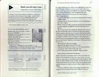
The book is organized into thematic chapters (“5: How long is a piece of string?—Notation for units of measurement”), and in each chapter the right-hand page is for running text, the left-hand page for examples. The left-hand pages are every bit as full of information as the right-hand, but they’re more visual and they sometimes show competing or alternate recommendations from other books.

The examples are always to the point. The suggestions on formatting a table in the midst of a page of text help the writer focus on the essential and keep away from needless distractions: “If the title runs to two or more lines, do not indent the additional lines”—a simple injunction that reserves the use of indents for meaningful situations.
Joshi’s text covers everyday situations: “Format and style for e-mails,” for instance, or tips on making an effective presentation using slides, transparencies, or the ubiquitous PowerPoint. I’m sure we all wish that more presenters would take this advice to heart: “Sheer quantity of information is the single most common cause of illegible slides or overhead transparencies or screen displays. Accept the large fonts size required to ensure legibility as given, and trim the contents accordingly, instead of taking the amount of information you would like to put on one slide as given and progressively reducing the font size to accommodate that amount” (“Constraints to visibility”). The latter part of Chapter 10 (“Stand and deliver: making effective presentations”) offers specific templates for typeface (Georgia), type size, and margins for slides, transparencies, and PowerPoint presentations—each designed for the nature and aspect ratio of each format. Similarly, the next chapter has suggestions for designing effective posters—not movie posters or graphically sophisticated advertising, but simple forms for a poster presentation on the floor of a technical trade show.
This is not high-end design, but it’s very practical for everyday presenters.
Culture-specific
As I said, the bits that caught my interest the most were those I wasn’t familiar with: those specific to India. It’s useful to have an explanation of the Indian postal code (and to know that it’s called a PIN code—not to be confused with the ever-present “personal identification number” that we use in cash machines), but what really fascinates me is discovering a numbering system that I was completely ignorant of.
In a discussion of abbreviations and punctuation in numbers, Joshi mentions the way the Anglo-American “decimal point” is a period while in continental Europe it’s a comma, but he goes on to point out further complications: “Even the so-called ‘thousands separator’—a comma in the US and a space in Britain—can lead to confusion because, in India, it is commonly used to separate crores, lakhs, and thousands. For instance, the latest census gives the exact figure for the population of Delhi (about 12 million in April 2001) as 12,791,458, which is commonly rendered as 1,27,91,458 (and read out as 1 crore, 27 lakh, 91 thousand…).”
Universal
Clarity and common sense are not limited to any one country or culture—nor, of course, to any one language. For the wide variety of writers and presenters using our modern-day lingua franca, English, a handbook like this is invaluable. No one has all the answers, and communication can never be reduced to a set of rules and formulas, but for pragmatic guides, suggestions, and rules of thumb, you could do worse than pick up a copy of Communicating in Style.
This article was last modified on January 6, 2023
This article was first published on March 7, 2005
Commenting is easier and faster when you're logged in!

Recommended for you

dot-font: True to Type, the Autobiography
dot-font was a collection of short articles written by editor and typographer Jo...

dot-font: Book Design, Part II
dot-font was a collection of short articles written by editor and typographer Jo...

dot-font: Twenty-five Years of Type
dot-font was a collection of short articles written by editor and typographer Jo...