


dot-font was a collection of short articles written by editor and typographer John D. Barry (the former editor and publisher of the typographic journal U&lc) for CreativePro. If you’d like to read more from this series, click here.
Eventually, John gathered a selection of these articles into two books, dot-font: Talking About Design and dot-font: Talking About Fonts, which are available free to download here. You can find more from John at his website, https://johndberry.com.
Once upon a time, all typography was the result of printing on a letterpress. Today, in 2004, when type is largely digital, and printing is usually done by offset or newer technologies, we can still find creative typography in letterpress printing. It’s not just antiquarian or deeply nostalgic; it’s sometimes innovative and original. Two of the most interesting practitioners of modern letterpress printing are C. Christopher Stern and Jules Remedios Faye, and now they have a well-designed Web site to show off their craft.

Figure 1: Letterpress print, designed and printed by Chris Stern, with text written by Chris Stern and Jules Faye.
Mix & Match
Chris Stern and Jules Faye have been printing together for more than a decade, under the name of Stern & Faye, Printers. Each of them has also been printing for longer than that under their individual imprints: Chris established Grey Spider Press in 1986, and Jules established Street of Crocodiles Letterpress Printery in 1990. When they moved out of Seattle in 1994, they settled in the rural Skagit Valley and set up what they referred to as a “printing farm,” with a barn full of working presses and typesetting equipment. Separately and together, they have produced an impressive body of printed work.

Figure 2: The logo for Stern & Faye, Printers, composed from wooden type.
What’s unique may be their combination of “fine press” sensibility and a freewheeling approach to typography and art. You don’t often see letterpress these days in Futura (a favorite typeface of Chris’s); more often, it’s a delicate, Renaissance-derived face like Garamond. Stern & Faye have command of both idioms, and mix them freely.
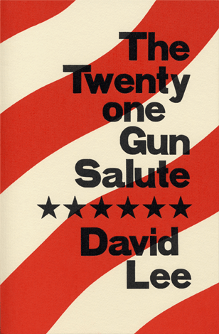
Figure 3: Cover of David Lee’s ‘Twenty one Gun Salute’ (Grey Spider Press, 1999).
Crafted by Hand, Composed by Mind
The fine-press books that Chris and Jules publish, like most fine-press books these days, are usually poetry or short prose. There’s a practical reason for this—much poetry is short, and even a long poem rarely packs the page as densely with words as prose does. When you’re setting the type by hand, brevity is a virtue. (Stern & Faye have the capacity to set longer books, without doing all the work the hard way; they’ve got a Monotype caster, which makes and composes hot-metal type for typesetting. They’ve stayed away from the hybrid technology of composing digital type and turning it into metal or polymer plates that can be printed by letterpress.)

Figure 4: Two-page spread from Rebecca Brown’s “Excerpts from a Family Medical Dictionary” (Grey Spider Press, 2001).
There’s an aesthetic reason too—good poetry and good prose deserve this kind of treatment. None of the work published by either Grey Spider or Street of Crocodiles is the slightest bit “precious”; it’s all strong and worth reading. And rereading, which is why people make books that will last.

Figure 5: Page from Jules Faye’s ‘Fallen Angels’ (Street of Crocodiles, 1999).
They also like to play, sometimes, with retro themes. Lately Chris has been doing a series of art prints, mixing up various kinds of old type with antique or out-of-date images from advertising and job printing. He layers them densely, but wittily, and the effect pleases both the eye and the mind.

Figure 6: Letterpress print, “Good Mornin’ Joe,” by Chris Stern, using text from ads for a 19th-century coffee company and multiple layers of type and image.
Image & Object
The Faye & Stern website, designed by Amy E. Redmond, is particularly well conceived and clearly laid out; it presents the range of Chris and Jules’s work very effectively, not only showcasing their artistic talents but giving information for anyone who would like to take advantage of their commercial job-printing capabilities.

Figure 7: Letterpress print, “Myti Good,” designed and printed by Chris Stern, incorporating 19th-century potato ads.
Yes, there’s an irony in talking about viewing letterpress printing on a website. Letterpress is an essentially three-dimensional medium, where the ink is slightly impressed into the paper, rather than laid flat on top of it as in offset printing. (Traditionally, the letterpress printer did not want to exaggerate this effect; printers would talk approvingly of the “kiss impression,” and look down on anyone whose printing left a noticeable indent in the paper. Today, some printers seem to want to show off the fact that they’re doing letterpress, by punching the type deep into the paper.) Part of the appeal of letterpress printing now, when it’s neither a standard nor a common mode of reproduction, is in the materials used: the texture and feel of the paper and (if it’s a book) the binding. None of this can be conveyed through an electronic image on a computer screen—and very little of the richness of color and depth in letterpress ink, either. But it can suggest these things, and it can show something of the care given to the typography. For more, go look at the books themselves.

Figure 8: Back cover of David Lee’s “Twenty one Gun Salute.”
This article was last modified on February 21, 2022
This article was first published on March 1, 2004
Commenting is easier and faster when you're logged in!
