


dot-font was a collection of short articles written by editor and typographer John D. Barry (the former editor and publisher of the typographic journal U&lc) for CreativePro. If you’d like to read more from this series, click here.
Eventually, John gathered a selection of these articles into two books, dot-font: Talking About Design and dot-font: Talking About Fonts, which are available free to download here. You can find more from John at his website, https://johndberry.com.
Push Pin Studios had a major effect on the visual design of the 1960s and 1970s. The two principal founding members, Seymour Chwast and Milton Glaser, achieved extremely high profiles in the graphic-design business, both through Push Pin and independently. But they began in the early 1950s as hungry design students out to make an impression and a buck. They were fabulously successful.
There have been other publications about Push Pin, and about its two leading lights, but a recent book from Chronicle Books focuses on the form they used to make their mark: a little publication that they created, produced, and sent out for free, called the Push Pin Graphic. And that, appropriately enough, is the title of this book, which presents itself as “by Seymour Chwast, edited by Steven Heller and Martin Venezky,” and with an introduction by Milton Glaser; the gang’s all here. Subtitle: “A Quarter Century of Innovative Design and Illustration.”
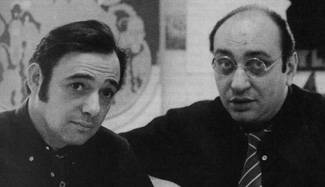
Seymour Chwast (left) and Milton Glaser in 1968
Getting Attention
The Push Pin partners started sending mailers to promote their services early in their careers. Where others sent brochures and desk blotters, these young designers created the Push Pin Almanack, a sort of Farmers’ Almanac collection of miscellany that they could illustrate and lay out in creative ways. In 1957 the Almanack was succeeded by the more freeform Monthly Graphic, and that’s what really became iconic. The Graphic endured, in various forms, for eighty-six issues over twenty-three years; in 1961, with issue number 35, its name changed to the Push Pin Graphic, so the readers wouldn’t howl so loud if it didn’t show up in their mailboxes every month.
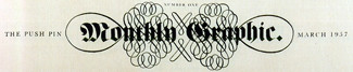
Nameplate of the first issue of the Monthly Graphic (later the Push Pin Graphic), 1957
After all, the Graphic was ultimately a promotional piece, not an end in itself. The various members of the Push Pin Studios had to produce the publication in the interstices of their paying work, even if the Graphic helped ensure that there would be another job waiting in the queue.
An Alternative to Modern
What’s fascinating about the Graphic is its seamless melding of illustration and publication design—that, and its creative use of retro styles and period ornament at a time with the austere Swiss Style ruled. Steven Heller, in his lead-off article (“The Push Pin Effect”), refers to their “reinvention of discarded mannerisms”: using everything from Victorian clichés to Art Deco flourishes to achieve striking contrast and surprising effect. This is the same spirit that infused some of the most creative design work that came out of the UK around the Festival of Britain in 1951: in the face of a standardized postwar modernism, putting old-fashioned visual elements to use in novel ways. Heller quotes Chwast as saying, in recollection: “Quaintness was popular in those days.”

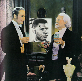
Pages from issue no. 23 (1959) on the theme “Medical Advice”
Although they were not alone in what they did, the Push Pin designers were hugely influential. The spirit of contrast that informs so much of the best design of the 1950s found itself elaborated in flowing ink lines and techniques like woodcut, collage, and painting on wood; Push Pin pioneered this. Since they were primarily illustrators, Push Pin particularly wanted to offer an alternative to the dominance of photography in modern graphic design. “Their mission was not solely an attack on modernism,” says Heller, but it did clearly offer a different way forward.

Page spread from issue no. 47 (1964) on the theme “Notorious Subjects as Children”
And novelty is always popular. In the late ’50s, other designers would use the Push Pin Graphic as inspiration, and new ideas or styles that appeared in one issue might show up all around the New York design world a month later. By the mid-’60s, when the principals’ modes had hardened into brilliant but recognizable styles, Milton Glaser and Seymour Chwast practically defined a certain end of the visual aesthetic of the time.
Well Presented
All of this is visually represented in the pages of this book. Every issue of the Graphic appears in some form, although not every page. The exuberance of the early issues is the book’s most inspirational aspect; the later issues, although wonderful and eclectic, are more a representation of their time—and the skills of the artists—than a mold-breaker or a paradigm-shifter. It is nonetheless a joy to have all of them here, in one form or another—the whole run, from March of 1957 to the final issue in 1980.
Page from issue no. 54 (1967 or 1969) on the theme “Southern Justice”; the facing page, all text, juxtaposes lyrics from the song “Mississippi” with an account of the murder of Medgar Evers.
The Push Pin Graphic is very well produced. It includes foldouts here and there, and a die-cut facsimile insert of issue 54, a scathing if slightly belated commentary on racism in the South. (That issue appeared in either 1967 or 1969; both dates are given, at different places in the book.) In the back there’s a visual index to the issues, with pertinent information (date, format, designers, and illustrators) and a fascinating section by Steven Heller called “A Push Pin Miscellany,” with short entries on almost anything having to do with Push Pin that was not contained in the pages of the Graphic. There’s even a spread showing some of the ads that Seymour Chwast designed, starting with issue 64, for the companies that supplied services to produce the Graphic. (From the very first, Push Pin had traded advertising design and space in the Graphic for the printing, typesetting, and prepress services needed to publish it. This was obviously a good way to show off the studio’s capabilities and get paying advertising work, too.)
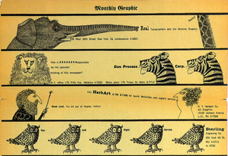
Part of a page of ads in issue no. 7 (1957) designed by Push Pin for their suppliers
“I Want That!”
Push Pin Studios designers were not the first to create a periodical to publicize their own services, but their success inspired any number of others to do the same. Herb Lubalin’s U&lc was clearly in the same mold, although Lubalin was more an expressive typographer than an illustrator and it was published by a type company rather than a design studio. The idea of an inexpensively produced, visually stunning publication that’s sent for free to its target audience is a natural. It’s hard not to imagine a horde of young designers picking up this book and starting to devise self-promotional publications of their own.
But to be effective, such a publication has to be really good. The crisp inventiveness and the visual tension of the Graphic’s early issues set a standard; if they had been ordinary, they wouldn’t have had such an effect. You want the recipients of such a piece to exclaim, “I want that!”—and then to come to your door with a fistful of money. Sometimes, if you have the talent and you hit precisely the right moment, they will.
This article was last modified on July 11, 2023
This article was first published on July 29, 2005
Commenting is easier and faster when you're logged in!

Recommended for you

How-to: Add Multiple Strokes to Editable Text in Photoshop
Have you ever tried to add more than one stroke to text using Photoshop’s Layer...

dot-font: Massin, the Unclassifiable Free Thinker
dot-font was a collection of short articles written by editor and typographer Jo...

Review : Lightroom Mobile
Review: Lightroom Mobile Pros: Automatic synchronization of edits between Lightr...