

dot-font was a collection of short articles written by editor and typographer John D. Barry (the former editor and publisher of the typographic journal U&lc) for CreativePro. If you’d like to read more from this series, click here.
Eventually, John gathered a selection of these articles into two books, dot-font: Talking About Design and dot-font: Talking About Fonts, which are available free to download here. You can find more from John at his website, https://johndberry.com.
“At Émigré,” says the introduction to Jonathan Barnbrook’s new type family Priori, “we have always had a soft spot for typefaces designed by graphic designers as opposed to typefaces designed by type designers. When graphic designers design type, there is a decidedly different intent and aesthetic at play that often results in surprising and unusual solutions to letterforms.”
This explains something that I’ve always found hard to pin down in Emigre’s type collection. All of the Emigre faces, even the most outrageous, are carefully designed, but many of them have a quirkiness that draws attention to itself—even in the typefaces intended for use in text. Certainly Jonathan Barnbrook is better known as a graphic designer than as a type designer, and the typefaces he has designed—especially Exocet and Mason (both issued by Emigre)—tend to be used in display work, such as book jackets and music posters and ads, by designers who want to achieve a catchy, not-quite-typographic look. Priori is more ambitious: a double type family of related serif and sans serif faces that can be used in text.
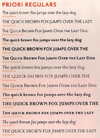
Priori has a range of weights and styles reminiscent of more traditional typefaces.
Playing with the Past
Barnbrook’s inspiration for Priori is the type he sees around him in his environment: the British typefaces of the early 20th century, and the general run of signage and public lettering in the United Kingdom. But he is always taking his material and playing with it, adding eclectic details and mixing them up, commenting on his sources as he draws from them.
It’s easy to see the look of Priori Sans as a sort of dialog with Edward Johnston’s sans serif Underground typeface and Eric Gill’s ubiquitous Gill Sans. Priori Serif has shapes and details in common with Gill’s Perpetua and some of his display lettering. But at the same time Barnbrook has chosen to use a form for the lowercase a (in both serif and sans) that echoes the oddly square-topped alternate a in Paul Renner’s original Futura. And he says that the little up-flipped tail on the ends of the serif h, m, and n comes from 18th-century letterforms.
{image src=”/wp-content/uploads/sites/default/files/story_images/120103_fg2.jpg
Priori Sans: a mixture of influences from sans serif typefaces of the early 20th century.
The quirks in Priori’s regular forms are minor—just enough to give the typeface its own look. Apart from that a, the basic letter shapes are pretty traditional. Most of the oddities can be found in the serif version, where the serifs themselves sometimes take odd form (such as a double serifs at the top of the vertical strokes of b and d, where you’d expect only a single serif, or the even odder double serif on top of the lowercase t). Priori Serif even has a remarkably traditional-looking italic (Priori Sans has no italic, though it does have small caps).

Text in Priori Sans with Priori Serif Italic.
But Barnbrook has given each face an “alternate” companion, in which his propensity for square geometry and decorative archaic flourishes comes to the fore. It’s hard to imagine anyone using any of the alternate fonts for setting straight text (though I’m sure someone will try); they seemed more intended as precisely what they’re called: alternate forms of particular letters, which you might use for some specific purpose in an otherwise normal passage of text. It would be instructive to see a short bit of text set in the Priori Sans alternates; it would certainly look odd, but it might be surprisingly legible. (Or maybe not.) When we get to the Priori Serif Bold Alternate, though, we’re back in the pure-display land of Exocet and Mason.

A few of Priori’s regular and alternate forms.
Use With Care
Emigre makes the point that Priori, like many of their other typefaces designed by graphic designers, is not for everyone. “In the end,” they admit, “these typefaces are not idiot-proof. They often require a trained, discriminating eye to use them effectively.” That’s true of any typeface, really, though a quirky typeface is harder to use well—and appropriately—than a more ordinary-looking face. “This results in typefaces that are perhaps limited in their application, but high on emotion and expressiveness when used well.”
Jonathan Barnbrook uses his own typefaces well; it will be interesting to see how others use Priori, and whether this font will prove trendy or durable.
This article was last modified on February 24, 2022
This article was first published on December 1, 2003
Commenting is easier and faster when you're logged in!

Recommended for you

dot-font: Type Under the Knife
dot-font was a collection of short articles written by editor and typographer Jo...
dot-font: Type You Can Use Again and Again
dot-font was a collection of short articles written by editor and typographer Jo...
dot-font: The Next Sabon
dot-font was a collection of short articles written by editor and typographer Jo...