
Digging into the Glyphs Panel
Grab a shovel (or a mouse) and start unearthing buried typographic treasures

This article appears in Issue 25 of CreativePro Magazine.
Our keyboards—even those fancy extended keyboards—are so small. Even with every possible combination of modifier keys, most glyphs can’t be accessed with a keyboard and are hidden from view.
When it comes to fonts, those glyphs that you can see—upper- and lowercase letters, numbers, punctuation, and a handful of special characters—represent the tip of the iceberg. And that iceberg can extend way beneath the surface: OpenType fonts have the capacity for up to 65,000 glyphs.
In reality, no font software comes close to having quite this many, but Pro fonts may have a full range of accented Latin characters to support central and Eastern European languages (such as Turkish and Polish) and full sets of glyphs to support alphabets like Cyrillic or Greek, as well as typographic delicacies like discretionary ligatures, real small caps, real fractions, and oldstyle numerals.
As an InDesign user, you should know that you can find such a wealth of resources just beneath the surface. The challenge is how to harness them.
Glyphs Panel
We gain access to the full range of glyphs through the Glyphs panel. Thankfully, it’s easy to use: Find the glyph you’re after, insert your Type tool into a text frame, and then double-click the glyph to insert it into the text.
But as invaluable as the Glyphs panel (Figure 1) is, your strongest impression of it may be that there must, in the twenty-first century, be a more-automated, less-error-prone way than visually sifting through rows and rows of glyphs to find the proverbial needle in a haystack.
There isn’t.
There are, however, some things you can do to make life easier, like viewing a subset of the font (such as math symbols, ornaments, or currency symbols)
or changing the view size of the glyphs.
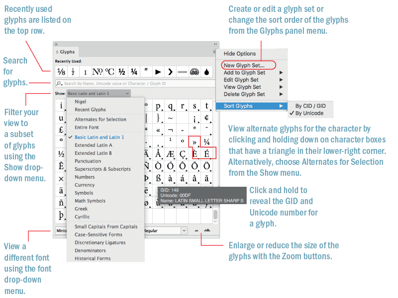
Figure 1. The Glyphs panel
If you know what the glyph is called, you can search for it by name in the Search field (but not in Photoshop and Illustrator, where dumbed-down versions of the Glyphs panel don’t have a search field). For example: Type pilcrow to find the ¶ character.
When working with text fonts, an educated guess will probably find what you’re after. For example, type half, and you’ll get the Vulgar Fraction One Half. If you know it, you can search by Unicode number, character name, or Glyph ID. But, if you’ve forgotten what that paragraph mark is called, it’s unlikely that you’ll know that its Unicode value is 00B6.
If you need to know the Unicode value of a particular glyph, Wikipedia has a useful page devoted to Unicode values arranged in subsets.
One of the biggest timesavers is making a custom glyph set (Figure 2)—another feature they forgot to include in Illustrator and Photoshop. That way, you’ll have frequently used glyphs close to hand, rather than having to hunt for them repeatedly.
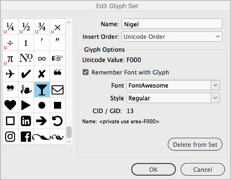
Figure 2. Glyphs that have Remember Font with Glyph selected are associated with a specific font; those that don’t (indicated by the U in the lower-left corner of the character box) will appear in the currently selected font.
Here’s how:
Choose Type > Glyphs.
From the Glyphs panel menu, choose New Glyph Set, name your glyph set, choose the method you want to use to order your glyphs (insert at front, append at end, or Unicode order), and click OK.
Click the glyph you want to add to your glyph set. Right-click, then choose Add to Glyph Set from the context menu.
To view your glyph set, choose View Glyph Set from the panel menu or the Show menu in the Glyphs panel. (You may need to scroll upward to see your glyph set in the Show menu choices.)
You can edit a glyph set by choosing Edit Glyph Set from the panel menu. As appropriate for individual glyphs you’ve added to the set, deselect Remember Font with Glyph when you want only the glyph itself and not the specific font that was active when you added it to the set.

Figure 3. Examples of manicules from different typefaces
View Emoji and Symbols in Your Operating System
While the Glyphs panel enables you to access all the glyphs of a given typeface, it doesn’t help you find a font that contains a specific glyph.
Let’s say you’re looking for a pointing hand. You know that some fonts have them, but you can’t remember which ones. Or, what if you want to compare certain glyphs across fonts? Maybe you’re creating a logo treatment that includes an ampersand, and you want to find the grooviest one possible.
You can use the Emoji and Symbols section of your system’s Character Viewer (macOS; Figure 4) with the following instructions (Character Map offers similar functionality for Windows users).
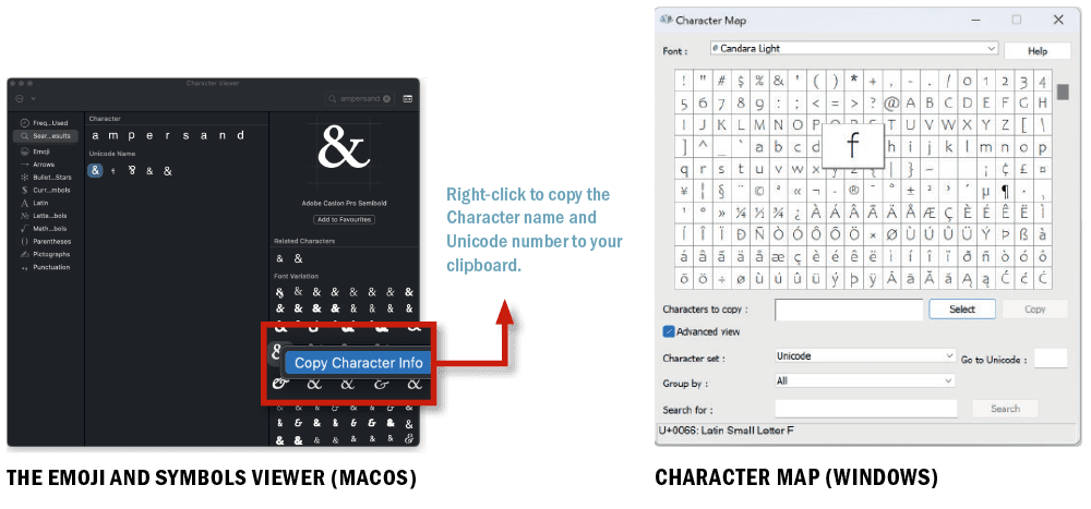
Figure 4. Use your operating system’s offerings to find emoji and symbols.
Go to System Settings (System Preferences prior to macOS Ventura), and choose Keyboard. In the Text Input section, click the Input Sources Edit button, and in the new dialog box, click the Show Input menu in menu bar. Now you have a new menu on the right-hand side of the menu bar in the Finder. Select Show Emoji & Symbols to open the utility.
Select a glyph category in the left column to see the glyphs it contains. When you click one of these glyphs in the middle area, an enlarged version will appear in the rightmost column, along with its official name and a button to add the glyph to a set of your favorites. Finally, here’s what you’ve been looking for: Under Font Variation, you will see every way that glyph is displayed in any of your currently installed fonts. Click one, and the font name will appear.
Double-click the glyph to insert it in your InDesign document at the point of your cursor. You can also add it to your favorites.
Tip: You can show or hide the categories that appear in the Character Viewer. Click the Action menu in the upper left, and select Customize List.
Hyphens and Dashes
Anyone who’s been working with type for a while will know there are different types of dashes—the hyphen, the en, and the em—and that they serve different functions (Figure 5A). If we forget their keyboard shortcuts, we can access them from the Type > Insert Special Character > Hyphens and Dashes menu.
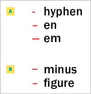
Figure 5. Most designers know the em dash, the en dash, and the hyphen (A), but InDesign gives you access to less-commonly-used dashes for more nuanced typography (B).
You might think there isn’t much to say about the humble hyphen, but did you know that as well as the regular form, there is also the discretionary hyphen and the nonbreaking hyphen?
Discretionary hyphens are entered at the insertion point by pressing Command/Control+Shift+-. They allow InDesign the option to hyphenate a word at that point. They’re useful when a word at the end of a line is not in InDesign’s hyphenation dictionary, or when you want to break a word somewhere other than where the dictionary recommends. Discretionary hyphens are just that: discreet. If the text reflows so that the word no longer needs hyphenating, the discretionary hyphen becomes invisible and lies dormant until needed.
Tip: You can also insert a discretionary hyphen in front of a word to prevent the word from hyphenating—but it’s easier to use the No Break attribute.
Nonbreaking hyphens can be used in a hyphenated name, like Gil Scott-Heron, to prevent the name from breaking across a line.
There are also two special dashes—the figure dash and the minus sign—that you won’t find in any menu (Figure 5B).
The figure dash (U+2012) is the same width as a tabular (monospaced, or nonproportional-spaced) digit—where each figure occupies the same set width—and is used for alignment purposes and in between digits of a telephone number.
Tip: For fonts without a figure dash, use an en dash, which is typically the same width.
The minus sign (U+2212) is used to represent the notion of negative as well as the operation of subtraction. If available—and in many fonts, it is absent—it’s slightly wider than a hyphen and may be slightly wider or narrower than the en dash, depending on the typeface.
With the minus sign (as well as with the plus sign), use spaces on either side when they indicate a mathematical operation, but not when they are used to indicate a positive or negative number.
Tip: While we’re on the subject of mathematical typography (Figure 6), I should also mention that the multiplication sign (×; U+00D7) is critically important in math equations with variables (e.g., 3x × y) and for accessibility, where using a lowercase x in place of the symbol will ruin the meaning of the equation when it is read aloud by a screen reader. Algebra and more advanced mathematics generally use the dot operator glyph (U+22C5) to indicate multiplication to avoid this confusion.
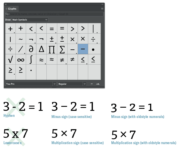
Figure 6. Glyphs for common mathematical symbols—and glyphs that many people use for these symbols but shouldn’t
Some fonts have the option of case-sensitive math symbols. If working with lining, as opposed to oldstyle, numerals, choose the case-sensitive form to shift the position of the glyph up from the baseline. To access these and other math symbols, filter your view in the Glyphs panel to show math symbols.

Figure 7. Glyph shifting uses OpenType technology to center dashes appropriately when you convert to uppercase.
White Space Characters
I can’t mention dashes without mentioning white space characters, not least because it’s common practice to put one (a thin space or hair space) on either side of an em dash.
In addition to the word space, InDesign gives us access to 12 spacing characters from the Type > Insert White Space menu, all of which are nonbreaking (Figure 8).
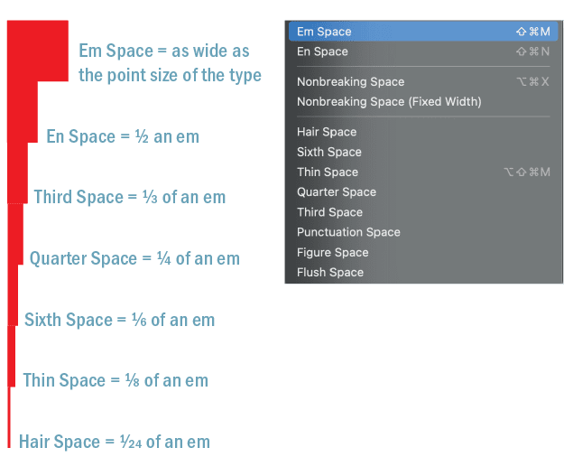
Figure 8. These white space characters are all based on the em space, which is as wide as the point size of the type. Other white space characters you can access through Type > Insert White Space (like punctuation space and figure space) are defined by the width of certain glyphs and will vary in width depending on the typeface you are using.
Excluded from the party is the zero-width space (U+200B; Figure 9), which, even though it has its own Wikipedia page, doesn’t make it to the Insert White Space menu. This is a shame, because the zero-width space is useful. If ever you want a continuous, unbroken string of characters that won’t hyphenate or cause the text frame to become overset, zero-width is your go-to. You can insert it using the Find/Change dialog. This video demonstrates its use.
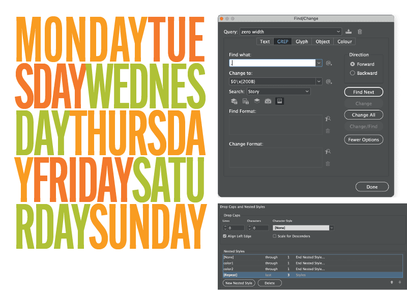
Figure 9. Use GREP to add zero width spaces in between every character, and those invisible spaces will let InDesign break long words without adding any hyphens.
Another unsung spacing hero is the flush space (Figure 10), which you can use to distribute remaining white space in one or more places across a line of text.
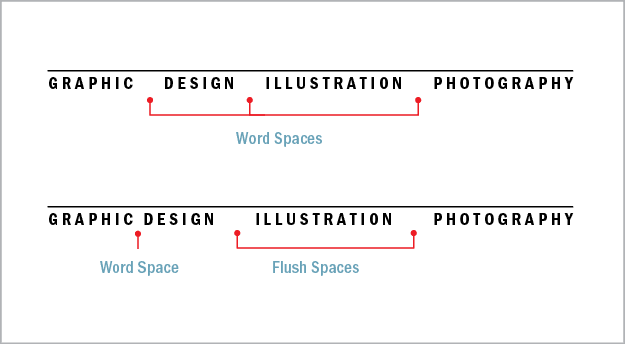
Figure 10. When you want to use justification as a graphic design element, you might find that using regular word spaces results in too large a gap between the words (above). Using flush spaces spreads the items across the column measure without increasing the space within those items. Note: You can achieve the same result by using a fixed-width, nonbreaking space between Graphic and Design.
Warning: Flush spaces work only with Justify All Lines alignment. There also is no Unicode designation for this character, which can be limiting if you use XML in your workflow.
Ever need to align numbers in tables? The figure space (Figure 11) is your friend. Its width matches a numeral in the typeface—assuming you’re using tabular lining or tabular oldstyle figures.
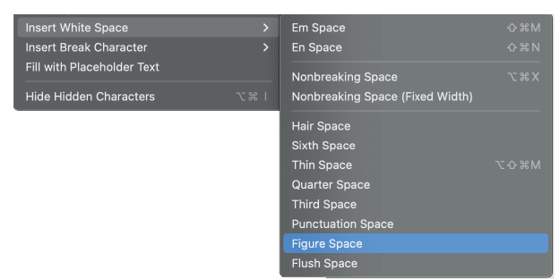
Figure 11. When using tabular lining or tabular oldstyle numerals, figure spaces can be used to ensure that the numbers align. In the right column, figure spaces are added between the dollar sign and the number.
Picture Fonts
There exists a parallel universe of typefaces that aren’t letters at all, but pictograms or emojis. These picture fonts can be playful as well as practical, offering such useful devices as bullets, social media icons, checkboxes and check marks, stars, and navigational arrows. Such fonts are used for musical notation, mapmaking, mathematics, crosswords, and puzzle publishing, to name a few examples.
The problem with these hidden gems is that when you squint at the icons in the Glyphs panel, even if you zoom in, it’s hard to identify what you’re looking for. For instance, EmojiOne (an open-source color font available on Adobe Fonts; Figure 12) contains a full set of national flags. But how to identify them? Unless you’re a keen vexillologist, when it’s 2 a.m. and you’re past deadline, the flag of the Republic of Ireland and the flag of Italy might look rather similar.
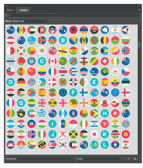
Figure 12. EmojiOne
The solution? Look beyond the Glyphs panel!
To avoid a diplomatic incident, consult emojipedia.org, where you can search by name, then copy and paste the glyph to InDesign. Similarly, if you’re using an icon font like Font Awesome (Figure 13), use the Font Awesome website, where you can search by name, and then copy and paste the glyph into InDesign. Of course, if you’re likely to need these glyphs more than once, add them to a Glyph set.

Figure 13. Font Awesome’s sprawling array of glyphs include logos for social media.
OpenType Features
More than any other application I’m aware of, InDesign supports OpenType features, but it is far from perfect. Many OpenType features remain obscure and fussy, and access to them is convoluted. Without a good user interface for accessing these features, the potential of OpenType remains undeveloped.
Discretionary Ligatures
You can consult Figure 14, for an overview of ligatures, while here we’ll focus on some OpenType options that are flying below the radar. In the interest of brevity, I’ll skip over regular ligatures like fi and fl and jump to discretionary ligatures, which in decorative typefaces may allow for unique letter combinations that give a hand-lettered look.
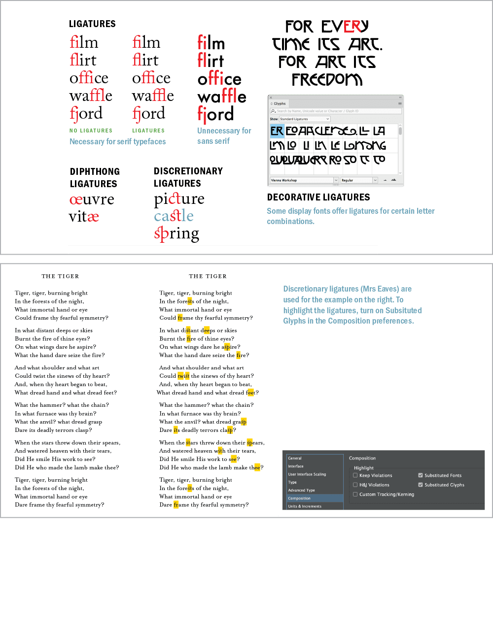
Figure 14. Ligatures and their use
Dipthongs are ligatures that visually represent the pronunciation of a combined vowel. The most common examples are æ or Æ and œ or Œ, such as in Cæsar, encyclopædia, mediæval, and œuvre. While their usage is considered archaic in modern English, especially American English, they may be just the visual seasoning you’re after.
You can apply both discretionary ligatures and diphthongs on a case-by-case basis through the Glyphs panel. Choose Discretionary Ligatures from the Show menu to see what’s available in your chosen font.
Figure 15. Great for infographics, Chartwell is an example of a font that makes clever use of InDesign’s support for ligatures and discretionary ligatures.

Figure 16. Amazing Infographica: The following syntax yields the results you see here: @b@b5050% @p@p6565%. Ligatures must be turned on, and Metrics selected for kerning.

Figure 17. To get the clock glyphs you see here, use Clocko with the syntax: x9:12 x21:12. The letter preceding the numbers determines the style of clockface. For a 24-hour clock, turn off ligatures.
Ornaments
Sometimes referred to as fleurons, typographic ornaments (Figure 18) were historically used to expand the typesetter’s palette.
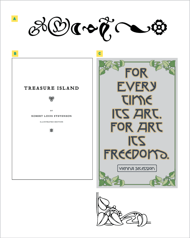
Figure 18. Adobe’s Minion includes a set of typographic ornaments (A). A book title page (B) gets some classic visual spark with the ornaments that accompany Emigre’s Tribute family. This poster (C) uses a frame made from the ornament font Art Nouveau. All three type families are included in Adobe Fonts.
While some typefaces, like Chaparral Pro, contain playful ornaments, ornaments typically create a historic feel—useful on a title page or chapter opener; or you can use them in repetition to create a typographic wallpaper suitable for endpapers.
Ornaments can also useful as section dividers, bullets, or end marks (also known as tombstones). Some ornaments were designed to be used in multiples to make decorative frames. These days, you might start with an ornament, convert it to outlines and save it as a pattern brush in Illustrator. You can make book endpapers or other decorative matter with typographic ornaments (Figure 19).
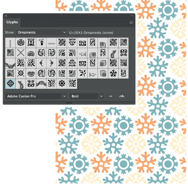
Figure 19. Typographic wallpaper: Ornaments from Adobe Caslon Pro are the basis for a simple repeating pattern in Illustrator.
Figure 20. Catchwords from the font HWT Catchwords
Figures
OpenType Pro fonts offer two styles of figures: lining, so called because they line up with the cap height and the baseline, and oldstyle, which are as tall as the x-height of the type, with figures 3, 4, 5, 7, and 9 having descenders, and 6 and 8 having ascenders (Figure 21). Both styles are available as proportionally spaced or tabular (monospaced) versions.

Figure 21. Tabular numbers (A) all occupy the same set width. Oldstyle numbers (B) align with x-height and have ascenders and descenders. (C) Oldstyle numbers blend in better with upper- and lowercase text. (D) Lining numbers work better when set alongside text in all caps. (E) A number of figure styles are available in OpenType Pro typefaces. (F) Use slashed zero in contexts where it’s critical to make clear to the reader that a numeral is being used (i.e., programming and mathematics).
Tip: Lining figures are appropriate for working with text in all caps; oldstyle figures combine better with body text.
Selecting the right typeface for a project is about the numbers as well as the letters. If there are numerals in the text, like address information or quantities and measurements in marketing collateral, you’ll need proportionally spaced figures. If you’re working on a financial report or with columns of statistics, you’ll need tabular figures.
Another consideration, if your text contains a lot of code, is the need to differentiate between the numeral zero and the letter O. Choose Slashed Zero from the OpenType menu to put a diagonal slash through the zeros—if your font includes the glyph, of course—to clear up any confusion.
Fractions
They were once the bane of the pre-OpenType desktop publisher, but today we can work with fractions (Figure 22) without the friction. Standard OpenType fonts will have ¼, ½, and ¾ in their character set, while Pro typefaces may contain others.
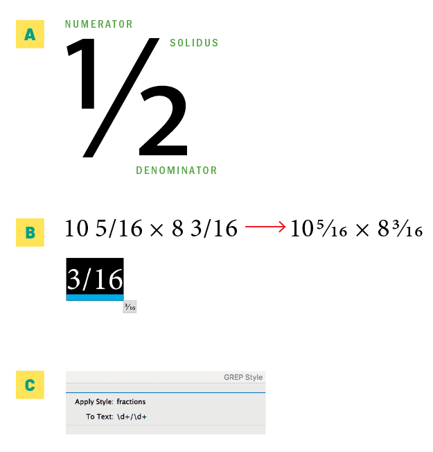
Figure 22. (A) Anatomy of a fraction. (B) You can create OpenType fractions with the Type Contextual Controls. (C) Apply fractions with a GREP style.
More importantly, OpenType typefaces allow you to compose custom fractions. Highlight the numbers you want to convert to fractions, and choose OpenType > Fractions from the Control panel menu.
However, this feature isn’t as smart as it should be. Leaving Fractions on will affect all numerals in your text, so you must apply it on an as-needed basis. If you’re working with a lot of fractions, you can incorporate a simple GREP style into your paragraph style to take of things (see the “GREP Style for Fractions” sidebar).

Figure 23. OpenType stacked, or “nut,” fractions in the Nutso font
Contextual Alternates
Some OpenType faces, usually scripts, have alternate characters that let you personalize your type. Some contextual alternates are designed to connect better in certain letter combinations; others exist just to offer alternatives.
Sometimes there may be several alternates to choose from, and applying them randomly (or in a carefully chosen way that looks random), especially with handwriting or calligraphic typefaces, creates an organic look.
You can choose the alternates on a case-by-case basis by enabling and using the Type Contextual Controls (see the sidebar of the same name) or by choosing Alternates for Selection from the Show menu in the Glyphs panel.
Alternatively, choose Contextual Alternates (Figure 24) from the OpenType menu, and as you type, the glyph to the left of your cursor may change after you type the glyph that follows it—if there’s an alternate for that letter combination.
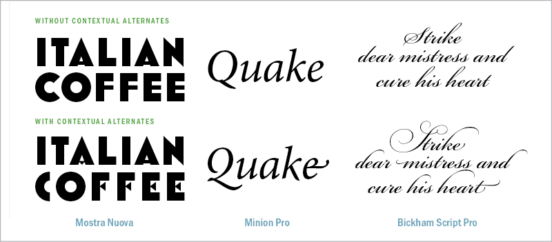
Figure 24. Three fonts, with and without contextual alternatives turned on
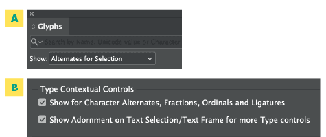
Figure 25. Two ways to see your options for contextual alternatives: (A) the Glyphs panel and (B) enabling the contextual controls, or the badge that displays when you select text in a frame and can be expanded into a pop-up menu with alternative glyphs you can select on the fly.

Figure 26. Swash characters are generally used as alternate initial caps. Some fonts include finials—alternate swash designs for lowercase letters.

Figure 27. Adobe Garamond Pro 100 point (left) compared with the titling alternate at the same size. The differences are subtle. In the ampersand, the titling alternate in red is placed on top of the regular character in black, showing that its strokes are somewhat thinner.
Stylistic Sets
One of the least discoverable OpenType features is Stylistic Sets (Figure 28), which tap into OpenType’s potential to provide whole sets of alternates that allow you to vary the character of a typeface.
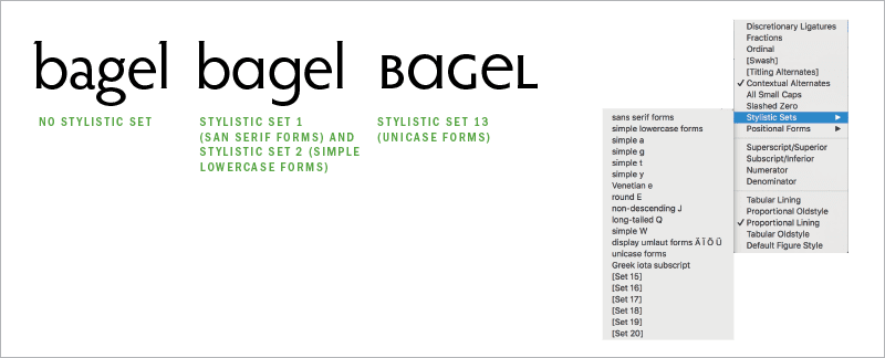
Figure 28. Thomas Phinney’s Hypatia Sans Pro has 14 stylistic sets, allowing you to introduce customization and expression while using a single typeface.
Rather than using the Glyphs panel or Type Contextual Controls to substitute every b and g, for example, with your preferred alternates, you can choose a stylistic set that uses those alternates as its default form for the b and g characters. You can select this set from the Control panel menu (OpenType > Stylistic Sets).
To find out what’s in each stylistic set, you can use the Glyphs panel and filter your view using the Show menu. What’s more, InDesign allows more than one stylistic set to be applied to the same text, allowing you to create unique combinations.
Like all OpenType features, stylistic sets can be incorporated into a paragraph or character style definition. An increasing number of fonts offer stylistic sets, but relatively few of them have descriptive names for those sets to indicate how they might be used. Some fonts come with accompanying documentation in the form of PDFs or webpages that offer more information about their stylistic sets.
Emerging Font Technologies
Like rust, technology never sleeps. There are always some new tools peeking over the horizon, promising to enhance our typographic abilities. Here are some emerging technologies worth keeping an eye on, even if they’re not quite “there” yet.
Color fonts
Though a manifesto on this new-ish technology calls it “the next big thing in graphic design,” color fonts (Figure 29), a variant of the OpenType font format, is still waiting to achieve critical mass.

Figure 29. Gilbert Color, an early example of a color font, with alternate glyphs available in different colors
InDesign automatically installs Trajan Color as an example of what’s possible, but how many of you have really tried it? One theory might be that graphic designers and printers are a cautious bunch made wary by tales of printing nightmares. Whether that’s true, the anticipated color font revolution feels like it’s on hold.
If you want to dive in and experiment with color fonts beyond Trajan, you’ll find many affordably priced examples on sites like Creative Market, and a handful are available on Adobe Fonts.
You can even make your own color fonts with the handy Illustrator and Photoshop plug-in from FontSelf, which—it must be noted—is the company responsible for the manifesto.
Variable fonts
It’s a similar story with variable fonts (Figure 30). We’ve seen the jaw-dropping demos, marveled at the inventiveness of font designers pushing the limits of the technology—check out Decovar—and mentally identified the possible use cases.
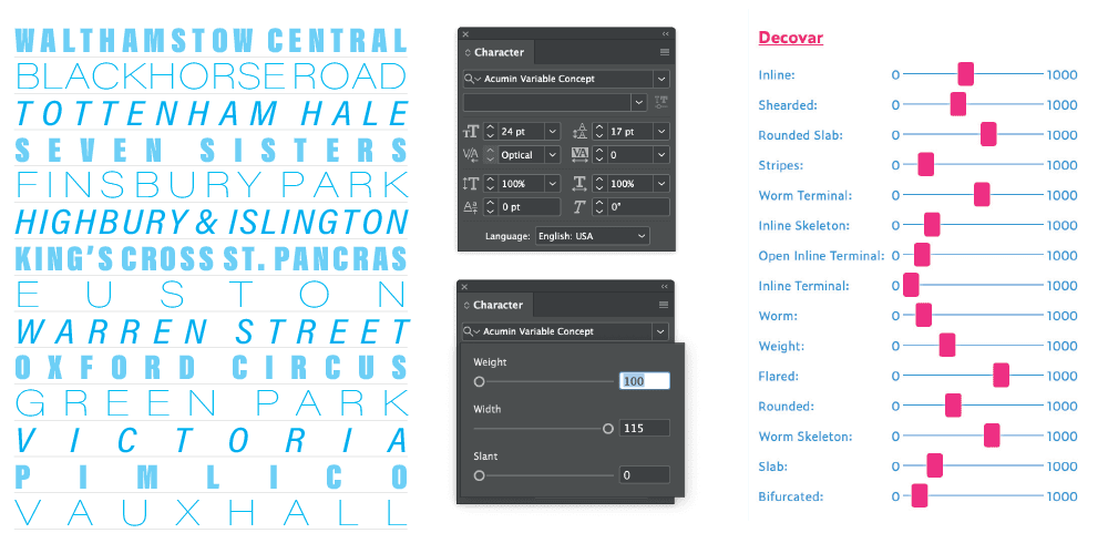
Figure 30. In this example, all the type is in the same font (Acumin Variable Concept), at the same size (24 point). The variations come from using the Weight, Width, and Slant sliders. While most variable fonts have 1, 2, or 3 axes, some experimental fonts have considerably more like David Berlow’s Decovar, whose 15 axes are shown here.
But then… not much happened. At least that’s been my experience.
This is perhaps another case of a promising feature hiding its light under a bushel—or a not-fully-developed user interface. The variable font widget thingy is easy to miss and has an annoying habit of disappearing while you’re trying to use it.
Chromatic/shaded fonts
While color fonts are new, chromatic fonts (Figure 31) are as old as the hills, predating digital type. They are perfect if you’re after a 3D look but don’t want to go to the trouble of creating an extruded shadow and outline in Illustrator.

Figure 31. With chromatic (shaded) fonts, you can create the above effect by precisely stacking five text frames, each with a different variant.
Shaded fonts, as they are also known, work by stacking multiple frames, each with a variant of the type family, on top of each other, offering a range of decorative strokes, shadows, and fills that can then be styled or colored individually to achieve different display effects.
Chromatic fonts are enjoying a wave popularity right now, and there are some good examples to be found on Adobe Fonts. They can add a fun or vintage look to a piece of display type.
Warning: When using Chromatic fonts, make sure to use Metrics kerning, or they won’t register.
Stand Out from the Crowd
In its early years, InDesign was a pioneer of typographic sophistication, harnessing the potential of OpenType and offering features and embellishments that had, out of technological reality, been left behind in the first wave of desktop publishing.
These were days of promise. In future versions, we thought, the kinks would be ironed out, the features would be made more accessible, and creative standards would rise all across the board.
But sadly, InDesign has yet to live up to its full potential. It is still the best typographic tool available, but many type-related features remain half-baked and obscure.
On the one hand, this is frustrating. On the other, it’s an opportunity for those of us willing to dig a little deeper to differentiate our work and stand out from the crowd.
Attention to detail has always been the mantra (one of them, anyway) of the good graphic designer. Sweating the details of typography remains just as important today—and is as much a hallmark of a dedicated professional—as it ever was.
Commenting is easier and faster when you're logged in!

Recommended for you

New Contest! The Text That Wouldn’t Move
Hey folks, it’s time for another InDesign mystery that you can solve for a...
Scanning Around With Gene: Is Your Dog Getting Sufficient Eggs?
The place where I shop for dog food is a large feed store where you could, if ne...

Add Variety with Glyphs and Text Alternates in InDesign
Learn how to find and activate type alternates in InDesign to add variety to you...