
Designing with Type: Grunge, Punk, and Futurism
A fascinating and fun look back at the grungy type of the ’90s and its ancestors.


This article appears in Issue 57 of InDesign Magazine.
In this age of Apple-inspired minimalism where white space is king, do you ever find yourself looking at all that luxurious space, those cool sans serifs, that carefully constructed grid—and want to mess it up? Ever wish that more, rather than less, was actually more? Want to put on some flannel, crank up the Pearl Jam, and get down ’n’ dirty with the type, explode that grid into a thousand tiny pieces?
Let’s take this simple piece of way-finding typography as our case study. In the hands of the gridmeisters it might look something like Figure 1. Everything that is needed and nothing more.

Figure 1: The bare essentials
But what if we were to step back in time—to, say, the mid ’90s, when grunge typography was all the rage. Maybe it would look something like Figure 2.

Figure 2: Grunge type
I made this in Photoshop—compulsive repetition, multiple layers, blending modes and transparency, and of course a distressed texture (courtesy of Texture Palace). Not to mention a Jonathan Barnbrook typeface, Exocet, that graced many a magazine and CD cover during that era (Figure 3).

Figure 3: Some examples of Grunge typography, including a cover of Raygun magazine, designed by David Carson (www.davidcarsondesign.com)
Cynics might say that part of grunge’s appeal was that you didn’t need to worry about getting things “right.” Around this time I taught graphic design at a large college in San Francisco where the work of the students was heavily influenced by grunge. It wasn’t always good to discern the good from
the bad. At its best, grunge designers were (consciously or instinctively) challenging the rules of what had come before. At its worst, they were trying to pass off their sloppiness as rule bending. By the late ’90s the style had filtered down to anyone with a computer (and a few dodgy fonts) and was being used to sell anything from beer to lottery scratch tickets. Grunge, once so anti-formula, started to look formulaic, expected, and safe.
Grunge was a backlash to the perceived stodginess and rule-bound typography of modernism, which had ruled the roost since the end of the Second World War (Figure 4). Self-indulgence was something to be celebrated, not dampened. Rather than subsume your personality in the neutrality of the type, you were free to be as expressive and as interpretative as your imagination allowed. Having a bad day?—let your type reflect that. Gone was the orthodoxy that typography should be a Crystal Goblet to hold the language (taken from the title of Beatrice Warde’s 1930 essay on typography), meaning unobtrusive and elegant. With grunge you got to blow your own goblet, and decorate it with spray paint, marker pens, and stickers. The medium was the message.

Figure 4: A grid-based example of the “old guard” designed by Joseph Müller Brockmann
One Step Back
But grunge wasn’t exactly new. It had its precursor in the punk design of the late ’70s and early ’80s. Inspired by the punk music from which it took its name, punk design is less about a unifying style and more about an attitude and sensibility. In the shorthand of our memories, when we think punk, we think Sex Pistols, and when we think Sex Pistols, we think Jamie Reid, the influential designer of the iconic covers for Never Mind The Bollocks and the single that scandalized polite society in the year of the Queen’s Silver Jubilee—God Save The Queen (Figure 5). Reid wasn’t the first to use ransom note graphics, but his work has become synonymous with them. If Jamie Reid were designing our simple way-finding informational message, perhaps it would look something like Figure 6. In this blatant ripoff of the Bollocks back cover, I’ve used Illustrator’s new Touch Type tool, which, combined with mixing a few typefaces popular during the ’70s, makes it a breeze to create ransom note text.

Figure 5: Cover artwork designed by Jamie Reid for the Sex Pistols
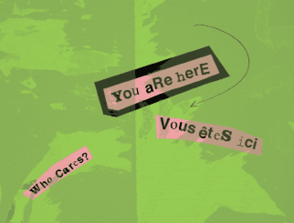
Figure 6: Imitation done with Illustrator’s Touch Type tool
Even Further Back
Tracing things back further, punk in turn owes a debt to the Futurist typography of the early twentieth century. Every bit as aesthetically challenging as punk or grunge, the Futurists too called for the destruction of outdated modes of communication. This was the age of the manifesto, and none of these was wider in scope than Filippo Tomasso Marinetti’s Futurist Manifesto (1909) (Figure 7). Painting, sculpture, literature, architecture, theatre, cinema, and music were all part of the package. Typography—until then a minor player in the arts—was integral to Marinetti’s program. Though the term had yet to be coined, Marinetti wouldn’t have had any use for crystal goblets. He was profoundly against elegance and typographic harmony, wanting instead to set the words “free” and hurl them in the reader’s face.
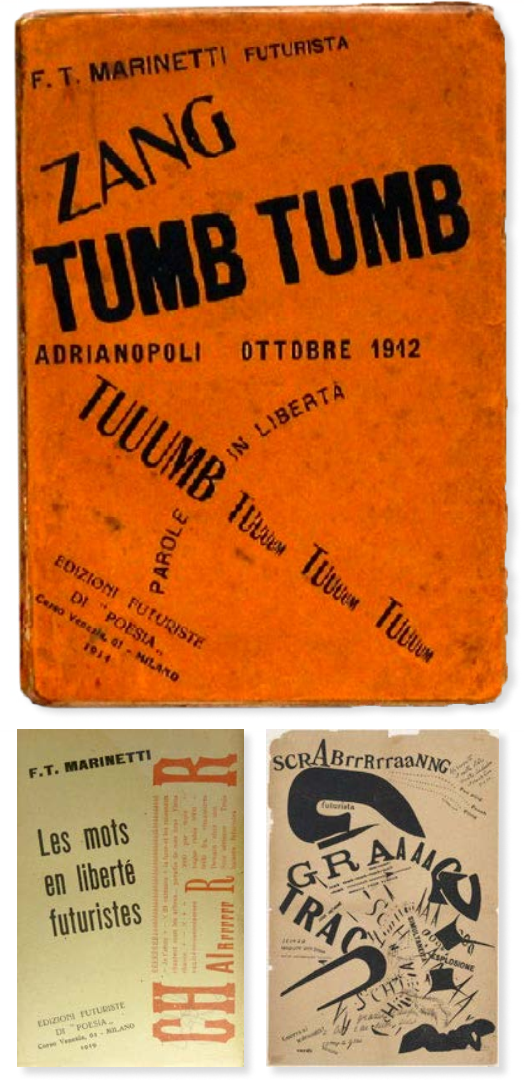
Figure 7: “Futurist” typography from Tomasso Marinetti

Figure 8: Marinetti imitation using today’s technology

Figure 9
Top: Flames of Love by Sebastian Lester (www.seblester.co.uk)
Bottom: Opportunities by Marian Bantjes
(www.bantjes.com)
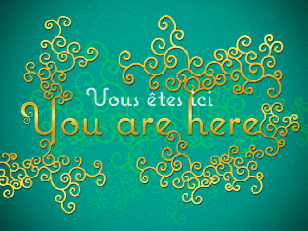
Figure 10: Embellished type
Commenting is easier and faster when you're logged in!

Recommended for you

InDesign How-to: Balance Columns with Vertical Justification
It’s not unusual for a layout to specify that all pages should start and end on...

TypeTalk: The Ins and Outs of F-ligatures
F-ligatures are special characters found in just about every professional font....

Five Distinctive Serifs from Typekit
Serif typefaces are the foundation of typographic communications. They can be se...