


This article appears in Issue 84 of InDesign Magazine.
Clutter is rarely a positive thing when it comes to graphic design. While it can evoke an emotion or pastiche, usually it’s the hallmark of an unassured or novice designer. When you’re not fully confident in what you’re doing, there’s a tendency—one I’ve succumbed to far too many times—to overcompensate by adding more stuff. This approach can have endearing results in a pub or restaurant or other realms, but rarely does any favors to a print or web design. So when challenged with a design problem, instead of throwing in more content, try adding more white space—the stuff without content—to bring the content you have into sharper focus. Using white space effectively comes with confidence and knowing how to employ it to your advantage. To start with, that means dispelling the myth that because it’s empty, it’s unimportant. Not to be confused with wasted space, white space is designed absence, not just space that’s left over when the text ran out. It’s a conscious choice: even with all the design tricks you have up your sleeve, you’ve chosen the path of restraint. Rather than the easy option of adding more content, you’ve chosen to use—or activate—the space in the layout to help your viewers better understand and appreciate your design. This isn’t because you ran out of stuff, or didn’t have anything better to put there, but rather because presentation and context is important, and by carefully considering the negative shapes, you’re making the positive shapes more interesting. White space gives a layout form, holding it together with emphasis and structure, giving meaning to image and text. Indeed, white space and content depend upon each other. A blank page isn’t white space until there’s something on it. Place an element on the page, and by creating a figure/ground relationship, the
space around it becomes white space (see Figure 1). On the other hand, without white space, content is ambiguous; the reader doesn’t know which elements in the design are the most important, nor how to navigate a layout.

Figure 1: A blank page and a page with the white space activated by a figure/ground relationship.
Hard Sell
As you’ve probably experienced, when working for design-unsavvy clients, incorporating white space—especially in print layouts where real estate is at a premium—can be a hard sell. Printing is expensive, the client wants the maximum return on their investment, so the impulse to fill all available space—to say as much as possible as loudly as possible—is a difficult one to rein in. We’ve all seen the internet parodies such as White Space Eliminator—a bonus add-on to the uncannily accurate Make My Logo Bigger Cream.
Micro and Macro White Space
White space can be small and subliminal or bold and audacious. At the micro level, white space is about readability. It’s the space around every letter, between every word, and the leading between every line of type. Without it, text would be unreadable: letters would collide, words run into each other, and lines overlap (Figure 2).

Figure 2: A paragraph without white space.

Figure 3: Micro white space. From top to bottom, three dots, an ellipsis character, dots separated with thin spaces.

Figure 4: Without the negative space around the lowercase letters, text in all caps has a rectangular profile.
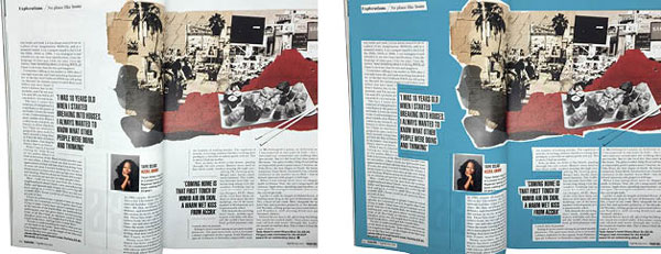
Figure 5: Macro white space (indicated in blue): margins, gutters, empty columns, and space around images. and pull quotes.


Figure 6: Changing times: Eighteenth-century newspapers built their credibility on cramming every column inch with information. Contemporary newspapers, especially in their “soft news” sections, employ white space liberally to divide the content, offer clear entry points, resting places, and just to all-around make the content more attractive.
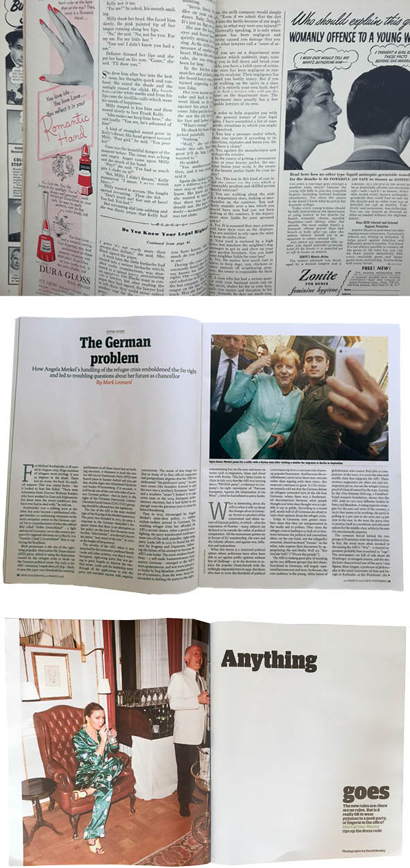
Figure 7: Changing expectations: From top to bottom, a 1950s women’s magazine with minimal white space; a contemporary current affairs magazine with generous but conventional white space to open the article; and a contemporary “lifestyle” magazine with a daring use of white space.

Figure 8: Adding white space at the top of the page provides a clear entry point to the article.
Asymmetry
The effectiveness of white space can depend upon how content is aligned on the page. Centering an image or passage of text tends to make the white space passive. Done well, it looks classic; done badly, it looks boring, the content held static in the grip of the equal white space surrounding it. In asymmetrical layouts, the white space is active, and so becomes integral to our understanding of the content. A common and effective approach with asymmetry is to use a layout grid with an uneven number of vertical fields, say 5 or 7. Divide the text into two or three columns, then use the extra column for captions and/or images—or just leave it empty. The position of this white space column can even vary from one page to the next to add variety (Figure 9).

Figure 9: Permutations of a 7-column layout, shifting the position of the “white space” column for variety. Using a grid ensures that the space around the elements is consistent.

Figure 10: The same amount of white space used effectively (top) and less effectively.
Removing the White Space
As well as manipulating the white space, designers can make a statement with its absence. Bleeding a picture off the edge of the page or across a spread makes the image more dynamic; with a full-page bleed, without white space to frame the image, the image has the impression of being so big that it cannot be contained by the page (Figure 11).

Figure 11: Consciously removing the white space to make the image a full bleed drops the image in the reader’s lap.
Luxury and Sophistication
White space can be extravagant, and using it in your designs can imply luxury and sophistication—just like the open floor plan of a high-end store versus the crowded shelves and wall-to-wall merchandise of a discount store (Figure 12).

Figure 12: White space at its most extravagant.
 The ad avoids depicting the car as an essential part of a smiling, middle class family and instead shows it as a black dot in a sea of white space, immediately attracting the readers’ attention. Accompanying it is the refreshingly understated headline. A exercise in minimalism, the ad was an accurate reflection on the product itself. The subtext was that owning a Volkswagen Beetle allowed you to show off that you didn’t need to show off. Today the influence of this campaign can be seen in Apple’s copious use of white space as well as many other acclaimed designs in print and online, such as the monotype site by information architects.
Too Much of a Good Thing?
Remember, there are no guarantees, and it is possible to overdo white space. A connotation of luxury and extravagance is not appropriate for every product or client; what works for a luxury perfume brand isn’t necessarily going to sell dog food. In the wrong context, ample white space could come off as snooty or elitist. Too much paper without ink might be considered environmentally irresponsible, or the design may look unfinished, boring, or even be perceived as having nothing to say. While The Beatles’ “White Album” may be a classic of design minimalism, Spinal Tap’s Smell The Glove (essentially the same design in black) is a parody of empty-headedness. Sometimes less isn’t more, it’s just less. But white space also has a more everyday role. In layouts that are by economic necessity crowded, the way the limited white space is used can make the difference between a functional and highly readable layout, and one that is a mass of foreboding text (Figure 13).

Figure 13: In a crowded layout, the use of white space becomes even more important. Without the pull quotes and section breaks, this magazine spread would be a mass of uninviting text.
 Book covers by Noma Bar
If you subscribe to the “less is more” approach to graphic design, then using white space is part of your daily practice: leaving quiet areas on the page to better structure the layout and better illuminate its contents. White space equates to visual hierarchy, and to layouts that are more approachable and easier to navigate. But even if you’re a maximalist, or just someone in a position where selling white space isn’t possible, it is no less important. At the micro level, white space is essential to readability. The economics of print publishing often mean working with less white space than is optimal—and this makes the limited white space you have especially important. Just as cities need parks and public spaces, so newspapers and magazines need white space, and with a finite amount to work with, how you choose to incorporate that white space within your layout can mean the difference between visual chaos and a pleasant reading experience.
Commenting is easier and faster when you're logged in!

Recommended for you

Before&After: Design Without Rulers
Put away your ruler; here’s how to design the way you see!

Markzware Files Digital Documents Preflight Infringement Lawsuit Against Enfocus
Markzware announced today that it has filed a lawsuit in the Federal Court in Lo...
Using InDesign’s Parent Pages
Learn how to update your long documents instantly with parent pages!