
Designing Book Covers in InDesign
Learn how the key to designing a book jacket lies in the execution of the InDesign layout.


This article appears in Issue 65 of InDesign Magazine.
Despite the underlying message of this adage, publishers place considerable importance on book covers and jackets. (Although book covers and book jackets have much in common, for simplicity I will refer to both as book covers for now. Later in this article I will go into greater detail to explain their similarities and differences.) Just ask any designer who has worked hard trying to please a fickle publisher when designing a book’s cover. Yet who among us isn’t seduced by a well-designed cover when strolling through an airport bookstore before a long flight? The key to designing a book jacket lies in the execution of the layout. For designers and larger publishers who specialize in creating book covers by the boatload, a couple of excellent scripts exist to automate the process (see “More Cover Resources” at the end of this article). But because this article is for the occasional book designer, I’ll forgo these scripts in favor of designing the file step-by-step (which I rather enjoy).
Jackets, Please
A book cover is exactly that. Some books (mass-market paperbacks, for example) consist of only a front cover, back cover, and spine. Laying out such a book is easy. Take the size of the front cover, double it, add the spine width, and you’re done. Let’s give it a try using a 5 inch × 7 inch book cover.
Single-Page Document Setup
From inside InDesign, choose File > New > Document. Deselect Facing Pages and leave Primary Text Frame unchecked. Orientation should be set to Landscape. Click the Preview button in the lower left corner. In the Width field, enter the width of your cover (5 inches in our example). The book’s actual cover width will be larger than 5 inches, but bear with me. Now we’ll add the back cover
into the same Width field. The simplest way to do this is to insert your cursor after 5 inches, type *2 to multiply the front value twice, and press Tab. Voilà! So now we have the width of the front and back covers, totaling 10″. (Okay, chances are you already calculated the answer to this high-level math in your head, but what if the cover width was instead 5.875″? Or 12p3.7 picas? Figure those out, Einstein!) We still need to add in the spine width. Going back in our example to our 10-inch width, insert your cursor in the Width field and type the plus sign (+). After the plus, type in the spine width. For our example, let’s assume that our spine width measures 5/8 inch (see sidebar “Calculating Spine Width”). Inserting our cursor back into the Width field of the New Document dialog box, add 0.625 to change the document width to 10.625 inches. But wait. We also need to factor in a value called turn. Turn is a slight amount that accounts for the extra bit of width needed by the cover when it folds at the edges of the spine. Again, commercial publishers will supply designers with the exact amount of the turn, but in our example let’s assume that we need to add 1/8″ to both spine edges. This means we need to go back once more to our Width field and add another plus sign (+) followed by the two 1/8″ turns—totaling ¼”, or 0.25″ when expressed in inches decimal. Still with me? I know this sounds hard at first, but after you’ve done a few covers you’ll find it easy. (If not, you might be a good candidate for one of the automated book cover plug-ins mentioned at the end of this article.) Our total width is now 10.875 inches. Next is the Height measurement. This one is easy. The height is 7 inches. Done. Now set Columns to 2. Set Gutter to 0.625 inches. Why 0.625? Because 0.625 is the width of our spine. Get it? Margins don’t matter much, but for now let’s use 0.125 inches. Next up is Bleed and Slug. Bleed is important if any artwork extends to the edges of the cover. If so, you’ll need to add extra beyond the trim size in case anything slips a hair during the trimming process. Again, I use 0.125 inches (or 9 pts or 5 mm) for my Bleed setting all around. Warning: These measurements are typical throughout the printing industry, but if your printer gives you different specifications, build your bleed to those settings instead. The last setting is Slug. The slug is the area beyond the trim and bleed that doesn’t print. Let’s set the Slug to 1 inch on all sides, and you can use this area to print information about your project. If you’re still with me, all our values are in place, so it’s time to click OK (Figure 1).

Figure 1. The New Document dialog box (legacy) shows the settings for a simple paperback book cover.
- In traditional publishing, the publisher’s production manager usually supplies the designer this value.
- If self-publishing, always consult your printer. Or, for the brave among us, start with this website.
Add Guides
The next step in setting up our file is adding a few guides to show the turn, or fold, areas. Start by going to View > Show Rulers. Double-click the cover page of your document. Next, drag two vertical rulers that snap to the sides of the spine (that is, the gutter lines separating the document’s left column from the right). When dragging your ruler guides, drag from outside the live page area to extend the ruler guides into the pasteboard, as seen in Figure 2.

Figure 2. This is how your document for a simple paperback should look. Notice its bleed and slug settings. Spine page guides extend into the pasteboard area.
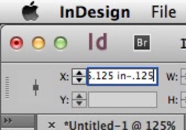
Figure 3. InDesign makes arithmetic fun! Here we see how to solve problems of basic subtraction.
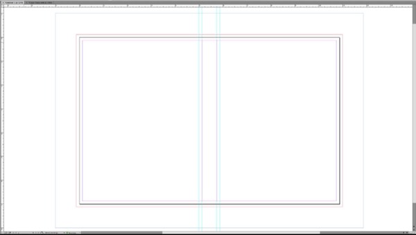
Figure 4. The two vertical ruler guides represent the turn of the book’s spine.
Drawing Fold Marks
The final step in setting up your document is to draw lines that show the printer where your cover folds at the spine. To draw these lines, use either the Line tool or the Pen tool. Start at the uppermost boundary of the slug area and draw a 1-point black line on top of the leftmost ruler guide (Figure 5).
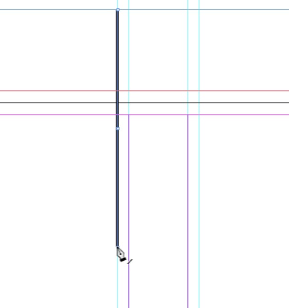
Figure 5. Begin your spine fold lines at the top of the slug area and stop at the border of your lower slug area.
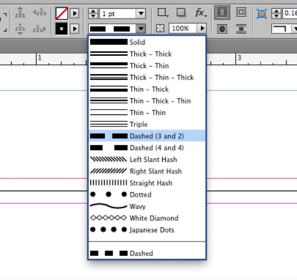
Figure 6. Apply a dashed style to your jacket’s fold lines.
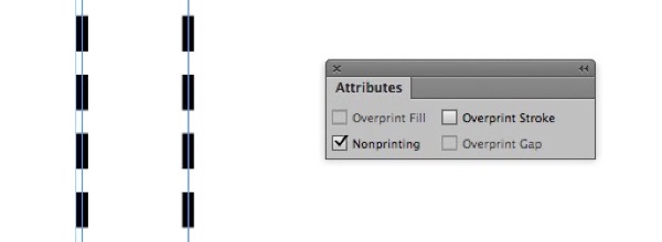
Figure 7. If you’re picky like me, you’ll insist on zooming in to see that your fold lines are properly centered on their respective ruler guides. Choose Nonprinting in the Attributes panel to render your dashed lines invisible.
Let the Fun Begin
Now that we’ve completed our book cover document, it’s time for the fun (or scary, depending upon your outlook) part: designing the front, back, and spine of your cover. But unlike the last stage of the process, where I can give you step-by-step instructions on how to set up your file, teaching designers how to design isn’t so easy. If it were, everyone would be a brilliant designer/pianist/ architect/dancer, etc.
So what makes a good book cover good?
Where do we begin? For starters, I find it helps to look at the work of others. Go to a bookstore (or any other type of store that sells books) and have a look around. Take mental notes about the covers you like and those you don’t. Another good place to look is on the internet. Try doing a search for “award winning book covers.” The amount of good work in this area of graphic design is astounding (and intimidating). The best advice is to make your cover unique. Boring, cookie-cutter covers become lost among the tidal wave of new books published every year. So how do you do so? Ever notice how people who speak in a flat monotone get less attention than those who tend to whisper or shout? Try applying the same principles to design. Use colors that shout when shouting is what you’re looking for. Likewise, use colors that whisper when whispering makes sense. The same goes for images and type. Sometimes a simple white page with one small image or line of text speaks louder than a splashy collage with large, menacing type. Yet today, with computers, we designers can experiment with all kinds of fonts and images. All it takes is a little time and the willingness to fail. Let’s take a look at an example. A few years ago a publisher asked me to work up some cover ideas for a series of famous mystery books they intended to reprint. Among them was Dashiell Hammett’s legendary The Thin Man. I’d never read the book, but did a little research to learn what it was about. I discovered that the book was a stylish and sophisticated murder mystery featuring husband-and-wife crime-stoppers Nick and Nora Charles. With that bit of information, I started to noodle around in Illustrator. I knew I wanted to play on the word thin, and that the cover should be dark and menacing. Then it came it me: What if the word thin were itself thin, and the characters of the word projected a long, eerie jail-like shadow? Too obvious? Perhaps. But the proof is in the execution of the idea, not so much the idea itself. Too often I’ve come up dry trying to overthink an idea. Sometimes simple is best. This cover is one such example (Figure 8).

Figure 8. This cover for the paperback reprint of The Thin Man was unfortunately never produced. All work was done in Illustrator.
Creating a Dust Jacket
Now that you understand the basics of creating a simple cover, let’s move on to creating another kind of book cover: the dust jacket. Dust jackets usually cover hardcover books. The major difference is that dust jackets have flaps that vary from narrow to wide. Often, better quality softbound books include what are called French flaps. Here the cover looks like a dust jacket, with flaps that fold at the front and back cover. Besides allowing for more copy, french flaps create a more attractive book, with the edge showing a discernible front and back cover. Laying out a dust jacket or cover with French flaps is a bit more complicated, but more interesting to design because of the cover’s increased width and use of flap copy. Here’s how. Once again we begin by choosing File > New > New Document. Again we deselect Facing Pages and Primary Text Frame and enable Preview. Click in the Width field. Our jacket is 8½ × 11 inches. Our flaps are 4 inches and the spine is 3/4 inch, so, to let InDesign figure it out in the New Document panel, go to Units and select Inches. Now, type 8.5+8.5+.75+4+4+.25. When you tab to the Height field, the Width should change to read 26 inches. Make the Height 11 inches. Move to the Columns field, and type 2. The gutter is 0.75 inches. We’ll use the Margins setting to define the flaps. This time, make the top and bottom margins 0 inches and both the left and right margins 4 inches. Add the same bleed and slug values we used before (0.125 on all four sides; slug is 1 inch all around). Click OK. Your document should look like Figure 9.
![New Document dialog box shows Document Preset [Custom], Intent: Print; Number of Pages, 1; Start Page, 1: Facing Pages and Primary Text Frame unchecked; Page Size: [Custom]; Width: 26 in; Height: 11 in; Orientation: landscape; Columns— number, 2; gutter, 0.75in; Margins — Top: 0; Bottom: 0; Left: 4 in; right: 4 in; Preview: checked.](https://creativepro.com/wp-content/uploads/2025/01/cover_story-fig09.png)
Figure 9. When creating a dust jacket with flaps, the New Document dialog box should look something like this.
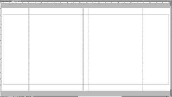
Figure 10. The basic dust jacket document before we add content.
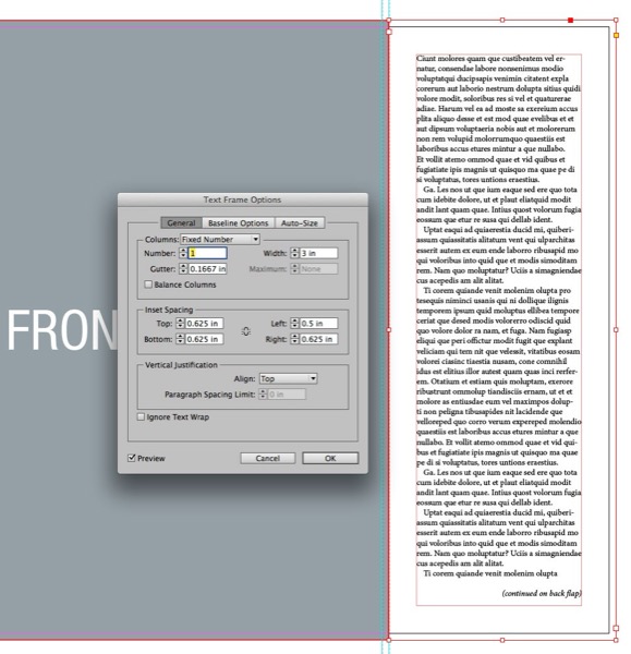
Figure 11. Do yourself a favor and use Inset Spacing (Object > Text Frame Options) to accurately define an area to house your jacket’s flap copy.
Designing the Spine
A book’s spine is an important element of the dust jacket. From a design perspective, the spine can be a bit tricky because of its long and narrow shape. But despite its limitations, I’ve seen many interesting designs used on spines. Start by making a text frame that’s the same size as your spine, including the top and bottom bleeds. Rotate the frame –90° (270°) so you can read it horizontally. Insert your cursor, and type the book’s title. Choose Object > Text Frame Options and in the Vertical Justification section, in the Align field, select Center. Depending on how you typed the title and which font you used, you may notice that the title is not centered exactly vertically in the frame. Chances are you’ll notice a little more space beneath the title than above. To remedy this problem, select the Baseline Options tab in the Text Frame Options dialog box. By default, InDesign sets the first baseline offset of a frame to Ascent. This means that when justifying vertically, your text is in fact centered, but to the title’s ascenders. The ascenders are those characters that are a bit taller than the font’s capitals. Lowercase h, l, and k are good examples of characters with tall ascenders. Yes, InDesign has vertically centered your text, but to your eye it looks off. For this reason I always set the First Baseline Offset to Cap Height (Figure 12). Notice how your text moves downward a touch, and now feels centered vertically.

Figure 12: To ensure your spine copy is truly centered vertically on its spine, choose Object > Text Frame Options. In the Baseline Options section, go to First Baseline and, under Offset, select Cap Height.
Back Copy and Barcode
Use Text Frame Options with appropriate inset spacing for the copy that goes on the back cover. Remember to leave enough room on the left and right sides so that the back copy doesn’t get too close to the book edges, like on the flaps. If you have a barcode, you should now add that to the back cover. Usually it goes below the back copy, surrounded by a white box (Figure 13).
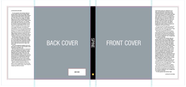
Figure 13. If you’ve followed along, your dust jacket should look something like this.
Finishing Up
When you’ve placed everything on your dust jacket, create a PDF for you and your client to review. If you’ve created your cover using multiple pages, be sure to choose Spreads instead of Pages in the PDF dialog box (Figure 14).
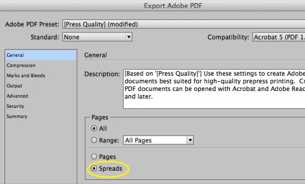
Figure 14. Choose Spreads in the Export Adobe PDF dialog box if you’ve assembled your book’s jacket or cover using separate pages.
Add-ons for InDesign
- Make Book Jacket ($19.99 U.S.; Dan Rodney)
- HurryCover (€49; indiscripts)
Inspiration
Commenting is easier and faster when you're logged in!

Recommended for you

Before&After Design Tip: Good Design Must Have a Focal Point
Learn how to create a focal point that will give your design holding power.

Children’s Books by Well-known Designers
Graphic design can be a serious business. But sometimes a creative professional...

Book Design Basics in InDesign
For book designers, let this article be your guide to getting the most from InDe...