
Creating Cutout Image Effects with Photoshop
Simulate layers of cutout paper and shadows with a graphic style

This article appears in Issue 11 of CreativePro Magazine.
In this article, I’ll show you how to make a graphic style in Photoshop that simulates layers of cutout paper, in which each layer casts a shadow on the layer beneath. It has a three-dimensional appearance, giving the impression of increasing depth with each layer. The effect is not hard to create and has the advantage that it’s easy to move elements around after the basic image has been created—and those elements can be photographs, graphics, or artwork created directly in Photoshop. 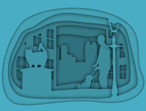 The technique uses multiple groups in Photoshop, each of which contains the color fill and shadow settings at the group level so the interior components are never affected directly.
Create the Front Frame
Each group in the illustration is bounded by its own frame, each of which gets smaller as it goes further into the composition. Start by creating the top frame. Use the Shapes tool to create a rectangular shape the size of your canvas. The color of the fill doesn’t matter at this stage, but make sure Stroke is set to None. Then, using the Pen tool in Shape mode, draw the shape of the inner frame. From the Options bar, choose Exclude Overlapping Shapes from the path operation menu, and the new path you draw will be cut out from the initial rectangle (Figure 1).
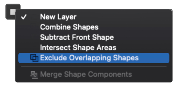
Figure 1. Set the Pen tool to Exclude Overlapping Shapes to remove the new path from the original shape.
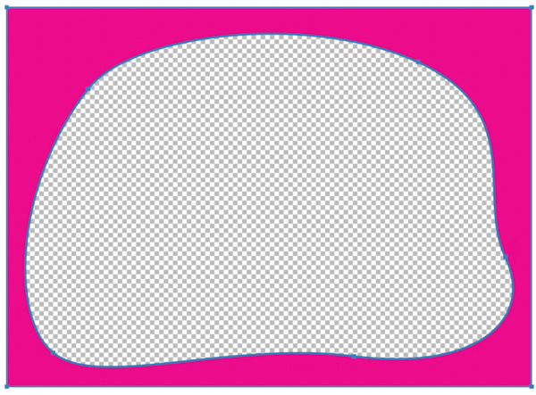
a pink rectangle, showing transparency in background” width=”600″ height=”443″ /> Figure 2. The inner path was successfully removed from the original shape.
Add a Fill and Shadow
In the Layers panel, select the top frame layer. Then click the Fx icon and choose Color Overlay. The Layer Styles dialog box opens. Choose the color you want for the whole composition. You can always change your mind later. I chose a light blue (Figure 3).
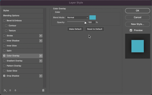
Figure 3. Add a Color Overlay using the Layer Style dialog box.
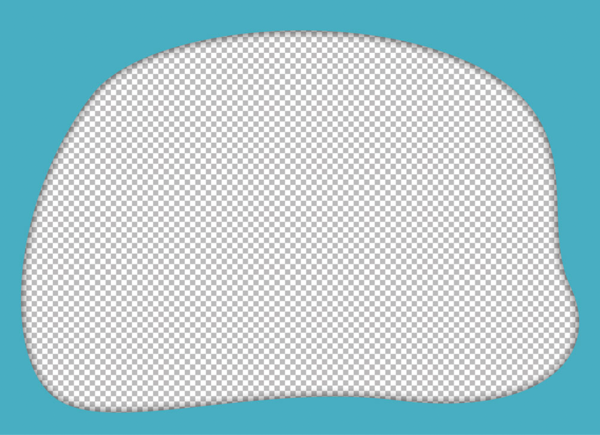
Figure 4. Add a Drop Shadow using the Layer Style dialog box.
Add a Background Layer
Add a new layer at the bottom of the Layers panel, so it’s behind all the other layers in the document. Tip: To add a layer underneath the currently selected one, hold Command/Ctrl as you click the New Layer icon; if no layers are selected the new one will go to the bottom of the stack. Fill the new layer with white, then repeat the process of adding a Color Overlay with the same color you used for the front frame. Now that you can see the shadow more clearly, this would be a good time to adjust its settings so it gives the effect you want (Figure 5). Double-click the Drop Shadow listing on the Layers panel to reopen the Layer Style dialog box and make any desired changes.
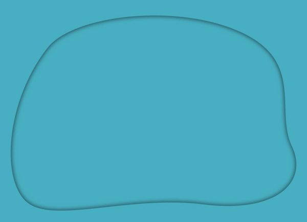
Figure 5. With the background in place, you can fine-tune the Drop Shadow effect.
Add More Components
You can use any sort of components you want for the interior contents. In the example, I added a lamp post at the front of the composition. To add a new component, add a new frame layer above the first component, created in the same way as before but with a smaller frame. I chose a contrasting color for the frame purely so that it would be easier to see exactly where it was in relation to the front frame and the background (Figure 6).
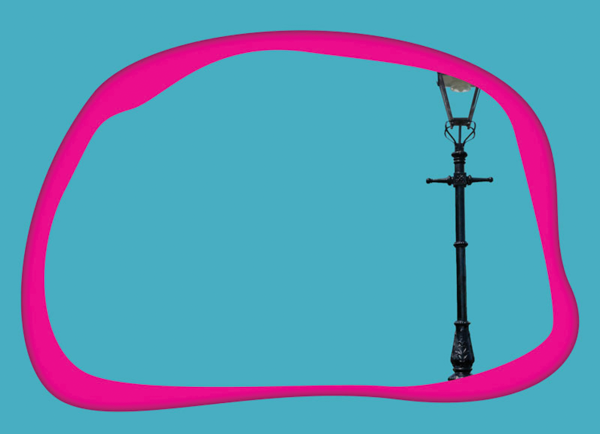
Figure 6. Add another inner mask and your first placed object.
Group the Layers and Apply the Layer Style
Select both your first object (the lamp post, in this case) and the frame layer in front of it, and choose Layer > Group Layers, or use the shortcut Command/Ctrl+G. Then right-click the words Layer Effects for the top frame layer in the Layers panel, and choose Copy Layer Style from the context menu. Click the new group, then right-click and choose Paste Layer Style to add both the color and the shadow. Because the layer style is applied to the group as a whole, both the interior element and the frame are treated as if they were a single object, unifying them so that the lamp post appears to be cut from the same piece of paper as the frame (Figure 7).
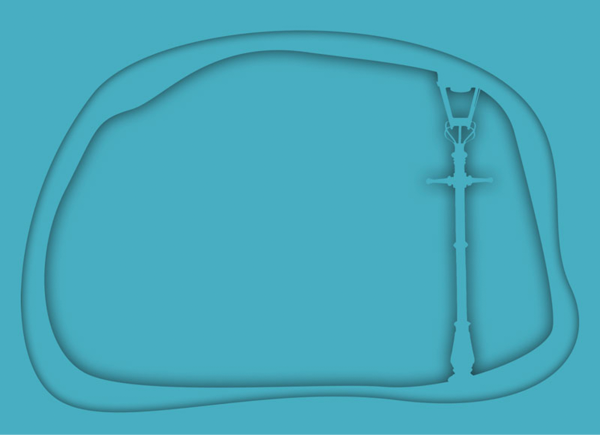
Figure 7. Make the components into a group and add layer styles.
Add More Layers
To speed up the process, duplicate the group you just created. Choose Layer > Duplicate Group, or use the shortcut Command/Ctrl+J. Move the new group below the existing one in the Layers panel, and delete the layer component (the lamp post, in this case). When you now select the frame layer, you can modify the shape of the inner frame using the Pen tool or the Direct Selection tool. Continue to populate your image with new components. The layers can be photographic images, placed clipart, or even (as in the case of the trash can in my example) simple shapes drawn directly in Photoshop. It can help to hide the effects as you’re doing this, by clicking the Visibility icon (the eye next to the word Effects in the Layers panel). You can see the layers both as placed and with the Effects turned on in Figures 8 and 9.
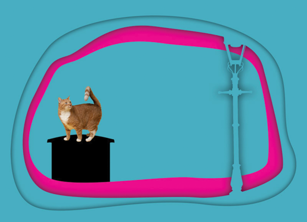
Figure 8. You can draw your content from a range of sources.

Figure 9. When the Layer Style is added, the elements are unified.
Keep Going!
Keep duplicating the group and editing its contents as you build up the image, piece by piece. Some layers will require a little more thought and care. In Figure 10, for example, the second-from-bottom layer includes two silhouettes of buildings with cutout windows. I didn’t, of course, want the group beneath this to be seen through the windows, so I had to edit the cutout in that group so that its edge would be hidden behind the edge of the building wall.
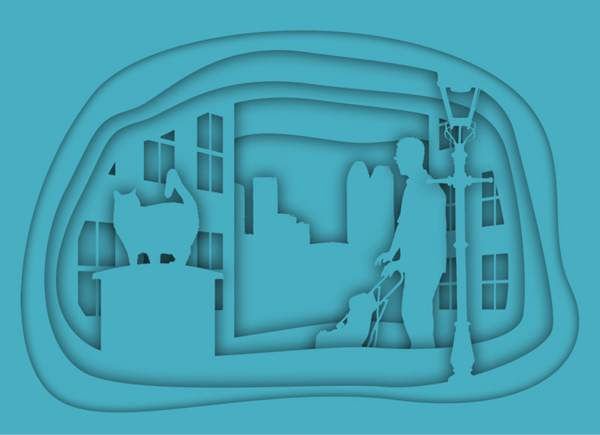
Figure 10. All the components and layers are in place, but it still lacks depth.
Adding Depth
At this point, the cutout illustration is complete in terms of its components, but the whole image could do with more depth. The best way to achieve this is to make each layer progressively darker than the one above, to create the impression of less light reaching it. You could do this by adjusting the Color Overlay for each group, but this would be a fiddly approach as it means guessing the amount of added darkness each time. Here’s a simpler approach: Create a new layer above the bottom layer, and fill it with black. Set Opacity of this layer to 50%. The shortcut for this is to press the 5 key on when the layer is selected and the Move tool is active (Figure 11).
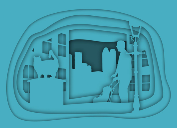
Figure 11. Add a black layer at the bottom, set to 50% opacity.
Duplicate the Black Layer
Hold Option/Alt as you drag the black layer in the Layers panel to make a copy of it. Drag it above the next higher group. Then repeat until each group has a black layer above it. As you can see, this produces a result that’s far too dark, although you can see the effect of the darkness increasing with apparent depth (Figure 12). So we’ve headed in the right direction; we’ve just gone too far and need to back up a bit.
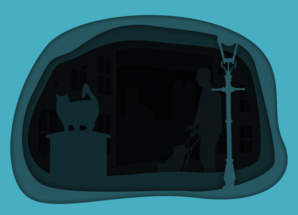
Figure 12. Duplicate the black layer above each layer group.
Reduce the Opacity
There’s a simple way to modify the opacity of all of the black layers at once, so you can experiment with different densities without having to repeat the process for each layer. Select one of the black layers. Then hold Command/Ctrl and click each of the other black layers in turn, so they’re all selected. They’ll be easy to spot in the Layers panel, as their thumbnails will be solid black rectangles. When you now change the opacity by pressing a number key, it will affect all the selected layers at once. In Figure 13, I changed the opacity to 20% by pressing the 2 key.
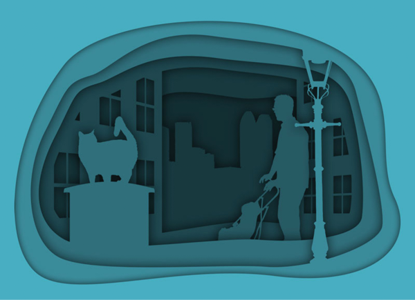
Figure 13. Lower the opacity of all the black layers to 20%.
Fine-tuning the Opacity
An opacity of 20% was still too strong for me. After experimentation, I settled on an opacity of just 7% for all the black layers. But wait—setting layer opacity using the number keys works in increments of 10, how can you set intermediate values (other than entering them in the Layers panel)? The answer is to type two numbers in rapid succession. So by quickly pressing 0 then 7, you can get an opacity of just 7% (Figure 14).
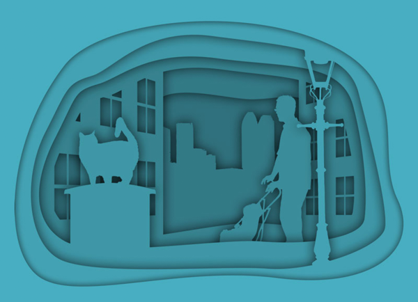
Figure 14. Lower the opacity of all the black layers to 7%.
Changing the Colors
If you want to change the color of the whole composition, it’s easy to do so. Select the top layer in the Layers panel, and from the Adjustment Layer menu at the bottom of the Layers panel choose Color Overlay. Select the color you want, and click OK. You’ll see a solid layer of just that color. From the blending mode menu at the top of the Layers panel, change the mode from to Color. Now you can change the color to anything you want, and it will affect all the layers below (Figure 15).
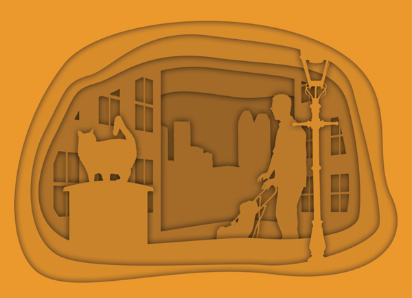
Figure 15. Use a Color Overlay adjustment layer to change the color of the whole image.
A Cut Above (and Below) Your Average Effect
I hope you’re already thinking of some interesting images you could compose with this technique. A quick Google or Pinterest search for layered paper cut art or a similar phrase will turn up loads of other ideas. And the best part of all—because you’re using Photoshop, your fingers will be free of paper cuts!
Commenting is easier and faster when you're logged in!

Recommended for you
CreativePro Video: Adding Hair Effects in Photoshop
In this week’s CreativePro CreativePro video, Steve Caplin uses Photoshop to mak...

Surreal Photoshop Effects: Swimming on Land
People swim in swimming pools. Or in the sea. But why limit ourselves to the obv...

Free Script to Add an Antique Edge to Photos
I recently stumbled across an interesting script that changes the border of a re...