
Creating Accessible Charts and Infographics
Creating Accessible Charts and Infographics is easier than you think: Simple tips to ensure everyone can engage with your work.


This article appears in Issue 43 of CreativePro Magazine.
Visual communication is a powerful tool, but it can become a barrier when accessibility isn’t considered, and overlooking visual and cognitive disabilities can compromise your chart design. It’s a common mistake. Let’s explore how to make charts more inclusive and effective. (Spoiler alert: It’s easier than you think.)
Color Blindness: A Widespread Issue
It’s astonishing how little attention is given to color blindness, considering that 300 million people worldwide have a color deficiency—affecting approximately 1 in 12 men (and 1 in 200 women).
Most notably, 98% of color blind individuals have red-green color blindness. Working in the finance industry, which is predominantly male, I noticed a recurring trap: the reliance on red, green, and yellow to convey meaning.
Think about common phrases. The project status is green. The financials are in the red. These two expressions align with color psychology: Red is stop or bad, yellow is slow or neutral, and green is go or good.
Now imagine if red and green looked like shades of brown to you. Viewing a chart with indistinguishable red and green elements would create an experience like Figure 1.
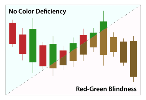
Figure 1. A standard red-green chart compared to how it appears to someone with color blindness
What would you do in this scenario? You might rely on context clues to interpret the chart, but that’s not ideal. Now consider a traffic light (Figure 2). Can you determine if it’s red or green?

Figure 2. This grayscale photo shows a traffic light with the bottom light illuminated.
Yes, the light is green. But how can you tell? The answer is consistency. No matter where you encounter a traffic light, the colors always follow the same order with red on top and green on the bottom.
You can apply this same principle and more to charts to ensure that your infographics are color-blind friendly. Specifically, you can:
- Use clear delineations between colors.
- Incorporate iconography.
- Maintain consistency.
- Apply patterns.
- Use color-blind-safe palettes.
- Always include labels.
Labels and Text Legibility
I often see designers shrinking charts to fit them onto slides—sure, they fit, but now the text is unreadable. Instead, treat your text independently from the chart, as shown in Figure 3.
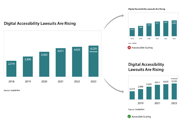
Figure 3. Reduce the chart size but not the text for better readability.
We have other ways to format and position text so we can significantly enhance accessibility and readability. When choosing a font and text size, be sure to:
- Use sans-serif fonts such as Arial, Roboto, or Helvetica.
- Ensure text is at least 12 pt for body copy and 16 pt or greater for headings in digital applications.
- Avoid decorative or script fonts for essential information.
- For more effective labeling, also remember:
- Labels should be clear and concise, positioned near the relevant data points.
- Use direct labels instead of a legend, where possible, to reduce cognitive load.
Cognitive load is the amount of mental effort required to process information. Overloading learners with too much information can cause stress, fatigue, and frustration and decrease recall.
For more tips, check out the article “Accessible Typography Essentials” in InDesign Magazine, Issue 149.
Now, let’s examine what happens when visuals are overexposed, as shown in Figure 4. When colors blend into the background but text remains legible, the information remains accessible even without graphics.
Figure 4. The chart colors fade into the background, but the text is legible.
But that’s still not ideal, bringing us to the next challenge: visibility.
Poor Visibility: It Affects All of Us
From an accessibility standpoint, you might think visibility issues impact only those with visual impairments. But the truth is, situational factors affect visibility for everyone. Poor contrast makes graphics unreadable under different lighting conditions. Think about trying to operate an ATM when the sun washes out the screen or how hard it would be to read the billboard in Figure 5.
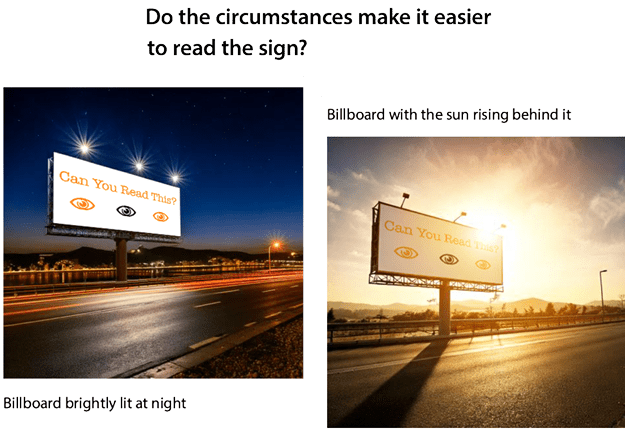
Figure 5. The time of the day and situational lighting affect this billboard’s readability.
Now, consider how graphics change when projected on a screen. Have you ever noticed elements disappearing due to lighting or poor contrast? Minimum contrast ratios help prevent this:
- Graphical elements (icons, lines, and similar) should meet at least a 3:1 contrast ratio.
- Text elements should meet at least a 4.5:1 contrast ratio.
For example, pure process yellow does not meet accessibility standards (Figure 6). To improve contrast, you’d need to introduce 40% black for graphics and 52% for text, as shown in the top row.
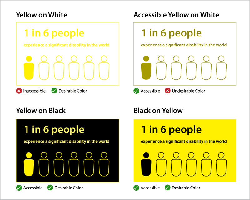
Figure 6. Contrast ratios affect your color choice.
I know what you’re probably thinking: That looks muddy or even That’s ugly. I avoid yellow text unless I place it on a dark background, as you see on the two examples on the bottom. You can also use creative solutions like adding a stroke to graphic elements or playing around with the color combinations.
For more information on color contrast, check out “Choosing Color Combinations for Accessibility” in Issue 38.
Comprehension and Understanding
During my time in finance, we followed an unspoken motto: Fit 10 pounds into a 5-pound bag. We’d cram presentation slides with facts and charts, unwittingly making them incomprehensible and impossible to follow for any audience—much less folks with disabilities, for whom this approach can be especially overwhelming.
I once was working on a color-blind-friendly version of a complex chart, testing various layouts, colors, and icons with my color-blind colleagues. Eventually, I had a few strong ideas, but when I tested them with actual users, I discovered a shocking truth: No one understood the original chart.
I had spent hours optimizing something fundamentally flawed. The original chart made sense only to those who created it. My mistake? Testing only with subject matter experts and not with end users.
So learn from my mistakes:
- Test with users with visual impairments.
- Test with people unfamiliar with the subject.
- Test with subject matter experts.
- Gather feedback and ask: Do users understand the key takeaway? Is this information valuable to them? Does the language make sense to the users?
Alternative Ways of Processing Information
Charts require alternative text (alt text) so screen-reader users can interpret the visual data. If you’re new to this concept, imagine explaining a chart over the phone to someone who has no visual reference.
Ask yourself: What is the purpose of this chart? What key takeaway do I want users to have? Supplying the answers to these questions in your alt text helps ensure that blind and visually impaired users can access the essential information effectively.
Alt text also benefits:
- Search engine optimization, improving discoverability
- Users with slow-loading images, ensuring they still receive context
- Hover-over explanations, providing additional insights for sighted users
- For simple charts, a short description may suffice. However, for more complex charts, where a brief alt text cannot fully convey the data, consider these additional options:
- Integrate key insights into the surrounding text.
- Provide a link to a detailed long description.
- Offer an option to display a data table for better readability.
- Include a download of raw data (in a text-delimited, standardized format like CSV) for users who prefer raw data access.
- Consider the tools you use in representing charts, too. I often use Highcharts (Figure 7).
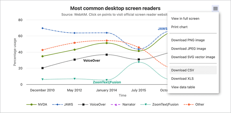
Figure 7. With its extensive libraries of styles, Highcharts makes creating accessible charts easy.
Recap: Tips for Creating Accessible Charts
By integrating some simple principles, you can create charts that are not only visually appealing but also inclusive and accessible to all.
- Avoid relying on color alone. Use patterns, labels, and icons.
- Ensure sufficient color contrast. Check minimum contrast ratios.
- Make text legible. Scale it appropriately, and separate it from the chart.
- Simplify when possible. Overcrowded charts are ineffective.
- Test with a diverse audience. Include a cross-section of users with and without disabilities, and don’t forget to include non-experts.
- Provide alternative ways to access data. Offer alternative text, tables, or CSV downloads.
For more help creating accessible designs, download the “Accessibility Checklist for Designers,” which you first saw in Issue 39.
Remember, though: Accessibility isn’t just a design challenge or about checking off compliance items on a list. It’s an opportunity to ensure that everyone can engage with your work. Accessibility benefits all.
Commenting is easier and faster when you're logged in!

Recommended for you

CreativePro Video: Numbering Across Stories in InDesign
In this week’s CreativePro video, Sandee Cohen demos how to continue a numbered...

InDesign Magazine Issue 104: Accessibility
We’re happy to announce that InDesign Magazine Issue 104 (December 2017) is...

You’ve got to try TextStitch
How to use the free TextStitch plug-in to simplify difficult text threading task...