
Creating a Logo in Illustrator
Learn to combine, shapes, symbols, and typography to make a great logo.

This article appears in Issue 9 of CreativePro Magazine.
Sooner or later, most InDesign users will have to leave the comfort of its text frames and its Pages panel and venture into the world of Adobe Illustrator, with its point type, area type, and artboards—most likely, when creating a logo.
Of course, when it comes to handling paragraphs of text, InDesign is second to none, but when we’re talking about designing just a word—or initials or a tagline—then Illustrator gives you a lot more options.
And if the logo you’re creating also includes a custom shape or symbol, then Illustrator’s vector tools offer greater sophistication than the basic vector shapes available in InDesign or Photoshop.
Simplicity in logo design is something to aspire to, but you don’t want to limit your options. Illustrator allows a faster route to a simple treatment than InDesign would, and if you need bells and whistles, they are readily available.
Why Illustrator and not Photoshop? A logo will be used at a variety of sizes, so it’s essential that the artwork be scalable—not something you can do to pixels without limits. You can enlarge Illustrator’s vector art to your heart’s content, from a business card to a billboard. That is not the case with vectors in Photoshop, which will be rasterized in most cases.
So, here are some techniques for working with logos that even Illustrator novices can use with confidence.
Explore Type Variables
Many logos are nothing but a wordmark. You can create an impactful logo imbued with personality, even within the confines of a single type family.
To get the most from the type, explore the variables: lowercase, uppercase, title case, or, if the name breaks into parts, perhaps camel case (multiple words expressed without spaces and differentiated by an uppercase letter for the first letter of each word, e.g., CreativePro).
If you’re working with more than one word, you can distinguish each with a space, a different shade, a different weight, or perhaps a different type style (Figure 1).
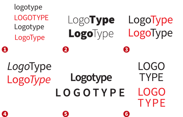
FIGURE 1. Start out a new logo by exploring how far you can go just by changing the casing of the text. Differentiate the word or part of the word with color, weight, or style. Explore the possibilities of tight or loose tracking.
What about letterspacing (tracking)? Should it be normal, tight, or loose? As you adjust this variable, you’ll want to consider how it works with the casing. Generally speaking, loose tracking or letterspacing is going to work better with uppercase text. If you’re working with a long word or multiple words, try stacking the type onto multiple lines.
With every change comes the suggestion of another direction—like word association, each change and new version brings you to new avenues to explore. Note that Illustrator handles type slightly differently from InDesign. When you click to make an insertion point with your Type tool in Illustrator, you create point type, which is more free-form and flexible and is preferable for working with single words and short phrases.
But there will be times when you need access to paragraph-level control like line spacing and additional alignment options. Converting the text from point type to area type (Type > Convert to Area Type) lets you justify all lines or apply space before or after a paragraph.
Change Just One Thing
Many logos work by making a subtle tweak to the type—adding something or taking something away. The best logos have one feature that stands out. If you try mixing two or three features, you’re probably trying too hard. The viewer won’t know which to respond to.
It may be as simple as taking a nick out of one of the letters, covering a portion of one of the letters, or filling in a counter (the enclosed area within a glyph, as you see in A, B, D, O, P, Q, R, a, b, d, e, g, o, p, and q).
You can add to or adorn the dot of the i or the ascender of the d, or you can shift the baselines. You can hide a letter or flip a letter. You can use color to reveal words within a word. If you have an odd number of letters, try making the central letter bigger.
A simple modification to a letterform can tell a whole story, as in the brilliant logo for Shelter, a UK housing and homelessness charity. (You can read about the organization’s rebranding here.)
Such modifications require that the type be converted from live (editable) text to vector shapes (Type > Create Outlines).
Warning: Be sure to keep a copy of the live type on the pasteboard as insurance before making this conversion.
With your outlined type, use the Direct Selection tool, along with related tools like the Scissors tool and the Smooth tool, to perform surgery on the individual path segments and anchor points.
The options on the Pathfinder panel are great for combining or subtracting shapes, while the Shape Builder tool offers an updated and more interactive way of doing the same thing (Figure 2).
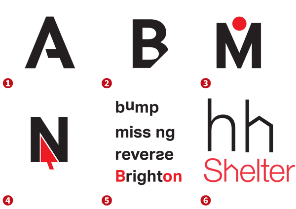
FIGURE 2. Take away or add one thing to a letter. Hide or reverse it, or modify its shape to tell a story. Add a layer of meaning to the text of your logo by finding words within.
Initial Letters
Often the initial letter of the company name forms the basis of its logo. Once you’ve experimented with the different voices that fonts have and you’ve decided whether the letter should be upper or lowercase, there’s a wealth of easy treatments you can explore.
Try putting a simple rectangular or circular enclosure around the letter, adding offset outlines or extruded shadows, or segmenting the letter with the Live Paint tool and applying different colors or shades to specific segments (Figure 3).
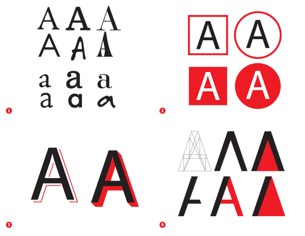
FIGURE 3. Here are examples of how you can use enclosures, offsets, or shadows, or you can convert to outlines and segment the letter form.
Beyond 26 Letters
Always think beyond the 26 letters of the alphabet—sometimes, punctuation or a special character deployed in a clever way can make a logo work. Maybe it’s an apostrophe. It might be an equal sign, an infinity symbol, a greater-than sign, or opening quotes (Figure 4).

FIGURE 4. Explore the possibilities of symbols, punctuation, and discretionary ligatures.
You also might replace letters or words with a symbol—think Milton Glaser’s “I Love New York” logo or Paul Rand’s rebus variant of his enduring IBM logo (Figure 5). This technique works best if the word is a common one and the letter is a simple shape. Avoid substituting the first or last letter of a word, which is likely to cause the word to be read without the picture.
If you are incorporating a symbol into your logo, the symbol doesn’t literally have to describe what the company does. Apple doesn’t use a computer, nor does FedEx use a parcel.
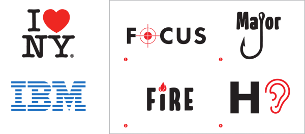
FIGURE 5. Switch letters with a symbol for effect. You can also switch entire words with a symbol to create a rebus.
Simple Type Treatments
Let’s look at some commonly used type effects, which are easy to execute in Illustrator.
Offset path around the type
Use this method to create exterior shapes around your type, as illustrated in Figure 6.
On the Appearance panel, add two fills and change their colors—in this case to black and yellow, respectively. Select the black fill, and, from the FX menu at the bottom of the Appearance panel, choose Path > Offset Path. Do the same for the yellow fill, making its offset amount about twice that of the black fill.
Using this approach, the type remains editable—you don’t need to convert it to outlines. You can also capture the settings as a graphic style to use elsewhere by clicking New Graphic Styles from the Graphic Styles panel menu.
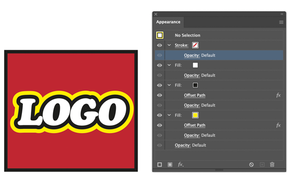
FIGURE 6. Create an effect with the Appearance panel with multiple offset paths around type.
Inline shapes
You can also use the Appearance panel to create interior, or inline, shapes by using the above technique with negative settings in the Offset Path dialog box (Figure 7). This method works best with a heavier typeface, and one with relatively little difference between the thin and thick parts of its stroke.
While it’s possible to retain the editability of the type, you may find yourself needing to convert the type to outlines so that you can take control of the letter shapes.
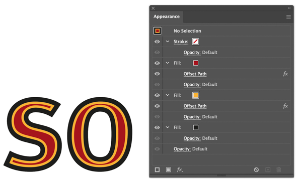
FIGURE 7. You can use negative offsets to create inline shapes.
Circular type
Putting type around a circle can evoke an official seal or stamp, and this design motif is often used to confer legitimacy and status on a brand.
This technique, shown in Figure 8, involves using the Type on a Path tool. If you want type reading at the top and bottom of a circle, then you will need two circles, one exactly on top of the other.

FIGURE 8. Pulling apart the finished version reveals multiple circles, each with text on a path. The height of the type relative to the path can be controlled in the Type > Type on a Path > Type on a Path Options dialog box.
Warped type
Warping type can create a sense of dimension, playfulness, and tradition. Illustrator offers a standard list of 15 warp effects that you can apply to type nondestructively. (Photoshop has the same ones.) Select your type with the Selection tool, and click the Make Envelope button on the Control panel to open the Warp Options dialog box where you can choose a Style and tweak its options (Figure 9).
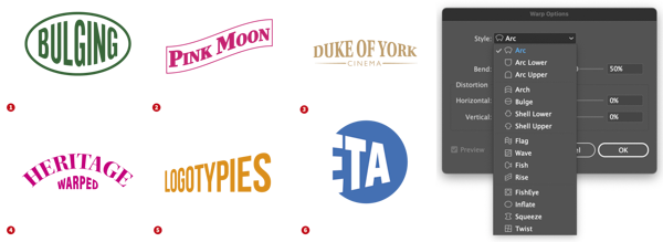
FIGURE 9. Various effects created using Warp effects (Effect > Warp)
Signature logos
Hand-drawn type suggests a personal, informal feel. A related approach—the signature logo—can convey authenticity.
Because you want your letterforms to be unique, it’s best to hand-draw them rather than use an off-the-shelf font.
Start with a pencil sketch. Trace over it with the Pen or Pencil tool, adjust the anchor points as necessary, then apply a calligraphic stroke.
To finish, outline the stroke to convert the strokes to fills and remove any overlapping areas using the Pathfinder panel or the Shape Builder tool (Figure 10).
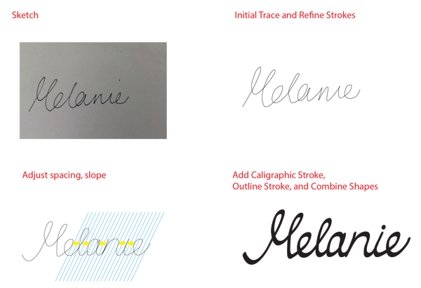
FIGURE 10. Starting with a pencil sketch, you can use Illustrator to create a logo of calligraphic vectors.
Monogram
Depending on the letters you’re working with, consider fusing them together into a custom ligature that can serve as a monogram, conferring a sense of pedigree and history on your brand (Figure 11).

FIGURE 11. Overlap the letters, convert to outlines, then use the Shape Builder tool to combine the shapes. Hold Option/Alt to subtract any extraneous parts.

FIGURE 12.
Vertical type and stacked type
Vertical and stacked type
If you’re after a more vertical shape, try the Vertical Type tool. To help the letters stack more effectively, consider a monospaced font so that the letters are the same width.
Note: To adjust the line spacing with vertical type, use tracking in the Character panel instead of the customary leading controls in the Paragraph panel.
If you want more than a single character per line, simply use horizontal type with a combination of line breaks and leading adjustment.
See Figure 12 for examples of both treatments.
Simple Shapes
Many successful logos use simple shapes: a square or rectangle, a circle or oval, an arrow or triangle.
Logos have only a second to capture someone’s attention, so there’s no time for fussy detail. And because they need to be reproduced at large and small sizes, there’s also the practical need to keep things simple.
The shapes may be simple, but they carry meaning.
The circle is infinite or protective. The square is stable, solid, honest. A triangle suggests tension, movement, change, or direction.
These shapes can be used as enclosures or to focus attention on part of a logo. They can be integrated into the type or stand next to it.
Multiple shapes can be combined to make patterns. You can make one shape from another, such as a group of circles to form a square. Shapes can be distorted to convey perspective, or they can be arranged in ascending size to suggest motion.
Lines
Many logos use any number of lines varying in style, weight, color, whether they are uniform or varying in width, and the way in which they interact with the type (Figure 13).
Lines can underscore a name, direct the eye, form barriers, suggest connections, or indicate movement. They can be shaped into swirls or ribbons. They might be entirely abstract or more concretely evoke the business of the company.

FIGURE 13. Whether you’re designing a logo for a contemporary art museum, a retail store, a computer company, a punk band, a mental health charity, or local government, you can use lines to create an effective solution.
Arrows
Stick a triangle on the end of a line, and you have an arrow. Arrows are used in logos in all sorts of ways—sometimes obviously, other times subtly (Figure 14).
Because in the West we read from left to right, arrows typically follow the reading direction. Sometimes they point up, but seldom do they point left or down.
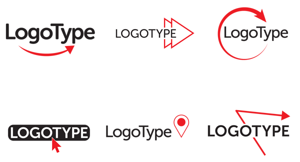
FIGURE 14. Here you see some simple uses of arrows—either added to the end of a line using the Stroke panel or built with triangles created with the Polygon tool. The map pin—an element in the center example in the second row—takes its form as a triangle combined with a circle.
Squares and rectangles
Rectangles are arguably the most flexible shape, fitting easily into columns of a newspaper, magazine, or website. Squares—rectangles whose sides are the same length—imply equality and solidity.
If you’re using a square or rectangle as an enclosing shape, consider how the type fits within it: A rectangle might work better with a longer name than a square would. Or extend the type to the edges to give the impression that the type is not confined.
See Figure 15 for some logo design motifs with squares and rectangles.

FIGURE 15. The permutations for using a squares and rectangles are many—and keep in mind that the corners can be rounded with Corner widget tool. To round the individual edges, first click the edge to select it, then drag to create the rounding.
Circles and ovals
Circles are loaded with symbolism. In a circle, we see a ring, the sun, the moon, the Earth, a wheel, an eye, a face, and many other things. See Figure 16 and Figure 17 for some design approaches.
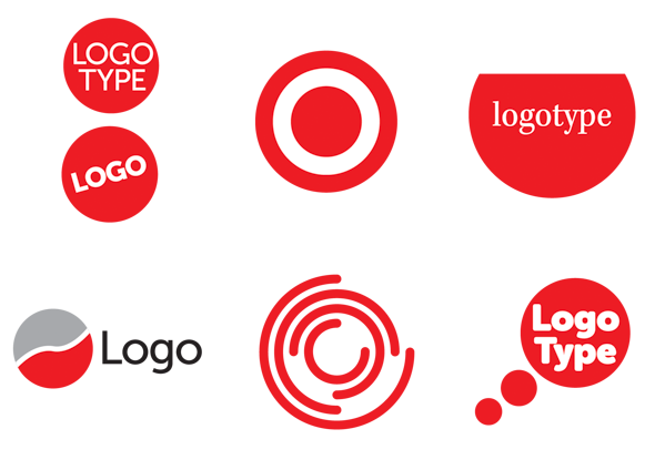
FIGURE 16. Experiment with positioning the type within the circle, with slicing off a part of the circle, with dividing it into two or more parts, or with repeating the shape to suggest a thought bubble.

FIGURE 17. When you’re working with a long name, perhaps an oval would be preferable.
As you would with squares, consider how the type sits within the shape. Try the Polar Grid tool to create multiple circles with a common center, and you have concentric rings—another widely used design element (Figure 18).

FIGURE 18. Create concentric rings and radial dividers (spokes) with the Polar Grid tool, then subtract the parts you don’t need.
Triangles, diamonds, and stars
Triangles make compelling shapes, either alone, as part of a pattern, or as an interior shape within a design. Put two triangles together, and you have a diamond (Figure 19).

FIGURE 19. Segment, duplicate, and reflect triangles, then combine them to create diamonds.
Because of their reduced volume, triangle and diamond logos tend to have the text stand outside the shape.
Not surprisingly, stars are a popular logo element because they signify brightness and excellence—and what company doesn’t want to be associated with brightness and excellence?
You can see some examples of stars in logo design in Figure 20.
Using the Star tool in Illustrator, press the Up or Down Arrow key to increase or reduce the number of points. Pull up or down while holding the Command/Control key to change the inner radius. Once you have created the star, you can round its corners.
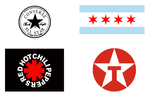
FIGURE 20.
Stars come in many different flavors.
Keeping It Simple Is Hard
If you’re familiar with InDesign’s type conventions and its basic vector shapes, you’ll adapt to Illustrator’s tools without difficulty.
Keeping a design simple is hard. Far from dumbing things down, limiting yourself to type and simple shapes is a design challenge.
Using the tools in Illustrator is the easy part; the difficult part is using simple, universal shapes in such a way that they convey the uniqueness and embody the values of a brand.
Commenting is easier and faster when you're logged in!

Recommended for you

Designing A Logo for Every Size & Usage
Designing a typographic logo, or word mark, isn’t as simple as coming up with on...
How to Style a Bar Chart in Illustrator
Learn a few helpful data visualization pointers on styling bar charts in Illustr...
A Great Script Lets You Add Measurements in InDesign or Illustrator
A script for InDesign or Illustrator takes the pain out of measuring and marking...