
Create Six “Smart” Paragraphs in InDesign with GREP Styles
Michael Murphy shows even the most code-wary designer how a little GREP can save a lot of time.

This article appears in Issue 30 of InDesign Magazine.
InDesign’s GREP Style feature mixes a little bit of GREP Find/Change with a little bit of Nested Styles to produce a whole lot of awesome. GREP Styles are more flexible than Nested Styles because they’re not limited to a rigid sequence that applies styles through (or up to) a specific delimiter character. Instead, a GREP style looks for text that matches a pattern, so it can be applied anywhere within a paragraph, to as many matching patterns as it finds. And even though GREP Styles lack the ability to rearrange the text they describe (as GREP Find/Change can), they have the unique advantage of lying dormant within a paragraph, waiting for a matching pattern to activate the character styles assigned to them.
This aspect of GREP styles is, perhaps, its most valuable one. By incorporating a GREP style into a paragraph (or, better yet, a paragraph style), you create a smarter paragraph—one that will react to certain patterns within that paragraph (an e-mail address, or a fraction, or a specific product name, for example). This saves you the time and trouble of looking for and formatting these things yourself, and rules out any chance of you missing one by putting it all in the hands of a well-formed GREP style. All you need is a GREP expression and a character style, and you’re all set. Unfortunately, what gives GREP Styles their power is also what deters most people from trying the feature out: the GREP part. GREP uses metacharacters to describe text that matches a certain pattern, rather than using specific words or phrases. There are several different types of metacharacters-Wildcard, Location, Match and Modifier-that can be combined to describe some very complex patterns (also called expressions). For most people, constructing those expressions is the biggest barrier
to using this great new feature. If you’re one of those people, this article is for you. To help you leapfrog your fear of GREP and get straight to the payoff without any of the pain, l’ve created a half-dozen useful GREP expressions you can start using immediately just by copying them out of this article and pasting them into the GREP Styles area of the Paragraph or Paragraph Styles dialog.
No Need to Type—Download the Code!
I’ve compiled all the expressions in this article into one handy text file, which you can download here.
Smart GREP Paragraphs and Dumb Character Styles: Perfect Together
I like to think of paragraphs with GREP Styles built into them as “smart” paragraphs. As soon as they detect another instance of the pattern they’ve been instructed to look for (and they’re looking for it all the time), they apply a character style you’ve specified to the matching text. To make those GREP styles pay off in many different paragraphs, keep your character styles as dumb-or, more accurately, as non-specific—as possible. The less you define about a character style the better. Everything you don’t specify is inherited from the paragraph, making them far more flexible. I call these flexible character styles “unitaskers,” because they typically perform only one function (i.e., applying underlining or turning on OpenType fractions). Together, this combination of smart paragraph styles and one-function character styles enables powerful, automatic text processing capability. The following six ready-to-use examples provide both the GREP expression you’ll need to create the GREP style, and the parameters of the character style that goes along with it to enable automatic formatting in several real-world situations.
1. BETTER LEADER DOTS
Creating leader dots using the Leader field in the tab ruler (Figure 1) is a long-standing technique that’s rife with problems.
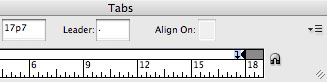
Figure 1. The leader field in the tab ruler.
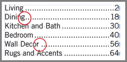
Figure 2. Inconsistent spacing and square dots are just two of the inherent problems with establishing leaders in the tab ruler.

Figure 3. A single-function character style with only Underline options defined.
~y THE RESULT: Figure 4 below. 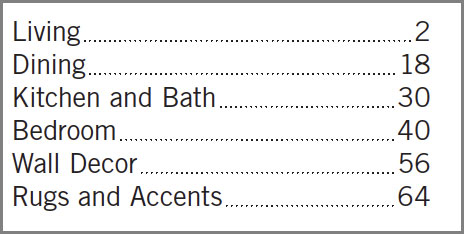 VARIATIONS ON THIS IDEA: The expression above uses just one metacharacter (a special character or combination of characters that describes text) that represents a right-align tab. The space spanned by that tab is filled by the underline style. This same technique can be used with a different character style that applies a solid underline to quickly create precise fill-in lines in a form. The right-align tab will push the line to the right side of the column, and an En Space added just before you insert that right-align tab will create a consistent buffer between that text and the start of the line (Figure 5).
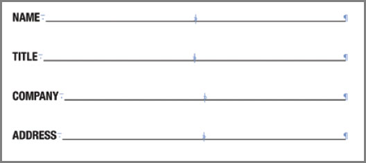
Figure 5. The same technique with a solid underline creates perfect form lines.
~y (to search for a right-align tab), and in the Change to field, enter~<~y<, which inserts thin spaces on either side of the tab space. Be sure to limit the search to the paragraph style using this GREP style (via the Find Format options) to avoid unintentional matches elsewhere in the document.
2. INLINE FIGURE REFERENCES
In many publications, figure references within a paragraph are enclosed in parentheses and styled differently from the rest of that paragraph to make them easier to find for the reader. A character style is the best way to consistently format each reference, but a GREP Style is the easiest way to apply that character style wherever it appears in a paragraph. THE GOAL: The expression must find any Figure reference within parentheses, but apply the character style only to the reference, not to the parentheses. This requires Positive Lookbehind (?<=), which determines if something—in this case an opening parenthesis character-precedes the matching text. It also requires Positive Lookahead (?=), which looks after the matching text to determine that something— in this case, a closing parenthesis—follows it (Figure 6).
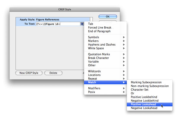
Figure 6. The Positive
Lookbehind and Lookahead metacharacters are available from the Match submenu in the Special Characters for Search menu.
\( and \)) to have them recognized as literal parentheses. THE CHARACTER STYLE: Any typeface, weight or color change you desire. It might benefit you to leave the Size and Leading fields under Basic Character Formats blank so the figure references will automatically adjust to any changes in size and leading made to the paragraph. THE EXPRESSION: (?<= (Figure Id+(?=\)) THE RESULT: Figure 7 below.  VARIATIONS ON THIS IDEA:
 (?<= (Figure Id+\. Id+(?=\)) matches figures referenced as Figure 2.5. (?<=|()See Figure Id+(?=\)) matches figures referenced as See Figure 5. (=\()Figure (?:ld+|\d+l.(d+)(?=1)) matches both Figure 5 and Figure 2.5. (?<=() (?:See )?Figure (?:\d+|\d+\.\d+)(?=1)) matches Figure 5 and Figure 2.5 and See Figure 5 and See Figure 2.5.
3. SMART FRACTION DETECTION
If you want all fractions in a paragraph converted to proper OpenType fractions, turning on the OpenType Fractions attribute for an entire paragraph is not an option. Any number in the paragraph will be considered a numerator until it’s followed by a slash, and any number after a slash will be considered a denominator. This is a recipe for disaster, but manually applying the OpenType attribute to every fraction one at a time is a tedious chore. While a simple expression like \d+/\d+ (any digit, one or more times, followed by a slash, followed by any digit, one or more times) does describe a fraction (1/2, 2/3, 7/16, etc.), it also describes part of a date like 10/6/2009 (Figure 8), making it too vague a description of a pattern to be depended upon for either a GREP Style or GREP Find/Change query.

Figure 8. A simple GREP expression isn’t enough to differentiate between a fraction and the numbers in a date.
(?<!), which considers a match valid only if it is not preceded by something, and Negative Lookahead (?!), which validates the match only if it is not followed by something. In this case, the something before the fraction that must not be present is another number followed by a forward slash, and the something after the fraction that must not be present is a forward slash followed by a number. Only under those conditions can GREP differentiate a fraction from a date. THE CHARACTER STYLE: Another “unitasker” style with every option left blank, unchecked or undefined in all areas of the dialog with the single exception of the Fractions checkbox in the OpenType Features, which must be checked (Figure 9). 
Figure 9. An all-purpose fraction character style that will work with any OpenType font that includes true fractions.
(?<!\d)(?<!/)ld+/\d+(?!/)(?!\d) THE RESULT: Figure 10 below.  VARIATIONS ON THIS IDEA: The above pattern is a good start, but it will also format “improper” fractions (i.e., both 7/16 and 16/7). A more complex pattern can describe specific numerator/ denominator combinations. In other words, a fraction with a one-digit denominator will only be a match if it has a one-digit numerator, and a fraction with a four-digit denominator will only be a match if it has a one-to three-digit numerator (Figure 11).
Figure 11. A more precise (but still not perfect) expression can prevent the unwanted formatting of “bad” fractions.
{1,3} which means at least one but no more than three), in combination with an exact number of digits for the denominator (that is, {4} which means exactly 4). Each “acceptable” numerator/denominator combination is isolated as a non-marking subexpression (?:), and separated by a vertical divider character (Shift-backslash), which is the “Or” metacharacter. That expression would look like this: (?‹!\d)(?<!/)((?:1d/\d)|(?:1d{1,2}/\d{2})1(?:1d{1,27/\d{3})|(?:1d{1,33/\d{4}))(?!/)(?!\d) While better, keep in mind that this still isn’t perfect. The same description that allows 11/16 to be a match will also match 16/11, but this is the best that can be accomplished with GREP. TWO SMALL CAVEATS: This pattern prevents a date in the MM/DD/YY or MM/DD/YYYY format from being matched, but it can’t distinguish a fraction from a date presented as MM/DD or MM/YYYY, nor would it prevent the Openlype fraction style from being applied within the phrase “20/20 vision.” Also, if the typeface of the paragraph using this GREP Style isn’t an OpenType font, or is an OpenType font that doesn’t support fractions, the style will change nothing.
4. SUPERSCRIPTED SERVICE MARKS
Nearly every typeface offers keyboard shortcutinvoked characters for the trademark (Option/Alt-2) and registered trademark (Option/Alt-R) symbols, but the elusive service mark (SM) is nowhere to be found. THE GOAL: Find the uppercase character combination SM at the end of any word and apply the superscript attribute. This expression must also call upon Positive Lookbehind (this time to require the presence of an upper-or lowercase character before the letters SM), but must also describe a location—the end of a word (\>)—that immediately follows the letters SM. The End of Word metacharacter considers any space, return or punctuation to indicate the end of a word. THE CHARACTER STYLE: Another unitasker with only the Superscript attribute specified from the Position menu in the Basic Character Formats area of the Character Styles dialog. THE EXPRESSION: (?<=[\u|\1])SM\> THE RESULT: Figure 12 below.  VARIATIONS ON THIS IDEA: Service marks in some fonts at some sizes may require additional adjustments beyond just the Superscript attribute. In Figure 12, an alternate character style for the matched SM also changes the font’s weight, and slightly baseline shifts the service mark. In addition, it establishes a dynamic, percentage-based relationship between the size of the text and the size of the service mark by applying horizontal and vertical scaling at the exact same values (Figure 13), which eliminates the need to tie the character style to any specific point size.

Figure 13: A character style with uniform horizontal and vertical scale values establishes a percentage-based relationship to the point size of the paragraph.
ServicePlus(?:Gold)? which describes “ServicePlus, followed (possibly, but not necessarily) by a white space together with the word Gold.” 
Figure 14: The second GREP style here auto-applies a bold character style to the phrases ServicePlus and ServicePlus Gold.
5. UNBREAKABLE E-MAIL ADDRESSES
When URLs and e-mail addresses are part of a paragraph in which hyphenation is turned on, you never quite know where those addresses are going to break (Figure 15). Since hyphens are allowed within the syntax of a domain or addressee name, there’s the risk of creating confusion on the reader’s part about whether or not the hyphen that InDesign adds is or is not part of the address. Web addresses are tricky to pin down due to the number of possible sub-domains and subdirectories (for example, forums.adobe.com vs. adobe.com, or theindesigner.com/blog vs. www. theindesigner.com), whether or not the https:// portion is included, what the specific file path is, and so on. Fortunately, e-mail addresses have a very specific syntax that allows them to be defined precisely.
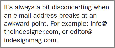
Figure 15: GREP styles can make bad e-mail address breaks a thing of the past.
\u and \1), digits (\d), dashes, periods and underscores—are allowed for the addressee name, you need to define that range of acceptable characters as a character class or, as it’s referred to in InDesign, a Character Set. Character sets are enclosed in square brackets, and anything within those brackets is a valid match. Domain names have stricter limitations (no periods allowed), and domain extensions are the strictest of all (no dashes, underscores, periods or digits), making each subsequent portion of the address easier to define. THE CHARACTER STYLE: Yet another unitasker style in which everything is deactivated or undefined except for the No Break attribute under Basic Character Formats. THE EXPRESSION: [-\u\d._]+@[-\u\d_]+\.[\u]{2,4} THE RESULT: Figure 16 below.  VARIATIONS ON THIS IDEA: If you have no problem with e-mail addresses breaking, or if you want to add other formatting, your character style could also italicize the addresses, makes them bold, blue, underlined, or any combination of attributes (Figure 17).
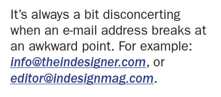
Figure 17: A more specific character style can add multiple attributes to any e-mail address detected by a GREP style.
(?) metacharacter after it: (?:\.[\u]{2,4})?
6. Squash (or Stretch) Your Em Dashes
The eternal battle over the appropriate use of Em and En dashes may never be settled definitively because people— designers and editors alike-have very subjective preferences about the appearance of dashes. In some cases where Em dashes are entirely appropriate, the appearance of that Em dash may be just a bit too wide in the font being used. I find this to be the case with Adobe Garamond Pro, whereas the sans-serif font Interstate has Em dashes so narrow they look like En dashes, if not hyphens (Figure 18).

Figure 18. Poorly proportioned Em dashes gets an automatic adjustment thanks to a GREP style.
~_ THE RESULT: Figure 19 below.  VARIATIONS ON THIS IDEA: If the font you re using has Em dashes that are too narrow, odds are its En dashes suffer the same problem. To expand this GREP style to both Em and En dashes, change the expression to
 ~_|~= to adjust both without having to create a second GREP style. If you have the opposite problem— your Em or En dashes are too wide-create a character style that reduces their width with a Horizontal Scale value less than 100%.
Commenting is easier and faster when you're logged in!

Recommended for you
New TypeFace Is Italian Art Deco Delight
Mostra Nuova is based on a style of lettering often seen on Italian Art Deco pos...
CreativePro Video: Delete Blank Pages in Adobe Acrobat
In this week’s CreativePro video, David Blatner shows us how to delete multiple...

CreativePro Week Preview: 5 Can’t-Miss AI Sessions
Our Editor in Chief lists his must-see sessions on the topic of AI at CreativePr...