Colorizing Grayscale Images (with transparency)
Georg wrote: I have a problem with placed grayscale images in InDesign. Normally I can set a color for the image with the swatches palette. But if the image has...

Georg wrote:
I have a problem with placed grayscale images in InDesign. Normally I can set a color for the image with the swatches palette. But if the image has transparency (in PSD or TIFF) the image stays gray.
You know that story about how InDesign and Photoshop work together so well in the Suite? Well, it’s mostly true, but this is a great example of how the interactions are not perfect. For those of you who don’t know what George is talking about: You can colorize a grayscale TIFF or PSD file by clicking on it with the Direct Selection tool (so the image is selected, not the frame) and then using the Swatches palette.
But this stop working as soon as your image has transparency in it. Why? Because. (I assume there’s a better reason than that, but the only answer I have is, “Because.”) Fortunately, there is a workaround.
First, save the file as a monotone instead of a grayscale image:
- Open the grayscale image in Photoshop and choose Image > Mode > Duotone.
- In the Duotone Options dialog box, choose Monotone from the Type popup menu.
- Click on the color swatch and choose any color (not black). I suggest picking some neutral gray or flourescent green or something obvious.
- After you click OK in the color picker, give the color some obvious name, such as “map me to the correct color”
- Click OK and save your duotone (monotone, actually) file as a PSD.

Once the image is saved as a monotone, you can import it into your InDesign document and apply the proper color. But first you need a color:
- If you already have a color swatch you want to apply to the image, select it in the Swatches palette (make sure nothing is selected on your page when you click on the swatch) and hold down the Option/Alt button while clicking the New Swatch button. This creates a duplicate of the swatch you selected. Set the Color Type popup menu to Spot and make sure it’s named something appropriate.
- If you don’t have a color swatch already, make one now in InDesign’s Swatches palette with the color ingredients you want — but make sure you save it as a Spot color (even if it’s specced with CMYK colors).

Now it’s time to do the deed, and apply the color to the image:
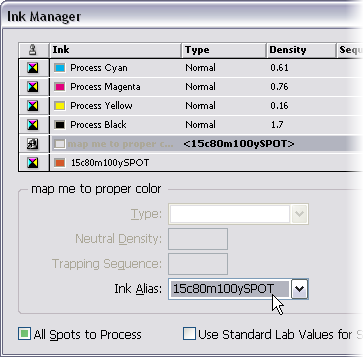
- After you have created your new spot color swatch, choose Ink Manager from the Swatches palette menu.
- In the Ink Manager, click on the imported image’s spot color (“map me to the correct color”) and then choose the new swatch you built in the Ink Alias popup menu.
- If the swatch you just made was supposed to be a spot color (for example, you’re applying a Pantone color to the grayscale image), then skip to the next step. On the other hand, if the color swatch was actually supposed to be a process color, click on the little icon next to it in the list of inks. Don’t enable All Spots to Process because that turns off the ink aliasing that we’re depending on.

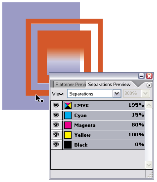
After you click OK to leave the Ink Manager, you’re done: The grayscale image is mapped to the new color. If you don’t see the color on screen, there’s an easy fix: turn on View > Overprint Preview. Ink aliasing (mapping one spot color to another color) is only visible when Overprint Preview is enabled. If you want to make sure that the effect worked, open the Separations Preview palette and hover the cursor over the image.

Should there be an easier way? Sure! But in the meantime, it’s helpful to understand the concepts of monotones, spot colors, and ink aliasing.
This article was last modified on December 18, 2021
This article was first published on March 20, 2007
Commenting is easier and faster when you're logged in!
Recommended for you

Track Down That Layout
Are you sure you're working on the right version of the layout? Here are a coupl...

Find All Headings Based on a Pattern
Here's a short and easy GREP pattern you can use to find one-line paragraphs

Use Eyedropper Tool to Copy Formatting
Peter wrote: Thank you for hosting the best resource around for any software pro...


