
Choosing Colors in Photoshop, Illustrator, and InDesign
Pick colors with confidence in Photoshop, Illustrator, and InDesign.


This article appears in Issue 39 of CreativePro Magazine.
Selecting colors is a crucial aspect of any design project, whether it’s for print, digital, or a blend of both. Adobe’s powerhouse suite—Photoshop, Illustrator, and InDesign—offers robust tools to help designers choose and harmonize colors effectively. With the tools, measurements, and commands available in all three of these programs, you can create color palettes that are visually appealing, grounded in color theory, and accessible. In this article, we’ll explore these essential tools, as well as some useful workarounds to keep your creativity flowing when the built-in options fall short.
Choosing Colors in Photoshop
The Photoshop Color Picker is Mission Control for color (Figure 1), allowing you to choose colors in five color modes: RGB, CMYK, HSB, Lab, and hexadecimal. If you’re nostalgic about late ’90s web design, check Only Web Colors to limit the color field to the 216 colors of the web safe palette. The Color Pickers of Illustrator and InDesign are broadly equivalent but not as fully featured.

Figure 1. The Photoshop Color Picker
Moving the sliders in the Color Picker updates the numbers (and in the case of hex, the letters) of all color models simultaneously, but the Color Picker makes most sense in HSB (Hue, Saturation, Brightness) color. Drag the vertical Color Slider (Hue bar) to change the hue. Imagine this as a color wheel—with the angle referring the color’s position around the circumference of the circle. In the color field on the left, drag horizontally to vary the saturation, and vertically to change brightness.
As you adjust colors, compare the New Color box with the Current Color box. The warning triangle informs you if a color is outside the print gamut and will
be clipped or scaled to the closest CMYK equivalent (not as scary as it may sound) if you convert the image to CMYK color mode. The cube warns you that the color is not a web safe color, but really who cares? Of course, if you know the specific values for the color you want, you can enter them in the input fields.
To reuse a color, click Add to Swatches to add it to the Swatches panel.
In addition to choosing different color models, you can also click the Color Libraries button to see predefined color sets like ANPA and TRUMATCH—and where the Pantone colors used to be before Adobe and Pantone had their falling out.
To sample a color from an image, click it with the Eyedropper (shortcut: I).
While all applications have an Eyedropper, the Photoshop version of the tool offers the most options. You can choose which layer(s) you’re sampling from as well as set the sample size from a single pixel to averages as high as 101×101 pixels for large images, where a single pixel might be unrepresentative. You can also drag the Eyedropper outside the Photoshop window (so long as your workspace is not in an Application Frame), to sample colors from anywhere on your desktop. While the Eyedropper is active, the Sampling Ring shows the new color above and the current color below, surrounded by a ring of neutral gray, making it easier to evaluate your choices (Figure 2).
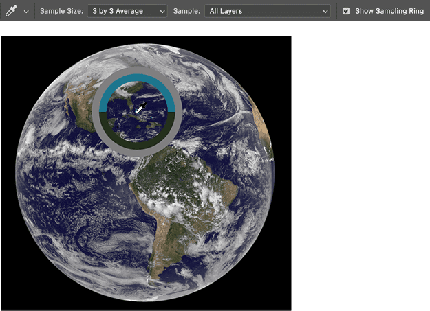
Figure 2. Sampling color with the Photoshop Eyedropper
Working in conjunction with the Eyedropper, the Info panel gives a breakdown of the colors you’re sampling, offering real-time feedback in all color modes: RGB, CMYK, HSB, Lab, or Web hex values at the cursor’s position. Hold Shift when using the Eyedropper to toggle to the Color Sample tool, letting you add up to four fixed color sample points. These can be invaluable when adjusting an image, as you can compare the values of the Current Color and the New Color during adjustments like color correction or retouching (Figure 3).
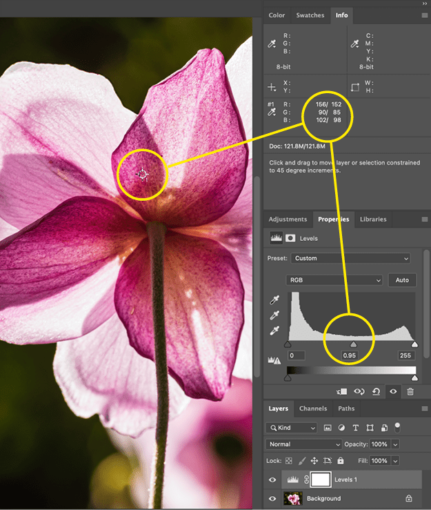
Figure 3. Comparing color with the Info panel
Choosing Colors in InDesign
In InDesign, the Eyedropper works a bit differently. It samples attributes from an image or other object, such as stroke and fill settings or even object transparency, rather than the colors specifically. Double-click the tool to open the Eyedropper Options dialog box, where you can set which attributes it selects. If you want to sample colors from an object, for example, make sure Stroke Settings and Fill Settings are checked.
A close cousin of the Eyedropper, the Color Theme tool (Shift+I) lets you extract colors from an image on your page. Let’s say you have a hero image in your layout on which you want to base the document’s color palette. Click the image, and the Color Theme panel displays five colors extracted from the image (Figure 4). You have five palettes to choose from: Bright, Muted, Deep, Dark, and Light. Click Add to Swatches to add the colors to your Swatches panel, or click Save to CC Libraries to share the colors across applications.
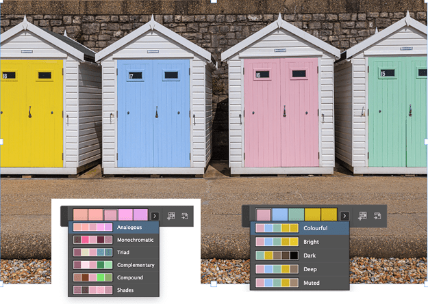
Figure 4. Using the Color Theme tool in InDesign
To organize your colors, you can sort by color value on the Swatches panel (Figure 5). If the colors are RGB or CMYK, though, the resulting order won’t be of much use: The panel just lists them according to which has the highest level of red (RGB) or the most cyan ink (CMYK). If you convert the colors to Lab (use the Swatch Options), however, you can then sort them by luminance, from dark to light. Alternatively, to sort by hue, convert the colors to HSB.

Figure 5. Three ways to sort colors in InDesign
Choosing Colors in Illustrator
The centerpiece of the Illustrator color tools is Recolor Artwork. A powerful and sometimes baffling tool with an interface only its mother could love, Recolor Artwork allows you to change the colors of vector artwork either by adjusting the hue, saturation, and brightness of individual colors or by remapping the existing colors to an entirely different color palette (Figures 6 and 7).
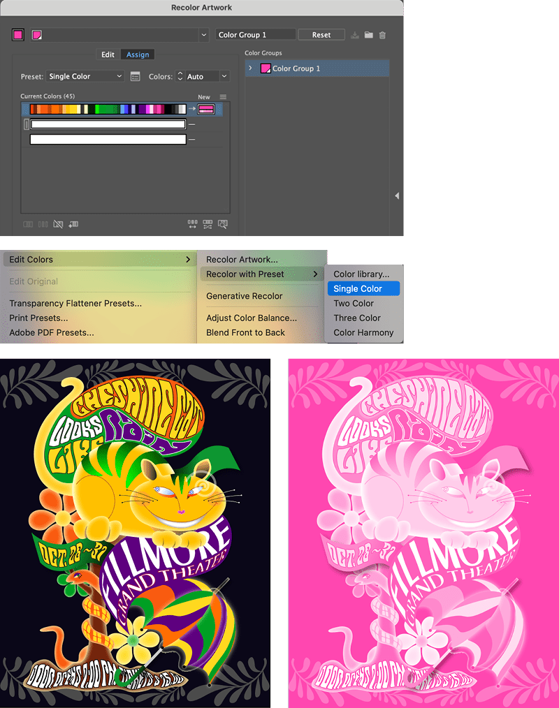
Figure 6. Recoloring artwork in Illustrator using the Single Color preset

Figure 7. Randomly changing color (top), hue and saturation (middle), and all three (bottom)
This is especially useful if the artwork needs to be reproduced with brand colors or with a radically simplified color palette. To control how the colors are remapped, you can order them by hue or lightness in the New menu, as well as drag current colors onto new colors. There’s also the option to preserve blacks, whites, or grays (Figure 8). You can also use Generative Recolor to recolor artwork by using text prompts to describe the color palette you’re after.
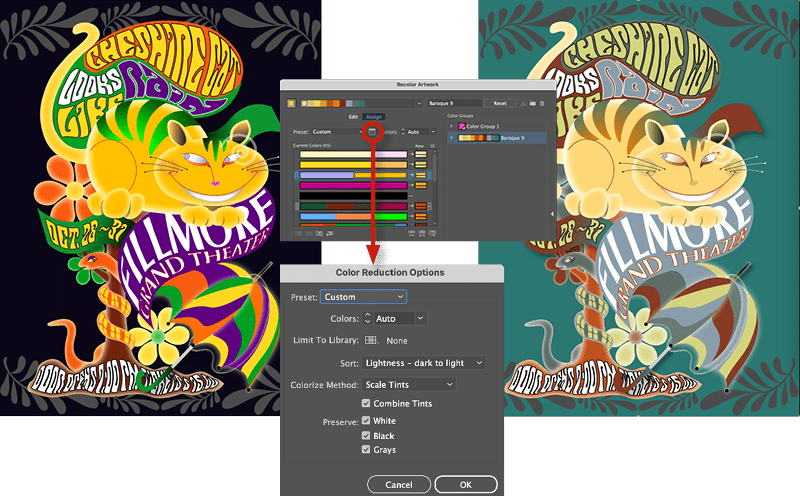
Figure 8. Recoloring using a color group
For an old school approach to creating color palettes, use the Blend tool. Create your start and end colors, apply them to simple objects, then create a stepped blend between them. You can blend between multiple objects, but for the example in Figure 9 I kept it simple.
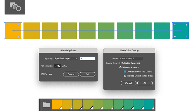
Figure 9. Creating color palettes with the Blend tool
When you’re happy with the result, duplicate the blend object and choose Object > Blend > Expand to convert it to individual shapes, from which you can create a Color Group. Reuse the original blend object to repeat the blending process with different sets of colors to create multiple palettes.
With the Illustrator Color Guide panel, you can create color palettes based on color harmony rules, making it easier to develop cohesive combinations, rooted in color theory. Select a Base Color, then explore the different Color Harmony Options. Here’s a breakdown of the color harmony rules (Figure 10), which are also at the heart of the Adobe Color website:
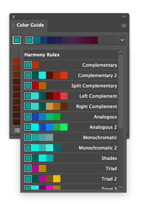
Figure 10. The Color Guide in Illustrator
Complementary: Colors opposite each other on the color wheel (e.g., blue and orange, red and green). When used together they create a vibrant, contrasting look.
Split Complementary: The two colors adjacent to the complement, rather than the color directly opposite the base color.
Triadic: Three colors evenly spaced around the color wheel, forming a triangle (e.g., red, yellow, and blue).
Tetradic (Double Complementary): Two pairs of complementary colors, forming a rectangle on the color wheel. This creates a four-color scheme with a variety of contrast and color diversity.
Compound: Similar to complementary, but adds complexity by combining analogous colors with complementary colors.
Shades: A single base color and variations of it. The variations are created by adding black, resulting in darker versions of the base color.
To create a custom palette from an image, embed (rather than link) the image. Next, choose Object > Create Object Mosaic. From the resulting dialog box, you can choose the number of tiles you want (Figure 11). With the image now converted to an abstract grid of colors, click New Color Group on the bottom of the Swatches panel. Just as in InDesign, reordering your colors by luminance or hue isn’t as straightforward as it could be. You’ll either need to reapply your colors to the original swatches or apply them to another piece of artwork, so with artwork selected, double-click the folder icon of the color group to go to Recolor Artwork. Click the New menu above the column of the new colors and choose your preferred sort mode. Now choose New Color Group from the top right of the dialog.
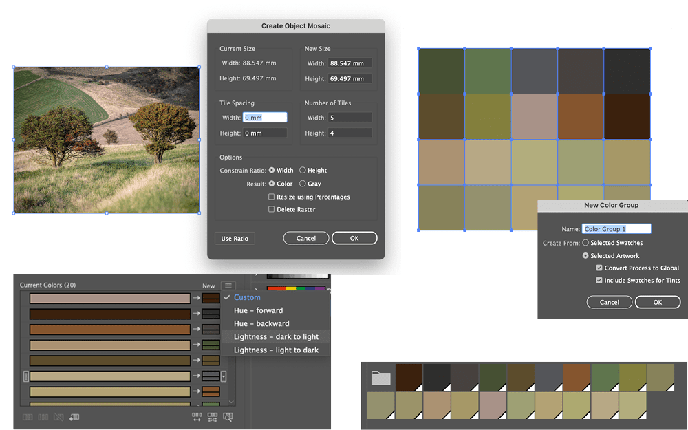
Figure 11. Create a custom palette from an image using Create Object Mosaic.
Another source of inspiration from within Illustrator are its color libraries—and I’m talking old fashioned libraries rather than CC Libraries here. There is a good selection of themed color libraries (probably created by an intern over a series of rainy afternoons circa 1998) that are often overlooked, but can provide a launchpad for your own color palettes (Figure 12).
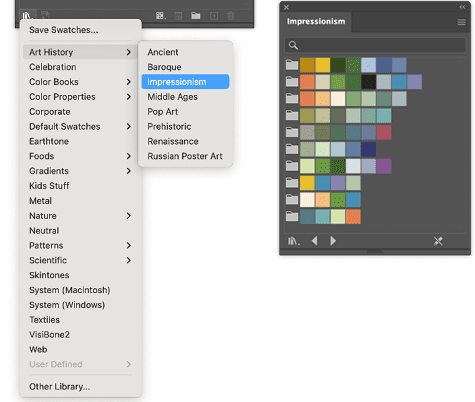
Figure 12. Illustrator color libraries
Choosing Color in Adobe Color
On the Adobe Color website (color.adobe.com) you can create color themes, save them to a Creative Cloud Library, and then share them across applications. If you’re in a hurry, you can adopt existing color themes made public by other users, but it’s more fun to create your own by moving colors around the color wheel in relationships determined by your chosen color harmony rule. There are fewer harmony rules here than in the Illustrator Color Guide, but the resulting theme now has six colors rather than five (Figure 13).

Figure 13. Creating and exploring color themes in Adobe Color
Another option is to extract a theme or a gradient from an uploaded image (Figures 14 and 15). This is like using the Color Theme tool in InDesign, but you have more control here because you can move the samplers around on the image to tweak the result.
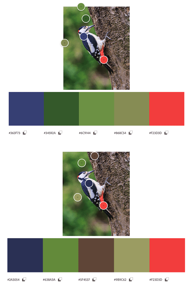
Figure 14. Extracting a color theme from an image uploaded to Adobe Color
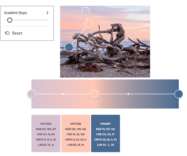
Figure 15. Extracting a gradient from an image uploaded to Adobe Color
Proofing Colors for Accessibility
As well as choosing colors that are visually pleasing, we also want to make sure they are inclusive and accessible to the widest possible audience. Illustrator and Photoshop both have proofing options that simulate how your designs will look to individuals with color blindness (Figure 16). For some reason, InDesign lacks this option, even though its proofing tools are otherwise the same.
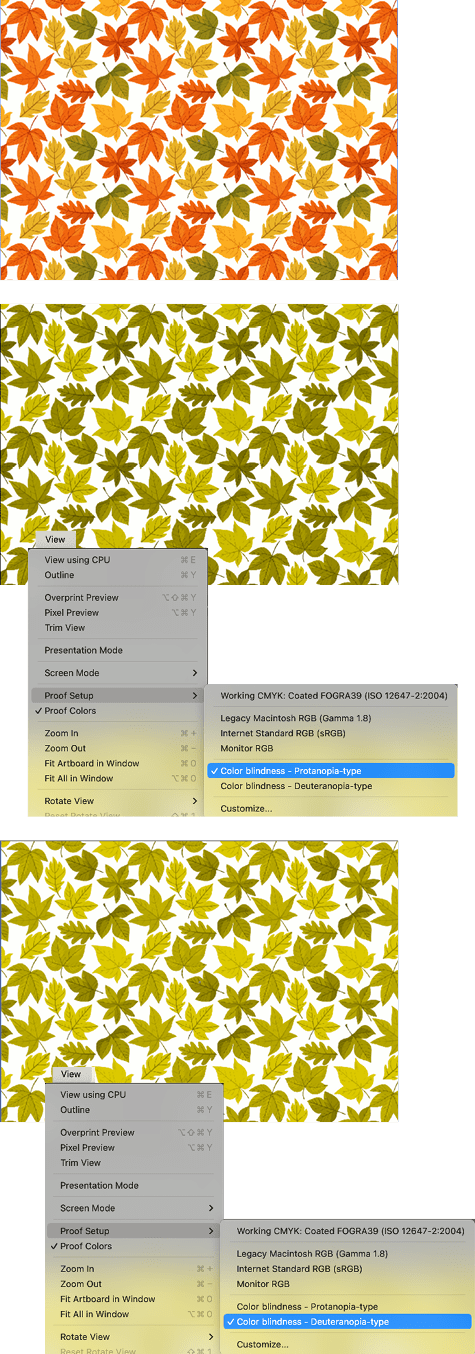
Figure 16. Proofing how colors will appear to individuals with color blindness
You also can check out some additional options. Tools like Adobe Contrast Checker verify that there is sufficient contrast between text and background colors, while the GreenLight accessibility tools from Circular Software make it easy to do this without leaving InDesign (Figure 17). Similarly, the Color Contrast Validator script enables you to build a matrix of color combinations derived from the colors on your Swatches panel and rated for their accessibility score. Keep in mind that even if your colors pass, you shouldn’t rely on color alone to carry your message, but employ additional cues (such as text labels, patterns, or shapes) to convey information.
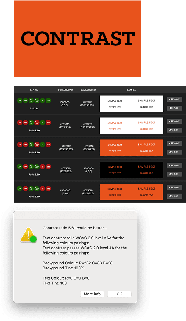
Figure 17. Evaluating the contrast of your foreground and background colors
Calming the Complexity
Color is a complex and lifelong study, and even experienced graphic designers can find it challenging, a mix of rules and learned intuition—much like choosing the right fonts. The various color tools in InDesign, Illustrator, and Photoshop make choosing colors easier, allowing you to work with precision and increased confidence. Even if you’re someone who wears black no matter what the occasion or feels hesitant about choosing paint colors for the living room, with Adobe’s ever-evolving color tools you can explore without feeling overwhelmed or insecure, crafting cohesive, visually compelling color schemes that are underpinned by the science of color theory or drawn from the natural harmony of existing images.
Commenting is easier and faster when you're logged in!

Recommended for you

InDesign Magazine Issue 77: Fresh Tips
We’re happy to announce that InDesign Magazine Issue 77 (September, 2015) i...

Photographic Frames and Mattes
David goes crazy with putting frames around pictures... and comes up with some i...

InDesign How-To: Designing with Data
Michael Murphy shows you how to take a bone-dry spread- sheet and turn it into a...